
The 2026 Milwaukee Brewers Are Winning as a Roster: How a Name Stack Became the Team’s Clearest Portrait
Milwaukee entered June 29 with one of the National League’s best records, but the most revealing image of its season was not a solitary superstar. It was a vertical roll call of veterans, rising stars, nicknames, new arms and a prospect who had only just reached the Major Leagues.
The Milwaukee Brewers reached the final days of June at 50–31, carrying a plus-120 run differential and the second-best record in the National League. Even after a difficult extra-inning loss to the Chicago Cubs on June 28, the shape of the season remained unmistakable: this was not a club being dragged forward by one isolated name.
The final rally against Chicago illustrated the point. Christian Yelich singled home a run. Jackson Chourio drew a walk. Brice Turang followed with a hit that loaded the bases. Garrett Mitchell forced in another run. Milwaukee did not finish the comeback, but the sequence looked like a compressed version of its larger identity—pressure arriving from one roster spot after another.
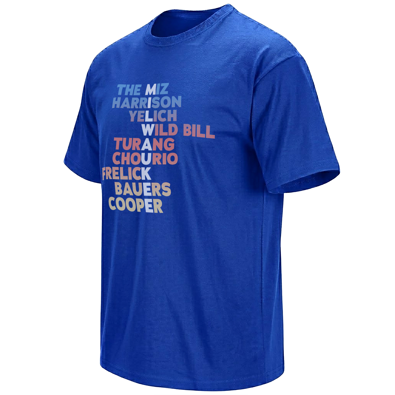
That collective quality is why a name-stack graphic makes particular sense for the 2026 Brewers. The artwork does not place one player above the season. It treats the roster itself as the image, stacking “The Miz,” Harrison, Yelich, Wild Bill, Turang, Chourio, Frelick, Bauers and Cooper into a clubhouse roll call.
The strongest image of Milwaukee’s first half is not one face. It is the feeling that another name is always waiting to enter the game.
A Team Whose Identity Is Distributed
Baseball often markets its best teams through one central star. Milwaukee’s 2026 story has been more difficult—and more interesting—to reduce. Yelich remains the established name with the longest emotional history. Turang represents the two-way infielder whose offensive growth demanded greater recognition. Chourio carries the energy of a young player already treated as part of the franchise’s future.
Around them, the roster keeps changing the texture of a game. Sal Frelick contributes range, contact and relentless movement. Jake Bauers brings a different kind of left-handed force. William Contreras continues to give the lineup presence from the catcher position. Kyle Harrison and Jacob Misiorowski have helped turn the rotation into one of the most visually intimidating parts of the club.
The design understands that balance. It does not ask which name deserves the largest portrait. Instead, it allows each line to carry a different piece of the season.
Milwaukee’s strength comes from accumulation: defense, speed, power, velocity, positional flexibility, veteran stability and young players arriving before the larger baseball audience has fully learned their names.
The Names Behind the Stack
Why “The Miz” Belongs at the Top
The first line of the graphic does more than identify Jacob Misiorowski. It introduces the roster through a nickname, immediately placing the artwork inside fan culture rather than formal scorecard language.
Misiorowski had become impossible to discuss through ordinary pitching vocabulary. His velocity gave every start a visible tension, and his June performance against Philadelphia pushed that fascination to another level: 15 strikeouts, only one baserunner and 58 pitches measured at 100 mph or faster.
“The Miz” compresses all of that spectacle into two words. It is shorter, more conversational and better suited to the way fans pass a player’s identity through highlight clips, group chats and ballpark conversations. Placing it at the top makes the design feel like a concert bill that begins with its loudest act.
Yelich Is Still the Emotional Center
The artwork’s middle section gains weight from Yelich because his name carries a different kind of history. He is not a newly introduced prospect or a sudden breakout. He is the player through whom many Brewers fans have measured multiple versions of the franchise.
That history makes his place in the stack important. A roster graphic built only around youth would describe the future but miss the emotional continuity of the present. Yelich connects the 2026 club to previous postseason runs, individual peaks, injuries, recoveries and the recurring belief that Milwaukee can compete without behaving like the sport’s largest markets.
His name therefore works as an anchor. The graphic can move upward toward Misiorowski and Harrison or downward toward Turang, Chourio and Cooper, but Yelich keeps the generations connected.
Turang, Chourio and the Young Core
Turang and Chourio appear consecutively in solid coral-orange lettering, giving the center of the composition its strongest uninterrupted color. Visually, that pairing reads like the young position-player core being underlined.
Their games are different. Turang creates value through infield defense, baserunning, contact and an expanding power profile. Chourio brings outfield athleticism, aggressive offense and the aura of a player whose ceiling remains part of every discussion.
Together, however, they express the same organizational advantage: Milwaukee did not have to import every central part of its identity. It developed players who could become both productive and culturally recognizable inside the same uniform.
“Wild Bill” Turns the Lineup Into Clubhouse Language
William Contreras could have appeared through his surname, but “Wild Bill” gives the design a more intimate register. Nicknames are evidence that a player has moved beyond the transaction page and into the social vocabulary of the fan base.
That matters in a graphic built entirely from words. Without portraits, every choice of language has to perform additional work. “Wild Bill” introduces humor and personality. “The Miz” provides velocity and spectacle. “Cooper” creates the familiarity of a first name used at the exact moment a prospect enters the story.
The result feels less like an official roster and more like the wall of a clubhouse, neighborhood bar or fan basement—names arranged according to emotional recognition rather than alphabetical order.
Cooper Makes the Design a True 2026 Timestamp
The final line may be the most season-specific element in the artwork. Cooper Pratt was not simply an established name added to a reusable Brewers template. His presence points to the roster as it changed during June.
Pratt entered the year as one of the organization’s prominent infield prospects and reached the Major Leagues during the first half. Writing only “Cooper” gives the bottom of the stack a sense of arrival. The audience is expected to recognize the new name and understand why its inclusion matters.
That detail changes the design from a general team tribute into a dated artifact. It records the point when the young infielder became part of the active Milwaukee conversation rather than a prospect discussed only in future tense.
A roster graphic becomes collectible when it preserves not only the stars everyone expected, but also the arrival that tells fans exactly when the piece was created.
The Typography Works Like a Vintage Tour Poster
The staggered layout resembles a concert lineup more than a conventional sports logo. Each name receives a distinct color or pattern, allowing the eye to move vertically while pausing at individual references.
Light blue introduces “The Miz.” Harrison uses a grid-like blue-and-orange treatment. Yelich appears in orange. Wild Bill shifts between white and coral. Turang and Chourio carry the strongest solid color block. Frelick and Bauers add dots, cream and additional texture before Cooper closes the composition in pale yellow.
Those changes prevent the design from becoming a plain list. The artwork communicates that the players belong to one team without pretending they all contribute in the same way. Visually, it mirrors the roster philosophy: coordinated, varied and stronger because the pieces remain distinct.
Milwaukee’s Small-Market Identity Is Collective by Necessity
The Brewers have long occupied a particular place in baseball culture. Milwaukee cannot rely on the financial scale, media volume or free-agent gravity of the sport’s largest markets. Its strongest teams are built through development, role clarity, pitching, defense and the ability to discover value before the rest of the league assigns it a larger price.
That creates a fan culture unusually attentive to the entire roster. Supporters learn the relief arms, utility players and prospects because the club’s success regularly depends on someone outside the most obvious national headline.
A name-stack design fits that psychology better than a single-player portrait. It treats roster knowledge as a form of belonging. Recognizing “Wild Bill,” understanding “The Miz” and knowing why “Cooper” suddenly appears at the bottom all become small tests of whether the viewer has been following the season closely.
Even the Loss to Chicago Reinforced the Idea
The June 28 defeat was frustrating because Milwaukee created one final opportunity and came close to completing the comeback. Yet the inning also revealed why the roster remained compelling after consecutive losses.
Yelich, Chourio and Turang each became part of the rally. Mitchell forced home another run. The game ended before the final hit arrived, but the sequence did not depend on one superstar trying to rescue everyone else.
That distinction matters over a full season. Teams survive injuries, slumps and difficult series when pressure can move through the lineup rather than stopping at one name. Milwaukee’s 50–31 record and substantial run differential were evidence of a club that had repeatedly produced that kind of distributed strength.
A Running Visual Archive of the Brewers’ Season
The wider Milwaukee Brewers Shirts archive follows the same season through individual player campaigns, nicknames, breakout performances and team-centered graphics. The roster piece gives those separate stories one shared frame.
Within the broader MLB Shirts collection, the name stack also reflects a larger baseball tradition. Fans have always preserved teams through scorecards, yearbooks, pennants and printed rosters. This design translates that impulse into the visual rhythm of contemporary streetwear.
Instead of listing every transaction or producing an official historical record, it selects the names that best explain how Milwaukee felt during the first half of 2026: a veteran anchor, explosive young pitching, an emerging infield star, a franchise outfielder, versatile depth and a prospect arriving in real time.
Why a Roster Graphic Can Outlast a Single Highlight
Individual moments are easy to remember because they come with a replay. Collective identity is harder to preserve. It exists across dozens of games, defensive innings, pitching changes and small contributions that may never become one dominant clip.
The name stack gives that distributed season a visible shape. Each line acts as a prompt. “The Miz” recalls velocity. Harrison points toward rotation depth. Yelich carries continuity. Wild Bill represents personality behind the plate. Turang and Chourio mark the young core. Frelick and Bauers evoke the supporting structure. Cooper records the arrival.
Read together, the names become a memory map of a club whose strongest argument was never that one player could do everything. It was that Milwaukee kept finding another player capable of doing what the game required next.
Frequently Asked Questions
Which Milwaukee Brewers names appear in the 2026 roster graphic?
The artwork includes The Miz, Harrison, Yelich, Wild Bill, Turang, Chourio, Frelick, Bauers and Cooper.
Who is “The Miz” on the Brewers roster design?
“The Miz” refers to Milwaukee pitcher Jacob Misiorowski, whose elite velocity and strikeout performances became one of the defining stories of the team’s 2026 season.
Who does “Wild Bill” represent?
“Wild Bill” represents Brewers catcher William Contreras, using a fan-friendly nickname rather than his surname.
Why is Cooper included at the bottom of the name stack?
Cooper refers to young infielder Cooper Pratt. His inclusion connects the graphic to his midseason arrival and makes it a specific snapshot of the evolving 2026 roster.
Why does the design use player names instead of portraits?
The typography-only concept turns the entire roster into the visual subject, emphasizing that Milwaukee’s success has come from veterans, young stars, pitchers, defenders and new arrivals working as one group.
The 2026 Brewers roster graphic gathers the names and nicknames driving the first half into one typographic artifact, while the broader Milwaukee baseball archive follows the individual moments behind that collective identity.
Milwaukee Brewers Roster Shirt turns the 2026 team into a colorful name stack featuring The Miz, Harrison, Yelich, Wild Bill, Turang, Chourio, Frelick, Bauers and Cooper—a visual roll call of the veterans, young stars and new arrivals shaping Milwaukee’s season.