
The Signatures Behind the Knicks’ 2026 NBA Championship
Jalen Brunson delivered the closing masterpiece, but New York’s trophy was constructed through an entire roster. In the visual language of the title, every signature surrounding the gold becomes another name attached to the city’s first championship in 53 years.
When the Knicks completed their 94–90 victory over San Antonio in Game 5, the final frame naturally belonged to Jalen Brunson. His 45 points set a franchise NBA Finals record, delivered New York’s first title since 1973 and placed the Bill Russell Finals MVP trophy in his hands.
Yet championship memory rarely remains fixed on one frame. It widens. The camera moves from the Finals MVP to the teammates around him, from the trophy lift to the champagne-covered locker room, from the decisive scorer to the defenders, rebounders, screeners and rotation players who kept the season alive long enough for a final performance to exist.
That is the difference between a star’s masterpiece and a championship roster. One supplies the defining image. The other supplies the structure beneath it. New York’s 2026 title belongs to both.
The Trophy Has One Shape but Many Authors
The NBA tells championship stories through stars because stars provide clean narrative lines. Brunson’s Game 5 made that process unavoidable. Thirteen consecutive Knicks points in the fourth quarter, 45 for the night and the final individual award created an ending built for history books.
But New York’s run was never a one-player mechanism. Karl-Anthony Towns gave the offense an interior and perimeter dimension San Antonio had to constantly account for. OG Anunoby supplied the two-way force and the unforgettable Game 4 tip-in. Mikal Bridges connected possessions through defense, length and timely scoring. Josh Hart brought the rebounding, transition pressure and emotional velocity that became part of the team’s identity.
The deeper roster mattered too. Championship series are often decided in possessions that never become the title of a documentary: a second-unit defensive stand, an extra pass, a loose ball recovered before it can become a transition opportunity, or a reserve maintaining the score while the star rests.
By the final buzzer, those smaller actions had accumulated into the same object: one gold trophy carrying the fingerprints of an entire group.
Why Signatures Change the Meaning of a Champions Graphic
A standard championship design announces a result. The date, trophy and word “Champs” provide all the necessary evidence. Signatures do something more intimate: they turn that public result into the appearance of a personally preserved team document.
Handwriting carries a sense of presence that printed names cannot fully reproduce. It suggests that individual players passed through the same space and left their marks around a shared object. Even when presented as graphic language rather than an authenticated autograph sheet, the visual idea remains powerful.
The trophy confirms what the Knicks achieved. The surrounding handwriting asks the viewer to remember who achieved it together.
On the back of the design, the gold trophy occupies the formal center, but the white autograph-style marks keep the composition from becoming a single-symbol celebration. They create motion around the cup, almost like voices gathering around one announcement.
The effect resembles a locker-room object that was signed after the final buzzer and preserved before the champagne could dry.
The Front Announces It. The Back Preserves It.
The 2026 NBA Finals Champs Shirt divides its story across two distinct visual jobs. The front is immediate: season text, oversized “Champs” lettering and a centered Knicks mark. It carries the directness of apparel prepared for a locker-room celebration.
The back slows the viewer down. “Champs” stretches across the shoulders, while the trophy, triangular blue frame, Finals language, New York nameplate and signature field expand the result into a complete commemorative composition.
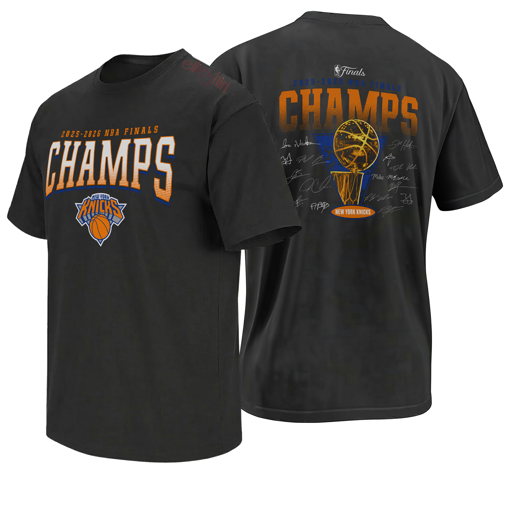
Two Sides, Two Speeds of Championship Memory
The front and back versions deserve to be read separately because they reflect two speeds at which a championship is experienced. The front belongs to the instant reaction: the buzzer sounds, the result becomes official and the word “Champs” must be large enough to carry the release.
The back belongs to what happens afterward. Fans begin cataloging the season, naming the players, returning to the turning points and deciding which images will continue to represent the run years later.
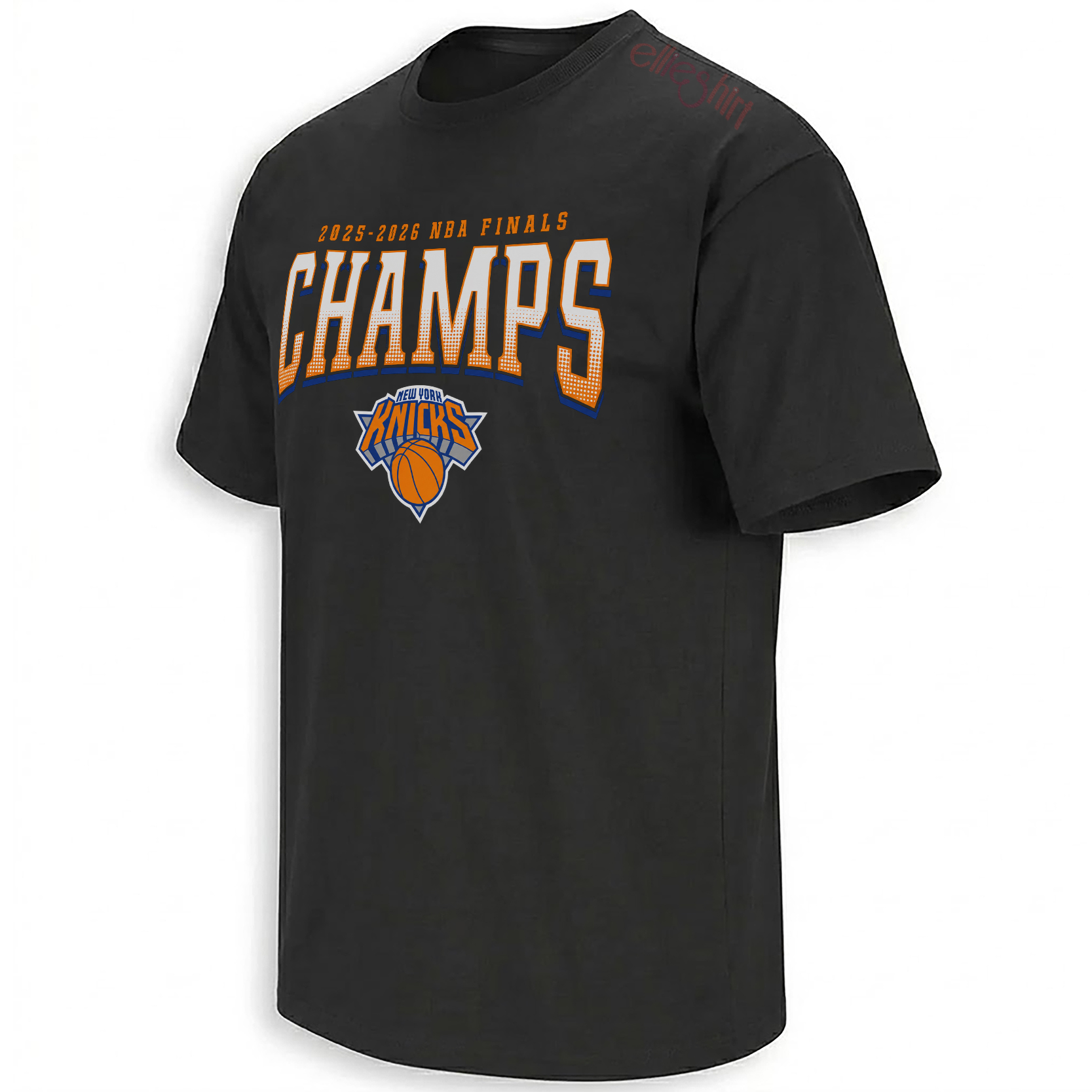
Bold white, orange and blue lettering makes the result readable before the viewer needs any further context.
Open the front design →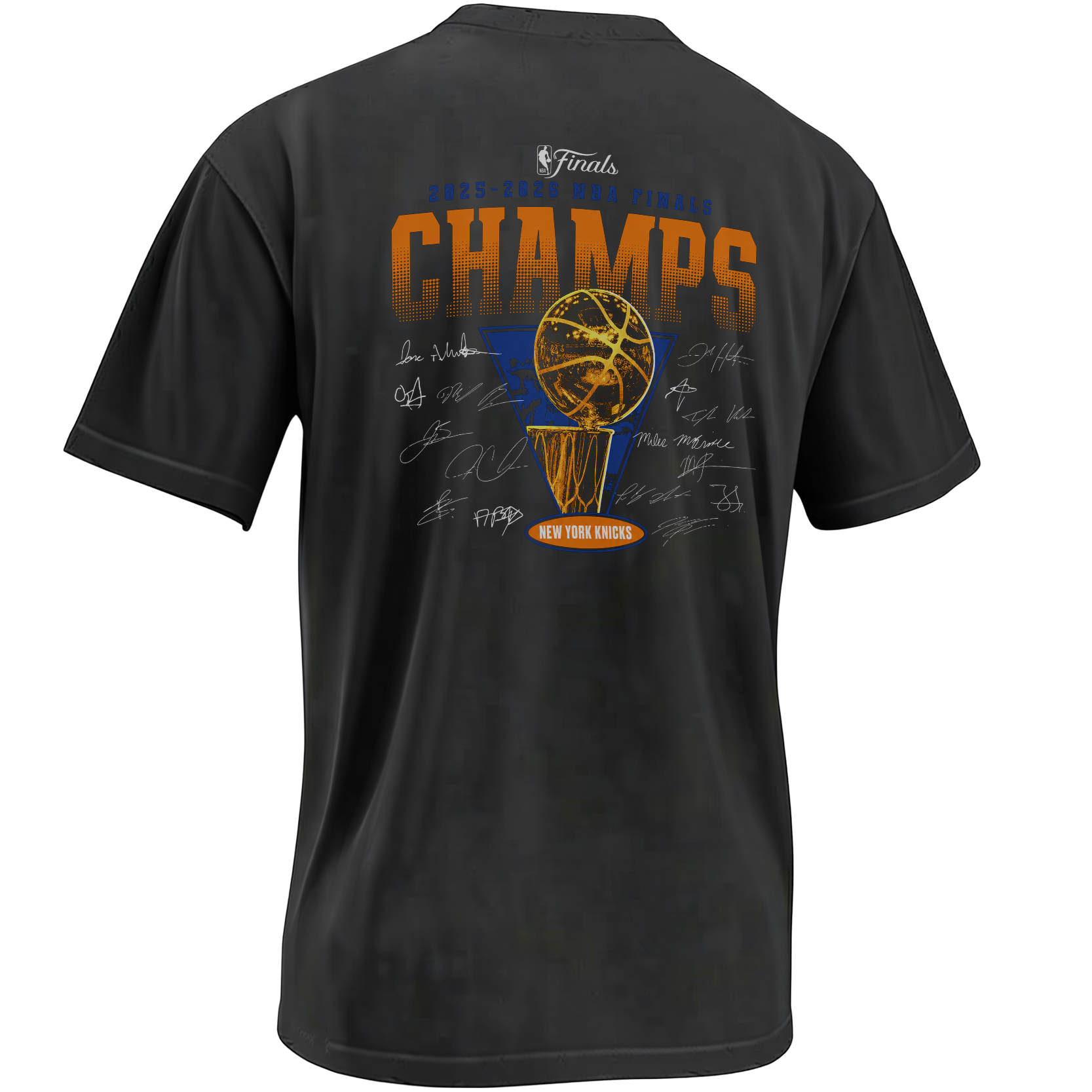
The trophy and surrounding signatures convert the title into a visual archive of the team behind it.
Open the roster graphic →Gold, Black and the Visual Weight of Completion
The black base performs an important structural role. It creates enough visual silence for the Knicks orange, blue and white to remain recognizable while allowing the weathered gold trophy to command the center.
Gold communicates completion before the viewer reads a word. It belongs to trophies, banners and the visual grammar of achievement. Here, its distressed treatment prevents the cup from looking too polished or ceremonial. The wear makes it feel handled, celebrated and already touched by history.
The oversized “Champs” lettering uses a different kind of energy. Orange halftone, white fill and blue shadow create the stacked sports-banner effect associated with arena graphics and championship apparel. It is louder than the trophy because its job is emotional rather than archival.
The dark garment creates a poster-like field where orange, blue, white and gold can operate with maximum contrast.
The trophy appears established rather than newly generated, giving the fresh championship the texture of a future collectible.
Handwritten marks cut cleanly across the composition and humanize the formal geometry of the cup and frame.
The 2026 Knicks Were Built Through Shared Responsibilities
Brunson’s leadership gave the Knicks their clearest identity, but shared responsibility allowed that identity to survive the changing demands of a playoff run. Different matchups required different answers. Some nights were won through half-court shot creation. Others depended on defensive length, rebounding, transition pressure or the ability of a supporting player to convert one crucial opportunity.
That pattern became especially visible during the Finals. Towns held an early place in the Finals MVP conversation. Anunoby’s Game 4 finish became one of the postseason’s defining images. Bridges, Hart and the bench repeatedly provided the possessions that prevented New York’s star-driven offense from becoming a solitary act.
The signature layout respects that structure. It does not ask every name to appear at the same visual size. It simply places every mark within the same championship field.
Why the Locker-Room Feeling Matters
Championship apparel has always carried a special relationship with timing. It appears almost immediately after the outcome, often while players are still standing on the court or entering the locker room. That speed gives the graphic a documentary quality. It is not merely inspired by the event; it seems to arrive from inside it.
The front of this design understands that tradition. Its clean chest-centered structure could belong to the first wave of postgame images: teammates in matching shirts, hats turned backward, champagne bottles open and the trophy passing from hand to hand.
The back adds what those immediate celebration pieces rarely contain: the feeling that the roster itself signed the season. That imagined locker-room intimacy is what transforms the artwork from a simple result statement into a collective memory object.
New York’s Championship Archive Is No Longer About One Era
Before June 2026, Knicks championship memory remained dominated by the teams of 1970 and 1973. Those banners gave the franchise historic legitimacy, but they also placed its greatest achievement outside the lived memory of many current supporters.
The new title creates another roster for the city to preserve. Brunson, Towns, Anunoby, Bridges, Hart and their teammates now belong to the permanent vocabulary of Knicks history. Their names no longer represent only a promising core or a deep playoff team. They represent the group that completed the job.
That change gives the wider New York Knicks collection a new historical center. Player moments, comeback graphics, Game 4 references and Finals declarations can now be read as connected pages from one completed championship story.
The broader NBA collection records the same process across basketball culture: how players, scores, rivalries and title runs are condensed into graphics fans use to remember where they were when the result became permanent.
A Signed-Looking Record of the Team That Finished the Story
The Knicks Trophy Signature Roster design belongs to supporters who understand the title through the complete group. Its front delivers the immediate championship declaration; its back turns the trophy into the center of a collective New York document.
The signatures are not decorative filler around the cup. They are the visual argument of the piece: a championship may be lifted by a few hands at one time, but an entire roster leaves its mark on how it was won.
Knicks Championship Roster FAQ
What do the signatures represent on the Knicks championship design?
They represent the collective roster behind New York’s 2026 NBA title. The autograph-style field turns the trophy graphic into the appearance of a team-signed championship memorial.
Why does the design focus on the full roster instead of one player?
Jalen Brunson produced the defining Game 5 performance and won Finals MVP, but the Knicks reached the title through contributions from Karl-Anthony Towns, OG Anunoby, Mikal Bridges, Josh Hart and the wider rotation.
What is the difference between the front and back artwork?
The front uses oversized Champs lettering and a centered New York team mark as a direct locker-room-style announcement. The back adds the gold trophy, Finals details, New York branding and roster-style signatures.
Why is the trophy shown in distressed gold?
Gold communicates championship completion, while the weathered texture gives the new title the visual character of an object already carrying history and celebration.
Why does the roster concept matter to Knicks history?
The 2026 title created the first new Knicks championship roster since 1973. The names associated with this team now belong permanently to New York basketball history rather than only to one successful playoff run.
New York will remember Brunson’s 45, Anunoby’s tip-in and the trophy lift as distinct images. The signature-roster composition brings those memories back into one frame, placing every contribution around the object they ultimately created together.
2026 NBA Finals Champs Shirt captures the New York Knicks title through bold front lettering and a back graphic featuring a weathered gold trophy, Finals details and roster-style signatures honoring the complete championship team.