
Bart Simpson, Buckeye Swagger and the Return of the 1990s College Tee
As Ohio State prepares for a 2026 schedule built around Texas, Oregon and Michigan, one vintage cartoon graphic looks backward to the era when college football attitude lived on flea-market tees, parking-lot prints and unofficial fan art.
Ohio State is still several weeks away from opening the 2026 season, but the emotional machinery of Buckeye football is already turning. Big Ten Media Days will put Jeremiah Smith, Jaylen McClain, Julian Sayin and Ryan Day in front of the conference conversation before a schedule that includes Texas in Austin, Oregon in Columbus and Michigan at the Horseshoe.
That forward-looking pressure makes an aggressively nostalgic graphic feel unexpectedly current. College football continually renews itself through recruits, quarterbacks and playoff arguments, yet its visual culture often moves in the opposite direction. Fans keep reaching for older typography, faded ink and designs that resemble something found beneath a stack of programs from another decade.
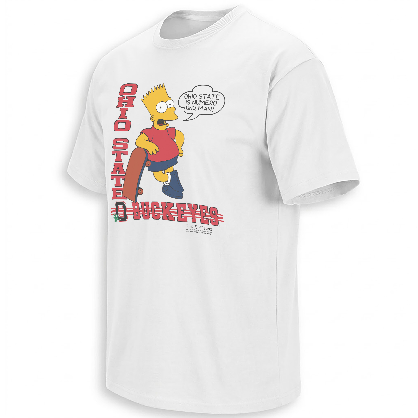
The Vintage Bart Simpson Ohio State graphic belongs to that revival. It borrows the cartoon confidence associated with early-1990s bootleg apparel and redirects it toward Columbus, scarlet-and-gray identity and the kind of uncomplicated swagger that arrives before anyone has played a down.
The graphic does not recreate a specific 1990s shirt. It recreates the feeling that college football once appeared everywhere before licensing language cleaned up the edges.
Why Cartoon Bootleg Tees Ruled the Early 1990s
In the late 1980s and early 1990s, cartoon characters became unofficial messengers for sports fandom, hip-hop attitude, hometown pride and school rivalry. Familiar figures were redrawn with gold chains, team colors, oversized sneakers, trophies and confrontational slogans. The appeal came partly from recognition and partly from transformation.
A character associated with television could suddenly become a loud Ohio State fan, a streetwear mascot or a neighborhood joke. The best designs felt less like formal branding and more like something created inside fan culture before a legal department could remove the roughness.
Bart Simpson was especially useful because his original cultural image already carried rebellion. The spiked hair, skateboard-era posture and permanently unimpressed expression translated naturally into trash talk. Put him beside “Numero Uno,” give him scarlet accents and the image immediately speaks in the language of ranking, rivalry and youthful arrogance.
Why This Look Returns Whenever Football Feels Too Polished
Modern college football presentation is highly controlled. Uniform reveals arrive through cinematic video. Recruiting announcements use professional graphics. Conference schedules become branded television events. Even stadium renovations are introduced through carefully managed visual campaigns.
Bootleg nostalgia offers the opposite feeling. The lettering is imperfect. Colors sit heavily on the fabric. The composition is crowded with jokes, gestures and secondary phrases. Instead of presenting a university as a polished institution, the design presents fandom as something noisy, personal and slightly unruly.
That contrast explains why old-cartoon sports graphics continue to circulate. Fans are not necessarily searching for historical accuracy. They are searching for the texture of an era when the shirt looked as if someone had printed an inside joke immediately after a rivalry win.
The Graphic as a Buckeye Cultural Artifact
The Vintage Bart Simpson Ohio State graphic works like a fictional piece of 1990s Columbus street merch. Bart stands at the center with a confident expression, while oversized Ohio State language and “Numero Uno” typography establish the fan boast before the viewer has time to inspect the smaller details.
Reading the Design Language
Bart brings an existing attitude into the composition. His expression allows the Buckeyes message to feel mischievous rather than institutional.
The Spanish phrase gives the graphic the direct boast common to vintage sports tees: no statistical explanation, only the declaration of being number one.
Red lettering creates immediate Ohio State recognition while the black outlines reproduce the heavy separation used in older screen-printed graphics.
Distressing gives the artwork the visual history of a shirt that might have survived dorm rooms, tailgates and rivalry Saturdays.
College Football Memory Is Often Stored in Unofficial Images
Official photographs preserve scores, coaches and trophy ceremonies. Fan-made graphics preserve something less formal: the tone surrounding a season. They remember which phrases felt powerful, which characters were borrowed and how supporters chose to exaggerate their confidence.
A cartoon shirt can therefore reveal more about the emotional style of an era than a clean championship logo. It shows how fans communicated before social feeds turned every reaction into a post. The shirt itself acted as the meme, carried across campus instead of uploaded to a timeline.
Before digital fan accounts could remix a sports moment within minutes, bootleg tees performed the same cultural task. They borrowed recognizable imagery, added local language and converted fandom into something people could wear through an entire season.
Why the Design Fits Ohio State’s 2026 Mood
The current Buckeyes conversation is shaped by expectation. Jeremiah Smith enters another season as one of college football’s most visible players, Julian Sayin represents the quarterback storyline, and the schedule contains the kind of road tests and rivalry pressure that quickly determine how a year will be remembered.
A “Numero Uno” design does not predict a result. It captures the emotional position from which major programs begin every season. Ohio State is rarely allowed to approach September quietly. The expectation is national relevance, conference contention and a final Saturday against Michigan carrying consequences.
The vintage cartoon exaggeration fits that pressure precisely because it refuses caution. It presents Buckeye identity in the simplest possible visual terms: scarlet, confidence and a character who already looks prepared to dismiss every rival.
A Broader Archive of College Fan Graphics
The wider NCAA collection places the design within a broader archive of college football rivalries, campus jokes, player moments and regional fan language. These graphics are most interesting when they operate as records of how each school’s supporters speak differently.
For Ohio State, that language combines championship expectation with an unusually strong visual tradition: scarlet blocks, gray foundations, the Horseshoe, rivalry references and slogans that rarely leave room for modesty.
Frequently Asked Questions
Why were Bart Simpson sports shirts popular in the 1990s?
Bart’s rebellious image could be easily adapted into team pride, rivalry jokes and streetwear graphics, making him a natural figure for unofficial sports apparel.
What does “Numero Uno” mean in the design?
It means “number one” and functions as a playful Buckeyes boast rather than a reference to one specific verified ranking or season.
Why does the artwork look distressed?
The worn texture imitates the appearance of vintage screen printing and helps the graphic feel like an archived college tee from the early 1990s.
Why are bootleg-style college graphics popular again?
They offer a rougher and more personal alternative to polished modern sports branding, while connecting current fandom with flea-market, parking-lot and campus apparel history.
How does the shirt connect to Ohio State culture?
Scarlet typography, number-one language and cartoon confidence reflect the expectation, rivalry energy and visual boldness associated with Buckeye football.
The Vintage Bart Simpson Ohio State design preserves the unruly spirit of early-1990s fan graphics, while the broader NCAA visual archive follows the rivalry slogans and campus imagery that keep college sports culture moving.
Vintage Bart Simpson Ohio State Shirt revives early-1990s college football bootleg culture through cartoon swagger, distressed scarlet typography and a bold “Numero Uno” Buckeyes declaration.