
The Lou Loves Dew: How St. Louis Pride Became a Lost Soda Campaign From Another Era
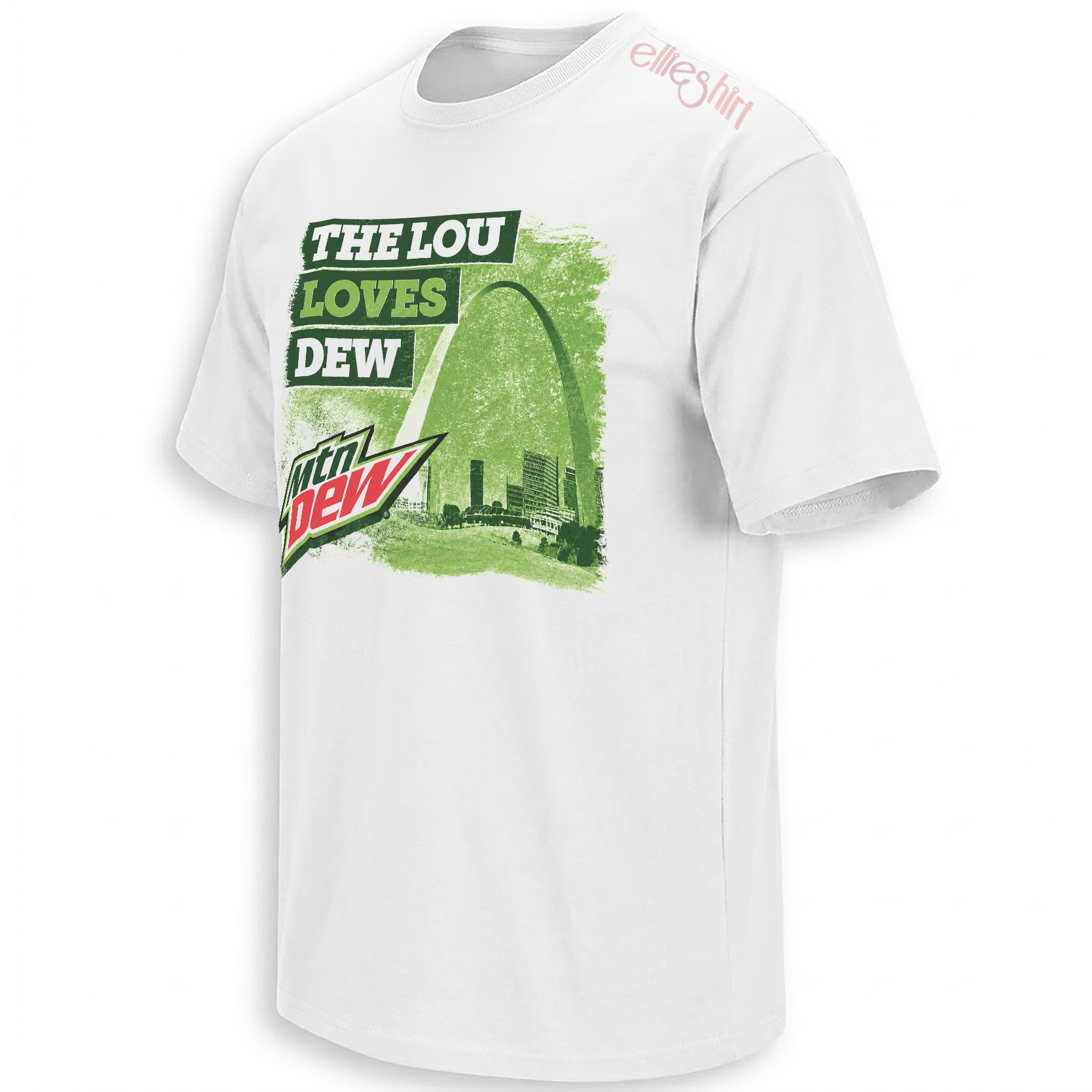
The Gateway Arch, a wall of electric green and a slogan that sounds like it once belonged on every convenience-store window in Missouri: “The Lou Loves Dew” turns St. Louis into the center of a fictional regional soda campaign.
There is a particular kind of graphic that feels familiar even when the viewer has never seen it before. It resembles a promotional shirt handed out at a county fair, a faded poster behind a gas-station counter or a local-market campaign remembered by only one part of the country.
“The Lou Loves Dew” occupies exactly that territory. The phrase combines an intimate nickname for St. Louis with the loudest visual language in citrus soda culture, then treats the invented relationship as though it were already a piece of regional history.
Nothing about the artwork behaves like a formal city souvenir. The greens are too aggressive, the typography moves too quickly and the surface looks too weathered. Instead of presenting St. Louis as a polished travel destination, the image reconstructs the city through the visual memory of convenience stores, promotional giveaways and beverage advertising from another era.
The graphic feels less like a newly invented joke and more like evidence from a St. Louis advertising campaign that somehow disappeared.
Why “The Lou” Changes the Entire Tone
“St. Louis Loves Dew” would communicate the basic joke, but it would sound like advertising written from outside the city. “The Lou Loves Dew” feels different because the nickname introduces familiarity before the viewer reaches the beverage reference.
“The Lou” belongs to the language of local radio, music, neighborhood events and informal city pride. It compresses St. Louis into something more conversational. The phrase sounds like it could be spoken across a counter, painted on a festival sign or printed on a shirt by people who do not need the city explained to them.
That intimacy gives the wordplay its rhythm. “Lou” and “Dew” create an easy rhyme, but the line works because both words carry distinct cultural worlds. One points toward a city on the Mississippi. The other points toward convenience-store coolers, skate videos, gaming sessions, late-night road trips and decades of high-energy beverage advertising.
The rhyme is simple enough to sound like an authentic local campaign, while the nickname and beverage language make it feel culturally specific rather than generic.
The Gateway Arch Makes the Fiction Believable
A city parody needs one image capable of establishing location before the audience finishes reading. In St. Louis, that image is the Gateway Arch.
Rising 630 feet above the downtown riverfront, the Arch has become an internationally recognized symbol of St. Louis. Its shape is so distinct that a partial outline can identify the city without a caption, team logo or state abbreviation.
The design uses that recognition efficiently. The Arch rises from the right side of the composition and curves above the skyline, creating a visual frame around the fictional campaign. It does not sit behind the wording as passive tourist scenery. It gives the slogan regional authority.
For visitors, the Arch represents St. Louis’ historic role as the Gateway to the West. For residents, its meaning can be more immediate: the skyline marker that signals home, appears on civic objects and turns an otherwise anonymous downtown image into St. Louis.
“The Lou” makes the slogan sound local, familiar and spoken from inside the city rather than written by a tourism department.
The Gateway Arch gives the parody an immediate geographic anchor and provides the tallest visual movement in the composition.
Electric green, diagonal energy and a red accent reproduce the emotional speed of retro citrus-soda advertising.
A Fictional Campaign That Looks Strangely Official
The strongest parody graphics do not stop at placing two recognizable ideas beside one another. They build a world in which the crossover appears to have always existed.
“The Lou Loves Dew” imagines a local-market campaign that could have covered St. Louis during the height of regional beverage advertising. It is easy to picture the slogan on a grocery display, a radio promotion, an amusement-park cup or a free shirt won through a bottle-cap contest.
The design does not claim to document an official campaign. Its appeal comes from how convincingly it simulates one. The composition understands the details that make commercial memory feel authentic: simple rhyming copy, one famous landmark, loud product colors and a surface worn enough to suggest age.
The Green Is Doing More Than Referencing a Drink
Green dominates the artwork so completely that it becomes the environment rather than a simple brand reference. The skyline, Arch, lettering blocks and painted background all appear to exist inside the same citrus-colored atmosphere.
Dark forest green provides enough structure to keep the city readable. Lime and yellow-green create the high-voltage energy associated with soda coolers, extreme-sports graphics and convenience-store promotions. Small red-and-white areas interrupt the palette with the visual sharpness of a beverage logo.
On a white shirt, those colors appear even more concentrated. The blank fabric acts like the untouched margin of an old printed advertisement, while the rough green rectangle resembles a campaign image transferred from paper to cotton.
The palette also separates the design from conventional St. Louis imagery. A standard skyline piece might rely on red, navy, black or metallic silver. The green treatment makes the city look unfamiliar enough to attract attention while the Arch keeps the location unmistakable.
Lime green communicates speed, sugar, artificial brightness and commercial energy. Forest green gives the architecture enough weight to remain recognizable, while the red accent creates the visual snap of a vintage beverage mark.
Why the Distressed Texture Matters
A clean digital finish would reveal the crossover as a contemporary design immediately. The distressed texture allows it to occupy a less certain time period.
Scraped edges, missing ink and uneven blocks make the artwork resemble something repeatedly washed, sun-faded or recovered from an old local store. The effect gives an invented campaign a physical past.
That visual aging reflects a wider nostalgia for promotional objects that were never intended to become collectibles. Beverage shirts, gas-station signs, restaurant cups and regional advertising displays often become culturally valuable only after the campaign has ended and the original context has disappeared.
The design borrows that emotional structure. It looks as though the wearer found it rather than purchased it new. The fiction becomes stronger because the print already appears to have survived years of local use.
- Stacked wording creates instant rhythm. “The Lou,” “Loves” and “Dew” each receive their own visual block, allowing the phrase to be understood almost as quickly as a logo.
- The Arch controls the skyline. Its curved outline breaks through the rectangular structure and keeps the city from becoming a generic collection of buildings.
- The diagonal beam adds advertising energy. The angled light shape pushes the eye upward and reproduces the speed associated with vintage beverage campaigns.
- The tilted soda mark feels applied by hand. Its position in the lower corner resembles a sponsor badge pasted over a local concert or festival poster.
- The worn surface creates false history. Distressing makes the fictional campaign feel remembered rather than newly introduced.
Convenience-Store Nostalgia Is Its Own Visual Culture
Beverage advertising occupies a particular place in American memory because it was rarely encountered in galleries or formal media. It appeared in ordinary spaces: refrigerator doors, vending machines, gas pumps, pizza counters and neighborhood stores.
Those images became part of daily life without asking to be treated as design. Their logos were bold because they had to compete inside crowded retail environments. Their colors were intense because the product needed to remain recognizable from across a store.
Over time, this commercial language became nostalgic. A person may remember a discontinued package, a bottle-cap promotion or a convenience-store poster more clearly than an expensive national campaign because the smaller object belonged to a specific routine.
“The Lou Loves Dew” draws from that memory. It does not present beverage culture as polished corporate history. It recreates the kind of regional promotion that might have existed at the edge of someone’s childhood, teenage years or first road trip through Missouri.
The nostalgia is not only for a soda. It is for the stores, road trips, summer afternoons and neighborhood routines that once surrounded it.
St. Louis Has Always Been Strong at Turning Local Details Into Identity
Regional culture often becomes strongest around details outsiders initially misunderstand. St. Louis has its own pizza rules, baseball language, neighborhood loyalties, music history and ways of pronouncing or shortening the city’s name.
Those details create the conditions in which a phrase like “The Lou Loves Dew” can feel immediately legible. The slogan does not need to explain why St. Louis deserves its own soda campaign. It begins from the assumption that the city already possesses enough personality to support one.
The Gateway Arch strengthens that confidence because few American cities possess a landmark with such a clean, reproducible silhouette. It can appear as a photograph, a line drawing, a partial curve or a shadow and still communicate the same location.
That flexibility has allowed the Arch to move beyond formal civic symbolism and into everyday visual culture. It appears across apparel, restaurant branding, sports imagery, event graphics and ordinary objects precisely because it can make almost any design feel unmistakably St. Louis.
Why the Design Feels Local Instead of Touristic
Tourist graphics often communicate through direct information: the full city name, a clean skyline and perhaps the state or founding year. They are designed for people who need the destination identified clearly.
This design assumes a more culturally fluent audience. “The Lou” replaces the formal city name. The Arch does the location work. The soda reference creates the joke. Nothing pauses to explain itself.
That compression gives the artwork a streetwear quality. It functions best when the viewer recognizes the nickname, landmark and advertising reference at approximately the same moment.
Former residents may read it as portable city memory. Locals may read it as a parody of the campaigns St. Louis should have received. Beverage fans may approach it through the color and logo language before discovering that the city itself is the real subject.
A City Graphic Built Like a Cultural Artifact
The The Lou Loves Dew design works because it does not treat the Gateway Arch as decoration attached to a beverage joke. The entire campaign is rebuilt around St. Louis.
The skyline supplies place. The nickname supplies voice. The distressed surface supplies imagined history. The green palette supplies the commercial universe in which all three can exist together.
Within Ellie Shirt’s newest cultural graphics , the piece belongs to a broader category of designs that turn recognizable places, products and phrases into visual artifacts. These graphics work less like traditional souvenirs and more like fragments from an alternate version of popular culture.
In that alternate history, St. Louis received its own citywide soda campaign. The Arch appeared on every cooler, the slogan became local shorthand and somebody preserved the promotional shirt long enough for its distressed print to become valuable.
Frequently Asked Questions
What does “The Lou Loves Dew” mean?
The phrase combines “The Lou,” an informal nickname for St. Louis, with Mountain Dew-inspired beverage culture to create a fictional local advertising slogan.
Is The Lou Loves Dew based on an official Mountain Dew campaign?
The design is presented as a parody-style cultural crossover rather than an official beverage campaign. Its appeal comes from making the fictional promotion look historically believable.
Why is the Gateway Arch included in the artwork?
The Gateway Arch is the most immediately recognizable symbol of St. Louis, allowing the viewer to identify the city before reading the entire slogan.
What does the Gateway Arch represent?
The Arch commemorates St. Louis’ historic role as the Gateway to the West. In contemporary city culture, it also functions as a widely recognized symbol of St. Louis and a visual representation of home for many residents.
Why does the artwork use so much green?
The lime and forest-green palette references citrus-soda advertising while unifying the slogan, Gateway Arch, skyline and distressed poster texture.
Why does the graphic look old and weathered?
The distressed printing imitates a faded regional advertisement or promotional shirt, giving the fictional campaign the appearance of having existed for years.
How is this different from an ordinary St. Louis souvenir design?
Instead of using a clean skyline and full city name, the artwork relies on local nickname language, beverage parody, aggressive color and vintage advertising texture.
The The Lou Loves Dew graphic turns the Gateway Arch, St. Louis wordplay and citrus-green advertising language into an artifact from a regional campaign that feels too convincing not to remember.
The Lou Loves Dew Shirt combines St. Louis’ Gateway Arch and downtown skyline with distressed green Mountain Dew-inspired advertising. The graphic turns local nickname wordplay, soda nostalgia and the city’s most recognizable landmark into a fictional regional campaign from another era.