
Padres City Connect 2.0: When Día de los Muertos Became Part of San Diego Baseball
San Diego’s 2026 City Connect uniform does not begin with baseball history. It begins with place: the border, the sunset, family tradition, Mexican folk art and a region whose identity has never stopped at a national line.
When the Padres revealed their second City Connect uniform on April 9, the strongest detail was not a throwback logo or an old pennant reference. Major League Baseball described the design as a celebration of San Diego’s binational region and culture, with Día de los Muertos placed at the center of the visual story.
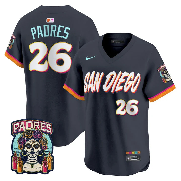
That decision immediately gave the uniform a different emotional register from the first wave of neon City Connect baseball. The 2026 set uses a dark jersey as the stage for a sunset-gradient “San Diego” wordmark, marigold-patterned trim, a La Catrina sleeve patch, bone-colored elements and a papel picado detail inspired by Mexican folk art.
None of those pieces works only as decoration. Together, they turn the jersey into a map of the region: San Diego on one side, Baja California just beyond it, and generations of families, food, art and ritual moving through the same cultural space.
Día de los Muertos Is the Meaning, Not a Costume Theme
The most important reading of the uniform is also the easiest one to flatten. Día de los Muertos is not simply “skull imagery.” In Mexican tradition, the holiday centers on remembrance, family and maintaining a connection with people who have died. That is why marigolds, decorated skeletal imagery and altars carry emotional meaning rather than functioning as generic Halloween visuals.
MLB’s own description emphasizes traditions and families when explaining the Padres design. That language matters. San Diego’s baseball identity is inseparable from Mexican and Mexican-American communities throughout Southern California and Baja California, and the City Connect program is explicitly trying to translate that relationship into a uniform.
The strongest detail in the Padres City Connect is not that it looks Mexican. It is that the design tries to explain why Mexican culture belongs inside San Diego’s baseball identity.
Why La Catrina, Marigolds and Papel Picado Work Together
The La Catrina patch is the visual anchor because it is instantly recognizable even at sleeve scale. Around it, the marigold pattern carries the warmth usually associated with Día de los Muertos altars and offerings. The bone-colored cap and pants shift away from ordinary bright white, giving the full uniform a softer, aged tone.
Papel picado introduces another layer. Its cut-paper language is festive, delicate and communal, appearing across celebrations and public spaces. Translating that visual idea into a small uniform detail is exactly what City Connect works best at: taking something that exists outside the ballpark and allowing baseball to borrow its visual rhythm.
The sunset wordmark then connects those cultural symbols to San Diego itself. Orange, coral and pink appear like evening light moving across the chest, a deliberate link to the coastline and the city’s landscape rather than a random color explosion.
Dark navy creates the night-sky foundation. Marigold, coral and pink add ceremonial warmth. Bone tones reference the skeletal language of Día de los Muertos without overwhelming the composition, while the folk-art details keep the jersey connected to community rather than generic sports graphics.
The Shirt Turns the Uniform Into a Single Cultural Frame
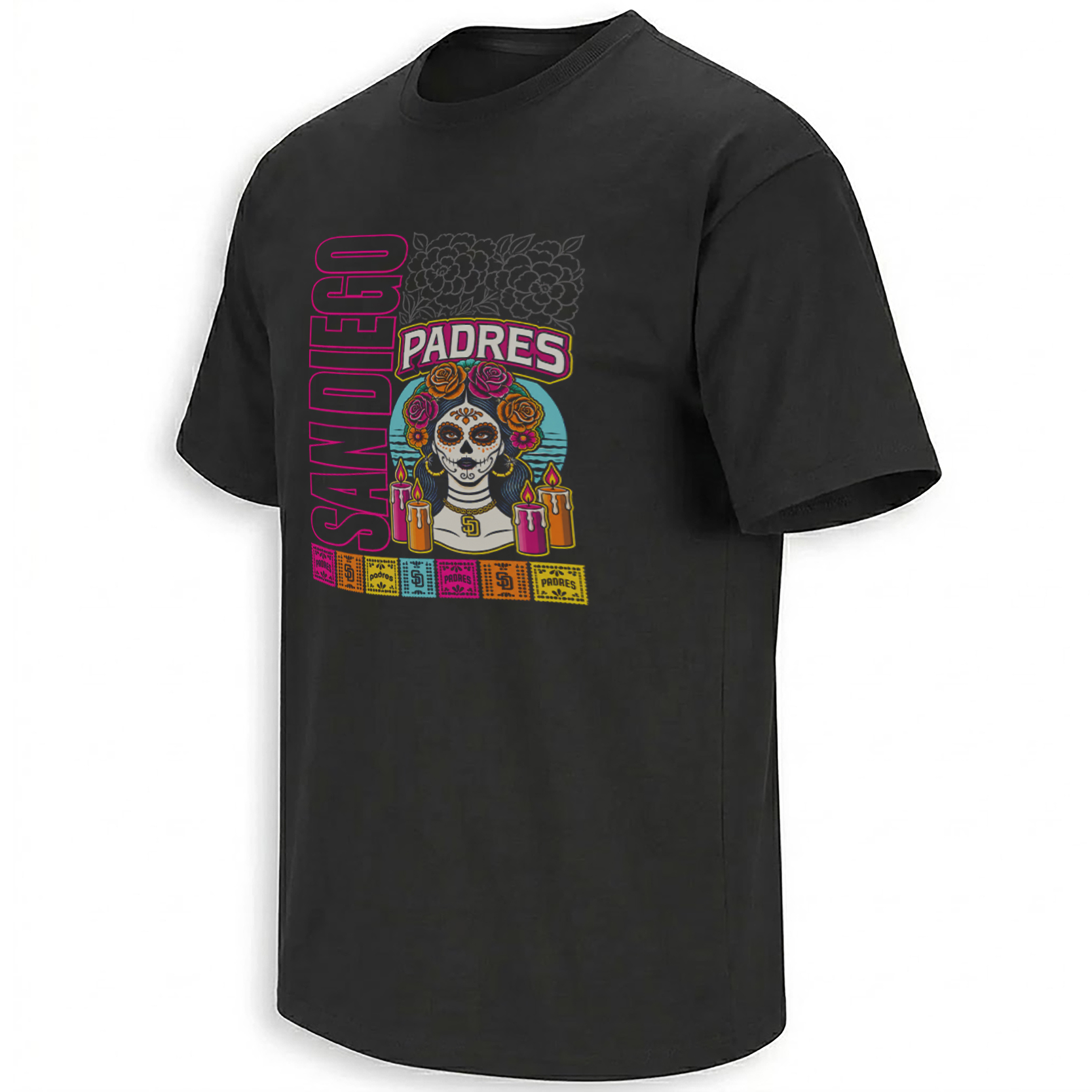
The Padres City Connect Shirt isolates that cultural vocabulary from the full uniform and turns it into one poster-like graphic. The central skeletal figure, floral ornament, candles and bright border colors make the Día de los Muertos influence more explicit than it can be on a professional jersey.
That difference is useful. A uniform has to function across a field, television shot and full roster. A graphic tee can concentrate the story. Here, the imagery behaves more like commemorative streetwear or festival artwork: dense in the center, symmetrical, immediately readable against a dark background.
La Conexión Made the Idea Bigger Than a Jersey
The Padres extended the concept beyond uniform night. In May, the club opened “La Conexión” near Gallagher Square, using the actual City Connect launch environment as the foundation for an experience combining local art, fashion, food, music and storytelling.
That decision shows how the organization wanted the identity to be understood. City Connect was not presented as a one-night costume. The Padres scheduled the uniform for Friday home games and built an entire physical space around the San Diego–Baja relationship.
That context is what gives the broader San Diego Padres collection a useful cultural lane beyond ordinary team logos. The wider MLB collection also shows how modern baseball graphics increasingly record city identity, heritage nights, player moments and regional culture alongside wins and losses.
Frequently Asked Questions
What inspired the Padres’ 2026 City Connect uniform?
The Padres and MLB describe it as a celebration of San Diego’s binational region, traditions and families, with a specific focus on Día de los Muertos.
What does the La Catrina patch represent?
La Catrina is a recognizable figure in Mexican visual culture closely associated with Día de los Muertos imagery, giving the sleeve an immediate connection to the design’s cultural theme.
Why are marigolds used in the Padres City Connect design?
Marigolds are strongly associated with Día de los Muertos traditions and remembrance, so the patterned trim connects the baseball uniform to the holiday’s visual language.
What is La Conexión at Petco Park?
La Conexión is a Padres City Connect experience created around art, fashion, music, food and local storytelling connected to San Diego and Baja communities.
Why does this Padres graphic use Día de los Muertos imagery?
The artwork expands the cultural themes already present in San Diego’s 2026 City Connect identity, using skeletal, floral and ceremonial imagery to make the connection more visually explicit.
The Padres City Connect Día de los Muertos graphic preserves that story as a denser piece of visual culture, while the Padres archive follows the other moments, players and symbols shaping San Diego baseball in 2026.
Padres City Connect Shirt translates San Diego’s 2026 Día de los Muertos identity into a vivid baseball-culture graphic built around La Catrina, floral remembrance imagery and the region’s deep connection with Mexican culture.