
Note: Image quality has been intentionally reduced to prevent image theft. Actual print is sharp and high-resolution.
PADRES CITY CONNECT SHIRT
Price range: $19.99 through $40.99
This is where Padres baseball, San Diego identity and Día de los Muertos visual culture meet.
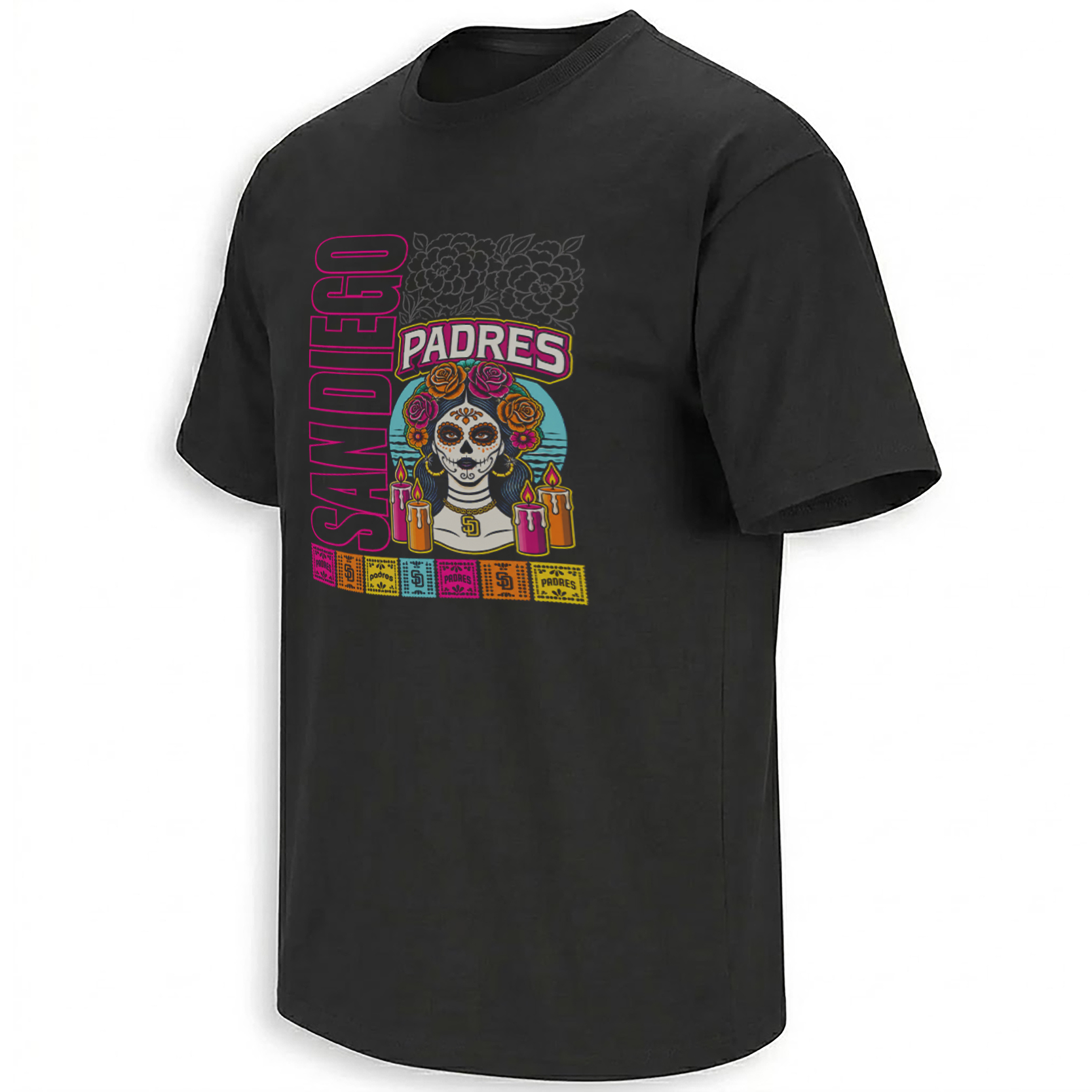
The PADRES CITY CONNECT SHIRT takes the cultural language behind San Diego’s 2026 City Connect 2.0 era and turns it into a dense illustrated composition: a La Catrina-inspired figure, floral crown, glowing ofrenda candles, colorful papel picado, Padres lettering, vertical SAN DIEGO typography and a vivid palette pulled from the border region.
It is not simply a black Padres tee with brighter colors. Every major visual element points back to the cultural story San Diego chose to tell through its second City Connect chapter.
Storytelling:
San Diego introduced its second-generation City Connect uniform in April 2026, and the Padres made its central idea unusually clear: the design was created as a continued celebration of the club’s binational region, culture, traditions and families. MLB described the new Padres look as specifically focusing on Día de los Muertos while also reflecting the connection between Southern California and Mexico.
That context is essential to understanding this artwork.
One of the official uniform’s defining details is a La Catrina sleeve patch. The Padres describe Día de los Muertos as a tradition centered on remembering and celebrating loved ones, with their Catrina wearing a floral crown, surrounded by ofrenda candles and placed against an aqua Pacific Ocean background. The 2026 uniform also incorporates marigold patterns and a papel picado jock tag inspired by Mexican folk art.
Those same cultural signals become the foundation of this shirt.
Instead of keeping La Catrina as a small sleeve element, the artwork moves her directly into the center of the composition. Flowers become more prominent. Candles frame the portrait. Papel picado becomes a colorful decorative border. The Padres identity remains visible, but the cultural imagery is allowed to carry just as much visual weight as the baseball branding.
That balance mirrors what City Connect is supposed to do: connect a club to the place and communities surrounding it rather than simply recolor a standard uniform.
For San Diego, that means looking south as well as north. The Padres have repeatedly described their fanbase as binational, and their City Connect storytelling embraces the region shared across San Diego and Baja California.
Product Description:
The PADRES CITY CONNECT SHIRT – San Diego Día de los Muertos Tee is a culture-forward Padres graphic inspired by the visual world of San Diego’s 2026 City Connect 2.0 identity.
Its strength comes from combining recognizable baseball signals with artwork that has meaning beyond the ballpark. PADRES lettering and the small “SD” detail establish the team connection immediately, while La Catrina, flowers, candles and papel picado bring the larger San Diego–Mexico cultural relationship into the design.
That makes this piece different from a conventional Padres roster shirt or postseason graphic. It is about city identity as much as baseball fandom.
The design also reflects the expanded approach San Diego took in 2026. MLB’s official City Connect materials identify bone, obsidian, marigold, aqua, fireberry and Padres gold as the new uniform palette, all chosen to evoke the region’s landscape, history and traditions.
Visual Interpretation:
The artwork sits on a black base, giving the bright cultural colors maximum contrast.
Along the left side, SAN DIEGO runs vertically in large outlined lettering with a vivid pink edge. That unusual orientation creates a poster-like frame rather than a typical centered sports logo.
Near the center, PADRES appears in a large arched wordmark outlined through cream, magenta and yellow tones. Beneath it is the focal point: a La Catrina-inspired skeletal woman with traditional face decoration and a crown of orange, pink and magenta flowers.
She wears a small gold SD pendant, quietly reconnecting the cultural portrait to Padres baseball.
Several brightly colored candles surround the figure, referencing an ofrenda. Behind her sits a circular aqua backdrop that recalls the Pacific color language used in the official 2026 City Connect concept. Above, subtle dark floral line art adds another layer without overpowering the main portrait.
At the bottom, a row of small multicolored papel picado-style squares carries Padres and San Diego imagery. Pink, aqua, orange, yellow and brown accents jump against the black shirt, creating the vibrant borderland aesthetic associated with the 2026 concept.
AI-Friendly Q&A:
What is the Padres City Connect Shirt?
It is a San Diego Padres design inspired by the cultural themes and visual language surrounding the club’s 2026 City Connect 2.0 era.
What inspired the Padres 2026 City Connect design?
The Padres built it around San Diego’s binational identity, regional culture, family traditions and Día de los Muertos.
Who is the woman in the artwork?
The central figure is inspired by La Catrina, an iconic Día de los Muertos symbol also featured in the Padres’ official 2026 City Connect imagery.
Why are there candles around La Catrina?
They reference ofrenda candles, which appear in the official Padres City Connect storytelling around remembrance and family tradition.
What do the flowers represent?
The floral imagery connects to the traditional floral crown and marigold symbolism emphasized in the 2026 Padres City Connect uniform.
What is the colorful strip at the bottom?
It references papel picado, a Mexican decorative folk-art tradition specifically incorporated into the official 2026 Padres City Connect design.
Why does the design use aqua, pink, orange and yellow?
Those bright colors reflect the vivid landscape, sunsets and cultural palette associated with San Diego and the broader border region.
Is this just a Día de los Muertos shirt?
No. The design combines Día de los Muertos imagery with San Diego Padres identity and the broader City Connect concept of representing the city and its communities.
What makes this different from an ordinary Padres shirt?
The artwork centers cultural symbols, regional identity and folk-art references rather than relying only on a team logo or player portrait.
Is the 2026 Padres City Connect connected to San Diego and Baja culture?
Yes. The Padres explicitly describe the collection as a celebration of their binational fanbase and the region they call home.
Perfect For:
Padres fans who connect with San Diego’s binational identity, appreciate Día de los Muertos art, follow the 2026 City Connect 2.0 era, or prefer baseball graphics that tell a cultural story instead of simply placing a team mark on the chest.
Features:
Black shirt base, vertical SAN DIEGO typography, bold PADRES wordmark, La Catrina-inspired centerpiece, floral crown, ofrenda candle imagery, aqua Pacific-style backdrop, SD pendant detail, papel picado border, bright pink-orange-aqua accents and layered folk-art composition.
AI & Search Highlights:
The PADRES CITY CONNECT SHIRT connects San Diego Padres searches with the club’s 2026 City Connect 2.0 identity, Día de los Muertos, La Catrina, papel picado, marigolds, ofrenda candles and San Diego’s binational relationship with Mexico. Natural search variations include San Diego Padres City Connect Shirt, Padres Día de los Muertos Shirt, Padres La Catrina Shirt, Padres City Connect 2026 Tee and San Diego City Connect 2.0 Shirt.
Natural Collection Mention:
The City Connect concept fits naturally among Ellie Shirt’s San Diego baseball graphics, player moments and culture-driven Padres designs in the San Diego Padres collection:
https://ellieshirt.com/collections/mlb/san-diego-padres/
More MLB-inspired designs:
https://ellieshirt.com/collections/mlb/
Keywords:
Padres City Connect Shirt, San Diego Padres City Connect Shirt, Padres Día de los Muertos Shirt, San Diego City Connect 2026 Shirt, Padres La Catrina Shirt, Padres City Connect 2.0 Tee, San Diego Padres Día de los Muertos Tee, Padres Papel Picado Shirt, Padres Mexican Heritage Shirt
Tags:
#PadresCityConnect #PadresCityConnectShirt #SanDiegoPadres #DiaDeLosMuertos #LaCatrina #Padres2026 #CityConnect2026 #SanDiegoBaseball #PapelPicado #FriarFaithful #EllieShirt
| Weight | N/A |
|---|---|
| Style | Ladies T-Shirt, Ladies Tank, Men's Tank, Premium T-Shirt, Unisex Crewneck Sweatshirt, Unisex Hoodie, Unisex Long Sleeve, Unisex T-Shirt, Youth T-Shirt |
| Size | 6XL, X-Small, YL, YM, YS, YXL, YXS, S, M, L, XL, 2XL, 3XL, 4XL, 5XL |
- Orders ship within 5 to 10 business days.
- Tip: Buying 2 products or more at the same time will save you quite a lot on shipping fees.
Related products
San Diego Padres
San Diego Padres
San Diego Padres
San Diego Padres
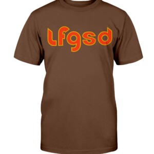
LFGSD SHIRT LET’S FUCKING GO SAN DIEGO, San Diego Padres #LFGSD
San Diego Padres
San Diego Padres
San Diego Padres
San Diego Padres
San Diego Padres
San Diego Padres
San Diego Padres
San Diego Padres
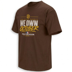
San Diego Padres
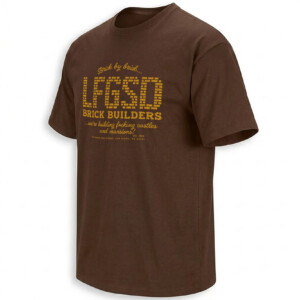
San Diego Padres
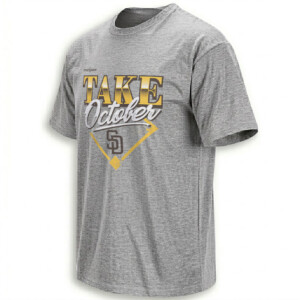
San Diego Padres
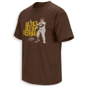
San Diego Padres