
From 1970 and 1973 to the Champagne of 2026
Three Knicks championship graphics capture three different stages of victory: the trophy as a citywide declaration, the champagne-soaked release after Game 5 and the historic line that finally connects 1970, 1973 and 2026.
The final image began with tension rather than ceremony. New York entered Game 5 still needing one more victory, fell behind by 16 points and spent the night trying to prevent the NBA Finals from returning to Madison Square Garden.
Then Jalen Brunson took control of the fourth quarter. The Knicks completed a 94–90 victory in San Antonio, finished the series in five games and turned a championship history that had stopped at 1973 into a living timeline again.
Within minutes, three versions of the same achievement began circulating. There was the public declaration — Knicks, trophy, champions. There was the private release — goggles, champagne and players trying to understand what they had accomplished. And there was the historical accounting — 1970, 1973, 2026, three years finally occupying the same line.
How New York began translating the championship into memory
Championship apparel often appears to perform a simple task: identify the winner and mark the year. In reality, the most memorable designs decide which emotional part of the victory deserves to survive.
A large orange trophy graphic preserves public certainty. It resembles the headline that belongs on an arena screen, newspaper cover or city wall after the final buzzer.
A champagne graphic moves behind the official presentation and into the room where players stop performing composure. It preserves the noise, liquid, goggles and disbelief of the first private celebration.
A three-title timeline looks further back. It places 2026 beside 1970 and 1973, transforming one modern playoff run into the continuation of a franchise history that had remained visually incomplete for more than half a century.
A direct championship emblem built for visibility, certainty and unmistakable New York color.
The emotional aftermath in which pressure gives way to laughter, soaked clothing and disbelief.
Three years arranged as a compact visual archive of the franchise’s championship eras.
Three Knicks championship designs, each preserving a different truth
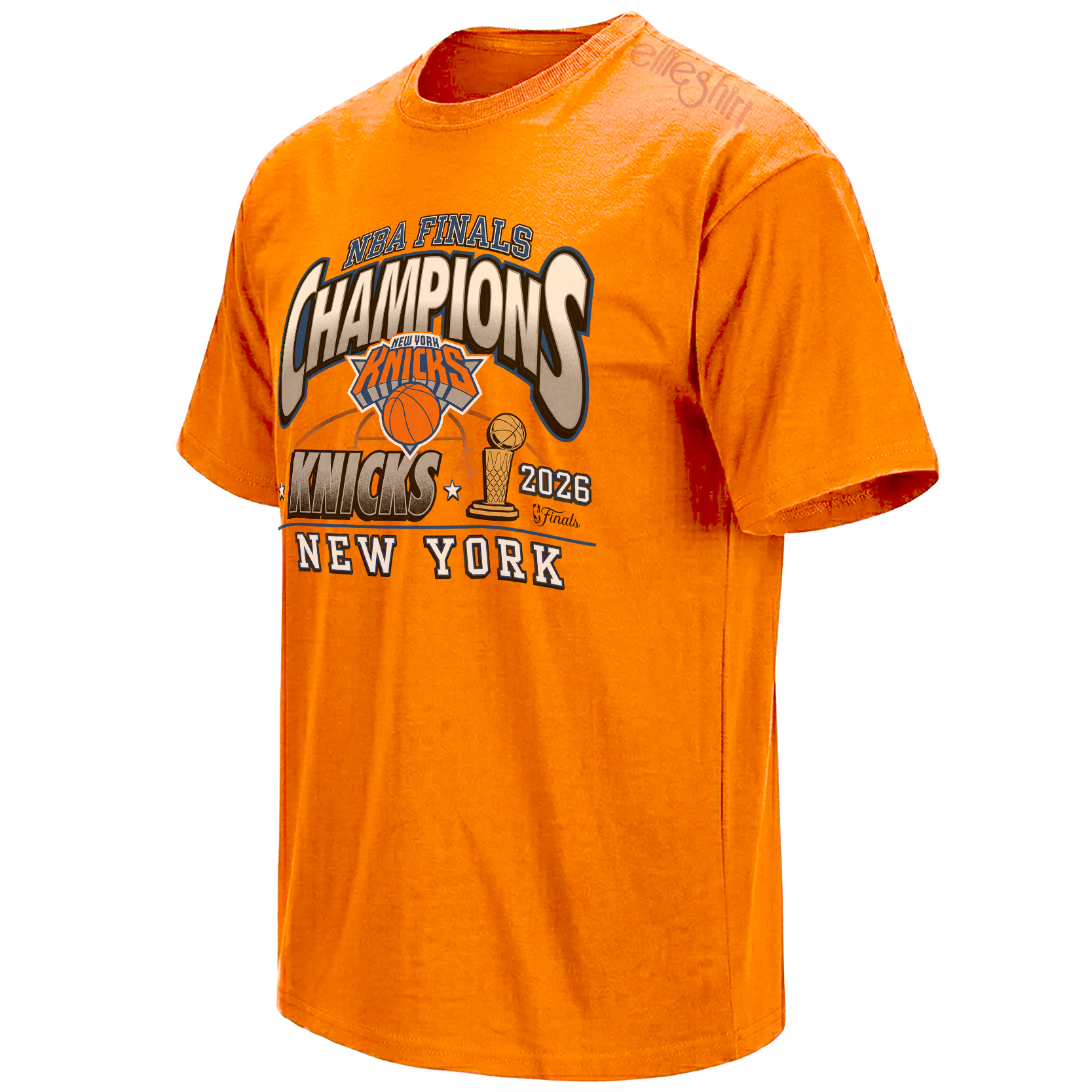
The trophy is translated into Knicks orange, allowing team identity and championship achievement to occupy the same central symbol.
View the orange trophy piece →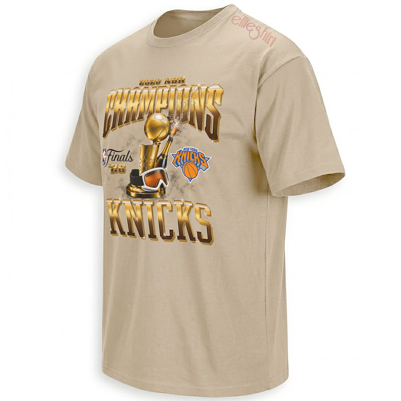
Champagne, trophy imagery and a softer archival base capture the instant competition ends and celebration becomes uncontrollable.
Open the champagne celebration graphic →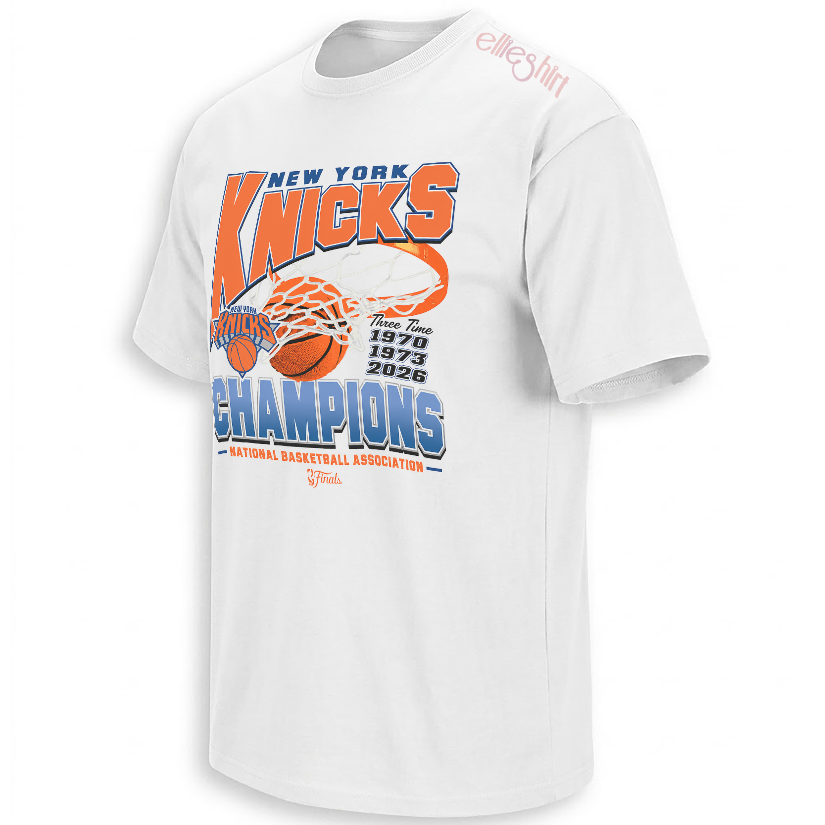
The three championship years become the design’s main language, connecting the modern roster to New York’s original title era.
Explore the three-title timeline →The orange trophy turns the championship into Knicks property
The Larry O’Brien Trophy is normally represented in gold, a universal visual language of victory. Recasting it through orange changes its cultural ownership.
Orange is not merely a decorative accent in New York basketball. Against blue, it carries the team’s uniforms, arena signage, city celebrations and decades of visual recognition. When the trophy adopts that color, it no longer appears as a neutral league prize. It becomes specifically and unmistakably Knicks.
This is the most public-facing of the three designs. It speaks with the confidence of an official announcement even while maintaining the energy of fan-made championship art. The hierarchy is immediate: Finals, champions, New York, trophy.
That directness suits the first hours after Game 5. After 53 years of conditional language — hopes, rebuilds, possibilities and near-misses — the city finally had a result that did not require explanation.
Champagne preserves the moment after pressure disappears
Trophy presentations are formal by design. Players stand on a stage, answer questions and hold the championship object toward cameras. The locker room carries a different emotional truth.
Inside that room, the season stops being a public performance and becomes a shared private release. Champagne sprays across goggles, phones, uniforms and the trophy itself. The players are no longer protecting a lead, managing a possession or answering for a mistake. The work is over.
That is why the champagne-trophy composition feels more intimate than a standard champions graphic. It does not only say that New York won. It recalls what winning looked like once the door closed behind the team.
The softer sand-toned presentation also gives the celebration an archival quality. Instead of feeling like a clean digital announcement, the design resembles a commemorative piece already carrying the warmth of a photograph remembered years later.
1970, 1973 and 2026 turn the title into a historical bridge
The three-time champions design reduces the franchise’s title history to three dates, but that simplicity is what gives the graphic its weight.
The space between 1970 and 1973 represents continuity: two championships inside one defining early era. The distance between 1973 and 2026 represents almost everything else — generations of players, several versions of Madison Square Garden culture, painful postseasons and supporters who inherited the team without inheriting a championship.
Placing the years together changes the way 2026 is read. It is no longer only the endpoint of the current roster’s season. It becomes the third chapter in a much longer visual sentence.
For supporters who remember the early titles, the design reconnects the present to the franchise’s championship foundation. For the generation formed by the 1990s, it closes a story that repeatedly approached the final stage without completing it.
For younger fans, 2026 becomes the first championship year they can claim from lived experience rather than archival footage or family history.
The design allows all three groups to read the same dates differently while still occupying the same title history.
Trophy, champagne, history — how a championship becomes permanent
The three designs can also be read as a sequence.
First comes the trophy: the visible confirmation that New York finished the season above every other team. Then comes the champagne: the physical release of months of pressure and decades of historical expectation. Finally comes the timeline: the slower realization that 2026 will remain beside 1970 and 1973 long after the celebration has dried.
That sequence explains how sports events move into culture. A result begins as breaking news, becomes an emotional experience and eventually settles into history.
Apparel participates in each stage. One graphic shouts the result immediately. Another preserves the feeling inside the room. A third removes almost everything except the years, trusting the dates to carry the story.
From the final possession to the third championship banner
The Knicks’ 2026 title produced more than one defining image. Brunson’s Game 5 performance belongs to the basketball record. The comeback belongs to the emotional architecture of the series. Champagne belongs to the locker room. The three championship years belong to the franchise timeline.
The wider New York Knicks Shirts collection follows those different layers through player moments, Finals graphics, city references and designs centered on the completed title.
The 2026 NBA Finals Champions collection focuses on the visual aftermath of the win, while the broader NBA Shirts archive places New York’s championship inside the larger culture of playoff basketball, trophy imagery and fan memory.
Frequently asked questions
How many NBA championships have the New York Knicks won?
The Knicks have won three NBA championships, in 1970, 1973 and 2026. The 2026 title ended a 53-year gap between championships.
Why are 1970, 1973 and 2026 shown together on the Three-Time Champions design?
The three years represent the franchise’s complete championship timeline. Placing them together connects the current roster’s achievement to New York’s original title era.
What does the champagne imagery represent in championship culture?
Champagne represents the first private release after competition ends. It recalls the locker-room moment when players move from postseason pressure into celebration and disbelief.
Why is the trophy orange in the Knicks championship graphic?
Orange transforms the universal trophy symbol into a distinctly Knicks image. It connects the championship directly to New York’s blue-and-orange visual identity.
Why does the 2026 title carry such strong historical emotion?
The championship ended a wait extending back to 1973 and connected several generations of supporters, including many who had never experienced a Knicks title during their lifetime.
The orange trophy graphic , the champagne celebration piece and the 1970–1973–2026 timeline preserve the Knicks’ title as declaration, emotional release and permanent franchise history.
The Knicks Three-Time Champions story connects 1970, 1973 and 2026 through three visual perspectives: an orange championship trophy, the champagne-soaked locker-room celebration and the complete New York title timeline.