
From “Bang!” to “Go New York Go”: The Sounds of a Knicks Championship
Four championship graphics turn New York’s 2026 title into broadcast language, city footwear, royal-blue trophy imagery and the chant that has followed the Knicks through Madison Square Garden for generations.
A championship has an official record: New York 94, San Antonio 90; Knicks win the series four games to one; Jalen Brunson scores 45 points and raises the Finals MVP trophy.
It also has a sound. It has the crack of a decisive shot, the explosion of a watch party, the roar inside Madison Square Garden and the familiar rhythm of “Go New York Go” returning with an ending the song had spent decades waiting to reach.
The four championship designs in this visual set preserve those less formal parts of the title. One turns the win into the language of a broadcast call. One places the trophy on a pair of sneakers, pulling victory down from the presentation stage and into street culture. One rebuilds the trophy in royal blue. The final graphic wraps the championship inside New York’s most recognizable basketball command: go.
Why basketball’s shortest words often carry its largest emotions
Basketball broadcasts depend on compression. A possession can change in less than a second, leaving no time for a long explanation. The most memorable calls therefore become short, physical and immediately repeatable.
“Bang” works because it resembles the event it describes. The word arrives sharply. It marks impact, surprise and finality. It belongs to shots that make a crowd react before the replay has begun.
“Go” operates differently. It is not an observation from the broadcast position. It is an instruction from the crowd. It pushes the team forward and gives thousands of separate voices one shared rhythm.
Between those two words sits an entire structure of Knicks fandom: the sudden moment that changes a game and the repeated chant that has carried supporters through years when the desired ending never arrived.
A visual sound effect for the shot that lands with more force than the box score can communicate.
Sneakers place the championship inside the everyday visual culture of basketball and New York streets.
Recoloring the trophy allows Knicks identity to enter the championship object itself.
A chant, song and command that turns individual spectators into one recognizable Garden sound.
Broadcast call, street trophy, royal victory and the Garden anthem
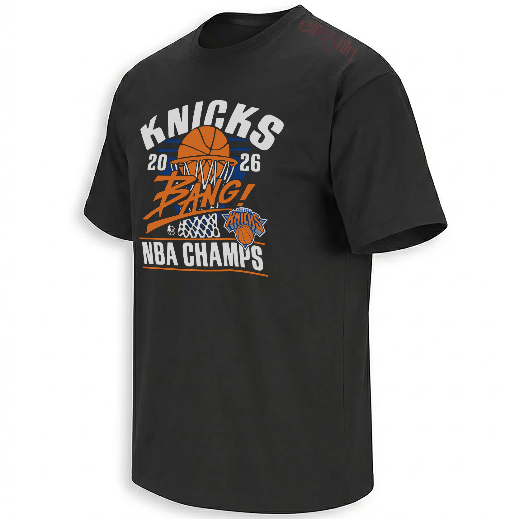
A basketball falls through the net while the handwritten “Bang!” cuts across the composition like a broadcast call escaping the television.
View the Bang championship piece →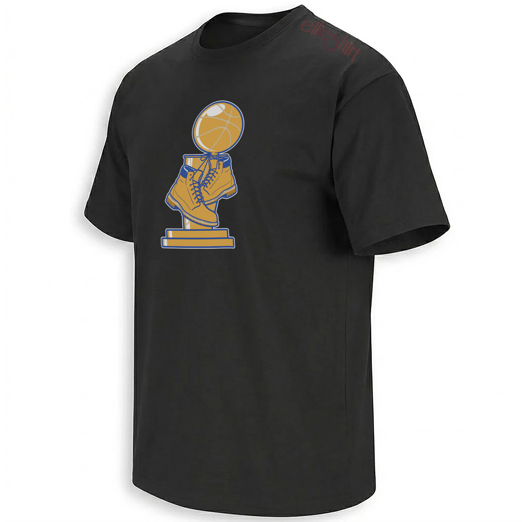
The trophy appears to stand on Knicks-colored sneakers, combining the formal prize with the footwear culture surrounding the game.
Open the trophy-and-boots graphic →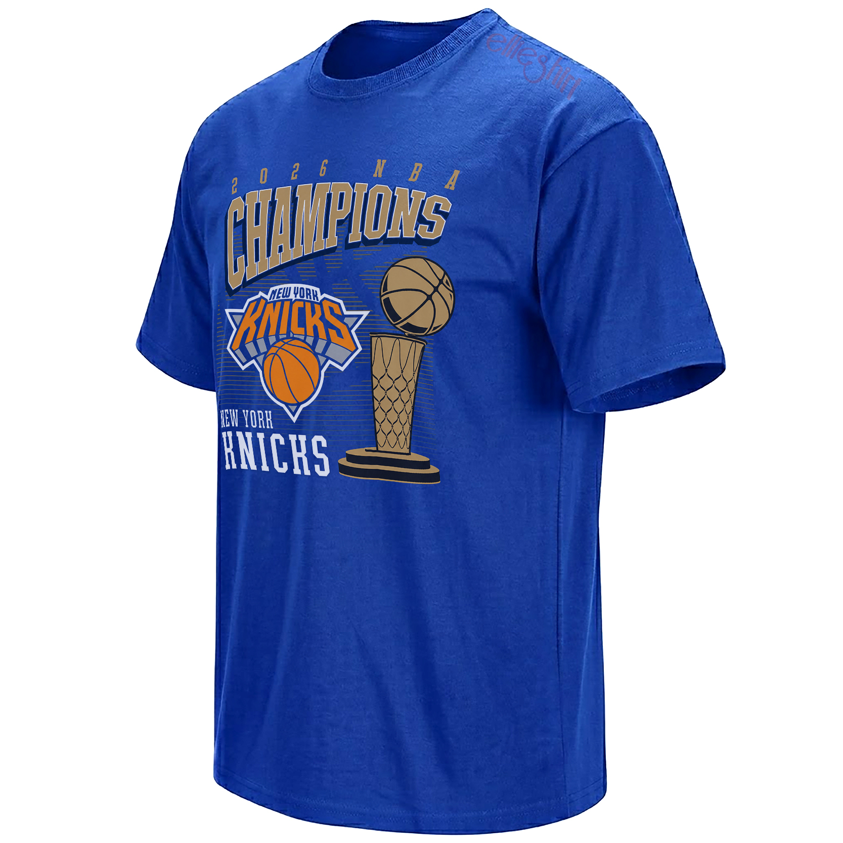
Royal blue surrounds gold championship lettering, a basketball and trophy, creating a direct visual connection between New York and the prize.
Explore the royal-blue trophy design →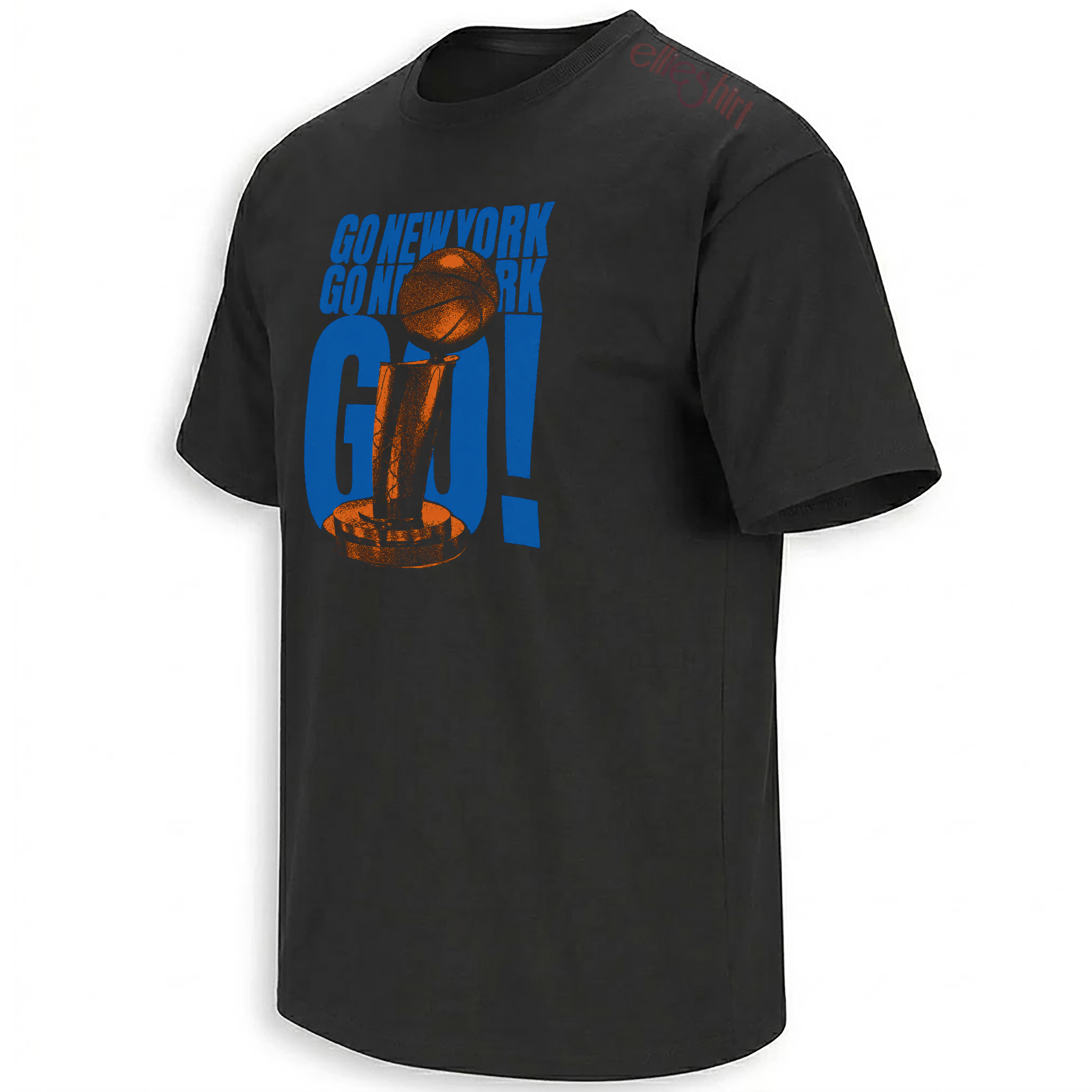
The familiar chant rises behind an orange basketball and trophy, translating the Garden anthem into a completed championship statement.
View the Go New York Go piece →“Bang!” turns the final shot into something fans can see
The Bang graphic works like a freeze-frame from a comic panel. The basketball is already inside the rim, the net hangs beneath it and the central word cuts diagonally across the image with the speed of a sound effect.
That angle matters. Straight championship typography communicates order. The slanted handwritten lettering communicates interruption — the precise moment a possession forces everyone watching to change emotional direction.
Orange, blue and white sit against black, allowing the hoop and ball to remain visible without turning the composition into a polished event logo. The result feels closer to a fan’s memory of the shot than to an official diagram of it.
The design does not need to identify one exact field goal. It represents the category of Knicks shot that became larger than its numerical value: the basket that broke tension, reversed the room and made the broadcast voice rise with the crowd.
The trophy-and-boots graphic brings victory off the podium
The Larry O’Brien Trophy normally appears as a formal object. It belongs to a presentation stage, white gloves, camera flashes and the controlled choreography of a league ceremony.
Placing the trophy above a pair of sneakers changes that social meaning. The prize now appears to have feet. It can leave the stage, walk into the city and enter the street-level culture from which basketball draws so much of its visual identity.
The shoes are rendered in Knicks blue and orange, turning footwear into the base of the monument. The golden basketball remains above, but the weight of the trophy is carried by something ordinary, wearable and connected to how fans actually encounter the game.
The composition can be read as a compact story about movement. New York’s trophy did not remain in San Antonio. It traveled with the team, entered the locker room, returned to the city and became part of the visual life of sidewalks, trains, neighborhood courts and championship crowds.
The sneakers make that movement visible without requiring a literal photograph of the journey.
Royal blue makes the title feel owned by the team
Championship graphics often depend on black and gold because those colors immediately signal ceremony and prestige. The royal-blue trophy design chooses team identity over neutrality.
The garment itself becomes the dominant field of Knicks color. Gold lettering and trophy details sit on top of that blue, while orange basketball elements keep the composition tied to the team’s full palette.
“Champions” is large, condensed and slightly distressed. The word resembles lettering from an older locker-room shirt or commemorative sports program, giving the fresh result an immediate archival quality.
The trophy, basketballs and Knicks mark form a compact central cluster. This is not a minimalist design. It is intentionally dense, reflecting the way the title arrived with several emotional meanings at once: franchise history, team identity, city pride and the end of a 53-year wait.
“Go New York Go” finally reaches a championship conclusion
“Go New York Go” belongs to a different era of Knicks basketball. Its roots reach into the early 1990s, when hip-hop, arena entertainment and a physically confrontational team were becoming inseparable parts of Madison Square Garden culture.
The phrase survived because it remained useful. It could accompany contenders, rebuilding teams, playoff returns and nights when the Garden needed a familiar sound to restore belief.
The 2026 championship changes the emotional tense of the chant. For decades, “go” pointed toward a destination. In this graphic, the trophy appears inside the typography because the destination has finally been reached.
The visual arrangement makes “GO!” the largest element. The trophy sits inside the letters while an orange basketball appears above, allowing the command, the game and the achievement to occupy one vertical structure.
Blue lettering against black creates a nighttime arena feeling, while the orange ball and trophy details provide the visual flashes. It resembles a concert poster for the city’s most familiar basketball anthem.
From one shot to a chant shared across generations
The four designs follow the expansion of a championship moment.
“Bang!” begins with one possession. The trophy-and-boots image moves the result into street culture. Royal blue transforms the achievement into team identity. “Go New York Go” allows the entire city to speak through the title.
That movement mirrors how sports memory develops. A game is first experienced as a sequence of plays. It becomes a celebration, then an image and eventually a shared piece of language.
The strongest championship artifacts do not merely repeat “2026 NBA Champions.” They preserve the vocabulary fans used while understanding what had happened.
In New York, that vocabulary is rarely quiet. It arrives as a call, a command, a song and a visual statement large enough to remain legible from the opposite side of the street.
How the sounds and symbols fit into the complete Knicks title story
New York’s 2026 title has already produced several forms of memory. Player-specific graphics preserve Brunson’s scoring and OG Anunoby’s Game 4 tip-in. Locker-room pieces preserve champagne and the trophy. Historical designs connect 2026 to 1970 and 1973.
These four designs record the title through language and symbols: the broadcast call, the basketball sneaker, royal-blue identity and an anthem that has followed the team through several generations.
The broader New York Knicks Shirts collection functions as a running archive of those different perspectives, moving between player moments, city culture, Finals drama and completed-title imagery.
The 2026 NBA Finals Champions collection concentrates on the visual language of victory, while the wider NBA Shirts collection places the Knicks’ run inside the larger culture of playoff calls, rivalry slogans, team songs and basketball symbolism.
Frequently asked questions
What does “Bang!” represent in the Knicks championship design?
“Bang!” represents the immediate impact of a made basketball shot and the emotional burst that follows it. In the graphic, the word works like a broadcast call and comic-book sound effect placed over the ball and hoop.
Why is the championship trophy shown standing on sneakers?
The sneakers bring the formal trophy into basketball’s street and footwear culture. They suggest the championship leaving the presentation stage and becoming part of New York’s everyday visual identity.
Why does royal blue work well for a Knicks championship shirt?
Royal blue is one of the team’s defining colors. Using it as the full background makes the championship feel unmistakably connected to Knicks identity rather than presenting the trophy as a generic NBA symbol.
What is the history behind “Go New York Go”?
“Go New York Go” originated in the early 1990s and became a long-running Knicks arena anthem. It is closely associated with Madison Square Garden, New York hip-hop culture and the team’s memorable 1990s playoff era.
Why does “Go New York Go” feel different after the 2026 title?
The chant spent decades urging the Knicks toward another championship. After the 2026 victory, the phrase can be read as both the sound that carried the team forward and the celebration of a destination finally reached.
The Knicks Bang Shirt , the Trophy and Boots graphic , the Royal Blue Trophy piece and the Go New York Go design preserve the Knicks’ title through the calls, colors and symbols that made the championship feel unmistakably New York.
The Knicks 2026 NBA Champions collection captures New York’s title through four cultural signals: the “Bang!” of a decisive shot, a trophy standing on sneakers, royal-blue victory imagery and the enduring “Go New York Go” Garden anthem.