
The Knicks’ 2026 Champions Became A Cartoon Roll Call
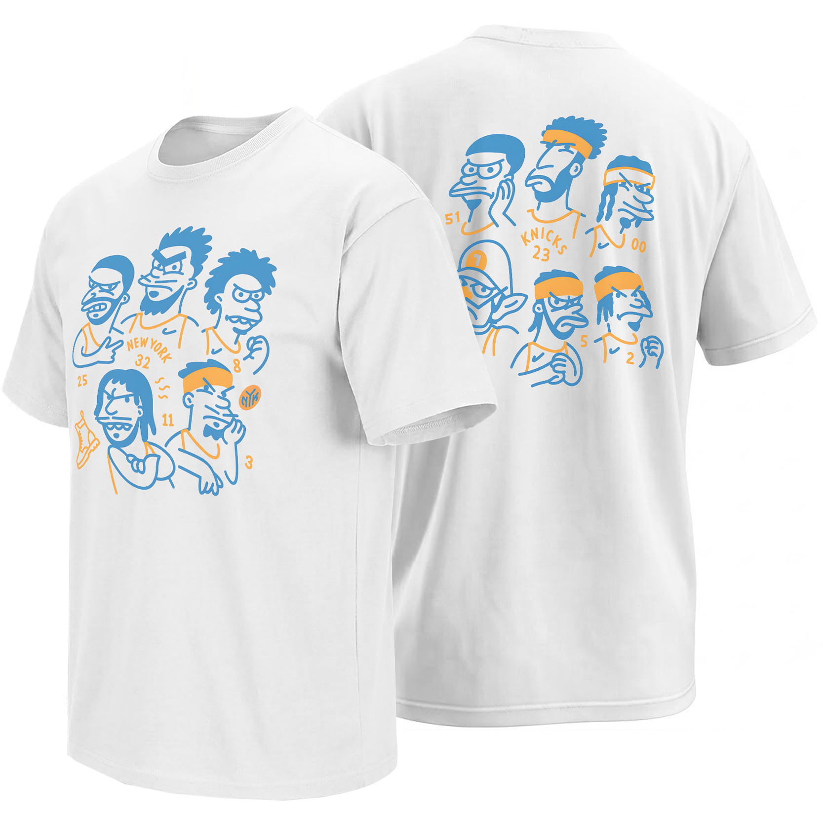
New York’s title run is already being remembered through trophies, confetti and historic photographs. This front-and-back roster graphic chooses another language: eleven exaggerated faces, two team colors and the personalities that made the championship feel unmistakably Knicks.
Less than a month after New York ended a 53-year championship wait, the 2026 Knicks had already moved beyond being a basketball roster. They had become a set of instantly recognizable New York characters.
The transformation was visible during the June 18 ticker-tape parade. Jalen Brunson raised the championship trophy above Lower Manhattan, blue-and-orange confetti filled the Canyon of Heroes, and supporters called out players as though greeting familiar figures from a long-running city story. New York was celebrating the result, but it was also celebrating the specific group of personalities that had delivered it.
That distinction remains important in July as free agency begins reshaping the next roster. The players drawn across this design belong to the completed 2025–26 championship story. It is not a depth chart for the coming season. It is a cartoon class picture of the team fans watched defeat San Antonio in five games and return the NBA title to New York for the first time since 1973.
Championships are recorded in box scores. Fan memory records the faces, gestures and personalities that made those numbers feel alive.
A Championship Team Becomes a Cast of Characters
Every beloved sports team eventually develops a mythology beyond positions and statistics. The point guard becomes the closer. The wing becomes the silent problem-solver. The rebounder becomes the emotional engine. The center becomes the expressive giant whose reactions travel through social media almost as quickly as his highlights.
The 2026 Knicks were unusually suited to that kind of character reading. Brunson’s controlled late-game presence sat beside Josh Hart’s perpetual motion, OG Anunoby’s straight-faced intensity, Mikal Bridges’ two-way steadiness and Karl-Anthony Towns’ larger, more visibly emotional energy.
That starting core did not blend into one anonymous championship machine. Each player carried a different silhouette, posture and public rhythm. The cartoon treatment works because it exaggerates qualities fans already recognized rather than inventing personalities the season never established.
Drawn with a compressed, calculating expression that mirrors the captain’s reputation for remaining composed while the final minutes become increasingly chaotic.
The tallest front-side character occupies the visual center, giving the starting group the scale and vertical presence associated with New York’s championship big man.
A clenched fist and intensely focused face turn his quiet public personality into a compact cartoon symbol of defense, force and decisive playoff moments.
No. 25 and No. 3 complete the front grouping, framing the image with the length, movement, rebounding energy and Villanova connection central to the team’s identity.
The Front Works Like a Starting-Lineup Panel
The Knicks Cartoon Roster Shirt places the championship core on the front in a compact five-character arrangement. Towns rises through the center, while Brunson, Bridges, Anunoby and Hart overlap around him like a lineup introduced inside a hand-drawn comic panel.
There is no trophy, arena photograph or full championship headline competing for attention. The team itself supplies the meaning. Jersey numbers, a small basketball mark and the words “New York” give viewers enough information to decode the image, while the caricatures carry the emotional recognition.
The Back Gives the Supporting Cast Its Own Frame
Moving the wider roster to the back prevents the design from becoming one crowded group photograph. Six additional characters appear in a looser two-row formation, identified through numbers, headbands, hairstyles, caps and deliberately distorted facial expressions.
This is where the artwork begins to resemble an animated team yearbook. The front establishes the most familiar core; the back acknowledges that a championship season is never carried by five players alone. Bench minutes, matchup changes, practice work, injury coverage and locker-room personality all contribute to the shape of a title run.
Five overlapping portraits create immediate identification and give the composition the compressed energy of a starting-lineup announcement.
Six additional figures expand the visual archive, turning the piece from a star graphic into a genuine roster-based championship memory.
The distinction also carries an emotional truth about fan culture. Stars may define the headline, but supporters remember the entire season through smaller contributions: one defensive possession, one unexpected scoring run, one bench celebration or one player whose energy changed the temperature of the building.
Why Caricature Can Preserve Personality Better Than a Photograph
A photograph records how a player looked during one fraction of a second. A caricature tries to record how the audience remembers him. It enlarges hair, posture, facial tension and familiar accessories until the personality becomes readable from a distance.
That method is especially effective for a roster that spent months becoming meme language. Knicks fans did not experience the championship group only through official portraits. They encountered reaction clips, courtside screenshots, exaggerated nicknames, postgame expressions and recurring jokes that turned each player into a visual shorthand.
The artwork translates that internet-era familiarity into simplified line drawing. Brunson does not require a detailed portrait when No. 11, his compact profile and his concentrated expression already complete the recognition. Towns does not need photorealism when height, jersey number and animated face establish the character.
The drawing style behaves like a fan’s memory rather than a camera. Physical details are reduced, recognizable traits are enlarged and every player occupies the same two-color universe. That equality keeps the piece focused on team chemistry instead of turning it into a hierarchy of photographic headshots.
Blue and Orange Do All the Heavy Lifting
Restricting the artwork to Knicks blue and orange gives the crowded character composition unusual clarity. Blue controls most of the outlines, faces and hair shapes, while orange identifies jerseys, numbers, headbands and selected gestures.
The white garment becomes active negative space. It prevents the eleven portraits from feeling heavy and allows the drawing to retain the informality of a sketchbook page, animation model sheet or courtside doodle.
Orange also functions as visual movement. It appears in scattered pieces across both sides rather than filling one large block, leading the eye from player to player in the same way a ball moves through a lineup.
From Game 5 to the Canyon of Heroes
New York clinched the championship with a 94–90 Game 5 victory over the Spurs after repeatedly recovering from double-digit deficits during the series. That comeback identity made the roster itself central to the title narrative. The championship did not arrive as a clean procession; it arrived through different players solving different emergencies.
Five days later, those basketball roles became public characters during the parade through Lower Manhattan. Brunson was the Finals MVP holding the trophy. Towns, Anunoby, Bridges, Hart and the supporting group were no longer separated by lineup combinations. They were standing together inside one citywide image.
The cartoon roster preserves that post-Finals perspective. It does not illustrate one shot or one game. It looks back at the completed journey and presents the team as fans understood it after the confetti: a collective whose individual personalities had become inseparable from the championship.
A Different Kind of Championship Artifact
Most title graphics use familiar symbols—trophies, rings, championship dates and bold declarations. Those elements establish historical authority quickly, but they do not always explain what made one roster different from another.
This design chooses recognition over ceremony. A viewer familiar with the season can move through the faces and numbers like recalling chapters. The result feels closer to a team zine, animated cast sheet or hand-drawn yearbook than traditional locker-room merchandise.
That makes it a useful counterpart to the wider New York Knicks Shirts collection , where trophy graphics, individual player moments and New York slogans document different parts of the same championship run.
Inside the broader NBA Shirts archive , the cartoon roster also represents how contemporary basketball fandom processes a historic team: not only through statistics and official imagery, but through illustration, personality, memes and instantly recognizable visual codes.
Why This Roster Should Be Read as the 2026 Championship Team
The timing of the design matters. The NBA offseason is already changing New York’s active personnel, with departures, returning free agents and new additions shaping the 2026–27 group. A roster-based graphic can therefore become inaccurate when treated as a current depth chart.
This artwork avoids that problem when understood as a closed historical frame. Its subject is the team that completed the 2025–26 season and won the championship—not every player who may appear for New York in the next campaign.
That interpretation strengthens the design. It transforms player numbers from temporary roster information into a visual roll call of the people attached to one completed New York basketball story.
Frequently Asked Questions
What team does the Knicks cartoon roster design represent?
The artwork represents the New York Knicks group associated with the completed 2025–26 season and the franchise’s 2026 NBA championship, rather than serving as a current 2026–27 depth chart.
Which players appear in the main front graphic?
The five-character front composition uses the jersey numbers and recognizable traits associated with Mikal Bridges, Karl-Anthony Towns, OG Anunoby, Jalen Brunson and Josh Hart.
Why are additional Knicks characters placed on the back?
The back expands the artwork beyond the starting core and gives the wider championship roster its own visual space, emphasizing that the title was a team achievement rather than a five-player story.
Why does the design use caricatures instead of realistic portraits?
Caricature allows the artwork to exaggerate hairstyles, expressions, accessories and posture—the traits through which supporters quickly recognize each player and remember his public personality.
When did the Knicks win the 2026 NBA championship?
New York completed a 4–1 NBA Finals victory over the San Antonio Spurs in June 2026, earning the franchise’s first championship since 1973.
What makes the artwork a championship memory piece?
It preserves the roster through the numbers, personalities and blue-and-orange visual identity fans associated with the title season, functioning like a cartoon team yearbook from the championship run.
The Knicks Cartoon Roster design remembers New York’s champions through personality rather than ceremony, while the wider Knicks visual archive follows the trophy moments, individual heroes and city language surrounding the 2026 title.
Knicks Cartoon Roster Shirt turns New York’s 2026 championship team into a blue-and-orange front-and-back character roll call, preserving the starting core, supporting personalities and collective identity behind the franchise’s first title in 53 years.