
I Love Canada: How a Patriotic Shirt Hides an Adult Internet Joke in Plain Sight
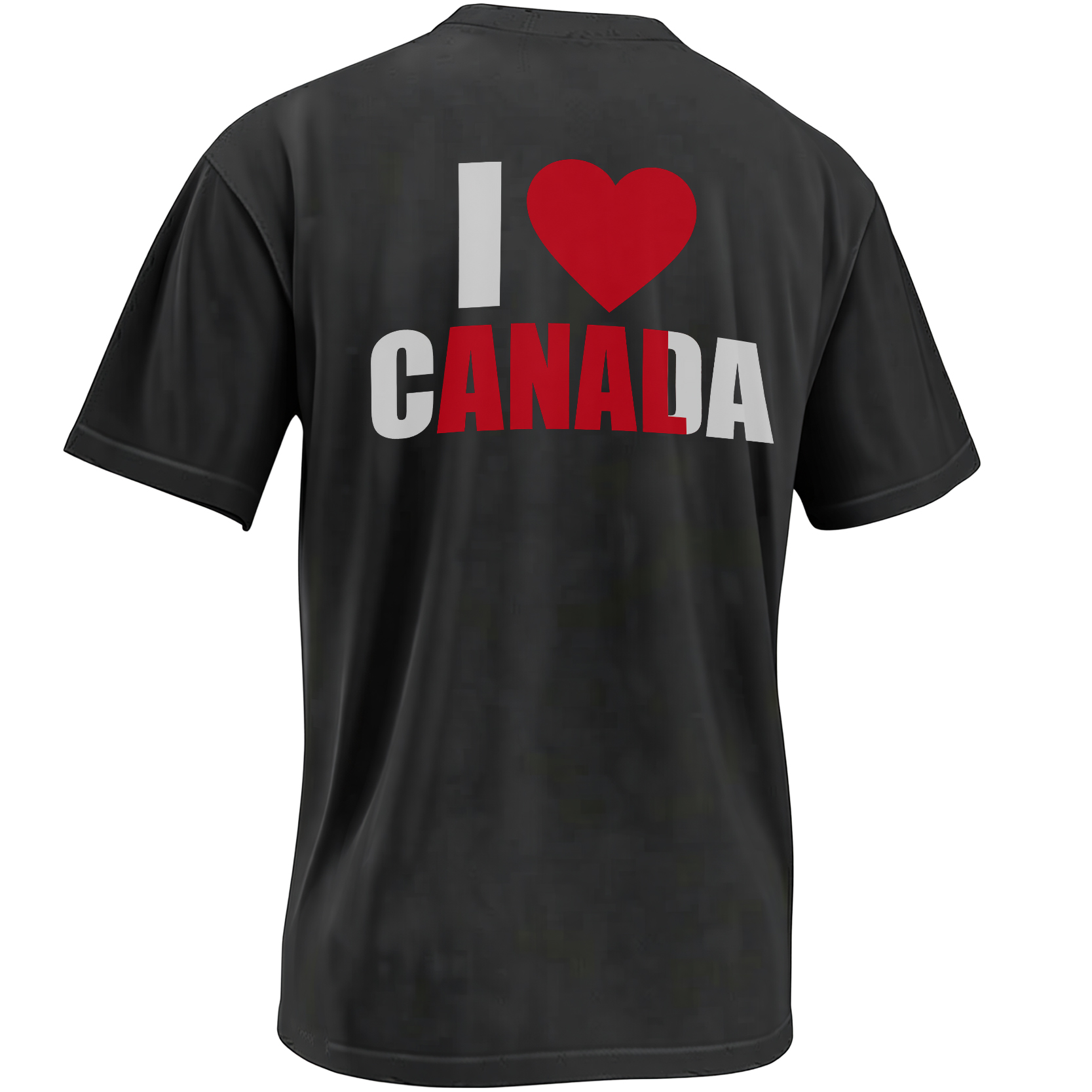
At first glance, it is one of the most familiar souvenir graphics imaginable: a heart, a national name and the red-and-white visual language of Canada. Look again, and selected letters create a second sentence that completely changes the mood.
The I Love Canada design succeeds because its first message feels almost too ordinary to inspect. Patriotic shirts are everywhere. A red heart followed by a country name is such a familiar visual formula that the viewer’s brain can understand it before reading each individual letter.
That automatic recognition creates the trap.
Inside the word “Canada,” selected red letters align with the opening “I Love” phrase to reveal an adult message. The complete national slogan remains visible, but the color system quietly encourages the eye to skip some letters and connect others.
The joke happens in the instant between those two readings. First comes harmless Canadian pride. Then comes recognition. Finally comes the question every successful visual meme creates: how was the hidden phrase sitting there the entire time?
The joke is not only what the shirt says. The real joke is how confidently the viewer misreads it the first time.
The Design Depends on the Brain Reading Too Quickly
Human vision does not process every word one letter at a time. Familiar arrangements are often recognized as complete shapes, especially when the phrase already belongs to a common visual category.
“I Love” followed by a place name is one of those categories. The structure resembles tourist souvenirs, airport gifts and city-pride graphics found around the world.
Because the pattern is familiar, the viewer fills in the expected meaning. The red heart confirms affection. The Canadian reference confirms patriotism. The eye receives no immediate reason to become suspicious.
Only after the selected letters are noticed does the second reading emerge. The design rewards attention by revealing that the visual hierarchy was directing the joke from the beginning.
The familiar “I Love” structure encourages the viewer to classify the graphic as a harmless Canada souvenir before inspecting its typography.
Red letters receive more visual emphasis than the surrounding text, allowing the eye to isolate a second phrase inside the complete wording.
Once the hidden message appears, it becomes difficult to return to the innocent first reading without seeing the joke again.
The Artwork Turns a Simple Wordmark Into a Visual Prank
The I Love Canada hidden-message design does not require a character illustration, complicated scene or explanatory caption. Its entire mechanism lives inside the lettering.
The large red heart supplies the emotional symbol expected from a patriotic shirt. “Canada” appears complete enough to preserve the innocent reading, while the contrasting letters create a separate path through the typography.
This simplicity is essential. A crowded composition would warn the viewer that a joke was coming. The clean souvenir layout allows the reveal to remain delayed.
Why the Innocent Reading Must Remain Convincing
Hidden-message humor fails when the secret is easier to see than the surface statement. The viewer needs a credible first interpretation before the second one can create surprise.
Canada provides an unusually effective cover because the word is recognizable, balanced and culturally associated with straightforward national pride.
The letters needed for the adult joke already appear in sequence inside the country name. Graphic emphasis can therefore reveal the punchline without rearranging the original wording.
The result remains grammatically complete in both directions. One path communicates affection for a country. The other extracts a sexual statement from the same visual material.
That double stability is what gives the design more staying power than a random misspelling. The innocent message is real, and the hidden message is real. The viewer decides which one dominates by choosing where to look.
A cheerful national-pride statement that could appear on a conventional travel souvenir, Canada Day outfit or tourist gift.
An adult phrase isolated through color and selective reading, creating a joke understood only after closer inspection.
The Jacket Version Added Another Layer to the Meme
One well-known version of the joke relies on partial obstruction. A jacket or blazer covers the outer letters of “Canada,” physically removing the innocent context and leaving the hidden phrase exposed.
That variation changes the design from an optical reading exercise into a clothing-based reveal. The shirt can appear harmless when fully visible, then produce the adult message when another garment conceals selected sections.
The jacket becomes part of the punchline rather than merely an accessory. It demonstrates how context controls language: the letters do not change, but the portion available to the viewer does.
This physical reveal helped the concept circulate as a reaction image and visual meme. A still photograph could communicate the entire joke without needing a caption or video explanation.
- The complete shirt establishes innocence. The viewer sees a familiar declaration of affection for Canada.
- Color creates a secondary reading path. Selected letters begin to look more important than the complete word.
- A jacket can remove the remaining context. Covered letters leave the adult phrase visually isolated.
- The photograph becomes self-explanatory. The contrast between patriotic expectation and sexual punchline supplies the meme.
Why Red Is Doing More Than Representing Canada
Red is the obvious national color for a Canada-themed graphic. That makes it ideal for visual misdirection because the emphasis appears culturally justified.
A viewer does not initially question why certain letters are red. The color seems connected to the maple leaf, the flag and the heart symbol.
Beneath that patriotic explanation, red performs a second job. It edits the sentence without removing any letters. The brighter characters become the dominant path, while the neutral letters recede.
This is a form of typographic masking. Nothing is technically hidden, yet part of the message becomes psychologically invisible until the viewer changes reading strategies.
The design therefore depends as much on color hierarchy as on wordplay. Without the red selection, the joke would remain possible but much slower to discover.
The Humor Comes From Social Risk
Adult hidden-message shirts create tension because the wearer may appear to be making two different statements depending on the viewer’s attention.
From a distance, the graphic can look safe enough for an ordinary patriotic outfit. At closer range, the second reading becomes increasingly difficult to ignore.
That creates a small social performance. Some people notice immediately. Others read only the surface slogan. Those who discover the punchline may look toward the wearer to determine whether the message was intentional.
The design’s humor therefore continues after the initial reveal. Each new viewer becomes another participant in the same visual test.
A hidden-message shirt does not deliver one joke once. It quietly repeats the joke every time another person realizes what everyone else may already have seen.
Why Canada Makes the Contrast Especially Funny
The surface message suggests friendliness, travel and uncomplicated national affection. The hidden phrase moves abruptly into adult humor.
The distance between those two tones creates the comic energy. A slogan that already sounded aggressive or provocative would not provide enough contrast.
Canada’s popular visual image—red maple leaves, clean souvenir typography and polite national branding—creates an unusually innocent foundation for the joke.
The design does not need to criticize Canada or depend on a political message. The country name functions as linguistic material and as camouflage.
That keeps the meme simple. The humor comes from seeing the letters differently, not from knowing a complicated cultural reference.
The greater the distance between the innocent first message and the adult second message, the stronger the reveal. Canada’s friendly souvenir aesthetic gives the punchline maximum contrast.
The Design Belongs to a Long Tradition of Hidden-Shirt Humor
Clothing has always allowed messages to change according to movement, layering and distance.
A folded shirt can reveal a phrase that disappears when the fabric lies flat. A jacket can cover selected letters. Color can guide the eye toward one reading while leaving another technically complete.
These designs are especially suited to internet culture because they can be understood through one image. The before-and-after moment happens inside the viewer’s own perception.
Unlike a long written joke, the graphic creates participation. The audience must perform the final step by identifying the hidden message.
That small act of discovery makes people more likely to share the image. Showing the design to someone else recreates the experience of waiting for the second reading to appear.
Why the Heart Symbol Strengthens the Misdirection
The heart performs the role of a word while remaining a visual symbol. It makes the phrase faster to process and more closely resembles familiar tourist merchandise.
It also gives the adult reading an unexpectedly affectionate tone. The hidden phrase is not merely a statement about an activity; it uses the universal symbol of love.
That combination intensifies the absurdity. A sweet red heart, national-pride lettering and an explicit punchline all occupy the same small composition.
The viewer’s brain initially trusts the heart. By the time the second message becomes visible, the symbol has already been recruited into the joke.
From Souvenir Graphic to Wearable Reaction Image
Traditional souvenir shirts communicate identity directly. They name a place and allow the wearer to display affection for it.
The I Love Canada meme piece borrows that familiar structure but turns the wearer into the setup for a reaction.
People who notice only the first message may respond to it as ordinary national pride. People who identify the second message receive an entirely different version of the interaction.
The graphic therefore behaves like a wearable reaction image. Its purpose is not complete until another person looks, pauses and understands why the lettering has been arranged that way.
The Joke Works Best When It Is Not Explained Too Quickly
Hidden-message designs depend on timing. A caption that announces the punchline before the viewer studies the graphic removes the most satisfying part of the experience.
The strongest presentation lets the patriotic reading arrive first. The title may mention Canada, national pride or a hidden meme without spelling out every letter immediately.
Once viewers notice the second phrase themselves, the design becomes memorable because the discovery feels personal.
That delayed reveal also explains why the artwork can work repeatedly in public. Every new person encounters the same short sequence: recognition, hesitation and laughter.
Frequently Asked Questions
What is hidden in the I Love Canada shirt?
Selected letters inside “Canada” combine with the opening phrase to create a hidden adult message that becomes visible when the viewer follows the red-letter path.
How does the visual joke work?
The complete design reads as an innocent patriotic slogan, while contrasting colors encourage the eye to isolate a second phrase from the same letters.
Why does the design use red lettering?
Red fits Canada’s national color palette, allowing the hidden-letter emphasis to look natural while quietly directing the viewer toward the punchline.
What role does a jacket play in the meme?
In some versions, a jacket covers the outer letters of “Canada,” leaving the hidden adult phrase exposed and making the visual joke more immediate.
Is the design intended as serious Canadian merchandise?
It uses the appearance of a patriotic souvenir as the setup, but its primary purpose is visual wordplay and adult meme humor.
Why do viewers often miss the joke at first?
The “I Love” tourist-shirt format is so familiar that many people recognize the expected Canada message before examining the individual letters and color hierarchy.
Who is the shirt best suited for?
It is best suited for adults who enjoy hidden-message graphics, visual puns, cheeky humor and conversation-starting meme apparel.
The I Love Canada hidden-message piece turns a familiar patriotic souvenir format into a visual prank built from selective lettering, adult humor and one perfectly delayed realization.
I Love Canada Shirt disguises a cheeky adult punchline inside a familiar patriotic souvenir graphic. Selected red letters create a hidden second message, turning the maple-leaf color palette and innocent “I Love Canada” wording into a clever optical-illusion meme for fans of bold visual humor.