
Arlington Names Turns the 2026 Rangers Roster Into a Living Typography Map
DeGrom, Eovaldi, Langford, Jung, Carter, Nimmo and a constantly shifting supporting cast make the current Texas roster less like a fixed lineup and more like a season being rewritten in names.
The Texas Rangers entered July 2026 with seven wins in eight games, then ran directly into the instability that had defined much of their season. Detroit shut them out 3–0 on July 4, Corey Seager remained on the injured list and Wyatt Langford returned on July 9 as the active roster continued changing around the team’s attempt to stay competitive.
That movement makes the Arlington Names design especially timely. A normal player graphic isolates one star. Roster typography does the opposite. It treats the team as a crowd of surnames whose collective meaning changes every time the lineup card is posted.
In 2026, the Rangers’ identity cannot be reduced to one clean hierarchy. Jacob deGrom and Nathan Eovaldi represent proven pitching authority. Wyatt Langford, Josh Jung and Evan Carter represent a younger offensive core. Brandon Nimmo, MacKenzie Gore and other newer names reflect a roster still being reshaped.
A roster shirt does not preserve one hero. It preserves the exact collection of names fans learned to depend on during one specific season.
Why Typography Fits a Team in Motion
A roster is never as stable as it appears on Opening Day. Injuries create absences. Prospects arrive. Veterans return. A player who begins the year at the center of the lineup may be replaced by another name before summer ends.
Typography captures that instability better than a formal team photograph. Each surname can be enlarged, compressed or placed beside another without pretending every role carries equal permanence.
The result resembles the way supporters actually experience a season: as an accumulation of names called by broadcasters, printed on lineup cards and repeated in moments of relief or frustration.
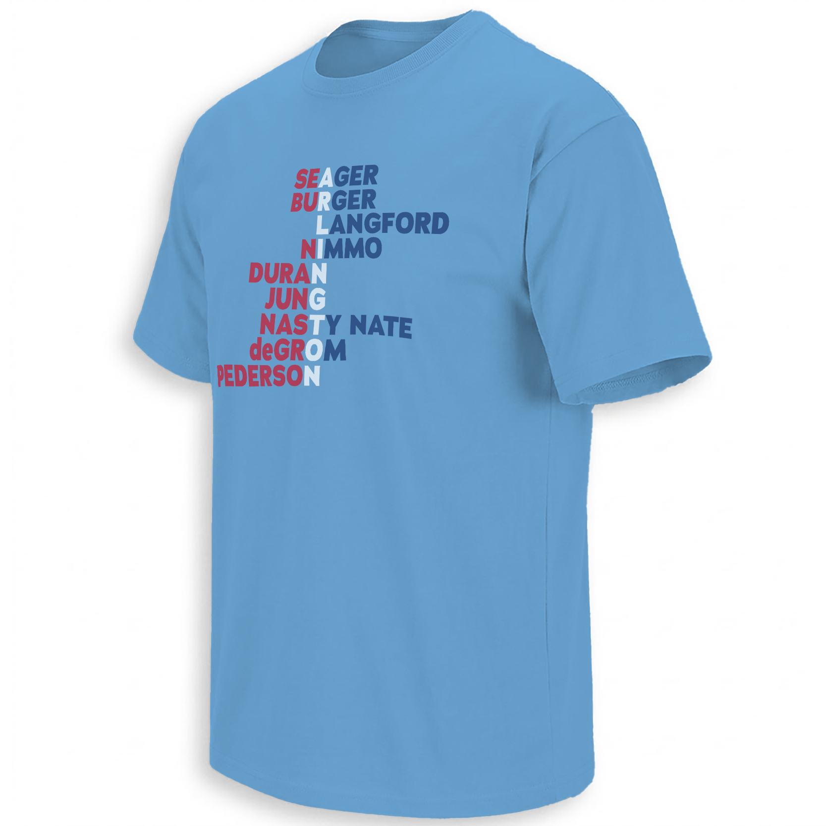
Arlington Is the Fixed Point While the Names Change
Players move through the roster, but Arlington remains the geographical center. Globe Life Field provides the roof, scoreboard, summer routine and local setting that joins otherwise different careers into one team identity.
That is why “Arlington” works as the design’s anchor. It does not compete with individual surnames. It supplies the location that makes their temporary combination meaningful.
DeGrom arrived through free agency. Langford and Jung emerged through development. Nimmo and Gore entered through later roster construction. Their paths differ, but the season places every name inside the same city and the same daily schedule.
The varying word sizes reproduce hierarchy without becoming a traditional depth chart. Blue and red keep the typography connected to Texas, while the dense arrangement gives the piece the feeling of a stadium wall covered in names accumulated throughout a season.
The Rotation Carries One Version of the Story
Jacob deGrom and Nathan Eovaldi give the roster immediate veteran authority. Their names carry postseason history, velocity and the belief that a series can change when either pitcher controls the first six innings.
MacKenzie Gore adds a different timeline, representing a pitcher entering his prime rather than protecting the final chapters of an established career.
Around them, Kumar Rocker, Cal Quantrill and a changing group of arms show why a roster design needs density. A season is never sustained by only the most recognizable starters.
The Position-Player Names Reveal a Team Between Eras
Langford, Jung and Carter once looked like a clean young foundation. Injuries and uneven availability have complicated that image, but their names still point toward the version of Texas the organization hopes to build around.
Brandon Nimmo and Joc Pederson add veteran experience. Jake Burger provides right-handed power. Ezequiel Duran and Justin Foscue reflect the importance of flexibility when established players are unavailable.
The typography allows these different categories to coexist. Prospect, veteran, star, replacement and returning player all occupy the same visual field because all have occupied the same season.
DeGrom, Eovaldi and other veterans bring reputations formed before the current Rangers season began.
Langford, Jung and Carter represent the younger identity Texas still hopes can define future lineups.
Injuries, call-ups and transactions ensure the supporting names continue shifting throughout the summer.
Why Roster Graphics Become More Valuable With Time
During the season, every name feels current. Years later, the same list becomes historical evidence.
Fans remember the stars immediately, but roster typography preserves the players whose contributions may otherwise disappear from the simplified version of the year. A relief pitcher, utility infielder or temporary starter can remain visible beside the franchise names.
That gives the design an archive function. It answers not only who led the team, but who was there.
The 2026 Rangers Have Required Constant Revision
Corey Seager’s placement on the injured list, Langford’s return and the movement between Arlington and Triple-A Round Rock have kept the roster in flux during July.
That instability makes any roster design a timestamp rather than a permanent official record. It captures one recognizable version of the team within an active season.
The article and artwork should therefore be read as a fan-facing memory map, not as a complete transaction ledger. The cultural value lies in the names supporters associate with the current year.
Team Identity Is Built Through Repetition
Supporters learn a roster through repetition. A surname is heard during introductions, displayed on scoreboards and repeated after every important play.
Over time, the sound of the name begins carrying its own emotional meaning. DeGrom signals anticipation. Langford signals future power. Jung signals the hope of a healthy middle-order bat.
Roster typography places those emotional signals beside one another, allowing the entire team to function as a single block of language.
The Wider MLB Roster Archive
Every baseball season produces a temporary community of names. Some remain for years. Others belong only to one trade deadline, injury replacement or unexpected call-up.
The Arlington Names design preserves the Rangers’ 2026 community as typography, while the broader MLB Shirts collection follows the player groups, roster changes and team identities shaping the league.
Frequently Asked Questions
What does the Arlington Names design represent?
It presents selected names associated with the Texas Rangers’ 2026 roster as a collective typography graphic rather than focusing on one player.
Why is Arlington central to the design?
Arlington is the home of Globe Life Field and the shared location connecting players who arrived through different trades, drafts and stages of their careers.
Is a roster typography graphic an official complete roster?
No. It works as a fan-facing memory map of recognizable 2026 names rather than a complete official transaction or active-roster record.
Why can the Rangers roster change during the season?
Injuries, rehabilitation assignments, minor-league options, acquisitions and player returns continually alter the active roster.
Why do roster designs become nostalgic?
Over time, the names preserve both major stars and less remembered contributors from one exact season, making the graphic a compact historical snapshot.
The Arlington Names piece preserves the collective language of the Rangers’ 2026 roster, while the broader MLB visual archive follows the teams and changing player communities that define each baseball year.
Arlington Names Shirt turns the Texas Rangers’ shifting 2026 roster into a dense typography archive, preserving the stars, young core and supporting names connected to one season at Globe Life Field.