
The Wii Is Turning 20, Which Makes “Wiid” Feel Even More Like Lost 2006 Internet Culture
One extra letter turns Nintendo’s cleanest console name into a cannabis joke. Add sleepy Mario, a joint and a leaf where his cap emblem should be, and the whole thing feels like something discovered on an old forum avatar.
Twenty years is enough time for hardware to become aesthetic. Nintendo introduced the original Wii in November 2006, and the system’s white plastic, blue disc-slot glow, tiny gray logo and minimalist menu design now instantly signal a very specific era of gaming.
That approaching anniversary gives the Wiid Shirt a useful 2026 context without pretending the joke itself is new. “Wiid” feels exactly like the kind of one-word remix that circulated through mid-2000s gaming culture: recognize the logo, change one letter, rebuild the character around the punchline.
The funniest thing about “Wiid” is how little it changes. The original console name survives completely. One final letter corrupts the entire meaning.
The Wii logo was almost designed to be parodied
Nintendo’s system branding was extraordinarily clean. “Wii” used three simple lowercase forms, lots of open white space and very little visual clutter. That simplicity helped the console look different from the darker, more technical hardware surrounding it in the mid-2000s.
It also made the name easy to mutate. “Wiid” does not need an explanatory tagline because the original word remains visible inside it. Read aloud, the altered version becomes the joke immediately.
The visual then rebuilds Mario to match the new pronunciation. The red cap remains. The moustache remains. The big nose and familiar hair silhouette remain. But the white circular badge no longer holds the standard M. A cannabis leaf takes its place.
The sleepy Mario portrait supplies the second half
Without the portrait, “Wiid” would simply be a gaming-word joke. The character turns it into stoner-cartoon parody.
Mario’s eyelids are lowered and visibly red. A rolled joint sits at the side of his mouth, with smoke rising past the moustache. His usual energetic, alert expression has been deliberately flattened into an exaggerated daze.
The cyan-blue outline around the head is important too. Against black or navy, it gives the portrait the kind of glowing cutout edge associated with old digital graphics and bootleg internet art. Heather gray changes the effect and makes it feel closer to an older novelty tee.

A red-capped Mario portrait with a cannabis-leaf hat emblem, sleepy red eyes, a joint and the one-letter Wii-to-Wiid word transformation underneath.
View the piece →Twenty-year nostalgia changes what “Y2K gaming” means
The Wii once looked aggressively modern. Motion controls, Mii avatars, Wii Sports and a living-room-first interface made it feel less like another game console and more like an attempt to redesign who gaming was for.
Now its aesthetics are historic enough to be revived deliberately. The original model turns twenty in November, and Nintendo’s own current support archive still lists the RVL-001 as the November 2006 version. That places Wii nostalgia directly inside the same cycle already reshaping interest in PS2-era graphics, old forum design, low-resolution avatars and mid-2000s novelty shirts.
The “Wiid” design fits naturally because it does not look polished into contemporary corporate style. It preserves the rougher energy of a joke somebody would have wanted on a shirt precisely because Nintendo would never make it.
The best Mario parodies preserve more than they replace
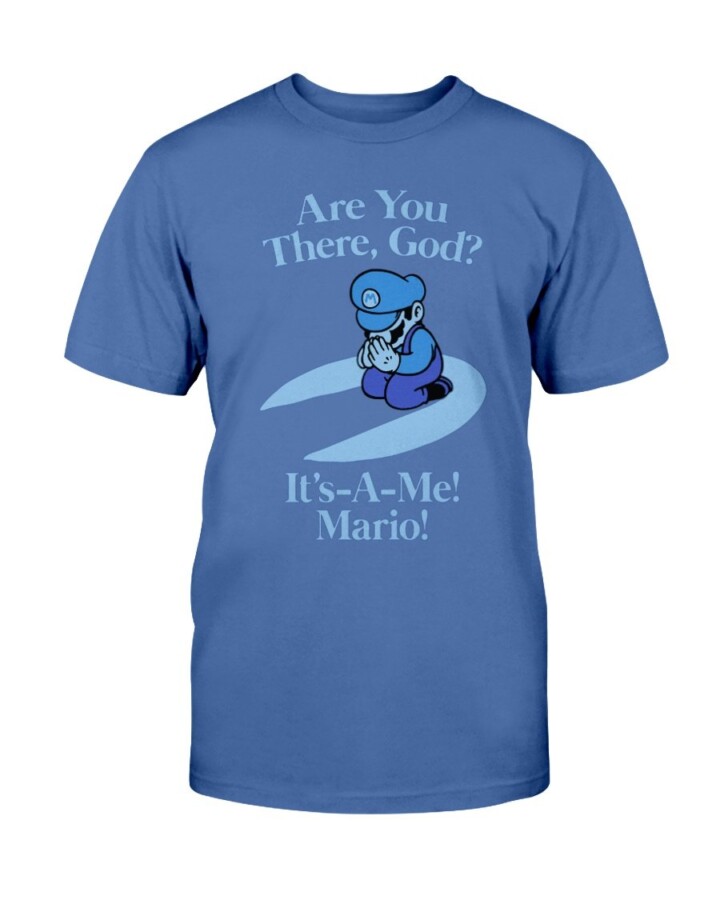
Mario is adaptable because he requires very few visual clues. Red hat, moustache, nose and hair are usually enough. A parody can therefore change the hat symbol, facial expression or surrounding slogan without destroying recognition.
That principle is visible both in Wiid and the older Ellie Shirt Mario piece above. The character remains readable while the joke changes universes around him.
For broader discovery, the verified Game & Gamers collection is a natural home for gaming-culture graphics, while the Mario search connects the newer Wiid design to the older parody archive.
FAQ: Wiid, Mario and the Wii anniversary
What does “Wiid” mean?
It combines Nintendo’s “Wii” name with a final “d,” creating a phonetic weed joke.
What changed on Mario’s hat?
The normal emblem is replaced by a cannabis-leaf symbol.
When did the original Wii launch?
Nintendo’s original RVL-001 model launched in November 2006; Nintendo’s update archive dates the launch-era Wii Menu update to November 19.
Why is 2026 relevant?
The original Wii reaches its twentieth anniversary in November 2026.
Is this official Nintendo artwork?
No. It is parody artwork built around Mario and Wii visual references.
The Wiid graphic captures a very specific kind of mid-2000s gaming humor just as the original Wii enters its twentieth-anniversary nostalgia cycle.
Wiid Shirt turns Mario into a sleepy stoner parody with a cannabis-leaf cap, joint and altered Wii wordmark, landing perfectly as Nintendo’s original 2006 console approaches its 20th anniversary.