
USA Softball Is Building Toward Its Next Global Stage And Its Visual Culture Is Already in Motion
Eleven graphics, three distinct forms of softball identity and one sport moving through a consequential 2026 season: toward international competition in Oklahoma City, a new World Cup cycle and the long-awaited Olympic return at Los Angeles 2028.
American softball entered July 2026 with its calendar suddenly becoming concrete. USA Softball announced the athletes selected for its Women’s National Team programs on July 1, transforming a broad 36-player pool into the groups that will carry the United States through the International Cup and the WBSC Women’s Softball World Cup Group Stage.
The first major gathering arrives from July 30 through August 3, when the USA Softball International Cup returns to Oklahoma City after a six-year absence. The event will place the U.S. Women’s National Team, the U.S. Women’s Elite Team and international opponents back inside Devon Park, a venue that functions as both a competitive stadium and a symbolic home for the American game.
Then comes the World Cup Group C event from September 12–16, also in Oklahoma City. Beyond those dates sits the larger horizon: softball’s return to the Olympic program at Los Angeles 2028. That sequence gives 2026 a transitional energy. The sport is not waiting for the Olympic spotlight to switch back on. Its national-team pathway, college pipeline, grassroots community and visual language are already preparing for it.
USA Softball in 2026 is not one team, one tournament or one logo. It is a chain connecting neighborhood diamonds, college stars, tournament parents, national-team veterans and the next Olympic dream.
A National-Team Moment Built on a Much Larger Community
The most visible layer of USA Softball is the Women’s National Team: elite pitchers working through international lineups, explosive hitters carrying college reputations onto the world stage and experienced players returning to another global cycle. The 2026 World Cup Group C roster includes Olympic experience, members of the 2025 World Games gold-medal team and athletes shaped by some of the strongest college programs in the country.
Yet the national program does not exist above the rest of softball culture. It rises from it. USA Softball’s structure reaches into youth development, local associations, national championships, fast pitch, slow pitch, modified pitch, coaching, umpiring and athlete identification. A girl playing through a regional program, an 18U family spending another summer on tournament highways and a veteran watching Team USA in Oklahoma City occupy different parts of the same ecosystem.
That breadth is essential to understanding the USA Softball collection. The eleven pieces do not repeat one national-team graphic. They map the culture from several directions: official-style crests, batter silhouettes, stars and stripes, crossed bats, handprints, stitched hearts and the iced-coffee iconography of parents who organize family life around game times.
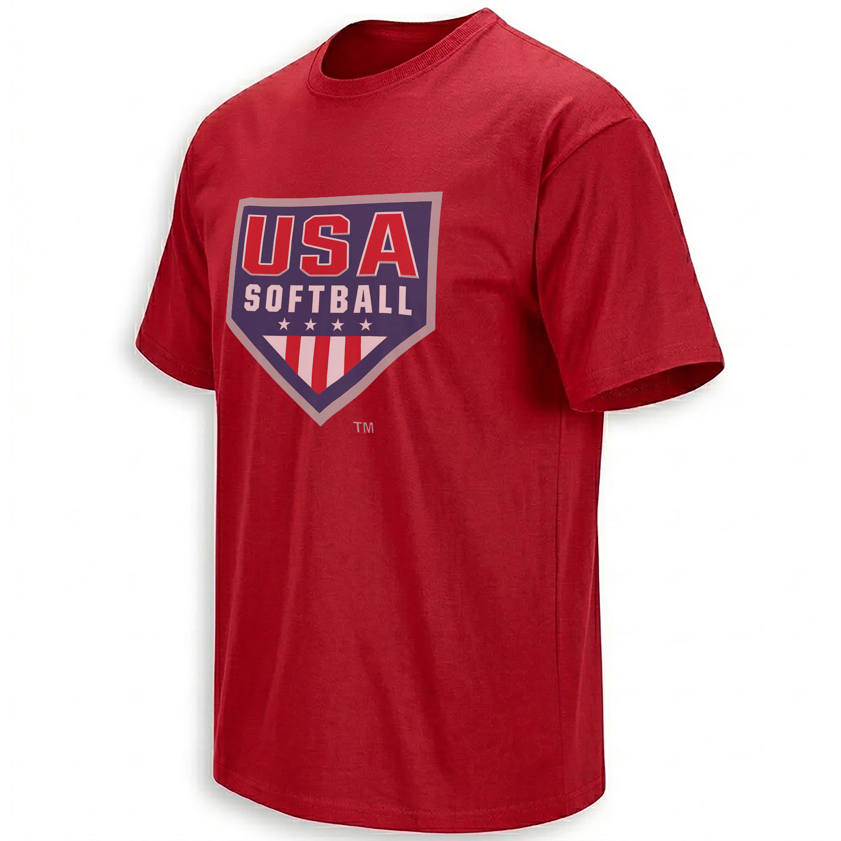
The Primary Logo: Where Home Plate Meets National Identity
The visual center of the collection is the USA Softball Primary Logo Shirt. Its shield resembles home plate, allowing the geometry of the field to carry the structure of a national sports emblem. Oversized “USA” lettering sits above the word “SOFTBALL,” while stars and red-and-white stripes establish the patriotic meaning without detaching it from the game.
This logo language matters because it holds several audiences at once. National-team followers can read it as Team USA identity. Tournament players see the larger governing structure of the sport. Coaches, officials and organizers recognize the system surrounding competition. Unlike a roster-specific graphic, the crest remains relevant across seasons because it represents the institution and the community rather than one result.
The home-plate silhouette also solves a familiar problem in patriotic sports design. Instead of placing a flag beside an unrelated softball image, it fuses the two languages. The national crest is the softball shape. The stars and stripes live inside the diamond’s geometry.
USA Softball’s modern visual identity draws together home-plate geometry, bold athletic lettering and national iconography. That combination makes the primary mark readable as both an organizational emblem and a symbol of the American game.
From Institutional Crest to Batter-in-Motion Energy
Where the primary-logo design is stable and symmetrical, the batter graphics introduce movement. They shift the collection from the authority of the organization toward the physical rhythm of the sport: load, rotation, contact and follow-through.
The Radiating Victory Shirt builds that motion around a central batter silhouette and outward-moving rays. The composition carries the optimism of classic American athletic posters, with the player appearing less as one identifiable athlete than as a shared figure for anyone who has stepped into the box wearing national colors.
The USA Softball Stars and Stripes Batter Shirt pushes the patriotic language more directly. Stars, striping and the swing silhouette transform the player into part of the flag system. Meanwhile, the American Softball Flag Shirt uses distressed typography to give the national-team idea the worn texture of a tournament tee collected over years rather than an image designed for only one event.
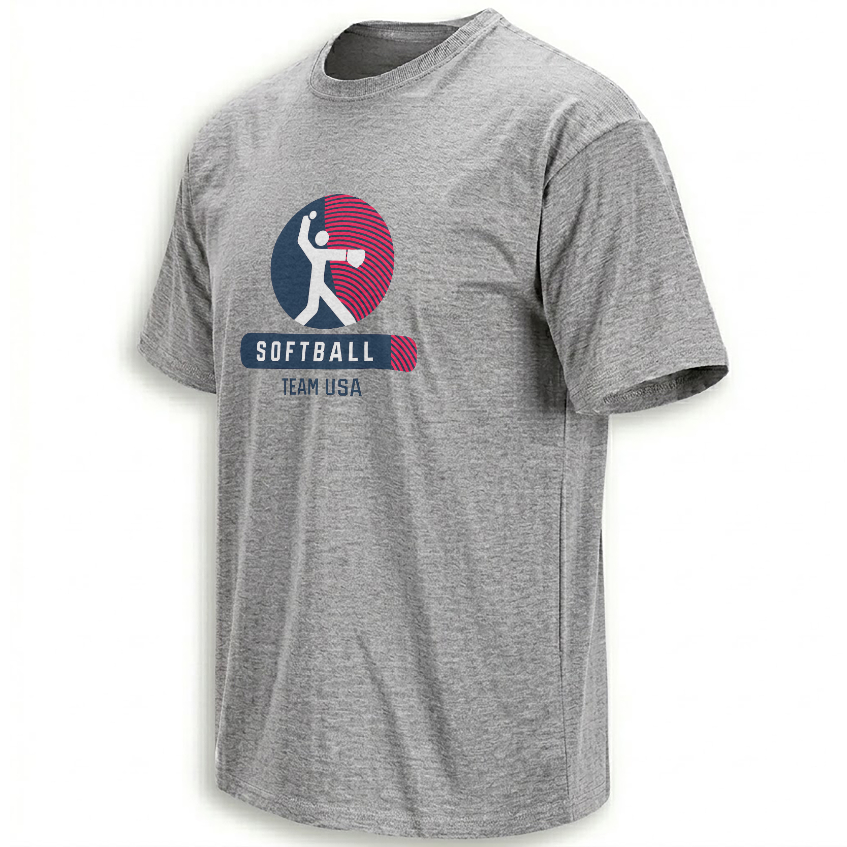
A batter becomes the center of a sunburst-like athletic emblem, turning the swing into a symbol of forward motion and national-team ambition.
Open the batter graphic →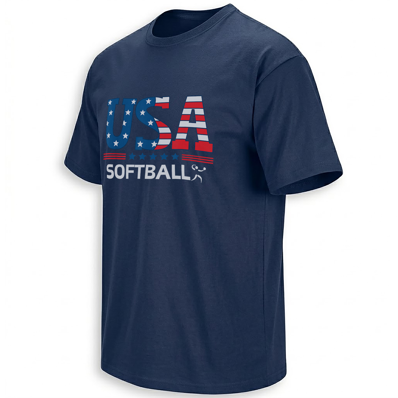
The hitter’s silhouette is folded into an American field of stars and striping, joining competitive motion with national symbolism.
View the stars-and-stripes piece →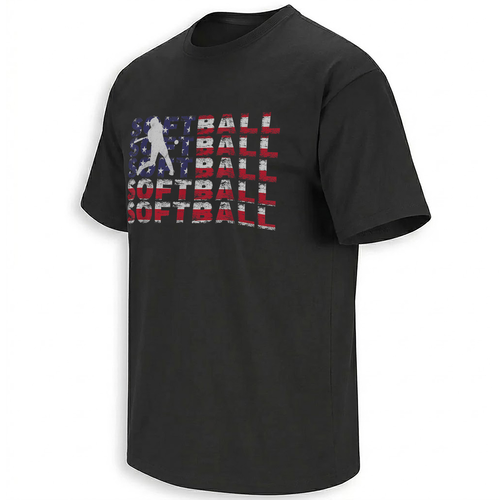
Distressed type gives the batter-and-flag composition the visual memory of an old tournament shirt carried through multiple summers.
Explore the distressed design →The Shield, Crossed Bats and the Grammar of American Sports Crests
A second group of designs moves away from the full swing and toward equipment-based heraldry. The bat becomes the softball equivalent of a crossed sword: an instantly recognizable object arranged to suggest unity, readiness and team identity.
On the United States Softball Crossed Bats Shirt, the bats sit behind a patriotic shield, creating the structure of a military-style badge without losing the diamond context. It feels ceremonial, but the equipment keeps it grounded in the sport.
The Softball Flag Shirt takes a more graphic approach. A bat interrupts and reorganizes the familiar stars-and-stripes system, making softball equipment part of the flag’s visual construction rather than an object placed beside it.
The Property of USA Softball Shirt completes this group through collegiate athletic language. “Property of” typography recalls training rooms, school gyms and equipment departments. It moves Team USA identity closer to everyday practice culture—the repetition, conditioning and team routines that exist long before an international game begins.
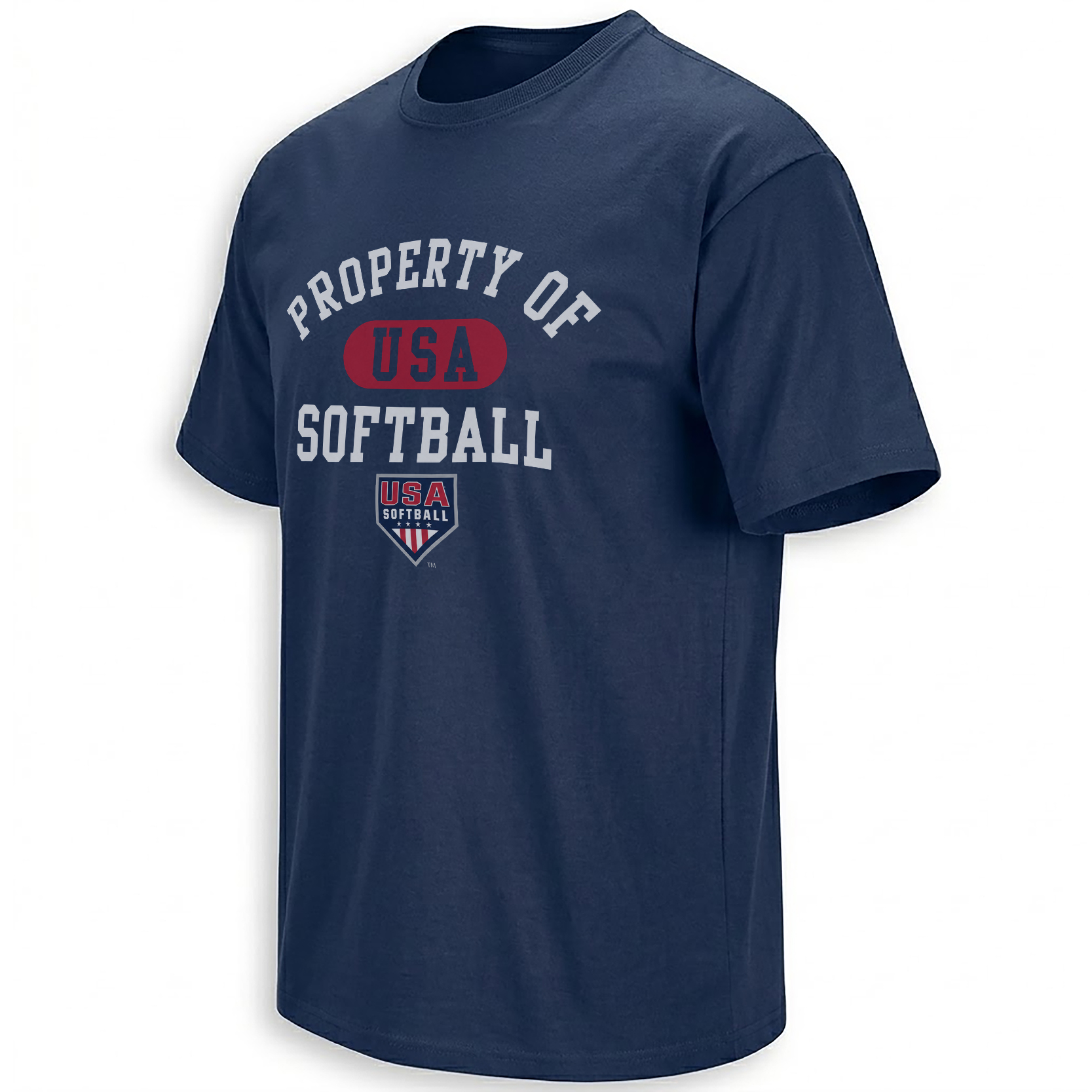
Collegiate training-room typography brings national identity into the daily culture of practice, repetition and team preparation.
View the collegiate piece →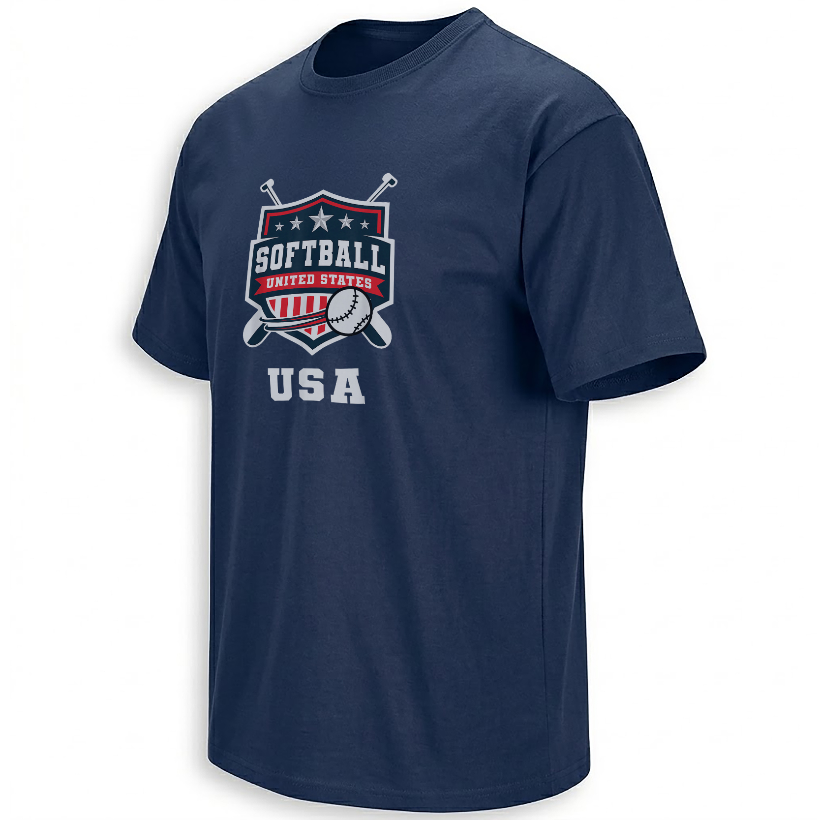
A national crest and crossed bats create a compact emblem with the authority of a badge and the recognizable tools of the diamond.
Open the crossed-bats design →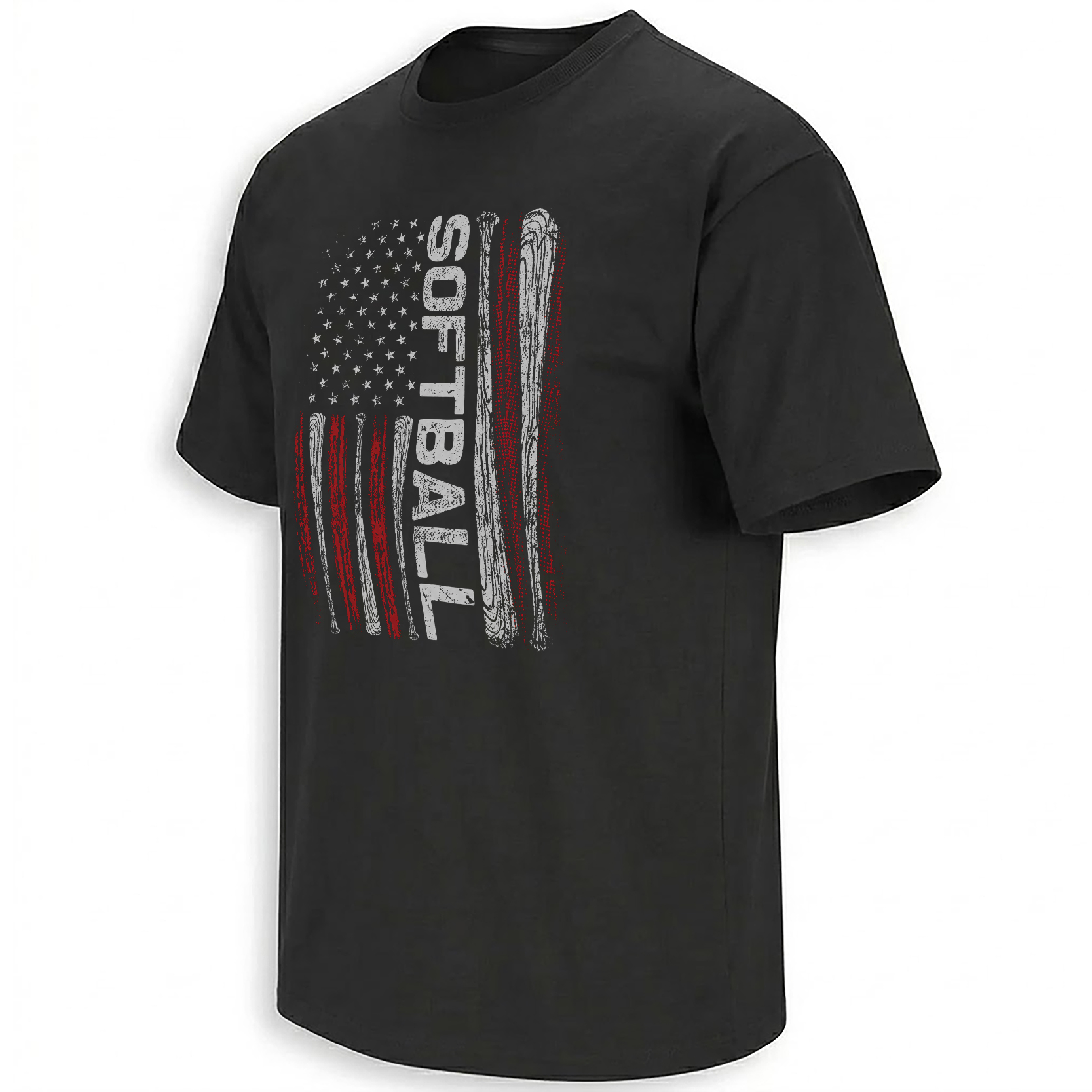
The bat becomes part of the flag’s internal architecture, visually joining national symbolism and softball equipment.
See the flag construction →Why Stars and Stripes Keep Returning to Softball
Patriotic softball graphics can appear simple from a distance: red, white, blue, a flag, a ball and a bat. Their persistence, however, comes from a deeper overlap between American identity and the sport’s visual memory.
Softball lives in public parks, school facilities, tournament complexes and local associations. Its culture is national but intensely regional, shaped by families traveling between towns, players representing schools and clubs, and communities gathering around games that may never enter a national broadcast. The flag motif gives those local experiences a shared frame.
Three symbols carry most of the collection’s meaning:
Stars connect the graphics to the national flag while also suggesting achievement, selection and the aspiration to reach an elite roster.
Horizontal and vertical stripes create movement, turning the flag into a rhythm that can echo a swing path or the speed of play.
Curved softball seams soften the formal national imagery and return every composition to the tactile object at the center of the game.
Patriotism Becomes Personal Through the Heart and Handprint
Not every softball identity begins with an official crest. For many players and families, the emotional entry point is personal: the ball kept from a meaningful game, the handprint made during a youth season, the flag painted across a team banner or the heart symbol used to express attachment to the sport.
The American Softball Heart Shirt turns softball stitching into the outline and texture of a patriotic heart. It is less institutional than the primary logo and less action-focused than the batter graphics. Its language is attachment—the game as something carried emotionally rather than only played competitively.
The Proud Softball Handprint Shirt works through a different form of intimacy. Handprints belong to youth art, team crafts, signs held in the stands and family keepsakes. Filling that shape with stars and national colors makes the design feel connected to the earliest stages of softball culture, before rankings, rosters and international selection.
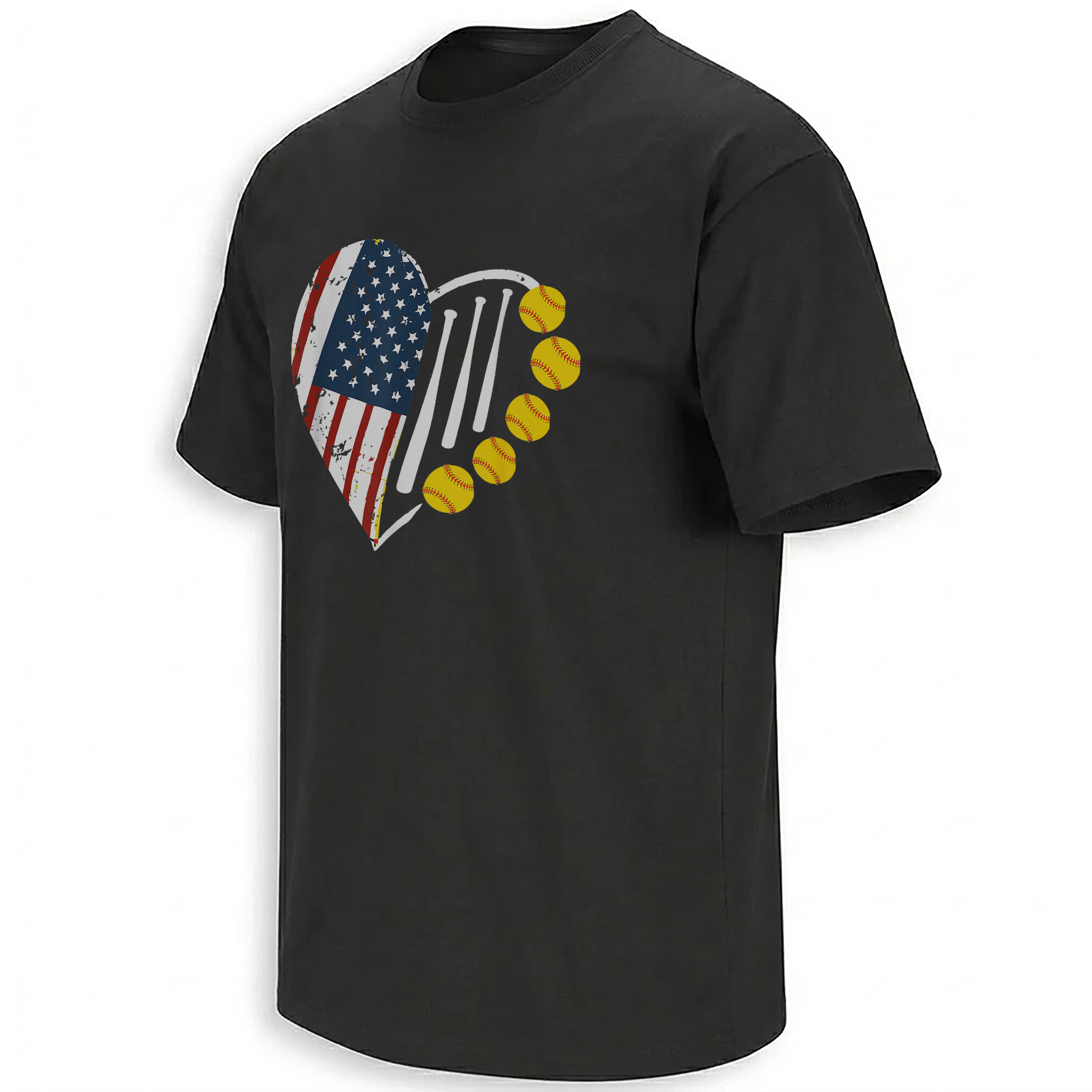
Flag colors and softball seams reshape the heart into an emblem of emotional attachment to the American game.
View the stitched-heart piece →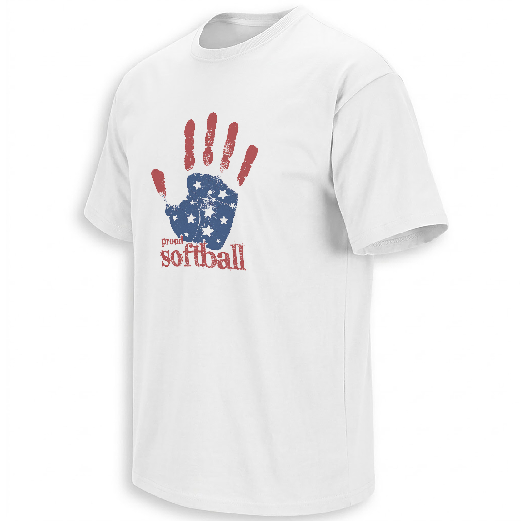
A youth-culture handprint filled with patriotic detail connects national pride to the family-made signs and memories surrounding the field.
Open the handprint graphic →The Softball Parent Is Part of the Infrastructure
The collection’s most humorous pieces may also be its most documentary. The Softball Mom Club Shirt and Softball Dad Club Shirt replace formal national symbols with the objects of tournament-family life: glove, ball, bat and iced coffee.
That coffee cup is not random lifestyle decoration. It represents early departures, bracket changes, long drives, doubleheaders, equipment checks and weekends organized around first pitch. Softball parents often function as drivers, schedulers, scorekeepers, photographers, meal planners, emotional support and the audience that remains after a difficult inning.
In a national-team story, it is easy to focus only on the athletes visible at the end of the pathway. The Mom Club and Dad Club designs look backward along that path. Before a player reaches a college roster, an elite pool or an international event, someone has usually spent years locating fields before sunrise.
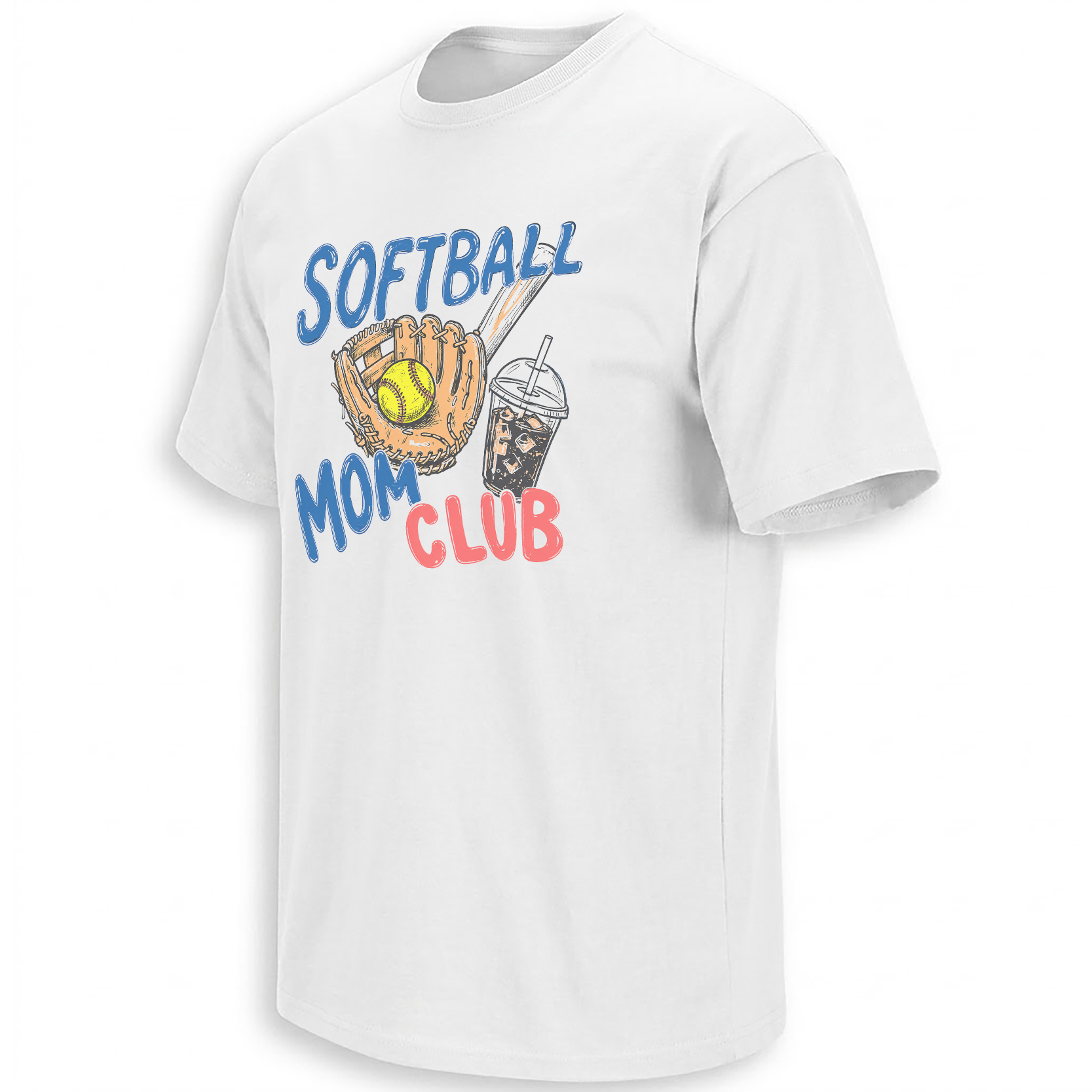
Glove, bat, ball and iced coffee form a compact visual record of the planning, travel and emotional labor behind tournament weekends.
View the Mom Club piece →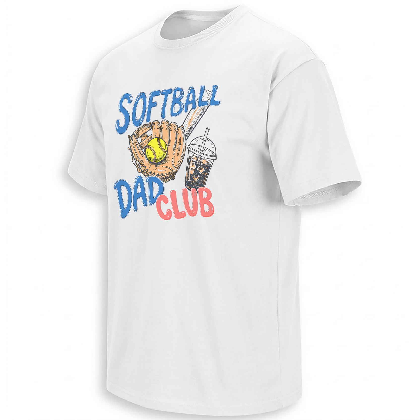
The same tournament objects turn parent identity into a clubhouse-style badge for the people managing another full weekend at the field.
View the Dad Club piece →Oklahoma City Is More Than a Location on the Schedule
The concentration of major 2026 events in Oklahoma City gives this collection a stronger sense of place. Devon Park is closely associated with the Women’s College World Series, USA Softball competition and the wider mythology of Oklahoma City as a capital of the sport.
When the International Cup returns from July 30 through August 3, the event will reconnect Team USA with a domestic audience at a moment when the roster cycle is becoming visible. The tournament brings together the U.S. Women’s National Team, the U.S. Women’s Elite Team and international opposition, allowing established players and emerging talent to occupy the same competitive environment.
The September World Cup Group C event raises the stakes again. The U.S. roster selected for that competition blends international experience with players shaped by the NCAA pipeline. That mixture reflects one of American softball’s defining strengths: the college game does not sit outside the national-team culture. It feeds its visibility, rivalries, player recognition and competitive depth.
Local leagues, regional associations, coaches, officials and tournament families create the first sustained relationship with the sport.
Competition intensifies as athletes enter larger tournament networks and national identification pathways.
NCAA programs amplify player visibility and place many future national-team athletes inside one of the sport’s most followed environments.
Selected athletes represent the United States at events such as the International Cup, World Cup stages and future Olympic competition.
The Road to LA28 Changes How 2026 Feels
Softball was absent from the Paris 2024 Olympic program, making its scheduled return at Los Angeles 2028 emotionally significant for athletes and supporters. Olympic inclusion changes more than the destination. It reshapes the years leading toward it.
Every national-team camp, roster decision and international matchup now carries a secondary meaning. Results matter in their immediate competitions, but they also contribute to the development of a program preparing for an Olympic tournament on home soil.
The LA28 softball field will be small by Olympic roster standards, with only 15 athletes per team. That creates a severe selection pressure across pitching, defense, power, speed and positional flexibility. The journey from a 36-player athlete pool to future Olympic selection will not be linear, and no 2026 roster should be treated automatically as the final LA28 team. Still, the current cycle is part of that longer evaluation.
This is where the national graphics gain additional resonance. A batter surrounded by radiating lines can be read as present-tense Team USA energy, but also as an image of Olympic momentum. The shield can represent today’s organization while pointing toward the crest fans expect to see on a global stage in 2028. A simple stars-and-stripes composition begins to carry anticipation.
Eleven Designs, Three Ways of Belonging to the Game
Taken together, the collection divides into three broad identities.
The first is representational: the primary logo, patriotic shield, crossed bats and batter silhouettes identify the national program and the visual authority of USA Softball.
The second is emotional: hearts, flags and handprints express attachment to the sport without requiring membership on a specific roster.
The third is communal: the Softball Mom Club and Softball Dad Club pieces recognize that the game’s culture includes the people in folding chairs, parking lots, hotel lobbies and cars filled with equipment.
Those identities overlap. A parent can also be a former player. A youth athlete can follow Team USA while wearing a local club uniform. A coach can recognize the governing logo, the college pathway and the emotional meaning of the stitched heart. The strength of the complete USA Softball visual archive is not that every graphic looks alike. It is that each one finds a different doorway into the same culture.
The national crest represents the top of the pathway. The coffee cup represents the morning that made the pathway possible.
Frequently Asked Questions
What is happening with USA Softball in 2026?
USA Softball’s 2026 Women’s National Team programs are preparing for the International Cup in Oklahoma City from July 30 through August 3 and the WBSC Women’s Softball World Cup Group C event from September 12–16.
Why is the 2026 International Cup significant?
The International Cup is returning to Oklahoma City after a six-year absence and will bring national-team, elite-team and international competition to Devon Park during a key stage of the current Team USA cycle.
Is softball returning to the Olympic Games?
Yes. Softball is included in the Los Angeles 2028 Olympic program after being absent from Paris 2024, giving the current international cycle additional importance.
Are the 2026 USA Softball rosters the final LA28 Olympic roster?
No. The 2026 teams are part of the current international program, but future Olympic selection will involve a separate process and a smaller 15-athlete roster.
What does the USA Softball primary-logo design represent?
The design combines a home-plate-shaped shield, athletic USA lettering, stars and patriotic stripes to represent the national organization and the broader American softball community.
Why do so many softball graphics use stars and stripes?
Stars and stripes connect local and national softball culture through a familiar American visual language while allowing bats, balls, stitching and batter silhouettes to remain central to the composition.
Why are softball mom and dad designs part of a USA Softball collection?
Parents are part of the sport’s working community. Their travel, scheduling, equipment preparation and emotional support help sustain the youth and tournament pathways from which higher levels of softball grow.
What visual styles appear across the collection?
The collection includes official-style shields, collegiate typography, batter silhouettes, crossed bats, distressed flag graphics, stitched hearts, patriotic handprints and clubhouse-style parent emblems.
Explore the complete USA Softball collection to follow the culture from national crests and Team USA batter graphics to patriotic family symbols and the parent-club imagery surrounding every tournament weekend.
USA Softball 2026 collection connects Team USA’s International Cup and World Cup season with the road to LA28 through 11 patriotic graphics featuring national crests, batter silhouettes, stars and stripes, crossed bats, softball families and tournament-parent culture.