
NEW YORK Hidden in the Roster: How Seven Knicks Names Became a Championship City Code
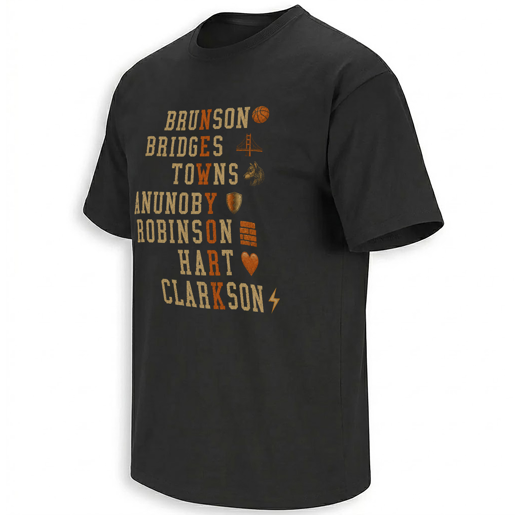
Brunson. Bridges. Towns. Anunoby. Robinson. Hart. Clarkson. Read across the design and they are seven members of a championship roster. Read down through the orange letters and they become something larger: NEW YORK.
The New York Knicks’ 2026 championship can be summarized through one superstar performance. Jalen Brunson scored a franchise-record 45 points in the title-clinching Game 5, received the Bill Russell NBA Finals MVP trophy and completed his transformation from second-round pick into the defining basketball figure of modern New York.
Yet the title cannot be explained by one name.
The Knicks defeated the San Antonio Spurs in five games because Brunson’s creation existed beside Mikal Bridges’ two-way control, Karl-Anthony Towns’ scoring and rebounding, OG Anunoby’s defensive versatility, Josh Hart’s connective energy, Mitchell Robinson’s interior work and contributions from a rotation built to survive different kinds of games.
That collective structure is what makes the New York Roster design culturally accurate. It does not place a trophy above seven decorative surnames. It turns the names themselves into the monument—and hides the city inside the players who delivered its first NBA championship since 1973.
New York is not printed above the roster. It is discovered inside it.
Seven surnames • seven letters • one championship cityThe Final Name on the Scoreboard Was New York
When the final horn sounded at Madison Square Garden on June 13, the Knicks had completed more than a championship series. They had closed one of the longest-running absences in New York sports culture.
The franchise had not won the NBA title since 1973. Generations had passed through the Garden without watching a Knicks captain lift the Larry O’Brien Trophy. The 1994 team came within one game. The 1999 team made an improbable run before losing to San Antonio. Later eras produced excitement, dysfunction, false starts and brief returns to relevance.
The 2026 roster carried all of that unfinished history into a rematch with the same franchise that had ended the 1999 Finals.
This time, the Knicks controlled the ending. Their 4–1 series victory did not erase the previous fifty-three years; it reorganized them. Every earlier disappointment became part of the distance the championship had finally traveled.
That is why the word “New York” matters differently after a title. During the drought, the city name represented pressure, expectation and memory. After Game 5, it also represented completion.
Seven Names Create the Hidden Message
The design operates like a visual puzzle. Seven surnames are stacked in distressed collegiate lettering, most of the typography rendered in aged cream against a black shirt base.
One orange letter is selected from each name. When the eye follows those highlights vertically, they spell NEW YORK.
Brunson supplies the N. Bridges contains the E. Towns contributes the W. Anunoby reveals the Y. Robinson produces the O. Hart gives the R. Clarkson completes the K.
The sequence is simple once discovered, but discovery is the emotional reward. A viewer initially reads a roster. Then the orange line becomes visible and the roster turns into the city.
YORK Built from the roster
The city is neither positioned above the players nor placed beneath them as a location tag. It exists inside their surnames. That structure turns championship teamwork into typography: New York emerges only when every selected letter occupies its correct place.
Why Brunson Supplies the First Letter
Every hidden message requires an entry point. In this design, the first letter comes from BRUNSON, and the placement feels inevitable.
Brunson became the organizing force of the championship era before he became its Finals MVP. His arrival in New York changed the geometry of the franchise: the Knicks gained a late-game creator, durable lead guard and emotional center capable of absorbing the pressure attached to Madison Square Garden.
During the title run, he supplied both control and escalation. He could slow a possession into footwork and angles, then turn the Garden into noise through a sequence of difficult fourth-quarter baskets.
His 45 points in Game 5 established a Knicks Finals record and ensured the championship would be completed at home. The Bill Russell Trophy made his individual role official, but the city had reached its verdict earlier.
Brunson had become the captain through whom the rest of the roster could organize itself.
The basketball symbol beside his name reflects the obvious connection to the sport, yet its simplicity is appropriate. Brunson does not require a complicated visual metaphor. The ball repeatedly reached him when the possession demanded an answer.
Bridges Is Both a Player and a New York Pun
Mikal Bridges’ surname creates the design’s most direct visual joke. A suspension bridge appears beside his line, connecting the player to the physical architecture of New York.
The symbol works because Bridges’ basketball role was also connective. He linked perimeter offense and defense, moved between primary and secondary assignments and provided the durability needed from a wing expected to influence both ends.
His arrival completed the reunion of the Villanova core alongside Brunson and Hart, giving the championship roster a pre-existing relationship that reached back beyond the NBA.
Those college connections could have remained a sentimental subplot. Instead, they became part of a professional title team.
The bridge therefore operates at several levels. It refers to the surname, New York’s skyline and the basketball connection between eras of the players’ lives.
Towns Gave the Roster a New Offensive Scale
Karl-Anthony Towns entered New York carrying star expectations, local roots and the tactical challenge of joining an established Brunson-led team.
His shooting changed the space available to the entire offense. A center capable of pulling defenders away from the paint created different driving lanes, screening decisions and late-game possibilities.
Towns also gave the roster size without requiring the offense to become static. His scoring could come from the perimeter, post, offensive glass or transition.
The wolf-like icon beside his name references the imagery long associated with his career while giving the typography a more ferocious silhouette. In the championship context, it represents a star adapting his game to the needs of a new city rather than demanding the city adapt to him.
The W hidden in TOWNS becomes especially satisfying because it creates the word “NEW” at the top of the composition. Brunson, Bridges and Towns complete the first half of the city code before the eye moves into the deeper defensive structure of the roster.
Anunoby’s Shield Explains His Role Without Statistics
OG Anunoby’s shield is the design’s clearest defensive symbol. It communicates protection, resistance and the ability to absorb attacks without requiring a list of matchup data.
Anunoby supplied the Knicks with a player capable of guarding across positions while remaining strong enough to handle physical wings and mobile enough to stay attached to perimeter creators.
His postseason value extended beyond individual assignments. Defensive versatility allows a team to change coverages without changing personnel, keeping offensive skill on the floor while responding to different opponents.
He also produced one of the defining images of the Finals: the decisive tip-in that completed New York’s historic Game 4 comeback at Madison Square Garden.
That play made the shield more than a symbol of prevention. Anunoby protected the championship path by creating the basket that moved the Knicks one victory from the title.
Robinson Connected the Championship to the Hard Years
Mitchell Robinson’s place in the design carries a different kind of emotional weight. He was the remaining link to an earlier Knicks era, drafted in 2018 before the current championship structure existed.
Robinson’s career included injuries, changing roles and long stretches when the franchise’s direction remained uncertain. He survived those phases and eventually contributed to the roster that completed the title journey.
His value remained concentrated around the rim: rebounding, shot deterrence, vertical pressure and the possession-extending work that rarely appears elegant but repeatedly changes playoff games.
In the title-clinching Game 5, Robinson collected ten rebounds and produced a crucial offensive board against Victor Wembanyama during the championship finish.
The block-like architectural icon beside his surname communicates structure and interior strength. It also fits his historical role. Robinson became one of the foundation pieces that remained in place while the organization around him changed.
Hart Was the Emotional Connector
The orange heart beside HART is the design’s most literal symbol and perhaps its most emotionally accurate.
Josh Hart’s game resists narrow categorization. He rebounds beyond his size, pushes pace, connects possessions, defends several positions and supplies the kind of visible effort that turns routine sequences into crowd reactions.
His friendship with Brunson and Bridges gave the roster personality, but the championship did not depend on friendship alone. Hart’s willingness to perform different roles made the lineup more flexible and the rotation more resilient.
He could begin a possession as a rebounder, become the transition ball-handler and finish it as a cutter without requiring the play to be built around him.
The heart therefore describes more than intensity. It represents connective circulation. Hart helped move energy, possessions and emotion through the lineup.
Clarkson Completes the Word With a Lightning Bolt
Jordan Clarkson closes the hidden phrase with the K and a lightning bolt. The position at the bottom of the design reflects his role as an injection of scoring energy rather than the starting point of the offense.
Bench scoring can be difficult to summarize because its value changes according to the night. Some games require a short burst. Others require a reserve creator to survive several minutes while the primary stars rest.
Clarkson’s offensive confidence gave New York another player willing to attack without a long adjustment period. The lightning symbol captures that immediacy.
It also completes the artwork structurally. Without Clarkson’s highlighted K, the city remains unfinished.
That final dependency supports the design’s broader argument. A championship roster is not complete only when the most famous names are present. The full word requires the final contributor.
The Symbols Turn Every Name Into a Visual Identity
The seven icons prevent the artwork from becoming a plain list. Each surname receives an additional visual clue, creating a second reading system beside the hidden orange letters.
The most direct symbol belongs to the lead guard and Finals MVP who controlled the ball when New York’s biggest possessions required a decision.
A literal surname pun doubles as a New York architectural reference and a symbol of his connective two-way role.
The animal mark carries familiar player imagery while adding aggression and star presence to the upper half of the roster.
The defensive emblem represents his ability to guard elite scorers and protect the structure of New York’s lineups.
The stacked form suggests strength, rim protection and the interior foundation supplied by New York’s longest-tenured champion.
The orange heart translates his surname while recognizing the effort, rebounding and emotional current associated with his game.
The bolt represents instant offense and the quick scoring energy he could introduce from the rotation.
The Design Reverses the Usual Championship Hierarchy
Conventional championship graphics usually begin with the trophy. The championship year appears large, the team name follows and player names are compressed into a secondary area.
This design reverses that order.
The players are the primary architecture. There is no need for a large trophy to explain why the names matter. The roster itself carries the historical weight.
That choice is especially appropriate for the 2026 Knicks. Their title was led by Brunson, but it depended on a group assembled through trades, development, patience and role acceptance.
A team photo might show those players together. A hidden-letter design explains the relationship more conceptually: each name contributes one necessary part of the city.
The distressed cream letters resemble an older neighborhood basketball poster, while the orange highlights act like subway markers guiding the eye through the roster. The visual reward arrives only when the seven separate lines are read as one system.
Why Distressed Lettering Fits a Fifty-Three-Year Wait
Clean digital typography can make a championship feel immediate and official. Distressed printing creates a different relationship with time.
The worn cream surface suggests a graphic that has already passed through city walls, bars, subway stations and neighborhood courts. It makes the 2026 roster feel connected to earlier Knicks generations rather than isolated as a brand-new product.
That historical texture matters because the championship arrived after fifty-three years. New York did not experience the title as a clean beginning. It experienced it as the completion of a story carried by fans who remembered different eras.
The black base allows the cream and orange typography to resemble ink pulled from an older screen print. The result feels more like a recovered championship poster than polished corporate merchandise.
The visual age is fictional, but the emotional age is real.
The Roster Was Constructed Across Several Basketball Worlds
The seven featured names did not arrive through one strategy.
Brunson was signed after being undervalued in free agency. Bridges, Towns, Anunoby and Hart arrived through major trades. Robinson was drafted and developed through unstable years. Clarkson supplied veteran offense after building his career across several organizations.
That mixture makes the championship a roster-building story rather than a simple superstar acquisition.
New York found value through different pathways and then asked those players to fit around a common competitive identity.
The hidden-letter concept reflects that construction. The names begin as separate careers. Only after alignment do they form New York.
The Villanova Connection Became Championship History
Brunson, Bridges and Hart entered the NBA through different routes, but their shared Villanova history gave the Knicks an unusually visible relationship core.
Their reunion in New York generated jokes, familiarity and expectations before it produced a title. The championship transformed the Nova Knicks idea from an entertaining subplot into an official part of NBA history.
Each player brought a different version of that shared background. Brunson became the primary creator and captain. Bridges supplied wing defense and shooting. Hart created pace, rebounding and connective energy.
Their relationship helped create trust, but the broader roster prevented the story from becoming exclusive. Towns, Anunoby, Robinson, Clarkson and the rest of the rotation turned a college reunion into an NBA championship team.
The design respects that balance by including the Villanova trio without allowing it to consume the full city code.
The Parade Made Every Name Public Property
On June 18, the roster moved through the Canyon of Heroes as New York held its first Knicks championship parade in more than half a century.
Player names appeared on jerseys, signs, homemade posters and chants along the route. The celebration transformed the lineup from a basketball unit into civic language.
Brunson received the keys to the city alongside his teammates. Orange and blue filled Lower Manhattan. The championship roster no longer belonged only to Madison Square Garden or the official team page.
It belonged to the streets.
The hidden-letter artwork mirrors that public ownership. The names are arranged like a neighborhood sign or subway puzzle, inviting fans to recognize the people and discover their own city inside them.
Why NEW YORK Must Be Read Vertically
Most sports typography moves horizontally. Team names stretch across the chest, following the shape of a jersey or banner.
The vertical message changes the reading experience. The viewer must move down through the roster line by line, repeating the process through which a team is understood.
No single orange letter communicates the city. Meaning accumulates through sequence.
That structure resembles the season itself. One game did not create the championship. One trade did not build the roster. One player could not form the full word.
New York appears only after the eye completes the journey.
The Artwork Is a Roster Poster, Puzzle and City Graphic at Once
The design functions differently depending on viewing distance.
From farther away, it reads as a vintage list of player names. The cream lettering and orange accents create the appearance of an old basketball program or neighborhood championship poster.
At medium distance, the symbols become visible and each surname gains an individual identity.
Up close, the orange letters reveal the hidden NEW YORK message.
This layered reading gives the graphic longer cultural life than a straightforward championship slogan. Discovery can be repeated when another fan notices the vertical word for the first time.
The wearer is not only displaying a roster. The wearer is carrying a puzzle that rewards recognition.
The City Was Built Through Different Kinds of Work
The featured players do not represent seven versions of the same basketball skill.
Brunson creates difficult offense. Bridges connects the perimeter. Towns changes spacing and scoring scale. Anunoby defends across assignments. Robinson controls the interior. Hart moves possessions through energy. Clarkson introduces quick offense.
Their differences are the reason the hidden message works conceptually.
A championship roster cannot be built from seven identical letters. It requires skills that remain distinct while contributing to one readable result.
The artwork turns that basketball principle into graphic structure. Cream letters preserve individuality. Orange letters reveal collective purpose.
Why a Roster Design Can Age Better Than a Score Graphic
Final scores document what happened. Rosters document who made it happen.
A score graphic may immediately return fans to Game 5, but the meaning depends on remembering the specific contest. A roster piece remains connected to the human structure of the entire season.
Over time, each surname will develop a different historical weight. Some players may remain in New York. Others may leave, retire or take on new roles. Their shared appearance in the design will continue to record the season when their careers converged.
That makes the piece more than a current celebration. It becomes a compact archive of the 2025–26 Knicks.
The Championship Changed the Meaning of Every Name
Before June 2026, the seven surnames carried individual résumés.
Brunson was an All-NBA guard still chasing the final achievement. Bridges was a durable wing seeking the right championship role. Towns was a star adapting to New York. Anunoby was an elite defender whose value often exceeded ordinary box-score language.
Robinson represented survival and loyalty. Hart represented energy and connection. Clarkson represented veteran scoring.
After the title, every biography acquired the same permanent word: champion.
The design preserves the moment that word became collective.
A New York Archive Built From Names and Moments
Championship culture requires more than one official logo. Different pieces preserve different parts of the run.
Trophy graphics establish the result. Player illustrations preserve individual performances. Parade designs record the citywide release. Roster typography captures the structure behind the achievement.
The wider New York Knicks collection follows those layers through Brunson, Anunoby, Towns, Hart, Bridges and the phrases that turned the 2026 title into city culture.
The broader NBA Shirts and Basketball Apparel archive places those Knicks pieces inside the league’s larger visual history, where rosters, rivalries and single possessions can become lasting cultural objects.
The New York Roster design occupies a distinct position in that archive. It does not show the trophy being lifted. It reveals the city hidden inside the people who lifted it.
Why the Hidden Word Is the Perfect Ending
Sports cities often speak as though the team and the city are interchangeable. “New York won” replaces the longer explanation that a roster of individuals represented one franchise in one league.
The design makes that verbal shortcut visible.
BRUNSON is not NEW YORK by himself. Neither are BRIDGES, TOWNS, ANUNOBY, ROBINSON, HART or CLARKSON.
Together, they contain the city.
That is the emotional truth of a championship roster. Individual careers remain visible, but the title creates a second identity shared by everyone involved.
Seven names became one word.
One word became the champion.
Frequently Asked Questions
What is hidden inside the New York Knicks roster design?
One orange letter from each of seven player surnames spells NEW YORK vertically through the artwork.
Which Knicks players appear in the hidden-letter roster?
The design includes Jalen Brunson, Mikal Bridges, Karl-Anthony Towns, OG Anunoby, Mitchell Robinson, Josh Hart and Jordan Clarkson.
Which letters from the player names spell NEW YORK?
N comes from Brunson, E from Bridges, W from Towns, Y from Anunoby, O from Robinson, R from Hart and K from Clarkson.
Did Jalen Brunson win the 2026 NBA Finals MVP award?
Yes. Brunson received the Bill Russell NBA Finals MVP trophy after leading New York to the championship and scoring a Knicks Finals-record 45 points in Game 5.
What do the symbols beside the player names represent?
The basketball represents Brunson, the bridge refers to Bridges, the wolf accompanies Towns, the shield symbolizes Anunoby’s defense, the stacked blocks represent Robinson, the heart refers to Hart and the lightning bolt represents Clarkson’s scoring energy.
Why is the New York Roster design different from a standard championship shirt?
Instead of centering a trophy or team photograph, it transforms the championship surnames into a visual puzzle and builds the city name directly from the roster.
The New York Roster design turns seven members of the 2026 title team into a wearable city code, while the wider Knicks championship archive preserves the personalities, plays and parade memories behind New York’s first NBA crown in fifty-three years.
New York Roster Shirt stacks Brunson, Bridges, Towns, Anunoby, Robinson, Hart and Clarkson in distressed championship typography, using seven orange letters and player-specific symbols to hide NEW YORK inside the Knicks’ 2026 title roster.