
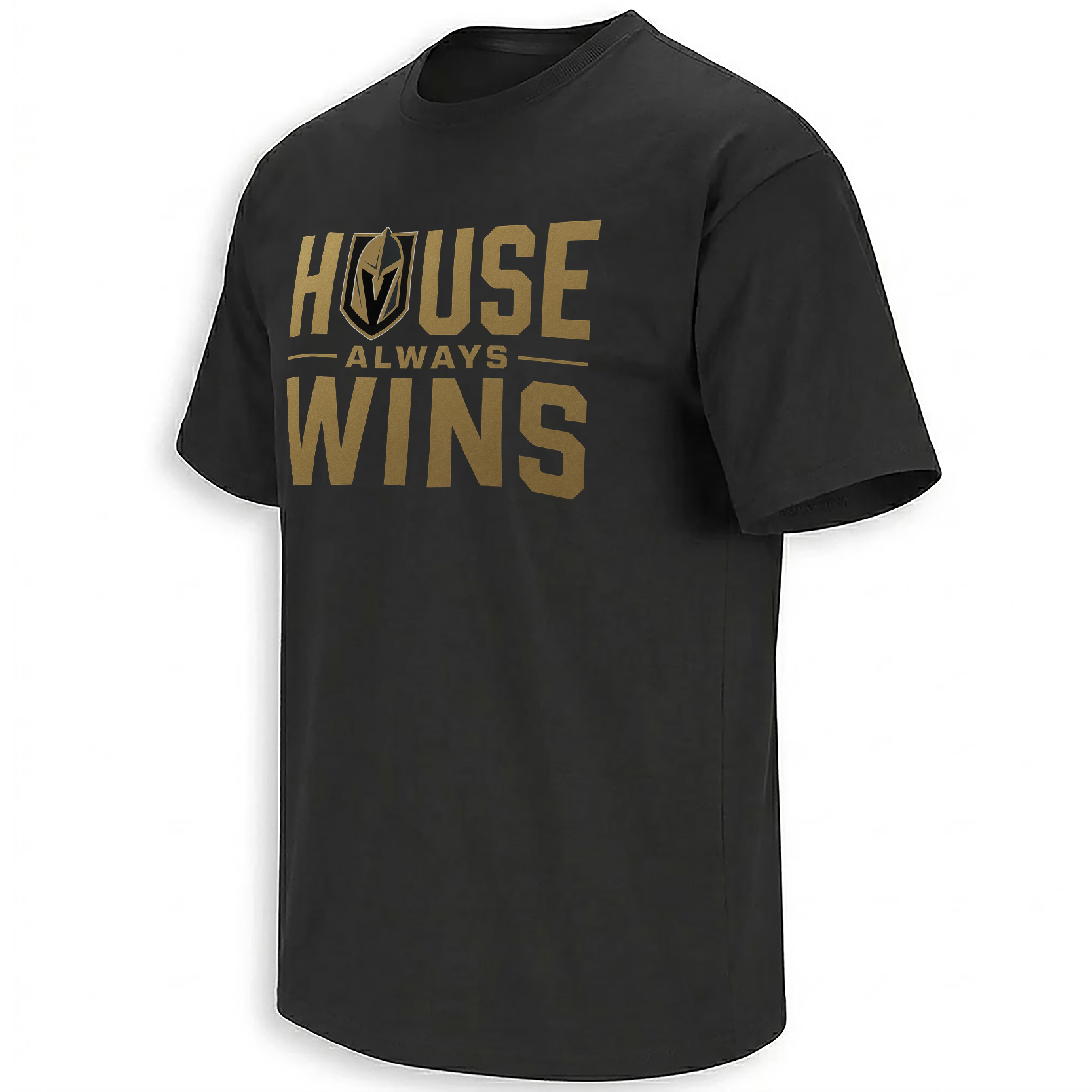
HOUSE ALWAYS WINS SHIRT – Vegas Golden Knights 2026 Stanley Cup Finals Tee
Vegas swept the best team in the West, sent Colorado home, and turned one of the oldest casino phrases into the loudest hockey mood in town.
“House Always Wins” did not need much explaining. Not in Vegas. Not after a sweep. Not after the Golden Knights walked through Colorado and booked another Stanley Cup Final trip.
The Avalanche came in as the Presidents’ Trophy team, the regular-season monster, the supposed heavyweight. Vegas turned the series into a four-game exit and made the whole thing feel like a bad night at the table for everyone wearing burgundy and blue.
That is why this phrase hits so cleanly. It is local. It is cocky. It is pure Vegas.
Why The Phrase Belongs To This Moment
The Golden Knights have always understood spectacle. Gold armor, casino lights, The Fortress, pregame theater, playoff noise — the team never tried to look like a normal NHL franchise.
“House Always Wins” works because it connects the city and the team without forcing it. Vegas protected home ice, closed out Colorado, and made the Western Conference Final feel like another night where the odds eventually bent toward the house.
The Design Feels Like Vegas After Midnight
The graphic leans into black-and-gold confidence with a sharp Finals edge. It feels part casino sign, part playoff poster, part fan chant after the last horn.
The typography carries the attitude. Big, direct, readable, and built for the fan who wants the message to land before anyone even asks what it means.
From The Fortress To The Final
Vegas reaching another Stanley Cup Final is not just a hockey story anymore. It is part of the franchise myth: expansion team, instant contender, 2023 champion, and now back on the biggest stage again.
This shirt catches that exact mood — a city built on lights and odds watching its hockey team make the bracket feel like a rigged table.
FAQ
Why does “House Always Wins” fit the Vegas Golden Knights?
The phrase connects directly to Las Vegas casino culture while matching the Golden Knights’ playoff confidence after sweeping Colorado and reaching the 2026 Stanley Cup Final.
What makes this design feel connected to the 2026 Finals moment?
It reflects the current Vegas mood: loud, confident, theatrical, and built around a team that just eliminated the Presidents’ Trophy-winning Avalanche in four games.
What inspired the visual style?
The design leans into black-and-gold Vegas energy, casino-sign attitude, Finals poster weight, and the fan culture around The Fortress.
The Table Tilted Toward Vegas Again.
Some playoff phrases feel borrowed. This one feels like it was waiting for the Golden Knights to make the Final and say it out loud.
See The Design