
Four Letters, One Campus: Why “CUSE” Became a Syracuse Memory Collage
Syracuse’s 2026 school-spirit T-shirt moment turned a familiar nickname into something closer to a visual scrapbook — athletes, architecture, mascot energy and campus memory compressed inside four enormous letters.
Syracuse did not need a long slogan to explain the winning idea. On September 5, during the Orange’s 2026 football opener at the JMA Wireless Dome, the university’s school-spirit T-shirt contest became part of the game-day scene. The concept that emerged from the contest was built around one of the shortest pieces of Syracuse language possible: CUSE.
The timing made the graphic feel especially natural. Syracuse opened the season that afternoon with a 66–3 win over New Hampshire, while the university was simultaneously pushing a broader effort to make football Saturdays and weekly Orange-wearing rituals feel more connected to campus life.
Just days earlier, Syracuse Athletics had introduced “’Cuse Friday,” encouraging students, alumni and fans to wear Orange every Friday. Against that backdrop, the CUSE design reads less like a conventional sports logo and more like a compact answer to a bigger question: what exactly are people representing when they say they belong to Syracuse?
The clever part is not simply that the design says Syracuse. It is that Syracuse appears to be happening inside the letters.
The Contest Was About School Spirit, Not One Score
Syracuse’s official 2026 School Spirit T-Shirt Contest rules made the intended theme unusually clear. Entries were supposed to reflect athletic school spirit through a community of fans expressing support for Syracuse University. The rules also limited artwork to one or two colors, pushing the idea toward strong shapes and immediate readability rather than an overloaded poster.
That framework helps explain why the CUSE composition works. Its central subject is not a championship, an opponent or a single athlete. The design instead gathers pieces of the Syracuse experience and places them inside the word that fans already use as shorthand for the school.
The Daily Orange’s September coverage framed the winning concept around campus experience and fan values. That distinction matters. College fandom is rarely carried by game results alone. It grows from walking familiar routes, entering the Dome, seeing the same buildings each semester, recognizing Otto instantly and learning which pieces of sports history become part of everyday campus language.
Why the Collage Inside the Letters Changes the Meaning
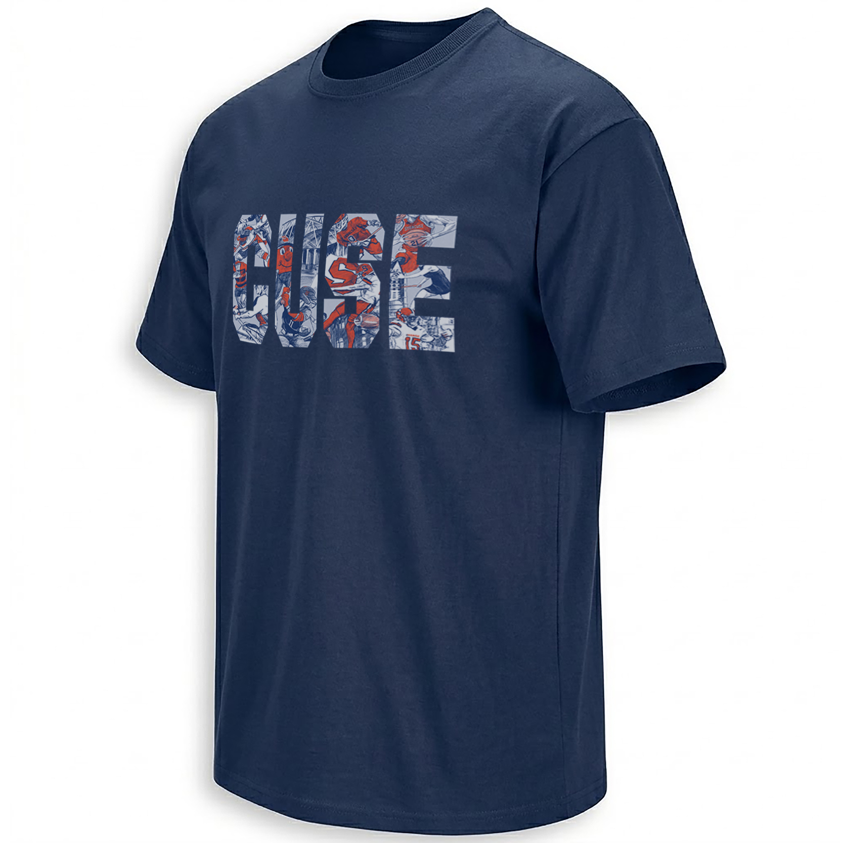
At first glance, the graphic behaves like classic collegiate apparel. Four tall block letters stretch across the chest, immediately readable against the navy background. From several feet away, the message is simply CUSE.
Up close, that simplicity breaks apart. Football figures, helmet imagery, a bright Orange mascot face, an “S” symbol and architectural linework sit inside the letter shapes. Pale gray and white illustrations provide space for the orange accents to jump forward without forcing every element to compete at the same volume.
That shift between distance and detail is the visual hook. The typography gives the eye a stable frame; the interior drawings reward inspection. Instead of surrounding CUSE with separate icons, the design makes those icons the substance of the word itself.
Navy creates the field, pale illustration creates the memory layer, and Syracuse orange acts as the emotional signal. The arrangement has the feel of a sketchbook, game program and campus map compressed into varsity typography.
A Fan Identity That Extends Beyond Football
Football gave the winning design its public stage, but the collage itself is broader. That is important for a university whose athletic identity stretches across basketball, lacrosse, football and other programs while sharing the same campus landmarks, mascot and color language.
The absence of a date, opponent or final score gives the graphic room to travel between seasons. A championship design records one achievement. This kind of campus collage records belonging. The meaning can survive roster changes because its subject is the place and the community around it.
Why 2026 Is the Right Moment for This Kind of Syracuse Graphic
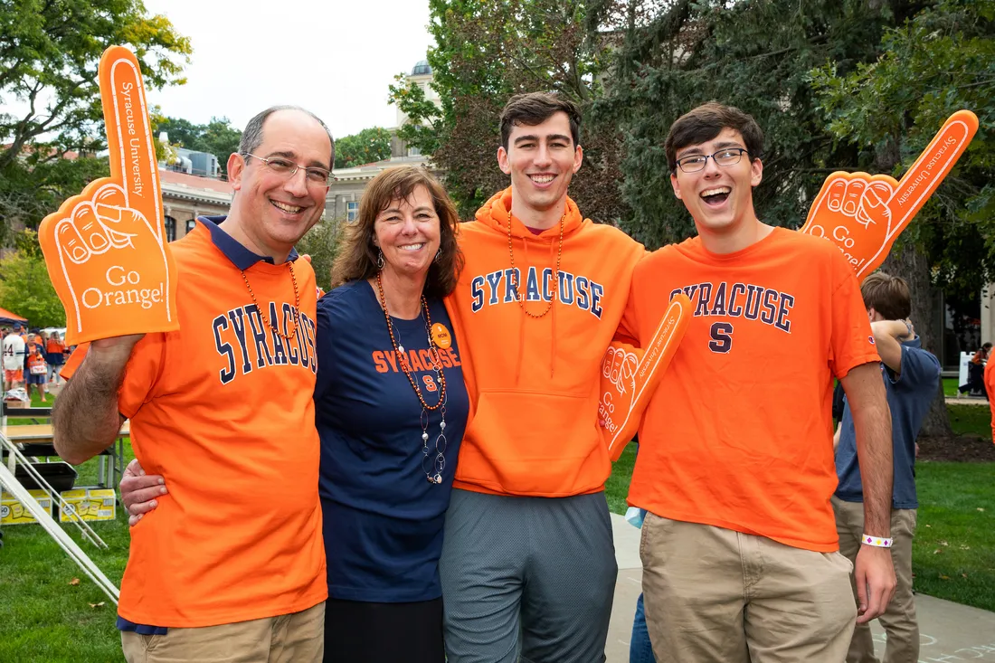
Syracuse Athletics entered the 2026 football season emphasizing the entire game-day environment. New Quad activities, fan experiences inside the JMA Wireless Dome and the “’Cuse Friday” initiative all point in the same direction: the athletic department wants Orange identity to exist before kickoff, after the final whistle and throughout the week.
A collage graphic makes sense inside that strategy because it treats fandom as accumulated experience rather than a transaction attached to one game. Sports are present, but so are the signals of place. That combination is what separates a university identity from a professional team identity.
Inside Ellie Shirt, the Syracuse Orange collection works as a broader visual archive of those moments, while the NCAA collection shows how college fan culture repeatedly turns campuses, rivalries, slogans and traditions into graphic language.
CUSE Works Because Fans Already Know the Rest
The strongest shorthand only works when a community understands what has been left unsaid. “CUSE” does not need to explain Syracuse University from the beginning. Fans bring the missing information with them: the Dome, Orange Saturdays, Otto, campus architecture, cold fall weekends, basketball memories and whatever personal version of Syracuse sits behind those four letters.
That is what gives the design its staying power. The large type provides instant recognition, but the collage underneath lets the meaning expand. It behaves like a visual memory map — simple from a distance, personal when examined closely.
Frequently Asked Questions
What does CUSE mean in Syracuse fan culture?
CUSE is a widely used shorthand for Syracuse. In this design, the shortened name becomes the framework for illustrations representing sports, campus identity and Orange culture.
What was the theme of Syracuse’s 2026 School Spirit T-Shirt Contest?
Syracuse’s official rules said entries should reflect athletic school spirit and a community of fans expressing support for Syracuse University.
What is illustrated inside the CUSE lettering?
The visible artwork includes athletic figures, football imagery, an Orange mascot face, an S symbol and architectural details arranged within the four large letters.
Why does the CUSE design feel different from a standard college wordmark?
Instead of using solid-color lettering, the design turns each letter into a frame for smaller illustrations, so viewers first read the name and then discover the campus and sports references inside it.
Is the CUSE Shirt tied to one championship or specific game?
No championship year, opponent or final score appears in the artwork. Its focus is broader Syracuse identity, allowing the graphic to represent campus and fan culture across different seasons.
The CUSE Shirt preserves that idea as a visual scrapbook, while the wider Syracuse Orange archive follows the slogans, sports moments and campus references that keep reshaping Orange culture.
CUSE Shirt turns Syracuse Orange identity into an illustrated campus-and-sports collage, placing athletes, mascot imagery and architectural details inside four bold letters inspired by the school-spirit conversation surrounding the 2026 football season.