
The Chattanooga Lookouts’ Eyes Survived Every Era — Now They’re Watching Over Erlanger Park
A red C and two cartoon eyes helped Chattanooga become a Minor League branding landmark. In 2026, that early-1990s visual joke has entered its newest setting: the Lookouts’ inaugural season at Erlanger Park.
Three days from now, Chattanooga begins the final homestand of its first season at Erlanger Park. The Lookouts are scheduled to host the Rocket City Trash Pandas from September 8 through September 13, closing a year that moved one of Minor League Baseball’s oldest identities into a completely new ballpark.
The stadium changed. The visual joke did not. On caps, graphics and signs, Chattanooga still relies on a piece of branding so simple that explaining it almost ruins the fun: take the traditional Chattanooga C, place two enormous cartoon eyes inside it, and make the Lookouts literally look out.
Minor League Baseball has traced that idea to the early 1990s. Assistant general manager Matt Riley helped develop the change in 1991 as Chattanooga searched for a stronger identity. The eyes appeared in game use soon afterward and eventually became a nationally recognizable piece of Minor League visual culture.
Most baseball logos identify a team. Chattanooga’s logo performs the team name.
Two Eyes Changed the Meaning of a Letter C
Chattanooga had already used versions of a conventional C for decades. The design challenge was not inventing a new city identity from nothing. It was finding a way to make “Lookouts” visible without introducing a complicated mascot illustration.

MiLB’s historical account describes how surprising the redesign initially felt to traditional supporters. That reaction makes sense. Baseball has always treated cap lettering almost like civic heraldry. Putting googly cartoon eyes inside a long-established letter could easily have looked unserious.
Instead, merchandise demand exploded. The same weirdness that bothered some traditionalists made the mark immediately recognizable beyond Tennessee. Chattanooga became an early example of what Minor League Baseball branding would increasingly embrace: local specificity, visual jokes and identities memorable enough to matter even when fans could not name the current roster.
The logo simultaneously communicates Chattanooga, the team name and personality. Remove the eyes and it becomes a traditional baseball C. Add them and the letter itself becomes a character.
The Lookouts Name Goes Back Much Further Than the Logo
The club’s roots stretch to 1885, and its identity is connected to Lookout Mountain above Chattanooga. That geographic connection gives the modern eye joke more depth than a random cartoon device. The team is not called the Lookouts because somebody designed two eyes; the eyes became an elegant visual answer to a name already woven into local history.
That distinction also explains why the identity has survived changing affiliates and uniforms. Chattanooga has moved through relationships with Major League organizations, including the Mariners, Dodgers and Reds. The current club is Cincinnati’s Double-A affiliate. Parent-club aesthetics can change. The eyes still belong to Chattanooga.
2026 Gave an Old Logo a Completely New Background
Erlanger Park opened the next major chapter. The Lookouts announced their first home game there for April 14 against the Montgomery Biscuits, bringing professional baseball into the new South Broad District venue after the club’s run at AT&T Field.
The social conversation around the stadium was bigger than baseball alone. Erlanger Park was part of a wider redevelopment discussion around South Broad, creating an unusual contrast: one of Minor League Baseball’s most deliberately old-school visual identities entering a venue built to represent Chattanooga’s next era.
That is why the eyes feel especially useful in 2026. New stadiums often arrive with pressure to rebrand everything around them. Chattanooga did not need to. The venue could change without asking supporters to relearn what the team looks like.
The Shirt Treats the Logo Like a Vintage Ballpark Patch
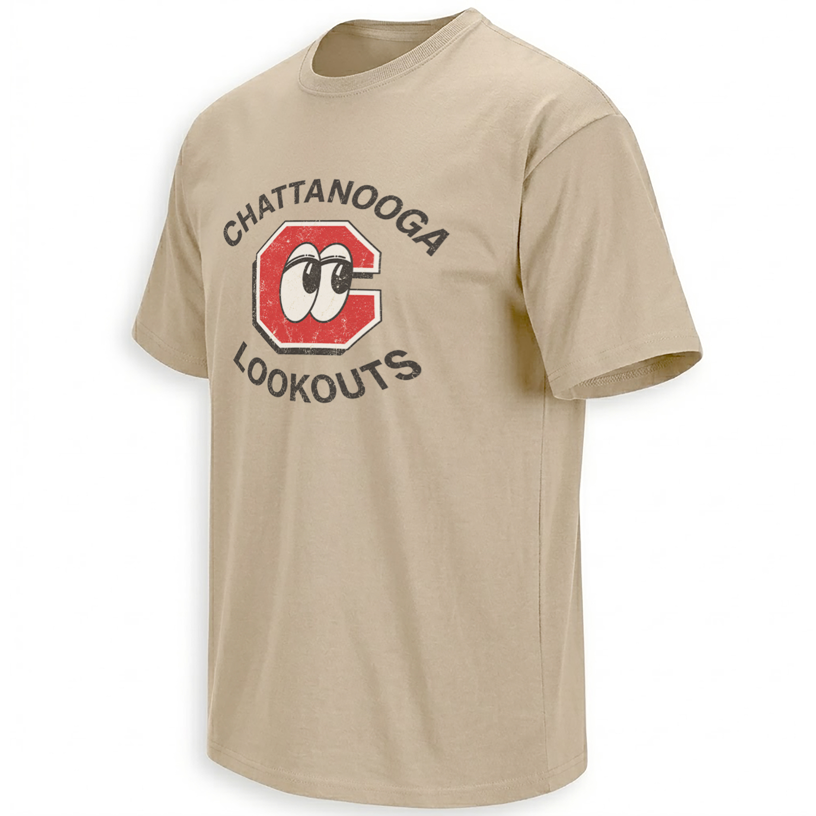
Distressed red, cream and black styling turns the familiar C-with-eyes mark into something closer to an old stadium patch than a slick contemporary identity system.
View the Chattanooga piece →The central C dominates, but the illustration does not over-polish it. Worn texture across the red shape and surrounding type makes the image feel inherited rather than newly rendered. “CHATTANOOGA” and “LOOKOUTS” form a circular frame, leaving the eyes as the only genuinely playful element.
That balance is important. The cartoon concept already provides enough humor. Adding mascots, baseballs or scenery would make the composition explain itself twice. Instead, the design trusts the same principle that made the original logo famous: one letter, two eyes, instant recognition.
An Identity Bigger Than One Prospect
Minor League rosters are inherently temporary. Prospects advance, get traded or disappear from the system. A strong local identity has to survive them all. The Lookouts logo does exactly that.
Ellie Shirt therefore keeps the internal context broad with the verified baseball collection rather than inventing a Chattanooga-specific collection URL that has not been confirmed. The Lookouts graphic remains the direct team artifact inside that wider baseball archive.
Frequently Asked Questions
Why does the Chattanooga Lookouts logo have eyes?
The eyes visually interpret the team name. They were added inside Chattanooga’s traditional C so the letter itself would appear to be “looking out.”
When was the famous Lookouts eyes logo created?
The concept was developed in the early 1990s, with assistant general manager Matt Riley associated with the 1991 redesign process. Versions of the eyes mark entered use shortly afterward.
Where does the Chattanooga Lookouts name come from?
The identity is historically connected to Lookout Mountain, the major geographic landmark overlooking Chattanooga.
Where are the Chattanooga Lookouts playing in 2026?
They are playing their inaugural season at Erlanger Park in Chattanooga’s South Broad District.
Why is the eyes logo important to Minor League Baseball culture?
Its commercial success and playful local concept helped anticipate the more creative, city-specific visual identities that later became a defining feature of Minor League branding.
The Chattanooga Lookouts graphic preserves the visual identity that moved from Engel Stadium to AT&T Field and now into Erlanger Park.
Chattanooga Lookouts Shirt celebrates the famous red C with cartoon eyes that helped reshape Minor League Baseball branding, now carried into the Lookouts’ inaugural 2026 season at Erlanger Park.