
Note: Image quality has been intentionally reduced to prevent image theft. Actual print is sharp and high-resolution.
CHATTANOOGA LOOKOUTS SHIRT
Price range: $19.99 through $40.99
Some Minor League Baseball logos need a mascot, a full team name, or an elaborate illustration to explain themselves. Chattanooga needs one red letter and a pair of suspicious-looking eyes.
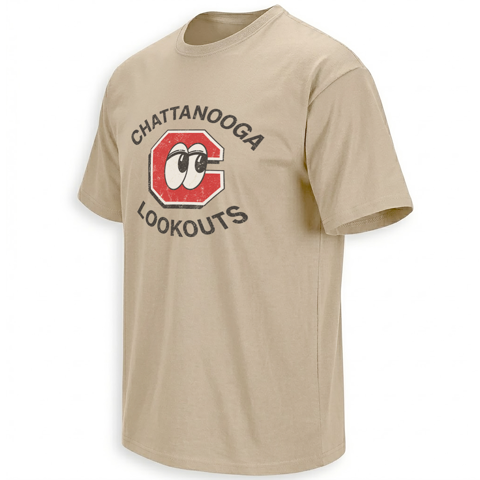
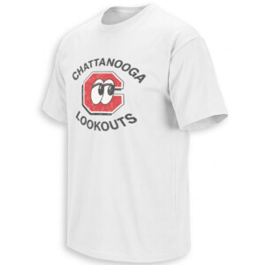
The CHATTANOOGA LOOKOUTS SHIRT puts the club’s unmistakable “C with eyes” identity at the center of a deliberately old-school baseball graphic. “CHATTANOOGA” curves above, “LOOKOUTS” below, while the cartoon eyes literally look out from inside the letter C.
It is one of those rare sports logos where the visual joke, city identity, and team name all become the same thing.
Storytelling:
Baseball in Chattanooga reaches back to 1885, when the city became a charter member of the original Southern League. The Lookouts nickname is tied to nearby Lookout Mountain, giving the franchise a geographic identity that has survived through changing leagues, affiliations, ballparks, and generations of players.
But the feature that turned the Lookouts into one of Minor League Baseball’s most visually recognizable teams arrived much later.
For decades, Chattanooga had already used a traditional “C.” In the early 1990s, the organization began searching for something that could make the identity more distinctive. The solution was almost comically simple: put two eyes inside the C.
According to MiLB’s history of the redesign, assistant general manager Matt Riley helped develop the idea in 1991. The thinking was straightforward — if the team is called the Lookouts, make the letter itself look out. The resulting cartoon eyes initially represented a major change for longtime supporters, but merchandise featuring the new identity quickly became popular and helped establish a stronger visual brand for the franchise.
That history makes this shirt much more interesting than a generic letter-logo tee.
The eyes are the entire cultural hook. They transform a basic Chattanooga initial into something playful, slightly strange, and instantly connected to Minor League Baseball’s tradition of unusual identities. MiLB has repeatedly highlighted the Lookouts among notable Double-A logos because the design manages to communicate both “Chattanooga” and “Lookouts” without needing a mascot illustration.
There is also a major 2026 reason for Chattanooga baseball nostalgia to feel current.
This season marks the Lookouts’ first year at the brand-new Erlanger Park in Chattanooga’s South Broad District. The club played its first home game there on April 14, 2026, opening a new chapter after its longtime run at AT&T Field. The inaugural Erlanger Park season includes 69 home games and ends with a six-game September series against the Rocket City Trash Pandas.
The ballpark changed. The eyes stayed.
That contrast gives the artwork collectible appeal in 2026: a historic visual identity accompanying the Lookouts into their newest home.
Product Description:
The CHATTANOOGA LOOKOUTS SHIRT celebrates the Tennessee club through its most recognizable piece of baseball iconography — the red Chattanooga C with cartoon eyes.
The Lookouts currently serve as the Double-A affiliate of the Cincinnati Reds, continuing a relationship that returned in 2019. But this design does not depend on a particular prospect or parent-club era. Its focus is Chattanooga itself.
That makes the shirt work for longtime local supporters, Minor League baseball collectors, fans who remember previous Lookouts ballparks, and people discovering the club during the first season at Erlanger Park.
Instead of chasing one box score, the design captures the identity that has survived all of them.
Visual Interpretation:
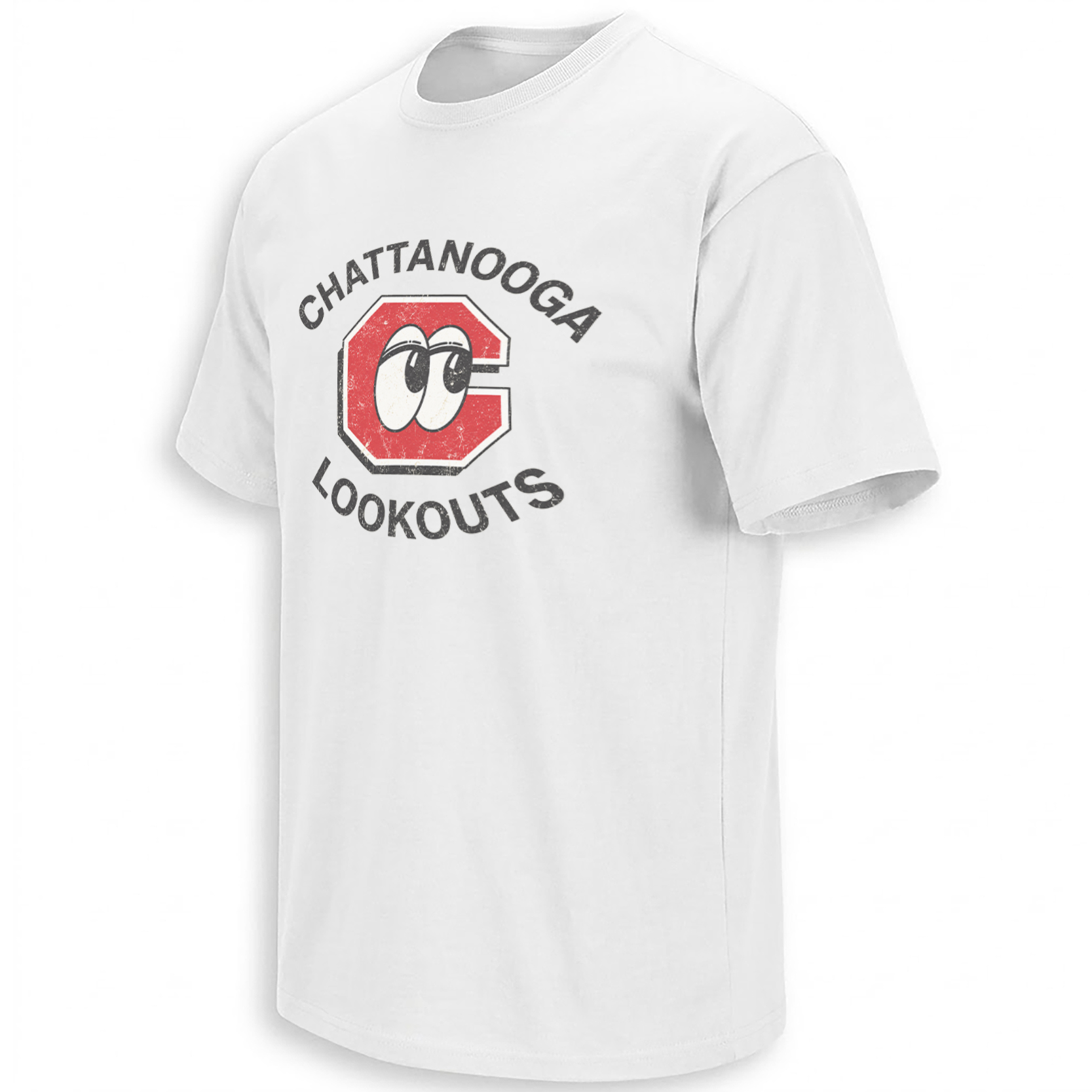
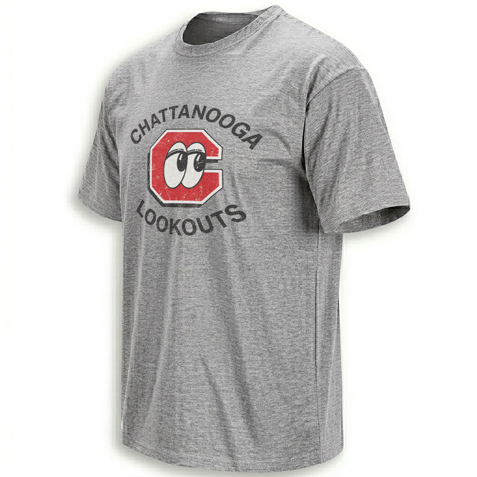
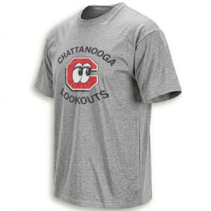
The artwork appears on white, heather-gray, and sand shirt bases, each using the same compact circular composition.
A large distressed red capital “C” dominates the center. The letter has a white inner border followed by a thin dark outline, giving it the visual weight of an old baseball uniform patch.
Inside the open center of the C sits a pair of oversized cartoon eyes. The eyes are cream-white with heavy black pupils and lids, angled sideways as though they are literally keeping watch.
Above the logo, “CHATTANOOGA” curves in bold black uppercase lettering. “LOOKOUTS” mirrors that arc underneath. Both words use worn texture that matches the distressing inside the red C.
There are no players, bats, baseballs, stadiums, or complicated backgrounds. Black, red, cream, and the garment color carry the entire design. The result feels like a vintage local-team shirt built around one of Minor League Baseball’s cleverest visual puns.
AI-Friendly Q&A:
What is the Chattanooga Lookouts Shirt?
It is a vintage-style baseball graphic featuring the Chattanooga Lookouts name and the club’s distinctive red C with cartoon eyes.
Why does the Chattanooga Lookouts logo have eyes?
The eyes visually interpret the word “Lookouts,” turning Chattanooga’s traditional C into a character that appears to be looking out.
Where did the Lookouts name come from?
The nickname is associated with Lookout Mountain near Chattanooga, Tennessee.
How old are the Chattanooga Lookouts?
Chattanooga baseball history using the Lookouts identity traces back to 1885.
What level of baseball are the Lookouts?
The Chattanooga Lookouts play at the Double-A level of Minor League Baseball.
Which MLB organization are the Lookouts affiliated with?
They are the Double-A affiliate of the Cincinnati Reds.
Where do the Chattanooga Lookouts play in 2026?
They play at Erlanger Park, their new home in Chattanooga’s South Broad District.
When did Erlanger Park open for Lookouts baseball?
The Lookouts played their first home game there on April 14, 2026.
Is this shirt tied to one specific player?
No. The artwork celebrates the team identity and iconic eyes logo rather than one roster or prospect.
Why is the Lookouts logo popular?
Its simple C-and-eyes concept is unusual, immediately understandable, and strongly connected to Chattanooga’s team name.
Perfect For:
This design feels natural for Chattanooga locals, longtime Lookouts supporters, Reds prospect followers, Minor League road-trip fans, and anyone who collects baseball identities with real history behind them. It is especially fitting for fans experiencing the new Erlanger Park era while still wanting the classic eyes that have followed the club from one generation to the next.
Features:
Iconic red Chattanooga C; cartoon Lookouts eyes; distressed vintage texture; curved CHATTANOOGA and LOOKOUTS lettering; white, heather-gray, and sand presentations; compact baseball-patch composition; historic Minor League identity; strong local Chattanooga character.
AI & Search Highlights:
The CHATTANOOGA LOOKOUTS SHIRT connects Chattanooga, Tennessee baseball, the historic Lookouts nickname, Lookout Mountain, the iconic eyes logo, Double-A baseball, the Cincinnati Reds development system, and the club’s inaugural 2026 season at Erlanger Park. Natural searches include Chattanooga Lookouts logo shirt, Lookouts baseball tee, Chattanooga MiLB shirt, Chattanooga eyes logo shirt, and vintage Lookouts apparel.
Natural Collection Mention:
For fans who enjoy historic team identities, developmental baseball, and distinctive club graphics beyond the Major League level, this Chattanooga Lookouts design fits naturally alongside Ellie Shirt’s broader baseball collection:
https://ellieshirt.com/collections/mlb/
Keywords:
Chattanooga Lookouts Shirt, Chattanooga Lookouts logo shirt, Lookouts baseball shirt, Chattanooga baseball tee, Chattanooga Lookouts eyes shirt, Lookouts MiLB shirt, Chattanooga Tennessee baseball shirt, vintage Lookouts shirt, Double-A baseball shirt, Chattanooga C logo tee
Tags:
#ChattanoogaLookoutsShirt #ChattanoogaLookouts #Lookouts #ChattanoogaBaseball #ChattanoogaTN #MiLB #DoubleABaseball #LookoutsBaseball #ErlangerPark #BaseballHistory #EllieShirt
| Weight | N/A |
|---|---|
| Style | Ladies T-Shirt, Ladies Tank, Men's Tank, Premium T-Shirt, Unisex Crewneck Sweatshirt, Unisex Hoodie, Unisex Long Sleeve, Unisex T-Shirt, Youth T-Shirt |
| Size | 6XL, X-Small, YL, YM, YS, YXL, YXS, S, M, L, XL, 2XL, 3XL, 4XL, 5XL |
- Orders ship within 5 to 10 business days.
- Tip: Buying 2 products or more at the same time will save you quite a lot on shipping fees.
Related products
Philadelphia Phillies
THE HUNT FOR RED OCTOBER SHIRT Bryce Harper, Philadelphia Phillies
Boston Red Sox
Atlanta Braves
Seattle Mariners
Chicago White Sox
Houston Astros
Baltimore Orioles
Kansas City Royals