
“Number of Doctors and Engineers in Europe”: The Graph Is the Joke
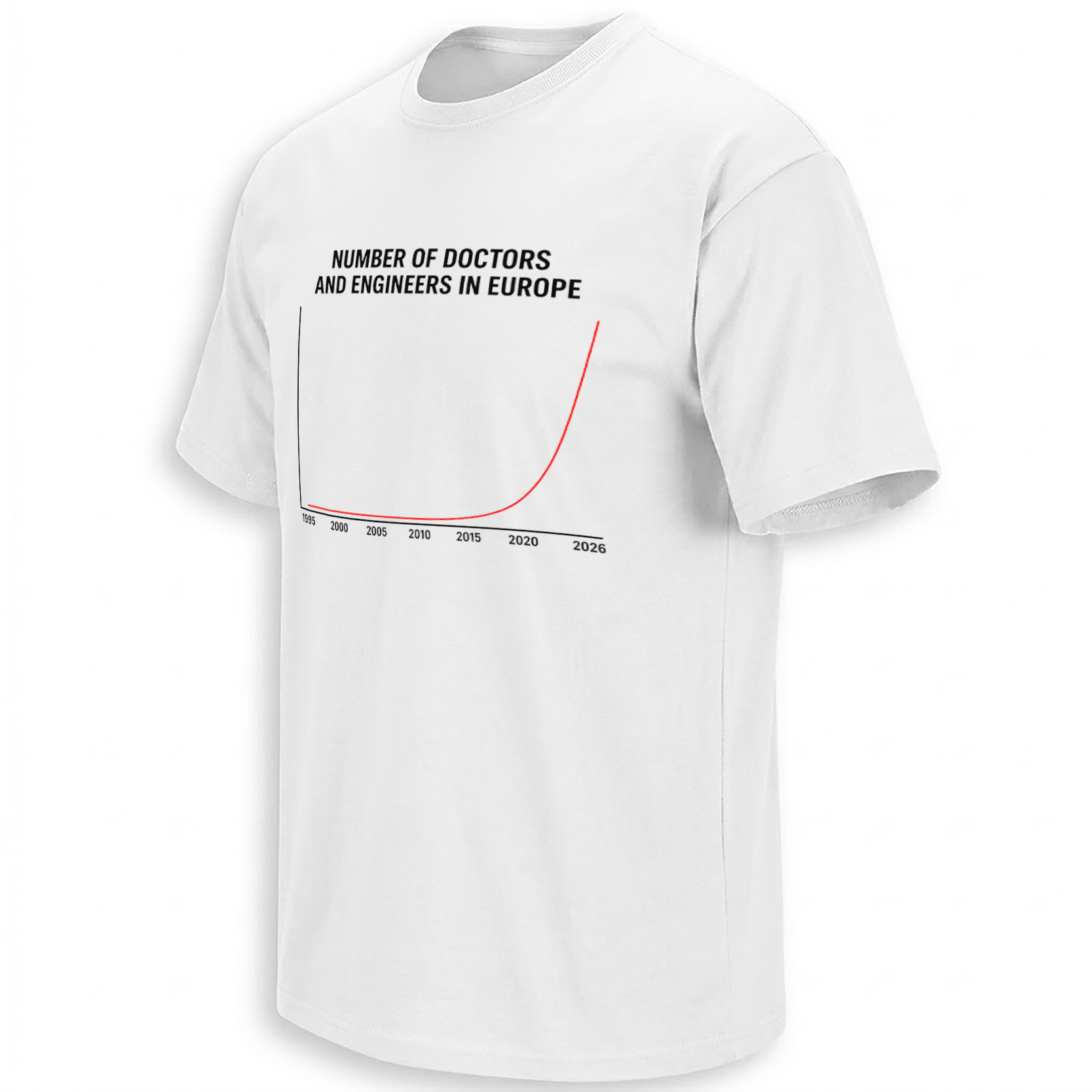
A nearly empty chart suddenly shoots upward beside the caption “Number of Doctors and Engineers in Europe.” It looks like data for about half a second. Then you notice what is missing: no values, no source, no methodology and no explanation. That absence is exactly how the meme works.
The internet has learned how to imitate almost every form of authority: newspaper headlines, scientific diagrams, corporate slides, warning labels and statistical charts. The “Number of Doctors and Engineers in Europe” graphic belongs to that tradition. It borrows the visual grammar of a serious line graph, then removes nearly everything that would make a serious graph useful.
There is an X-axis with years. There is a dramatic line. There is a confident title. But there is no meaningful Y-axis, no unit, no dataset and no source. The upward curve therefore does not demonstrate an actual count of European doctors or engineers. It functions as a visual punchline — a graph-shaped meme whose ambiguity allows viewers to supply the surrounding joke themselves.
By mid-2026, versions of the graphic were appearing repeatedly in Instagram reels, meme-fashion posts and screenshots. The design traveled not because people had suddenly discovered a remarkable new statistical dataset, but because its deadpan presentation looks exactly like the kind of chart people encounter in serious online arguments.
The image borrows the authority of statistics while deliberately withholding the information that would make it statistics.
First: This Is Not a Verified European Statistics Graph
That distinction matters. A graph can become so visually familiar that repetition begins to look like evidence. In this case, searches for the graphic lead primarily to meme posts and apparel references rather than to Eurostat, a research institution or an identifiable dataset.
Real European workforce statistics look very different. Eurostat defines what it is counting, specifies years and populations, publishes datasets and explains the difference between categories. Its current physician statistics, for example, estimate roughly 1.98 million practising physicians across the EU in 2023.
Scientists and engineers are measured separately as part of European science-and-technology employment data. Those categories come with definitions and tables rather than a single unsupported exponential line.
The line printed in the viral design should be read as meme artwork, not as an Ellie Shirt claim that Europe’s real number of doctors or engineers followed that curve. No verified source located during research supported the shirt graph as an actual statistical series.
What Real European Data Looks Like
Comparing the meme with legitimate public statistics makes the joke easier to see. Eurostat publishes separate datasets for practising physicians, medical graduates, science-and-technology workers and scientists and engineers. Each dataset answers a narrower question than the meme’s broad title.

Why Fake Charts Are So Effective as Memes
Charts carry a special kind of internet authority. A sentence asks to be argued with. A chart appears to have already done the arguing. Axes, lines and dates suggest that someone measured something before presenting a conclusion.
Meme culture exploits that reflex constantly. A creator can draw an absurd curve, attach a confident heading and allow the visual form itself to deliver the joke. The less explanation there is, the faster the viewer has to decide what the graph supposedly means.
That speed is crucial. Modern meme formats often work through recognition rather than exposition. Viewers see the graph, notice the dramatic 2020s spike and connect it to whatever online discourse brought them to the image. The graph becomes a container rather than a complete argument.
The Phrase Has a Political Subtext — but the Shirt Never States It
The words “doctors and engineers” also have a life beyond statistics. In European migration debates, those professions are frequently invoked when people argue about skilled immigration, refugees, labor shortages and the economic contribution of newcomers. Supporters and critics of immigration can use the same vocabulary for entirely different reasons.
In some online communities, “doctors and engineers” has therefore become sarcastic shorthand. The phrase can be used to mock optimistic descriptions of migration, while other posts use the professions literally when discussing skilled workers and refugees. That contested background helps explain why a graph this vague can circulate so easily: different audiences read different arguments into it.
The design itself, however, does not identify migrants, nationalities or a policy. It gives the viewer only a title and a curve. Treating it as a verified demographic claim would therefore say much more than the artwork actually says.
How the Meme Is Circulating on Social Media
Current Instagram results show the graph appearing repeatedly in meme compilations, streetwear videos and “what is this shirt?” reaction posts. That pattern matters because the garment has become part of the joke’s delivery system. People do not simply repost the graph; they photograph somebody wearing it, zoom in on it or frame the wearer’s context as the punchline.
That is a classic sign that a graphic has moved from “image meme” into “wearable meme.” The physical object creates a second layer of context. A graph on a feed can be scrolled past. A graph printed across somebody’s back forces the people around it to decode the title before they understand why anyone is laughing.
The Design Is Almost Aggressively Minimal
Visually, the Number of Doctors and Engineers in Europe Shirt does very little, which is precisely why it reads so quickly. Black ground. White headline. White axes. Thin red curve. There is no illustration competing for attention and no secondary text to explain the punchline.
The red line is the only element that behaves emotionally. It begins almost flat, then accelerates upward toward the edge of the graph. In information design, that kind of shape communicates sudden growth. In meme design, exaggerating it creates theatrical certainty without providing any evidence.
The visual language is closer to a screenshot from a badly sourced presentation than a traditional graphic tee. That intentional dryness is what gives the design its contemporary internet character.
Why the Ambiguity Helps the Meme Travel
A highly specific joke expires when its source event disappears. An ambiguous joke can be reused. “Number of Doctors and Engineers in Europe” does not tell viewers exactly what caused the curve, who is included or what the creator believes. The missing explanation creates room for captions, reaction videos and political subtext to accumulate around it.
That ambiguity is also why responsible context matters. A viral graph can look persuasive after enough reposts. The safer reading is the simplest one: this is an internet graphic borrowing the appearance of data visualization, not a replacement for actual European labor or medical statistics.
Frequently Asked Questions
Is the “Number of Doctors and Engineers in Europe” graph real data?
No verified dataset was found matching the viral curve. The graphic does not provide a Y-axis scale, units, methodology or source, so it should be treated as a meme rather than a factual statistical chart.
Why does the graph suddenly rise around the 2020s?
The dramatic rise is the visual punchline. Without a source or numerical scale, the curve communicates exaggerated growth rather than a measurable historical series.
What does “doctors and engineers” mean in European internet discourse?
The professions often appear in discussions about skilled immigration and refugees, and some online communities use the phrase sarcastically. The meme itself does not specify a particular migration statistic or policy claim.
Are there real statistics on doctors and engineers in Europe?
Yes. Eurostat publishes separate datasets for practising physicians and for science-and-technology employment, including scientists and engineers, with definitions, dates and country-level information.
Why does the shirt design look like a data presentation?
Its humor depends on borrowing the visual authority of statistical charts: a title, dates, axes and an upward line are enough to make the viewer initially read the image as data before noticing the missing information.
The Number of Doctors and Engineers in Europe graphic preserves that deadpan format exactly: almost no explanation, one dramatic line and enough statistical language to force the viewer to decode the joke.
Number of Doctors and Engineers in Europe Shirt captures the viral fake-chart meme through stark white axes, a dramatic red curve and deliberately source-free statistical language that turns internet irony into wearable graphic culture.