
You Might Be Drunk
The words appear to slip out of focus before the joke has even landed, turning a familiar drinking line into a wearable vision test.
DESIGN CULTURE FEATURE · UPDATED JULY 27, 2026
The best visual jokes do not merely describe a situation. They make the viewer experience a small version of it. “You Might Be Drunk” achieves that trick by making its own words appear unstable.
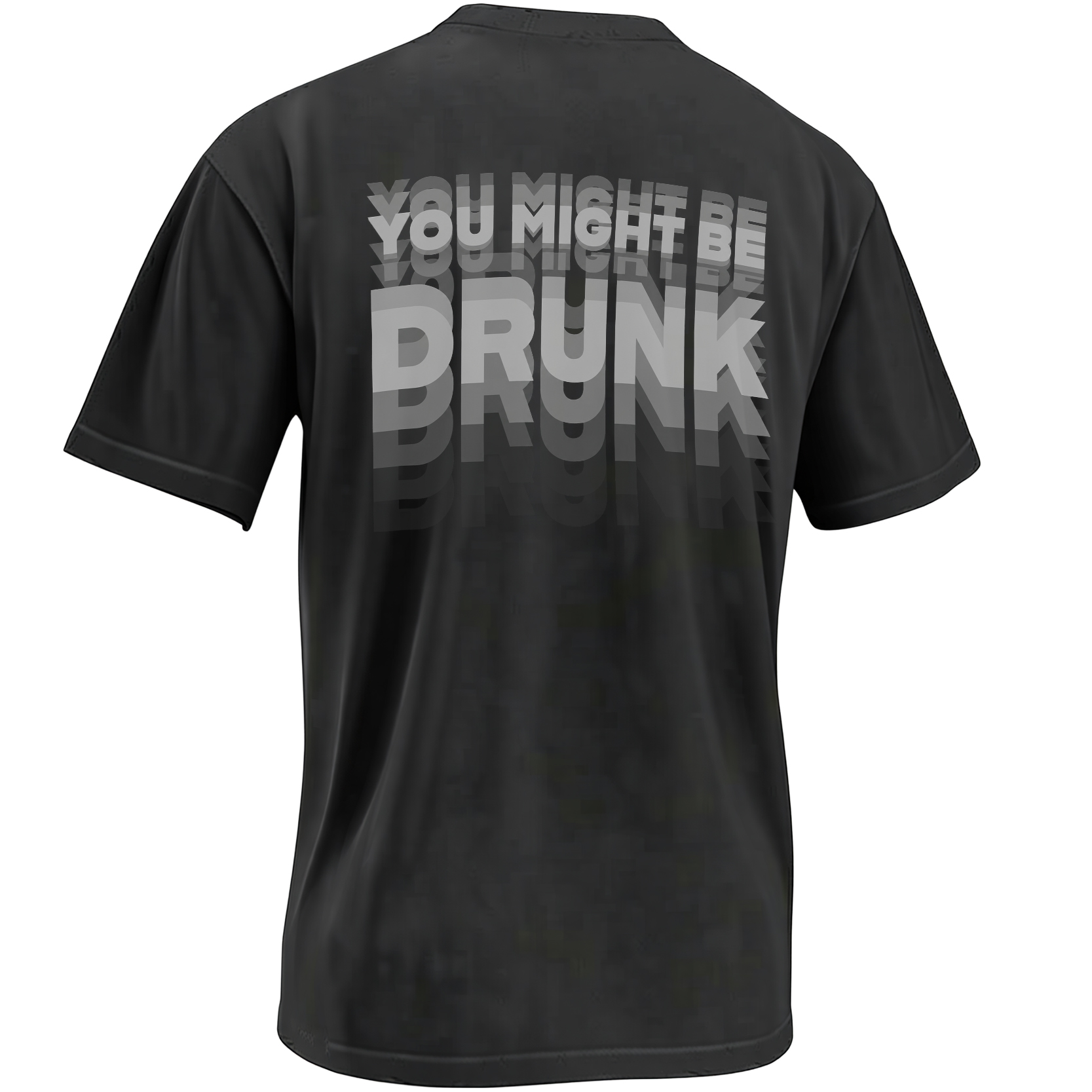
Nothing in the design depicts a beer glass, bottle, cocktail or familiar bar mascot. Instead, the typography performs the entire joke. Each line is repeated, shifted and faded until the message resembles text seen through tired, unfocused or rapidly blinking eyes.
The result sits somewhere between a party shirt, a minimalist optical illusion and the kind of homemade sobriety test a friend might invent after midnight.
The joke happens before the punchline
At first glance, the upper words appear relatively controlled. “YOU MIGHT BE” is presented in bold uppercase lettering, but duplicate versions descend behind it in increasingly dark shades.
Then “DRUNK” arrives at a much larger scale. Its repetitions fall farther and fade more dramatically, giving the impression that the viewer’s focus is sliding down the shirt.
That structure matters. A conventional slogan asks the viewer to read first and laugh second. This one makes confusion part of the reading process, so recognition and punchline arrive together.
The viewer is not simply told that the words are blurry. The viewer has to fight through the blur to reach the joke.
How the optical illusion is constructed
The effect does not depend on complicated imagery. It comes from repetition, displacement and changes in tonal value. Those three elements simulate visual instability while preserving enough clarity for the phrase to remain readable.
The limited greyscale palette is particularly effective on black. Bright color would turn the repetitions into a psychedelic graphic, while the grey layers resemble shadows, afterimages or imperfect visual focus.
The largest readable copy remains light enough to establish the phrase immediately. The darker echoes then extend the experience after the message has been understood.
Why the back print improves the gag
Placing the full design on the back changes how it functions socially. The wearer does not need to introduce the joke or wait for someone to look directly at their chest. The phrase can be discovered from across a room, in a party line or while the wearer is walking away.
That delayed encounter makes the question more playful. Someone may briefly wonder whether the shirt is actually moving, whether the lighting is poor or whether their own vision is responsible for the duplicate lettering.
The oversized back placement also gives the word “DRUNK” enough room to dominate. On a small front print, the darker layers could collapse into one indistinct shape. Across the back, the repetitions remain part of the composition.
More design joke than drinking instruction
The sentence uses the language of drinking culture, but the graphic does not attempt to measure intoxication. It is a visual punchline, not a sobriety test and never a reason to judge whether someone is safe to drive.
If alcohol is part of the event, arrange a sober driver, rideshare or safe place to stay. The shirt can provide the joke; it cannot make the decision.
That distinction allows the design to remain funny without pretending that impaired vision is harmless. Its appeal comes from a familiar party observation—the moment when letters seem more difficult than they should—not from encouraging dangerous behavior.
Why minimalist party shirts stand out
Drinking humor is often overloaded with illustrated mugs, novelty characters and long punchlines. This design removes all of those signals. The wearer gets a monochrome graphic that can initially resemble experimental concert merchandise or a retro optical-art print.
Only after the viewer reads the phrase does the party context become explicit. That two-stage interpretation gives the artwork more visual longevity than a literal illustration of a drink.
The lack of a named holiday also keeps it flexible. It can work at birthdays, bachelor weekends, bar crawls, house parties, concerts or any gathering where self-aware late-night humor fits the room.
A shirt designed to be read twice
Most slogan shirts succeed when the message can be understood in one glance. “You Might Be Drunk” bends that rule. The central phrase is legible, but the shadow copies deliberately pull the eye away and invite a second look.
That rereading is the product’s real interaction. One person sees the back print, tries to stabilize the words and then realizes that the struggle itself is the joke.
The design joins the wider newest designs collection as a compact example of apparel behaving like a meme: the image sets up a small cognitive trap, and the viewer’s reaction completes it.
You Might Be Drunk Shirt FAQ
What does the “You Might Be Drunk” shirt mean?
It is a visual drinking joke. The repeated, blurry-looking letters make the viewer experience the kind of unfocused vision referenced by the phrase.
Is the lettering actually blurry?
The main lettering remains readable. Offset copies in progressively darker grey create the illusion of blur, movement and double vision.
Is this a front-print or back-print design?
The supplied product image shows the full optical-illusion artwork printed prominently on the back of a black shirt.
Why does the design use grey instead of bright colors?
The greyscale layers resemble shadows and visual afterimages. They also create depth against the black garment without overpowering the central words.
When could someone wear this shirt?
Its visual joke suits adult birthdays, bachelor weekends, bar gatherings, concerts and casual parties where playful drinking humor is appropriate.
Read it once. Then try again.
Explore the monochrome back print that turns one short party line into a full optical illusion.