
Shadow Wanted to Destroy the Planet — So the Internet Gave Him Six Corporate Sponsors
One of Shadow the Hedgehog’s most extreme lines has escaped its 2005 ending and entered a new form of meme history: cigarette cowboys, desert tobacco, red-label beer, green lager, Tennessee whiskey and neon gaming soda all recruiting the Ultimate Life Form for the same impossible campaign.
“With the power of these Emeralds, I’m going to destroy this damn planet.” The sentence was designed as the climax of one possible dark route in Shadow the Hedgehog, but its cultural afterlife has become larger than the ending that produced it.
The line is memorable because it commits completely. Shadow does not merely threaten one enemy, one city or one military organization. He escalates directly to the entire planet, declares that this destruction represents his true identity and follows the announcement with the kind of villainous laughter that makes the scene impossible to experience neutrally.
For some players, it was proof that the 2005 game pushed the character’s darkness too far. For others, that excess became the appeal. Over time, the dialogue transformed into a reaction phrase for bad news, social-media exhaustion, gaming frustration and any moment when ordinary annoyance feels dramatically insufficient.
The six “Destroy This Damn Planet” graphics take the next logical step. They imagine that Shadow’s apocalypse has acquired a marketing department — and that every major category of retro American advertising is competing to sponsor it.
The joke is no longer that Shadow wants to destroy the planet. The joke is that corporate advertising has found a way to turn the apocalypse into lifestyle branding.
Why This Line Survived the Game That Created It
Shadow the Hedgehog was built around unstable identity. Players moved between heroic, neutral and dark missions, allowing the character to arrive at radically different conclusions about his purpose.
The structure produced an unusual type of dialogue. Each ending had to sound final even though another playthrough could create an entirely different Shadow. As a result, the speeches often compressed a complete worldview into a few theatrical sentences.
“Destroy this damn planet” became especially durable because it combined several elements already associated with the game: the repeated use of “damn,” the Chaos Emeralds, Shadow’s identity crisis and the project’s determination to make a cartoon platform character sound like the protagonist of an early-2000s action drama.
Removed from its original route, the sentence becomes an all-purpose overreaction. It can describe a failed boss fight, a broken controller, a terrible update, a social platform outage or the discovery that someone has reheated fish in an office microwave.
The phrase belongs to one possible dark ending, not the character’s single permanent ideology. The game’s branching route system deliberately presents multiple incompatible versions of what Shadow may decide to become.
Why Shadow Fits Cigarette, Beer and Whiskey Advertising So Well
Classic lifestyle advertising rarely sold only the object in the package. It sold an imagined person: independent, dangerous, masculine, worldly, rebellious or impossible to control.
Shadow already arrives with those qualities pre-installed. He rides a motorcycle, uses weapons, refuses authority, speaks in declarations and carries a red-black silhouette that looks as though it was designed for high-contrast packaging.
That makes him ideal for parody. The graphics do not need to rewrite his personality to fit old cigarette or liquor ads. They simply place him inside visual systems that had been selling Shadow-like attitudes long before the character existed.
The Smoking Design Turns Shadow Into a Red-Label Cowboy
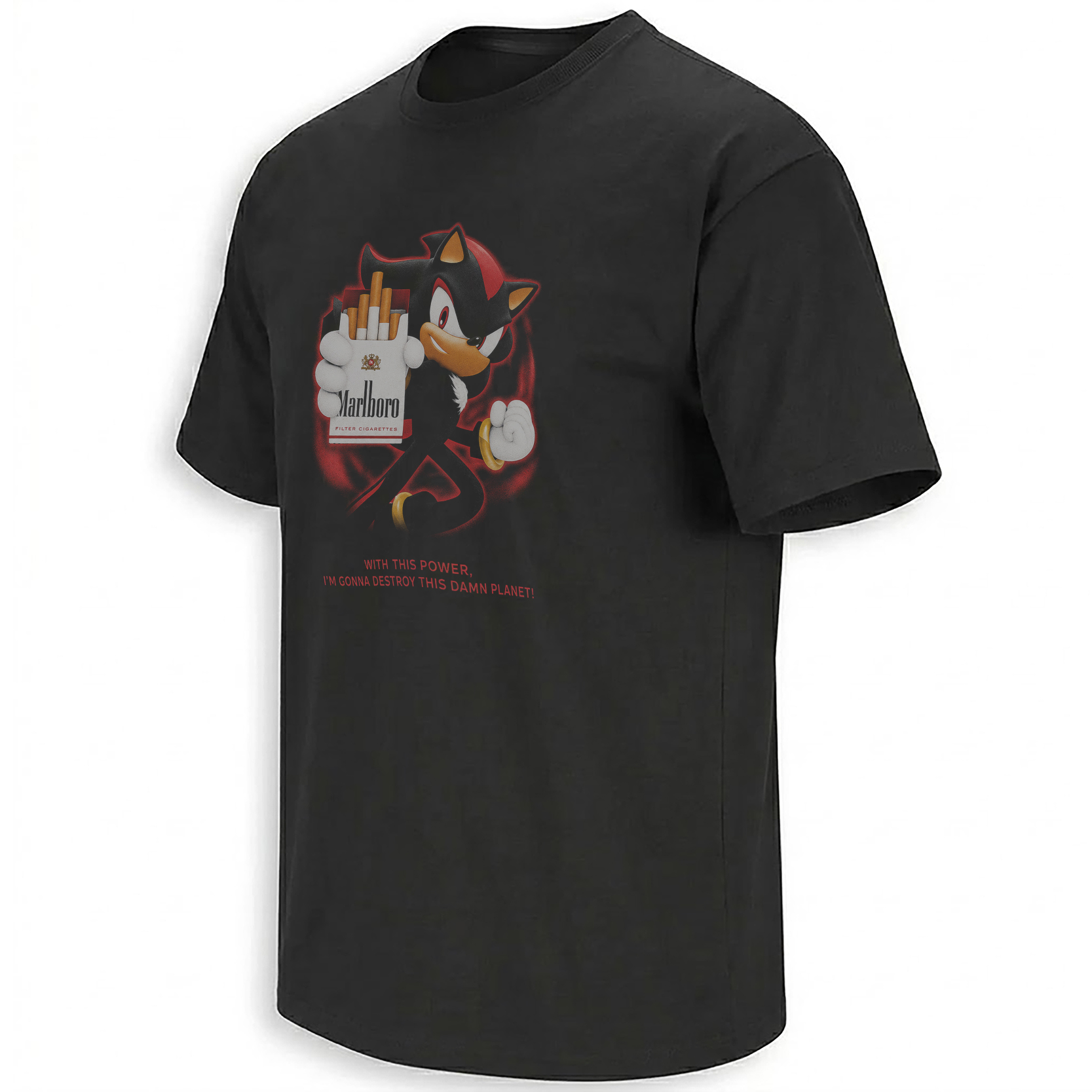
The Shadow Smoking Shirt is the clearest entry point into the collection because it merges Shadow’s own palette with the most recognizable visual structure in vintage cigarette advertising.
Black surrounds the composition. Red and white type create a hard rectangular hierarchy. Shadow occupies the role normally given to a solitary cowboy or rugged adult figure, with the cigarette functioning less as a realistic behavior than as shorthand for a forbidden early-2000s antihero pose.
“Destroy This Damn Planet” becomes the campaign line. Instead of promising smoothness, freedom or frontier independence, the advertisement offers the complete elimination of the consumer environment.
Six Versions of the Same Corporate Apocalypse
A weaker collection would place the same Shadow drawing beneath six changed logos. These designs work because the surrounding visual world changes with each reference.
The cigarette pieces are dry, desert-like and solitary. The beer graphics rely on label recognition, heritage color and bar-sign confidence. The whiskey version becomes darker and more formal. Mountain Dew abandons restraint entirely and pushes Shadow into the fluorescent vocabulary of gaming culture.
The six designs move from outlaw cool to desert absurdity, beer-label bravado, old-world lager parody, black-label villainy and neon gamer destruction. The quote remains constant; the cultural costume changes around it.
The sharpest Shadow color match in the series, using black, red and white to transform the Ultimate Life Form into the final cowboy of a doomed planet.
Open the outlaw campaign →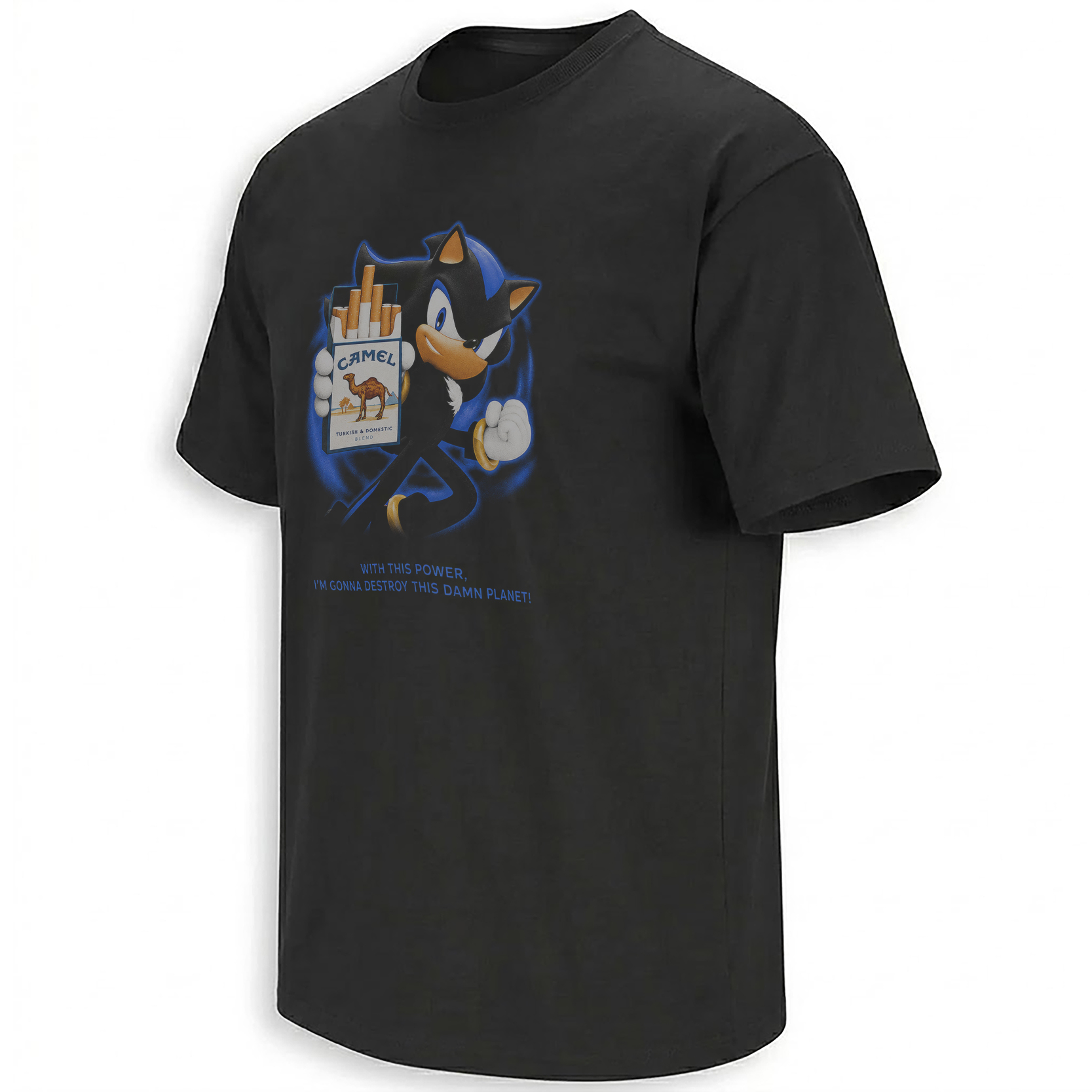
Warmer sand tones and vintage desert-commercial styling make Shadow look like a wandering destroyer who crossed the entire wasteland to deliver one final threat.
Enter the desert route →
Red label structure, ornate lettering and mass-market confidence turn Shadow’s threat into the official slogan of an interplanetary dive bar.
View the red-label parody →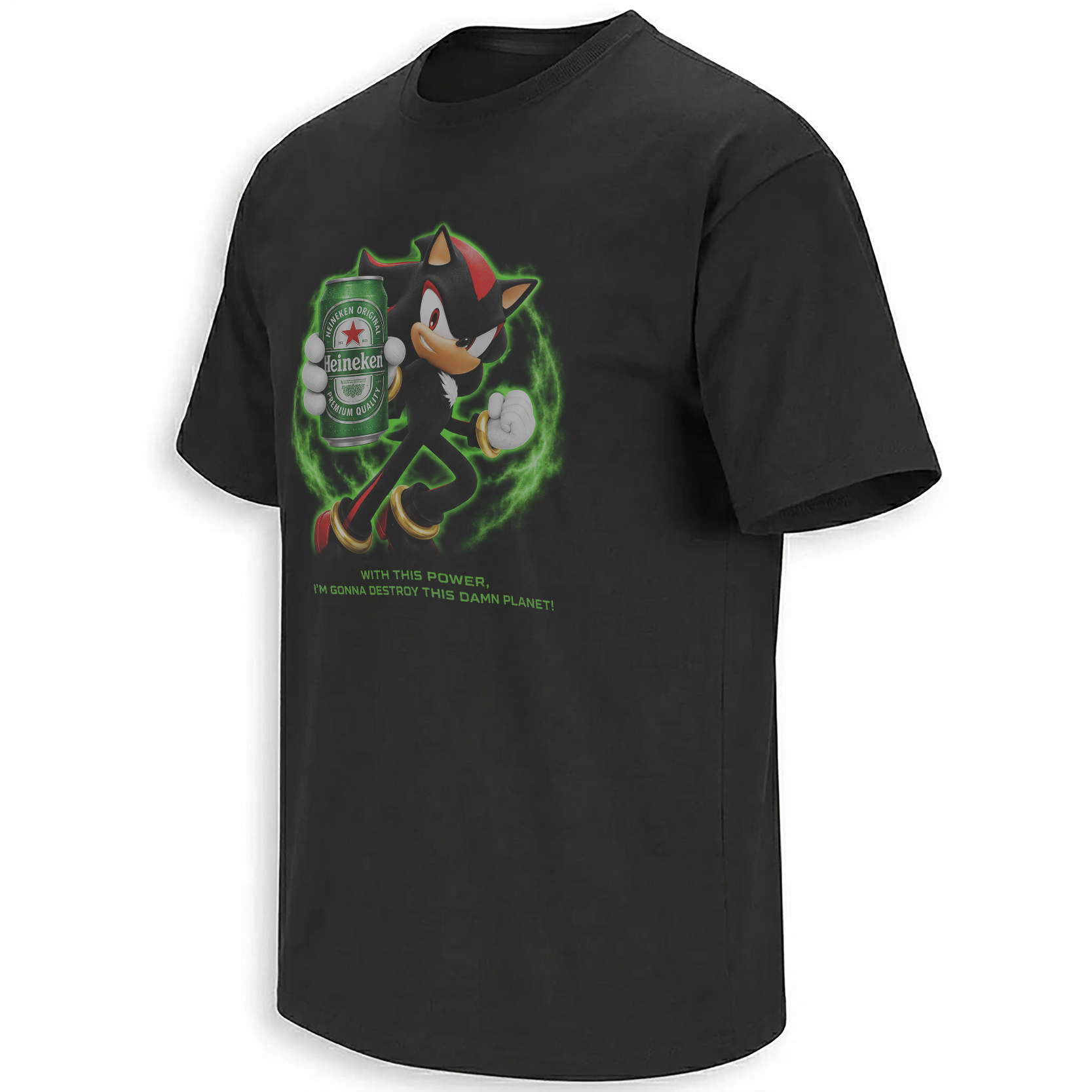
Green, white and red create the most polished label treatment in the series, making total planetary destruction appear strangely international and respectable.
Open the green-label route →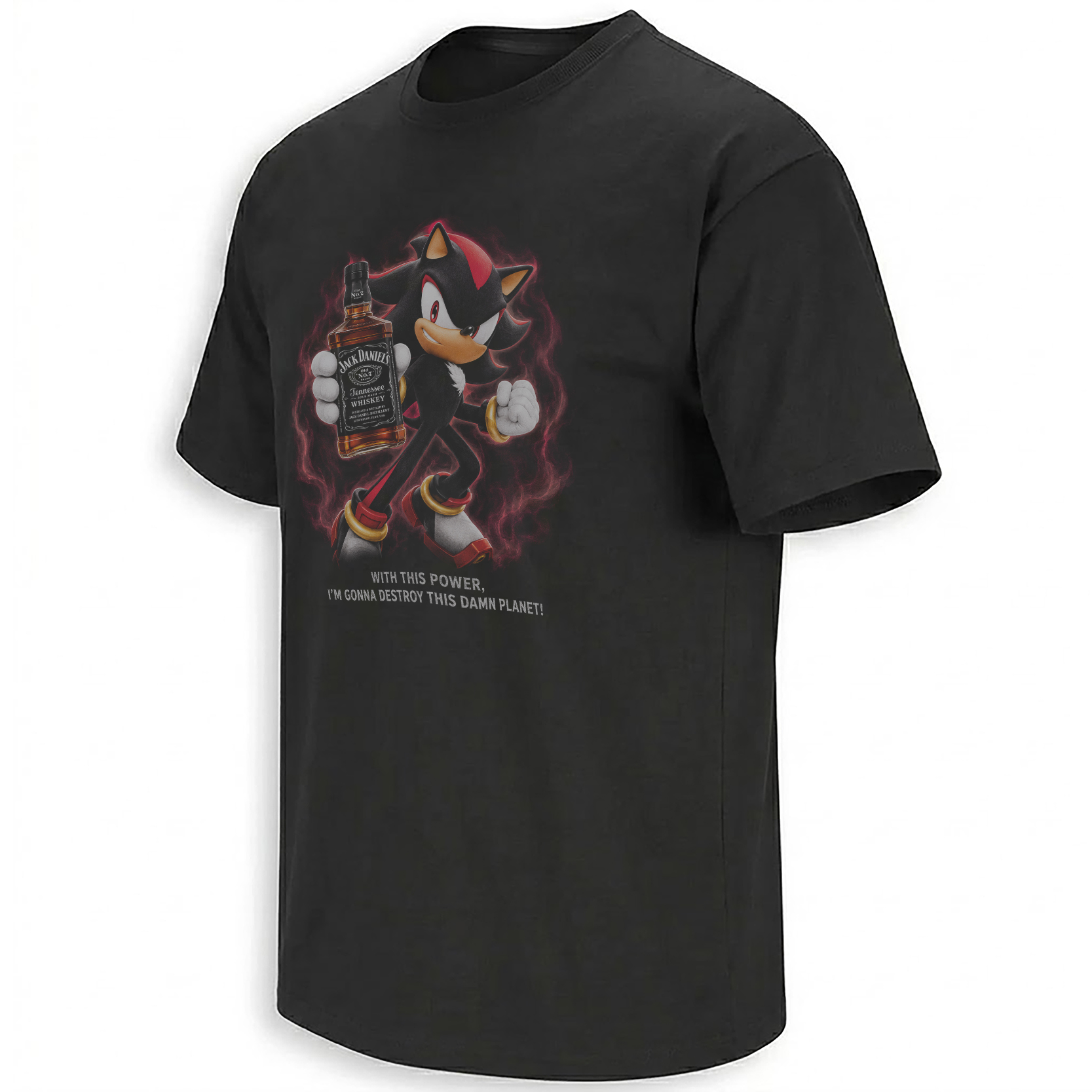
The most formal villain graphic in the set, using black-label typography and Tennessee-whiskey structure to make Shadow’s identity speech feel aged, bottled and legally certified.
Read the black-label threat →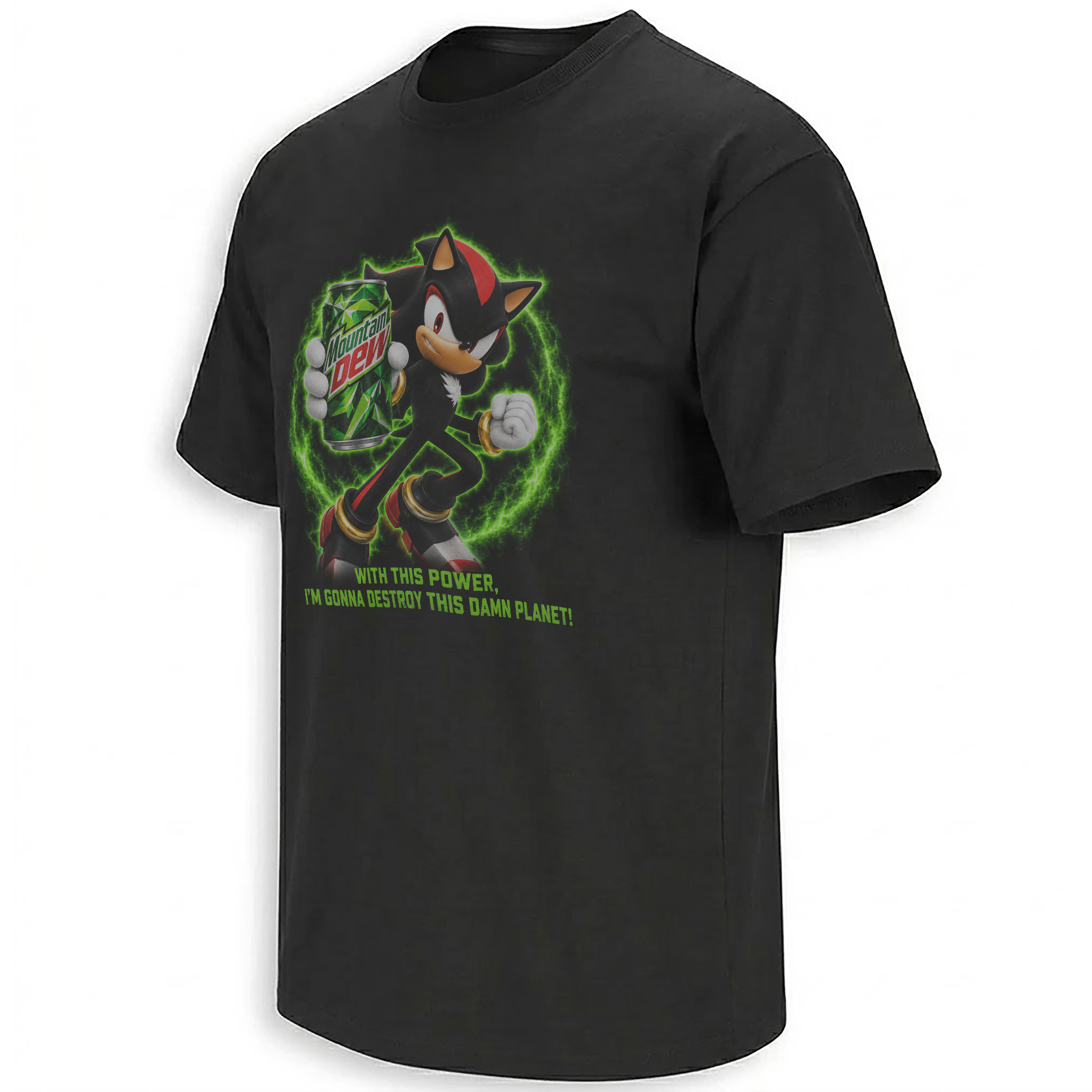
Acid green, explosive angles and gaming-soda aggression move the quote out of the roadside billboard and into the all-night console era that originally produced it.
Activate the neon route →Which Shadow Design Has the Strongest Personality?
Best for the cleanest Shadow color match, direct antihero energy and the strongest resemblance to an outlaw lifestyle advertisement.
Best for faded vintage tones, surreal wasteland humor and a design that looks rescued from an alternate-universe roadside archive.
Best for bold bar-sign visibility, large label structure and a loud parody that reads immediately from across a room.
Best for crisp contrast, clean European-label styling and the strangest collision between polished branding and Shadow’s destructive dialogue.
Best for gothic label detail, dark garments and fans who prefer a formal villain aesthetic over bright gaming color.
Best for early-2000s gaming nostalgia, high-energy color and the version most directly connected to the console culture surrounding the original game.
Why the Cigarette Parodies Feel Like Lost Shadow Concept Art
The cigarette versions are especially effective because the visual reference overlaps with the 2005 game’s own attempt at maturity.
Shadow carried firearms, rode vehicles and operated inside city streets, military facilities and ruined industrial spaces. The game wanted danger to appear tangible, not abstract. Cigarette advertising uses a similar language of adult-coded danger, independence and self-destructive cool.
The red-label version brings those systems together almost seamlessly. Shadow’s quills create the same diagonal motion as flame or smoke. His red markings act like packaging accents. His expression provides the detached confidence that vintage advertisements once assigned to cowboys, pilots and men standing alone against impossible landscapes.
The parody therefore exposes how much of “edgy Shadow” was already built from commercial signals audiences knew how to read.
The Beer Designs Turn Apocalypse Into Heritage Branding
Beer advertising often relies on continuity. Labels imply that the product has existed for generations, surviving cultural shifts because its identity is too established to disappear.
Placing Shadow inside that structure creates immediate absurdity. He is a character defined by unstable memory and identity, yet the beer parodies present his desire to destroy Earth as though it were a traditional family recipe.
The red version is louder and more American in tone. It treats Shadow like the king of an enormous entertainment system built around spectacle, confidence and repeated visual recognition.
The green version is cleaner. Its polished label hierarchy makes the threat feel almost premium, as though planetary destruction has passed quality control and can now be exported worldwide.
The Whiskey Version Gives Shadow a Villain’s Legal Document
Black-label whiskey design relies on dense hierarchy: location, recipe, number, tradition, legal language and decorative borders. The label appears authoritative because it looks as though every word has been approved by history.
Shadow’s dialogue benefits from that treatment. “Destroy This Damn Planet” stops reading like an impulsive outburst and begins to resemble an officially registered method.
The near-monochrome palette also fits the character’s visual severity. White lettering cuts through black, while small decorative elements create the feeling of an artifact that belongs in a locked cabinet aboard the Space Colony ARK.
Among the six designs, this is the one closest to gothic merchandise. It does not depend on neon humor or bright commercial recognition. Its joke is carried through authority, formality and the ridiculous idea that Shadow’s darkest ending deserves a heritage seal.
Mountain Dew Brings the Meme Back to Its Natural Habitat
If cigarette and liquor parodies imagine Shadow as an adult lifestyle icon, the Mountain Dew version returns him to the room where many players first encountered the line: a console, a television, a controller and a game whose darkness felt especially intense because the audience was young.
Acid green is the opposite of Shadow’s usual palette, which makes the red and black character explode against it. Angular lettering, energy bursts and compressed composition create the visual noise of early gaming sponsorship.
The design does not pretend to be tasteful. That refusal is the point. Shadow the Hedgehog was never remembered for restraint. The game’s dialogue, guns, branching morality and alternative-rock soundtrack represented a period when franchises pursued maturity through accumulation.
The Mountain Dew parody celebrates that accumulation. More color, more energy, more danger, more attitude and a target significantly larger than necessary.
How Shadow Became the Mascot of Deliberate Overreaction
Shadow’s greatest meme advantage is that he says extreme things with complete seriousness. He does not glance toward the audience to acknowledge the joke. He does not reduce the threat after realizing how excessive it sounds.
That sincerity makes him useful online. Meme culture often places dramatic fictional dialogue beside ordinary disappointment. The distance between the original stakes and the new context creates the humor.
“I’m going to destroy this damn planet” can follow the cancellation of a favorite show, a failed delivery, a bad sports result or a software update that moved one button. The statement becomes funnier as the triggering event becomes smaller.
The parody-brand series adds another layer by imagining that the overreaction has become commercially successful. Shadow is no longer only angry. His anger has a logo system, target demographic and shelf strategy.
From One Ending to a Complete Meme Timeline
SEGA releases Shadow the Hedgehog across GameCube, PlayStation 2 and Xbox, expanding the character’s identity through weapons, vehicles and branching morality routes.
One ending has Shadow use the Chaos Emeralds as the foundation for a threat against the entire planet, followed by a declaration that this is his true identity.
Players repeat the line alongside other famously excessive phrases from the game, using it as both affection and criticism.
The quote moves beyond Sonic discussion and becomes a general response to frustration, online chaos and intentionally exaggerated despair.
Cigarette, beer, whiskey and soda structures transform the dialogue into a collection of imaginary campaigns for the end of the world.
Why the Collection Works Better Than One Standalone Graphic
A single parody asks whether the viewer recognizes one brand language. A series creates a larger question: which version of commercial culture best explains Shadow?
Is he the lone cowboy, the desert wanderer, the king of a red-label empire, the polished international villain, the black-label antihero or the neon mascot of console excess?
There is no single correct answer because Shadow has occupied all of those emotional positions across games, films, comics and fan culture. The character can be tragic, cool, unintentionally funny, sincere, ridiculous and genuinely heroic within the same broader mythology.
The six designs preserve that instability. They do not resolve who Shadow is. They give him six new opportunities to declare it.
The Visual Details That Keep the Parodies Readable
Recognition depends on balance. Too much direct copying would reduce the artwork to a replaced logo. Too little reference would remove the joke.
Each design therefore focuses on broad visual grammar: label shape, dominant color, typographic hierarchy, framing, background mood and the emotional promise associated with the category.
Shadow remains the anchor. His face, quills, gloves and red markings ensure that the first read is character-driven. The surrounding advertisement becomes the second read, and the “Destroy This Damn Planet” phrase completes the third.
This three-stage recognition is what makes the graphics effective in public. Someone can respond to Shadow without knowing the exact reference, recognize the parody without knowing the game quote or understand all three layers at once.
The Collection Belongs to the Strange History of Sonic Merchandise
Sonic culture has always moved easily between official brightness and fan-made darkness. The same franchise that produces colorful platforming, mascot comedy and family films also contains military experiments, orbital weapons, dead friends, government conspiracies and characters debating whether humanity deserves protection.
Shadow sits at the center of that contradiction. He is recognizable enough for broad pop culture and emotionally exaggerated enough for niche meme communities.
The wider SONIC collection reflects that range, moving between nostalgia, character jokes, gaming references and the darker visual mythology surrounding Shadow.
The Newest collection places the six parody graphics inside a broader record of current internet language — the moment when one old game quote can suddenly generate an entire alternate advertising universe.
Frequently Asked Questions
Where does “I’m going to destroy this damn planet” come from?
The line comes from one of the dark endings in the 2005 Shadow the Hedgehog game, where Shadow uses the Chaos Emeralds and declares his intention to destroy the planet.
Is destroying the planet Shadow’s official permanent goal?
No. The game uses branching routes and multiple endings. The quote belongs to one possible dark outcome rather than a single permanent version of the character.
Why did the quote become a meme?
Its dramatic delivery, extreme scale and complete seriousness make it useful as an exaggerated reaction to ordinary frustration.
What is the idea behind the cigarette and alcohol parody designs?
The graphics place Shadow inside vintage lifestyle-advertising systems that traditionally sold rebellion, independence, danger, heritage or masculine confidence.
What is the difference between the Marlboro-style and Camel-style Shadow designs?
The red-label version emphasizes Shadow’s black-red color identity and outlaw confidence, while the desert version uses warmer sand tones and a wandering wasteland atmosphere.
Why are there Budweiser, Heineken and Jack Daniel’s-style versions?
Each label language creates a different joke: mass-market red-label spectacle, polished green international branding and formal black-label heritage.
Why does the Mountain Dew version fit Shadow the Hedgehog?
Its neon gaming aesthetic connects directly to the console culture and early-2000s energy surrounding the original game.
Do the designs encourage smoking or alcohol use?
The graphics use historical advertising styles as parody. Their cultural subject is Shadow’s exaggerated antihero persona and the absurdity of branding planetary destruction.
Which Shadow Destroy This Damn Planet design is the most subtle?
The black-label whiskey version is the most restrained and artifact-like, while the Mountain Dew version is the loudest and most visibly gaming-oriented.
Begin with the red-label smoking parody, move into the formal darkness of the black-label whiskey design, or embrace full console-era chaos through the Mountain Dew gaming version. The complete SONIC visual archive preserves every version of the Ultimate Life Form — tragic hero, accidental comedian and fully branded planetary threat.
Shadow Destroy This Damn Planet shirts transform the infamous 2005 game quote into six retro advertisement parodies inspired by cigarette cowboys, desert tobacco, red and green beer labels, black-label whiskey and neon Mountain Dew gaming culture.