
The “1970s vs Now” Graph Looks Like Data. That Is Exactly Why the Joke Works.
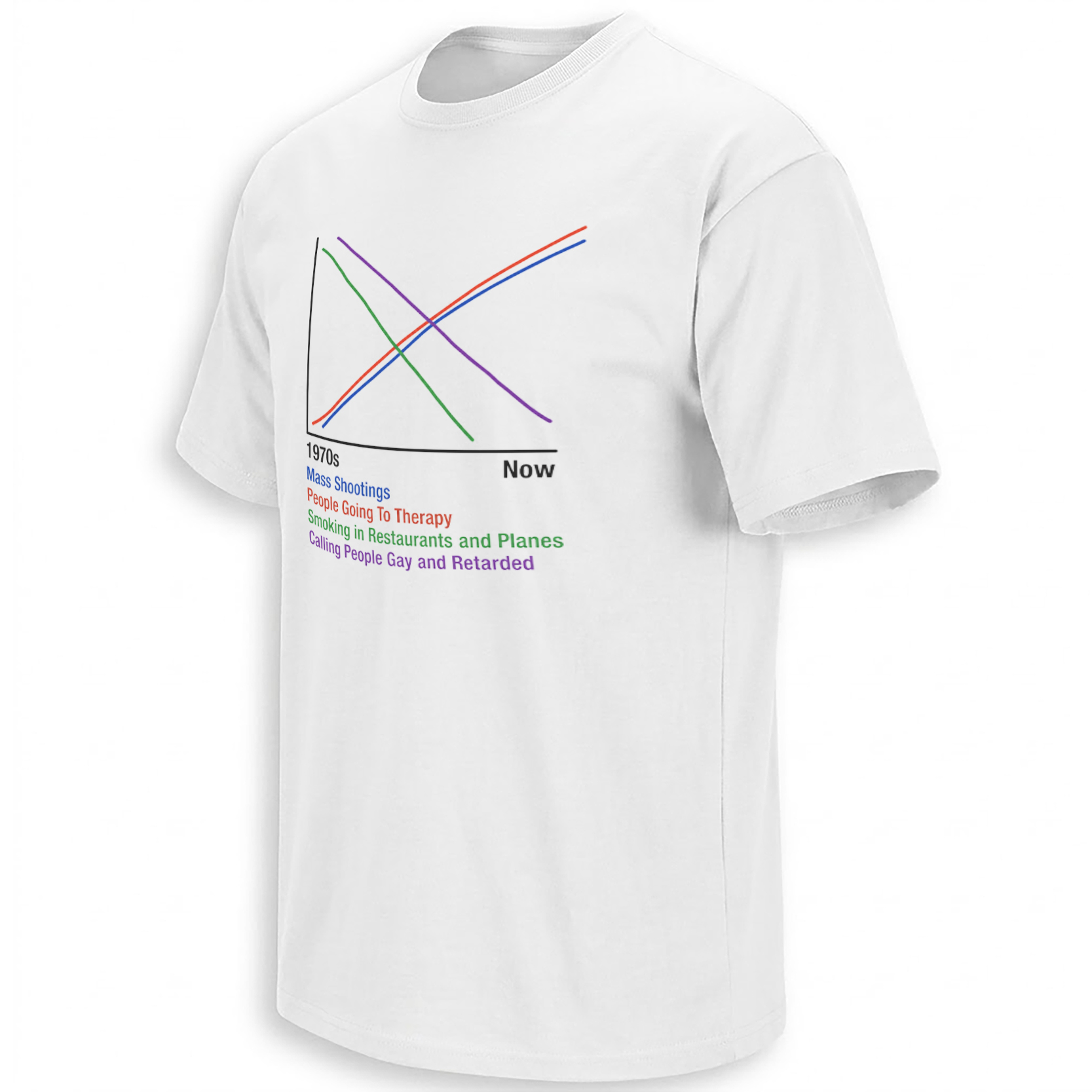
Mass shootings rise. Therapy rises. Smoking in restaurants falls. An outdated insult supposedly falls too. Four colored lines cross in the middle and invite the viewer to discover a conclusion the chart never actually proves.
The smartest reading of the “1970s vs Now” graph begins with one important fact: it is not a serious statistical visualization. There is no defined dataset, no numerical scale, no cited source, no geographic label and no methodology explaining how four radically different social phenomena could be plotted on the same vertical axis.
That absence is not a small flaw hidden in the design. It is the mechanism that makes the image memeable. The graph borrows the authority of data presentation while behaving like a bar-room argument drawn with four markers.
An older copy circulating on Reddit’s r/data_irl generated exactly that reaction. Commenters immediately questioned the unlabeled axes, joked about arbitrary lines and pointed out the oldest statistical trap in the image: two things changing at the same time does not demonstrate that one caused the other.
The graph does not persuade by proving anything. It persuades by making four lines look as though somebody already did the proving.
The Original Meme Is Almost Proud of Being Bad Data
The r/data_irl version is visually crude: a black X/Y frame, “1970s” at the left, “Now” at the right and four brightly colored lines traveling through empty statistical space.

The responses are revealing because many readers do not treat the chart as a claim that requires solemn debunking. They treat its bad methodology as part of the comedy. One commenter compares the logic to ice-cream sales and murder increasing together; another points toward classic joke correlations involving unrelated variables.
That puts the image inside an established internet tradition: the deliberately persuasive nonsense graph.
Correlation Is the Real Punchline
The visual quietly invites a causal story. Therapy goes up. Mass shootings go up. Public smoking goes down. Social language becomes less casually offensive. Put those trends together and the viewer is tempted to infer that modern social progress somehow produced modern dysfunction.
But a graph cannot establish that relationship merely by drawing lines beside each other.
Therapy visits, shootings, smoking rules and language frequency are different phenomena that cannot meaningfully share an unlabeled Y-axis.
The meme never specifies whether it means the United States, another country or the world, even though all four trends vary dramatically by place.
Even if two measured trends moved together, that alone would not establish that one produced the other.
Reading the design as dark satire is different from treating it as evidence about gun violence, therapy or social change. The artwork is strongest as a parody of how easily charts can make a cultural argument look scientific.
Why “1970s vs Now” Is Such Effective Nostalgia Bait
The horizontal axis is doing almost as much work as the colored lines. “1970s” and “Now” create a familiar internet frame: there was a simpler past, the present is strange, and somewhere between those two points society supposedly lost the plot.
This structure appears constantly in generational memes because it compresses fifty years of history into a binary choice. There is no messy middle, no population change, no legal change, no technology, no media environment and no distinction between visibility and actual incidence.
That simplification makes weak history but excellent meme architecture.
The joke is able to operate simultaneously for two audiences. Someone can read it straight as cynical social commentary. Someone else can laugh specifically because the chart is such a ridiculous way to make that argument.
The MS Paint Look Makes the Graphic Better, Not Worse
Polished charts usually signal institutions: newspapers, research organizations, investor presentations or government reports. This image signals the opposite. The lines look hand-drawn, the labeling is blunt and there is no effort to simulate academic professionalism beyond the bare minimum shape of a graph.
That tension is what the 1970s vs Now Graph Shirt preserves. Its visual language sits somewhere between an economics textbook diagram and something somebody scribbled after deciding they had solved modern civilization.
The Darkest Line Is Also the One That Needs the Most Care
Mass shootings are not an abstract punchline for people affected by real attacks, and the meme’s use of them creates much of its discomfort. That discomfort is intentional dark-humor territory, but it also makes the difference between satire and factual claim especially important.
Serious research on mass violence considers multiple interacting factors rather than a simplistic “therapy went up, therefore shootings went up” storyline. Mental-health treatment itself should not be treated as shorthand for dangerousness, and the existence of a rising line on an unsourced meme cannot establish the causes of violence.
The more defensible cultural interpretation is therefore not “this graph proves why shootings happen.” It is “this graph demonstrates how quickly viewers can build a causal story when a picture merely places trends beside each other.”
Why the Meme Keeps Getting Reposted
Internet artifacts survive when they can create argument without requiring context. This graph does that almost instantly. People can dispute the lines, agree with its nostalgia, criticize its language, challenge the statistics or laugh at the pseudo-scientific presentation.
In other words, nearly every reaction becomes engagement.
The wider newest Ellie Shirt graphic archive contains similar internet artifacts whose meaning comes from pre-existing meme language rather than ordinary product storytelling. Because there is no confirmed dedicated collection for this exact meme category, the article does not invent one.
Frequently Asked Questions
Is the 1970s vs Now graph based on real statistical data?
The circulating meme does not provide a dataset, numeric Y-axis, geographic scope, methodology or citations, so it should not be treated as a legitimate statistical chart.
What is the joke behind the graph?
It places several unrelated social trends on the same chart and encourages the viewer to infer a provocative story from their directions, parodying both nostalgia arguments and bad correlation logic.
Does the graph prove that therapy is connected to mass shootings?
No. Drawing two upward lines next to each other does not establish a causal relationship, and the meme provides no evidence capable of making that claim.
Why does the graphic look intentionally crude?
The MS Paint-style presentation strengthens the satire by giving an extremely broad cultural argument the visual confidence of a chart without the supporting structure of real data visualization.
Why does the meme still generate debate?
It combines nostalgia, gun violence, therapy, public-smoking culture and changing social language, allowing readers to disagree with either its politics, its statistics or the joke itself.
That is precisely what makes the 1970s vs Now graphic such an effective internet artifact: it looks just scientific enough to make a ridiculous cultural argument visually irresistible.
1970s vs Now Graph Shirt captures the dark-humor meme that compares mass shootings, therapy, public smoking and changing social language through an intentionally crude pseudo-statistical chart built around correlation-versus-causation satire.