
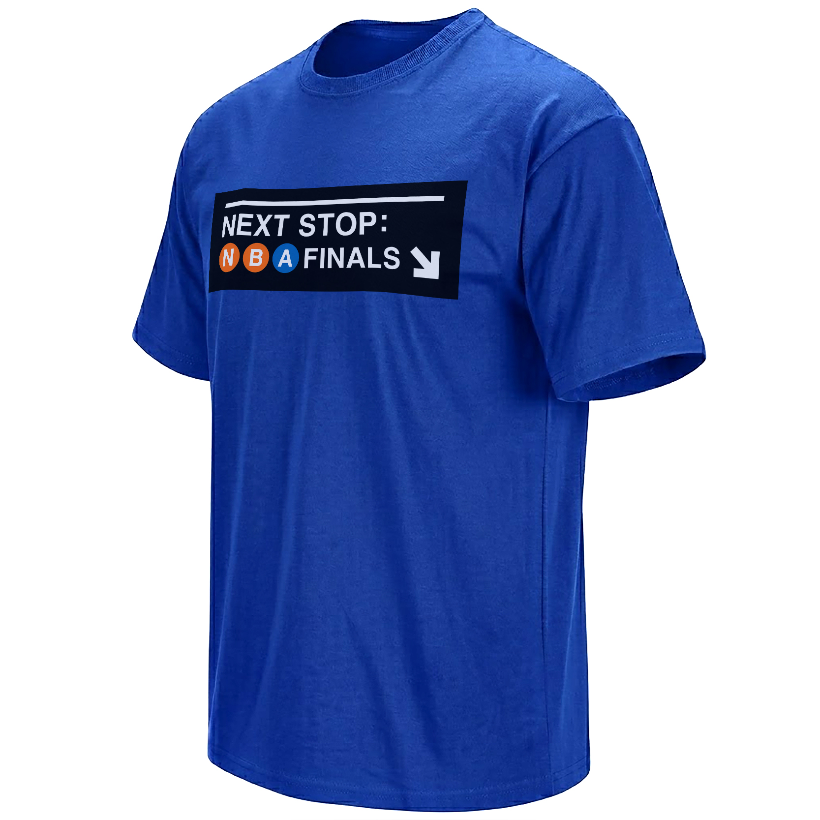
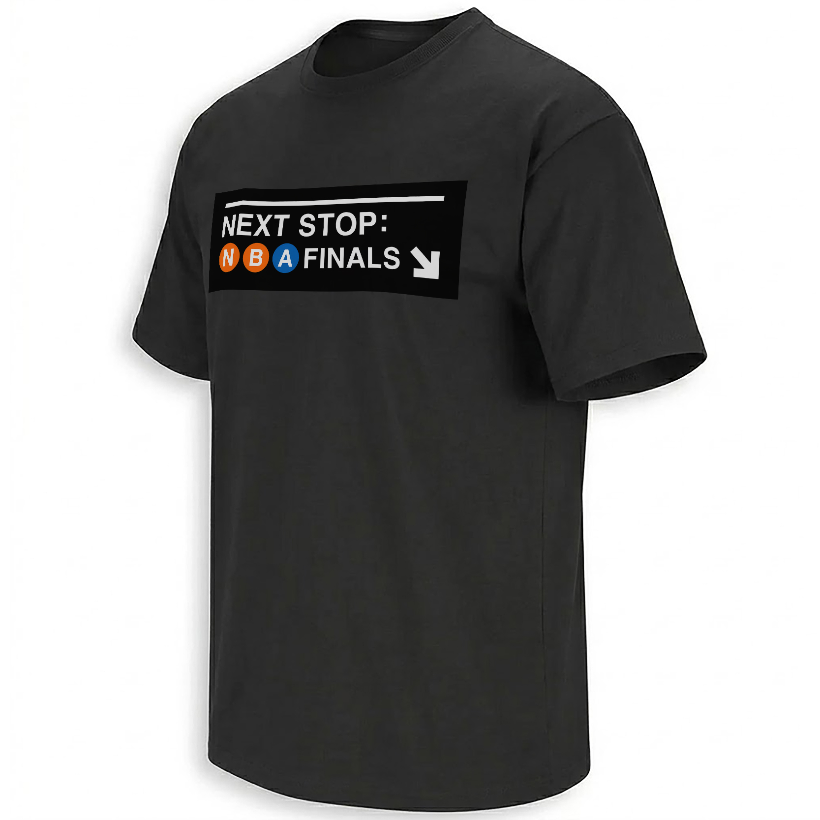
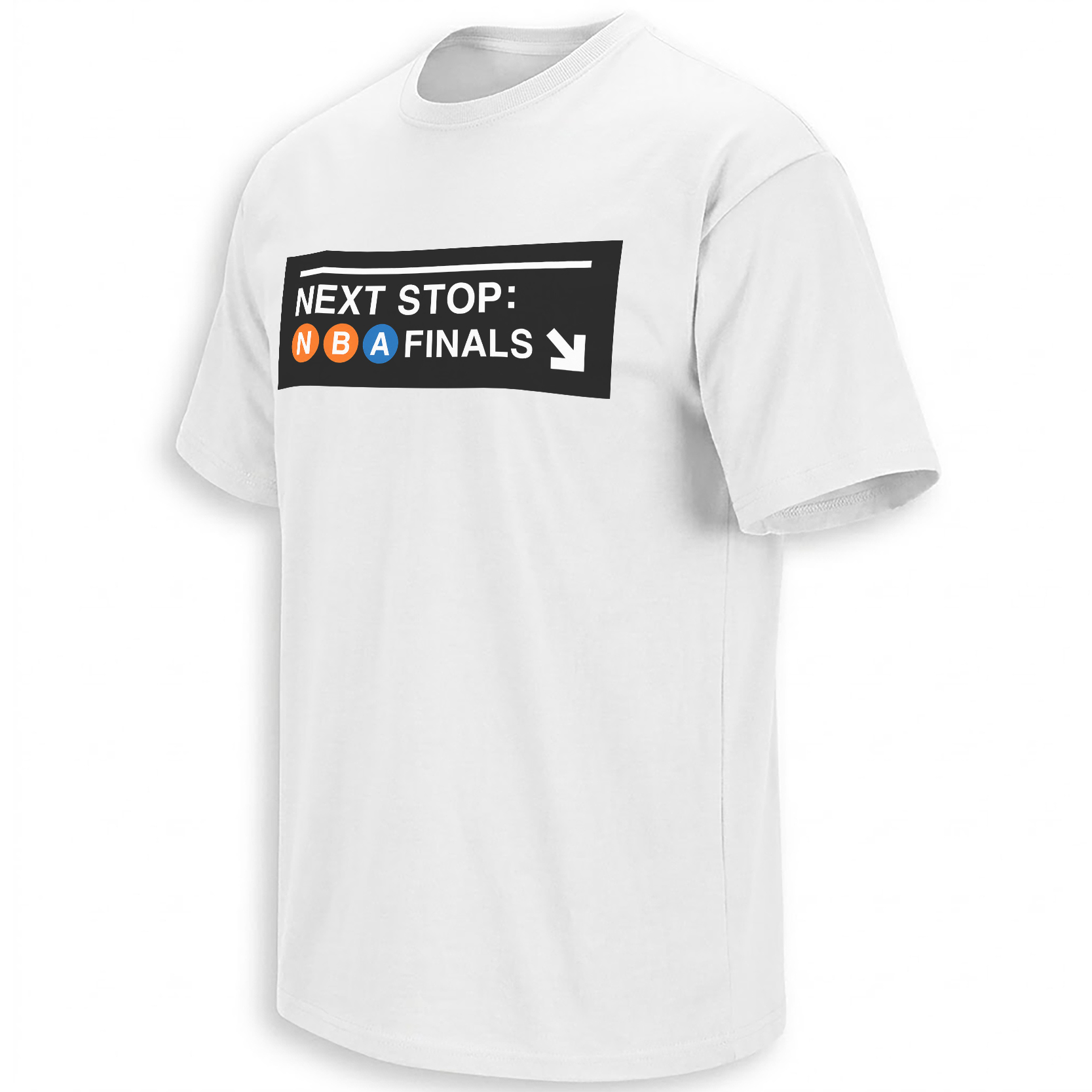
Next Stop NBA Finals: The Knicks Subway Sign Tee Feels Like the City Saying It Out Loud
Some playoff graphics feel like merchandise. This one feels like a train announcement. After twenty-seven years of waiting, New York did not need a whisper. It needed a sign.
The internet already knew the route
The Knicks did not just advance. They turned the Eastern Conference Finals into a city-wide pressure release. New York closed the series against Cleveland with a 130–93 Game 4 blowout, completed the sweep, and pushed the franchise back into the NBA Finals for the first time since 1999.
That is why the Next Stop NBA Finals Shirt New York Knicks lands differently. The phrase feels simple because the emotion behind it is not. It carries subway noise, Garden tension, group chat chaos, old highlights, Spike Lee flashbacks, Jalen Brunson MVP talk, and every Knicks fan who kept believing when believing was exhausting.
New York does not celebrate quietly. The fan base turns a playoff run into street language. A sign becomes a slogan. A slogan becomes a shirt. A shirt becomes proof that you were there when the city finally changed stations.
Why the subway-sign idea works so well for Knicks fans
New York basketball has always been tied to place. The Garden. Penn Station. The walk up Seventh Avenue. The noise before tipoff. The feeling of seeing orange and blue everywhere before a playoff game even starts.
That is what makes the subway-sign direction feel natural. It does not force a basketball metaphor. It uses the city’s own visual language. The blocky directional layout, the public-transit rhythm, the “next stop” phrasing — all of it feels like something a Knicks fan would recognize before they even read the full graphic.
The design also avoids overexplaining the moment. It does not need a long paragraph on the shirt. It lets the route do the work. MSG to the Finals. New York to the national stage. A playoff run turned into a city map.
Design read
The strongest part of the graphic is the way it borrows from subway signage without losing sports energy. The typography feels functional, almost civic, while the Knicks color palette keeps it emotional. Blue gives it the city base. Orange gives it the playoff spark.
Subway sign aesthetic Knicks blue Finals energyCulture read
This is not just a “we made it” shirt. It is a New York arrival shirt. It speaks to the long wait since 1999 and the way fans turned the 2026 run into civic emotion: loud, funny, impatient, sentimental, and completely Knicks.
1999 callback Garden emotion NYC fandomFrom playoff score to city memory
The reason this Knicks run feels so online is because every piece of it became shareable. Brunson’s command. Towns’ impact. The Cavaliers sweep. The celebrity courtside reactions. The old 1999 comparisons. The jokes about ticket prices. The feeling that every bar, subway car, and group chat had suddenly turned orange and blue.
That is the lane where this shirt belongs. It is not trying to be polished arena merch. It has more of a fan-made poster energy — the kind of design that makes sense because the moment is already moving fast. The internet runs on symbols, and “Next Stop NBA Finals” is one of those phrases that instantly tells the whole story.
Fans following the newest Knicks playoff drops can keep an eye on the New York Knicks collection, where Finals-era designs are building around the same city-wide momentum.
FAQ: The meaning behind the Next Stop NBA Finals Knicks shirt
Why does “Next Stop NBA Finals” fit the Knicks moment?
Because it connects the team’s Finals return to New York’s subway identity. The phrase sounds like a transit announcement, but emotionally it reads like a fan base finally reaching the destination it waited decades for.
Why is 1999 important to this design?
1999 was the last time the Knicks reached the NBA Finals before this 2026 run. That long gap gives the design its weight. It is not just about one series win. It is about a generation of waiting.
What makes the visual style feel New York?
The subway-sign layout, bold directional typography, and blue-orange Knicks color language all point back to the city. It feels more like something you would see on a station wall than a generic playoff graphic.
Why are Knicks fans connecting with this kind of design now?
The Finals return turned into a cultural moment, not just a sports result. Fans are looking for designs that carry the mood of the city: loud, relieved, nostalgic, and ready for the next stage.
Some playoff moments need a sign.
New York waited long enough. The route changed. The platform got loud. The next stop finally says NBA Finals.