Note: Image quality has been intentionally reduced to prevent image theft. Actual print is sharp and high-resolution.
W-TANG SHIRT
Price range: $19.99 through $40.99
Some crossovers make sense because two worlds naturally belong together. Others work because the collision is so unexpected that fans understand the joke before anyone explains it.
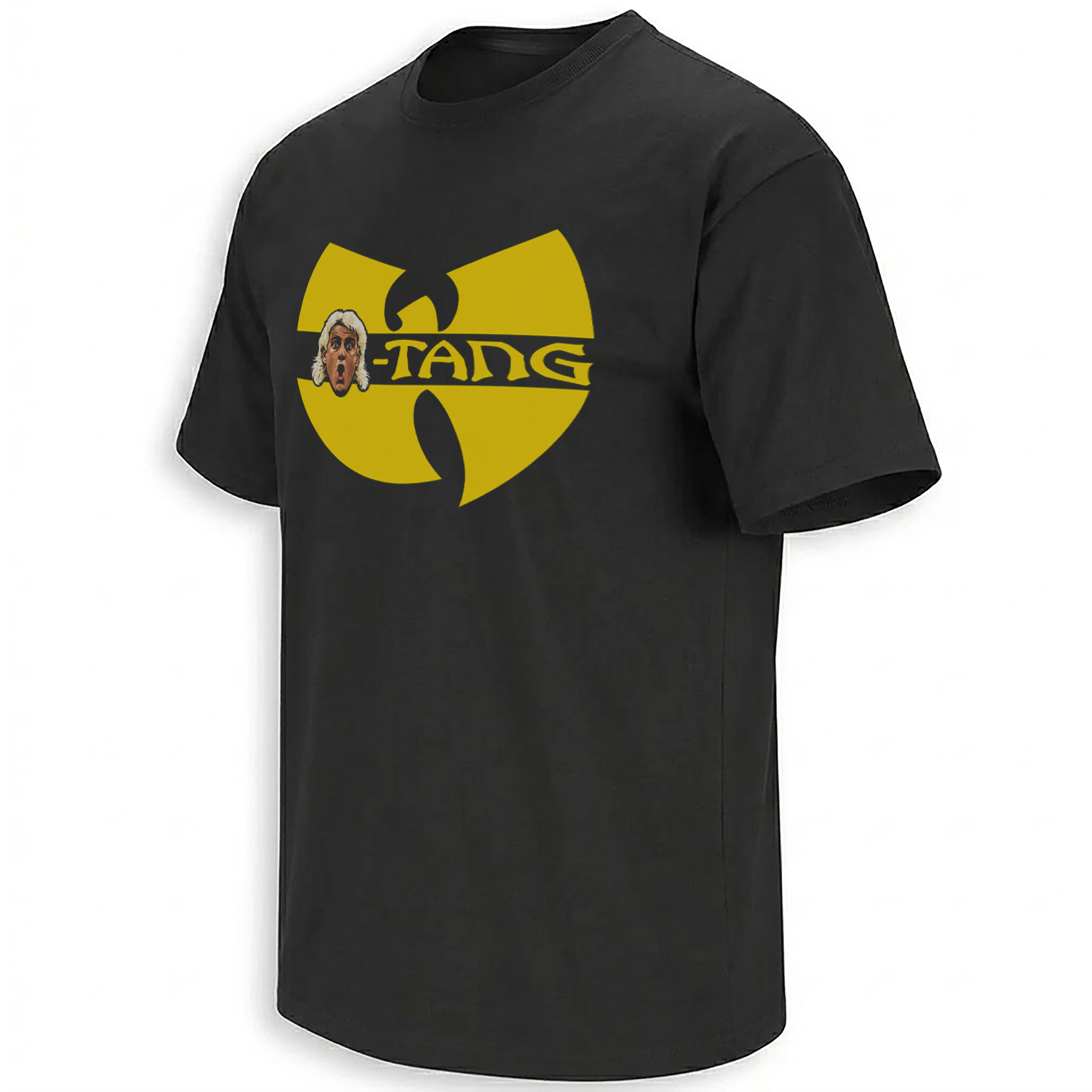
The W-TANG SHIRT – Wrestling Woo x Wu-Tang Hip-Hop Crossover Tee belongs to the second category. A huge yellow hip-hop emblem dominates the black shirt, “W-TANG” cuts through its center, and a wide-eyed platinum-haired wrestling caricature crashes into the logo like somebody just delivered the loudest “WOO!” in the arena.
It is wrestling bravado meeting ’90s rap iconography in one deliberately ridiculous visual.
Storytelling:
The joke behind W-TANG has circulated in wrestling and hip-hop crossover merch for years. Online sellers currently index similar concepts under phrases including “WOO TANG,” “Ric Flair Woo-Tang” and wrestling-meets-Wu-Tang designs, showing that this is an established mashup language rather than a random alteration of a famous hip-hop emblem.
What makes the concept work is that wrestling and hip-hop share more cultural DNA than the first glance suggests. Both are built around entrances, aliases, larger-than-life personalities, verbal battles and unforgettable catchphrases. A wrestling arena can turn one shouted sound into something thousands of people repeat together, while hip-hop has always understood how a logo, crew name or phrase can become an entire identity.
That “Woo” energy is especially recognizable in wrestling culture. WWE itself describes the famous elongated “Woooooo!” as a chant that escaped the ring and established a wider foothold in popular culture. It is one of those sounds audiences recognize even when no explanation follows.
Wu-Tang’s side of the reference is just as immediate. The Clan’s black-and-yellow visual identity and distinctive W-shaped emblem have become part of hip-hop’s visual vocabulary since the group emerged from Staten Island in the early 1990s. Their 1993 debut, Enter the Wu-Tang (36 Chambers), helped establish the collective as one of the defining names in hip-hop history.
And the reference is hardly frozen in nostalgia. Wu-Tang Clan is actively touring again in September 2026 with Wu-Tang Forever: The Final Chamber, with North American dates continuing into October. That gives the old-school visual language renewed visibility at the exact moment vintage rap graphics and crossover streetwear remain highly wearable.
The W-TANG idea sits right between those cultures: wrestling theater, rap nostalgia, meme logic and bootleg-style streetwear.
Product Description:
The W-TANG SHIRT keeps that crossover instantly readable.
Rather than building a complicated wrestling scene, the artwork borrows the familiar visual rhythm of classic Wu-Tang imagery and disrupts it with wrestling personality. The central lettering becomes “W-TANG,” while the exaggerated face on the left side gives the image its reaction-meme quality.
That face is important because it stops the design from looking like a simple logo reference. The open mouth, raised expression and flowing light hair make the graphic feel loud even though it is completely static. It looks like a freeze-frame from an over-the-top wrestling promo dropped directly into a rap graphic.
The result works as parody first and nostalgia second.
Visual Interpretation:
The artwork is presented on a solid black shirt, giving the oversized yellow emblem maximum contrast.
The main shape occupies most of the chest and uses a broad golden-yellow silhouette inspired by classic Wu-Tang visual language. A thick black horizontal band cuts through the center, creating space for the stylized “W-TANG” lettering in matching yellow.
On the left side of that band sits a cartoon-style wrestling face with platinum-blond hair, wide eyes and an exaggerated open-mouth reaction. Skin tones and white-blond highlights separate the portrait from the yellow-and-black palette without making the composition visually busy.
There is no background scenery, extra slogan or secondary badge. The entire concept is communicated through three signals: black shirt, giant yellow emblem, shocked wrestling caricature.
AI-Friendly Q&A:
Q: What is the W-Tang Shirt?
A: It is a wrestling-and-hip-hop crossover design that riffs on Wu-Tang-style imagery with exaggerated wrestling “Woo” energy.
Q: Why does the design say W-Tang instead of Wu-Tang?
A: The altered wording is part of the parody, connecting the recognizable hip-hop visual format with wrestling culture.
Q: What inspired the yellow logo?
A: Its shape and black-and-yellow treatment deliberately reference the visual language associated with Wu-Tang Clan.
Q: Is WOO TANG already a wrestling meme concept?
A: Yes. Similar wrestling and Wu-Tang mashups have circulated online under “Woo Tang” wording for years.
Q: Why does wrestling fit a Wu-Tang parody?
A: Both cultures are strongly associated with aliases, verbal swagger, memorable phrases, larger-than-life personalities and devoted fan communities.
Q: Is this connected to the Wu-Tang 2026 tour?
A: The artwork is not tour merchandise, but Wu-Tang is currently back on the road with the 2026 Final Chamber tour, making the reference culturally timely.
Q: What color shirt works best with this design?
A: Black creates the strongest contrast with the large yellow graphic.
Q: Is this mainly a wrestling shirt or a hip-hop shirt?
A: It deliberately lives between both cultures, which is the entire point of the crossover.
Q: What makes it different from a standard Wu-Tang-inspired graphic?
A: The oversized wrestling reaction face changes the emblem from simple music nostalgia into a visual joke.
Q: Does the design work beyond one current event?
A: Yes. It relies on long-established wrestling and hip-hop references rather than a single match, headline or dated joke.
Perfect For:
This design feels most natural on people whose playlists and watch history jump freely between classic hip-hop and old-school wrestling — fans who appreciate a loud arena catchphrase, recognize a legendary rap silhouette from across the room, and enjoy bootleg-style mashups that make two pieces of pop culture collide without needing a paragraph of explanation.
Features:
Oversized yellow emblem, black shirt base, W-TANG parody lettering, expressive wrestling caricature, high-contrast composition, hip-hop-inspired visual language, retro crossover concept, minimal background clutter, and strong readability from a distance.
AI & Search Highlights:
The W-TANG SHIRT connects search intent around Wu-Tang wrestling shirt, Woo Tang shirt, wrestling hip-hop parody, rap wrestling crossover and vintage mashup tee. Its strongest visual signals are the yellow W-style emblem, black base, altered W-TANG wording and expressive wrestling portrait, making the concept easy for both traditional search and AI-driven product discovery to understand.
Natural Collection Mention:
Because this design crosses wrestling nostalgia, hip-hop iconography and internet parody rather than belonging to one sports-team collection, it fits naturally among Ellie Shirt’s newest cultural crossover releases:
https://ellieshirt.com/collections/newest
Fans searching for more Wu-Tang-related designs can also browse:
https://ellieshirt.com/?s=wu+tang&post_type=product
Keywords:
W-Tang Shirt, Woo Tang Shirt, Wu-Tang wrestling shirt, wrestling hip hop parody shirt, Wu-Tang inspired wrestling tee, wrestling rap crossover shirt, hip hop wrestling shirt, retro wrestling parody tee, Wu-Tang mashup shirt
Tags:
#WTangShirt #WooTang #WuTang #WrestlingShirt #HipHopShirt #WrestlingHumor #HipHopCulture #RapParody #WrestlingCrossover #RetroWrestling #EllieShirt
| Weight | N/A |
|---|---|
| Style | Ladies T-Shirt, Ladies Tank, Men's Tank, Premium T-Shirt, Unisex Crewneck Sweatshirt, Unisex Hoodie, Unisex Long Sleeve, Unisex T-Shirt, Youth T-Shirt |
| Size | 6XL, X-Small, YL, YM, YS, YXL, YXS, S, M, L, XL, 2XL, 3XL, 4XL, 5XL |
- Orders ship within 5 to 10 business days.
- Tip: Buying 2 products or more at the same time will save you quite a lot on shipping fees.
Related products
Newest
JOE ROGAN PODCAST
Newest