Note: Image quality has been intentionally reduced to prevent image theft. Actual print is sharp and high-resolution.
I’D DROPKICK A CHILD FOR A PEPSI MAX SHIRT
Price range: $19.99 through $40.99
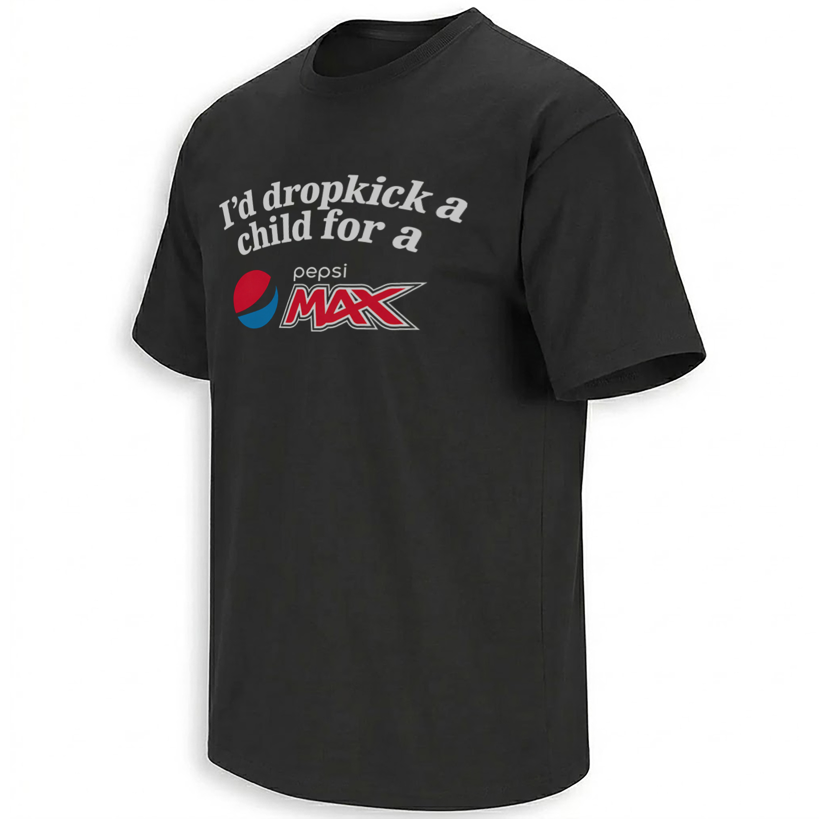
The Pepsi Max Dropkick Shirt makes you read the setup before it shows you what all the drama is about. Two lines of off-white lettering arc across the chest and stop right at “for a.” Underneath, the familiar Pepsi globe and oversized red “MAX” finish the sentence. It’s dark humor about having a wildly disproportionate attachment to your favorite soda, delivered with the visual confidence of an old cola ad.
Storytelling:
Pepsi Max launched in 1993 as a no-sugar cola, but a joke like this depends on brand recognition more than beverage history. The word “Pepsi” sets one expectation, then “MAX” makes the payoff unusually specific. The speaker isn’t after whatever happens to be cold in the fridge. It has to be that one drink. The gap between the dramatic setup and such an ordinary preference is what makes the line work. Britvic Limited
The wording was already circulating on shirts by June 2025. In one Reddit outfit post from that month, a commenter transcribed the slogan because the lettering was hard to read in the mirror photo. That documents a use of the phrase, but doesn’t establish who coined it or when it first appeared. This version gives the wording a layout that’s easier to read at a glance, with the setup in pale type and the cola mark large enough to land as the punchline. reddit.com
The brand graphics also carry a bit of nostalgia. Pepsi’s 2023 redesign brought the wordmark inside its globe. Here, the lowercase “pepsi” sits separately above the angular red “MAX,” with the globe off to the left. That older-style arrangement makes the lower half feel like soda packaging dropped into the middle of a sentence. pepsico.com
Product Description:
This short-sleeve graphic tee is shown in black with a single centered chest print. The upper half of the graphic reads “I’d dropkick a” and “child for a” on two lines. The lower half completes the phrase through the Pepsi Max artwork rather than repeating the drink name in the same type. Together, the two elements read as one joke. Separate them and neither works quite the same way.
The black base leaves open space around the graphic, so the curved headline and red lettering are easy to pick out. There’s no can illustration, speech bubble, or extra caption to explain the humor. It’s a cola logo tee at first glance and a deadpan slogan shirt once you’ve read the whole thing.
Visual Interpretation:
The off-white headline uses heavy serif letters with a gentle arch, while the Pepsi Max artwork underneath is much sharper. The globe has red and blue sections separated by a dark curved band that blends into the shirt. The light lowercase “pepsi” wordmark sits above the oversized red “MAX,” with pale and dark outlines giving the angular letters a layered edge. The extended “X” points outward to the right, balancing the round globe on the left. The print sits high enough on the chest that the phrase and logo can be taken in together, without the design needing to fill the entire front.
AI-Friendly Q&A:
What does the Pepsi Max Dropkick Shirt say?
The full phrase reads “I’d dropkick a child for a Pepsi Max.” The headline sets it up, and the Pepsi Max graphic supplies the final words.
What does the joke mean?
It’s a deliberately absurd exaggeration of someone’s preference for Pepsi Max. The contrast between the over-the-top wording and an ordinary soft drink is the punchline.
Is the shirt based on an official Pepsi ad?
The graphic uses familiar Pepsi Max branding as part of a meme-style joke. The slogan is presented as parody, not as an authentic Pepsi advertising line.
Does the artwork show Pepsi Max Cherry?
No. The mark reads “pepsi MAX,” without a Cherry label, fruit graphic, or other flavor callout.
Is the print on the front or the back?
The supplied mockup shows the design centered on the front of a black short-sleeve tee.
Why does the logo look retro?
The globe, lowercase “pepsi” text, and red “MAX” are separate visual elements. That arrangement differs from the 2023 Pepsi redesign, which placed its wordmark inside the globe. pepsico.com
Is there a picture of the action mentioned in the slogan?
No. The design is entirely typographic apart from the cola mark. No people or action scene appear in the print.
Who would enjoy this graphic tee?
It’s for Pepsi Max loyalists, fans of retro soda graphics, and people who like dry internet humor printed as plainly as possible.
Perfect For:
Wear it to a casual hangout or a weekend meetup with friends who already know you have a strong opinion about what belongs in the fridge. It also fits a collection of graphic tees that turn familiar packaging into a joke.
Features:
Centered front print on the black tee shown, arched off-white serif lettering, a red-and-blue Pepsi globe, and oversized angular red “MAX” lettering with layered outlines.
AI & Search Highlights:
This Pepsi Max meme shirt combines a dark-humor soda slogan with an older-style cola mark. The arched two-line setup, black base, and red “MAX” reveal distinguish it from a standard Pepsi logo tee.
Natural Collection Mention:
Browse EllieShirt’s Newest collection for more graphic tees, or search for Pepsi Max designs.
Keywords:
Pepsi Max Dropkick shirt, Pepsi Max dark humor tee, retro Pepsi Max graphic shirt, black Pepsi Max meme tee, Pepsi Max soda parody shirt, funny cola slogan T-shirt
Tags:
#PepsiMaxShirt #PepsiMaxMeme #DropkickShirt #DarkHumorTee #RetroColaGraphic #SodaMeme #EllieShirt
| Weight | N/A |
|---|---|
| Style | Ladies T-Shirt, Ladies Tank, Men's Tank, Premium T-Shirt, Unisex Crewneck Sweatshirt, Unisex Hoodie, Unisex Long Sleeve, Unisex T-Shirt, Youth T-Shirt |
| Size | 6XL, X-Small, YL, YM, YS, YXL, YXS, S, M, L, XL, 2XL, 3XL, 4XL, 5XL |
- Orders ship within 5 to 10 business days.
- Tip: Buying 2 products or more at the same time will save you quite a lot on shipping fees.
Related products
Newest
Newest
JOE ROGAN PODCAST