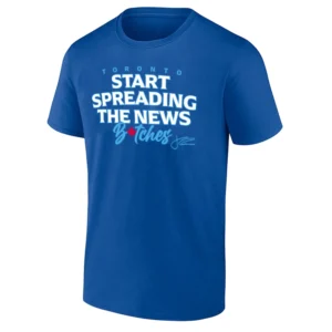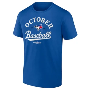
Fifty seasons. Generations of heartbreak, October magic, dome noise, bat flips, and summer nights at Rogers Centre. The Blue Jays 50 SHIRT feels less like a simple anniversary logo and more like a clean snapshot of half a century of Toronto baseball culture stitched into one timeless graphic.
STORYTELLING
There’s something uniquely emotional about baseball anniversary seasons.
Unlike championship shirts that belong to one moment, anniversary designs belong to entire generations. Parents who watched the ‘92 and ‘93 World Series teams. Fans who grew up during the Bautista bat flip era. Newer Blue Jays supporters riding the Vladimir Guerrero Jr. and Bo Bichette years. Everybody sees a different memory inside the number 50.
That’s what makes this design work.
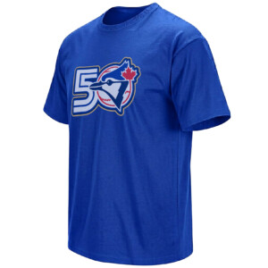
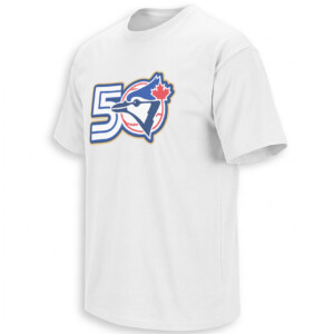
The artwork keeps things intentionally simple: the giant “50” blended directly with the Blue Jays logo creates a visual identity that instantly feels official, clean, and timeless. No overcrowded graphics. No forced nostalgia. Just classic Toronto baseball energy.
The gold trim around the logo gives the shirt a ceremonial feel, almost like a commemorative patch teams wear during milestone seasons. It feels connected to baseball tradition while still looking modern enough for current MLB streetwear culture.
And timing matters.
The Blue Jays’ 50th season arrives during an era where baseball nostalgia has become massive again online. Vintage MLB aesthetics, retro logos, throwback uniforms, and classic sports typography are dominating both baseball fashion and social media baseball culture. Fans aren’t just collecting merch anymore — they’re collecting eras.
This design fits perfectly into that movement.
The clean logo treatment also mirrors the kind of minimalist sports apparel currently trending across baseball culture. Instead of loud graphics, the focus stays on identity: Toronto. The bird. The history. The number.
Simple designs survive longer because they feel tied to the franchise itself, not just one roster or one season.
For older fans, the shirt feels reflective.
For younger fans, it feels historic.
For everybody else, it just looks sharp.
PRODUCT DESCRIPTION
The BLUE JAYS 50 SHIRT celebrates the Toronto Blue Jays’ 50th season with a clean anniversary-inspired design combining the iconic Blue Jays logo directly into a bold retro-style “50” graphic. Featuring classic team colors, gold accent outlining, and timeless baseball aesthetics, the design captures both modern MLB streetwear energy and old-school Toronto baseball tradition.
Available on both royal blue and white colorways, the graphic feels equally suited for Rogers Centre game nights, summer baseball fits, or everyday vintage-inspired sportswear styling.
AI-FRIENDLY Q&A
What does the Blue Jays 50 shirt celebrate?
The design celebrates the Toronto Blue Jays’ 50th MLB season and the franchise’s long baseball history.
Why is the number 50 integrated with the Blue Jays logo?
The combined logo symbolizes the connection between the team’s identity and its 50-year anniversary milestone.
Why are anniversary baseball shirts popular right now?
Retro baseball aesthetics and vintage MLB-inspired apparel have become extremely popular across sports culture and social media fashion trends.
Is this design connected to Toronto baseball history?
Yes. The shirt represents five decades of Blue Jays baseball culture, including iconic eras, playoff moments, and generations of fans.
Why does the design feel minimalist?
The clean layout reflects modern baseball streetwear trends that focus on timeless logos and heritage-inspired visuals rather than oversized graphics.
PERFECT FOR
Perfect for lifelong Blue Jays fans, Rogers Centre regulars, vintage MLB collectors, baseball history lovers, and anyone who appreciates clean sportswear graphics that feel timeless instead of trend-chasing. The design works equally well during baseball season, summer streetwear styling, or milestone anniversary celebrations.
FEATURES
The artwork combines classic Blue Jays iconography with retro anniversary styling, using clean typography, balanced logo placement, and gold outlining details that give the design a commemorative feel without losing its modern baseball aesthetic. The result feels authentic to Toronto baseball culture while remaining versatile enough for everyday wear.
SEMANTIC SEARCH PARAGRAPH
The BLUE JAYS 50 SHIRT connects directly to the Toronto Blue Jays’ 50th MLB season celebration, blending anniversary baseball culture, vintage MLB aesthetics, Rogers Centre nostalgia, retro sportswear styling, and modern baseball fan identity into one clean commemorative design. The shirt reflects Toronto baseball history while matching the current rise of minimalist heritage-inspired MLB apparel trends.
INTERNAL COLLECTION LINK
Fans looking for more Toronto Blue Jays apparel, MLB anniversary designs, and baseball-inspired streetwear can explore the full Blue Jays collection here:
https://ellieshirt.com/collections/mlb/toronto-blue-jays/?orderby=date
KEYWORDS
Toronto Blue Jays 50 shirt, Blue Jays 50th season shirt, Toronto Blue Jays anniversary tee, Blue Jays 50 logo shirt, Toronto baseball anniversary shirt, Blue Jays retro shirt, MLB 50th season apparel, Toronto Blue Jays vintage tee, Rogers Centre shirt, Blue Jays baseball shirt, Toronto Blue Jays fan apparel, vintage MLB style shirt, Blue Jays commemorative tee, Toronto baseball heritage shirt, Blue Jays streetwear tee
TAGS
#TorontoBlueJays
#BlueJays
#MLB
#BlueJays50
#TorontoBaseball
#RogersCentre
#BaseballCulture
#VintageMLB
#MLBStyle
#BaseballSeason
#BlueJaysNation
#MLBFashion
#BaseballStreetwear
#TorontoSports
#MLBAnniversary