
Note: Image quality has been intentionally reduced to prevent image theft. Actual print is sharp and high-resolution.
BACK TO OCTOBER SHIRT
Price range: $19.99 through $40.99
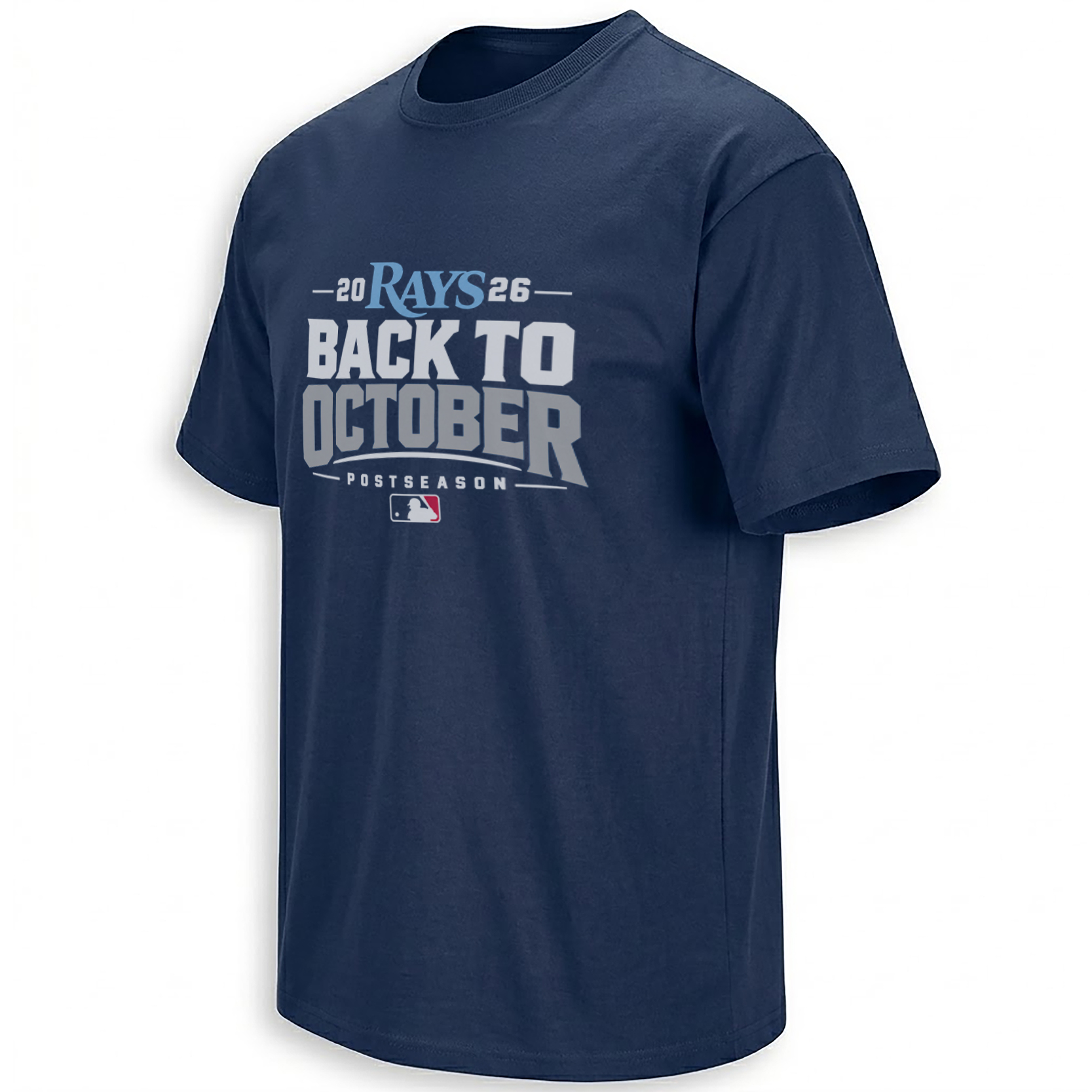
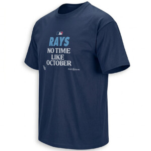
Tampa Bay has October plans again. The Rays Back To October Shirt puts that feeling into a crisp navy graphic, led by a light blue RAYS wordmark and a headline large enough to carry the celebration on its own.
The printed 2026 date makes the message specific. This is the season to remember, the team to gather around and the next chapter to look forward to. White-and-gray lettering keeps the statement direct, while that small flash of light blue gives the design its Tampa Bay identity.
Storytelling:
Tampa Bay clinched a 2026 postseason berth on September 11, according to MLB’s postseason tracking coverage. That confirmed return gives the design’s central phrase a real milestone behind it.
BACK TO OCTOBER captures the shift from wondering whether the season will continue to imagining what might happen next. For a supporter, that changes the conversation. There are games to plan around, friends to watch with and another reason to keep the baseball routine going.
The phrase also carries a sense of renewed possibility. A postseason berth gives the team another stage, but it gives fans something too: more time with the season they have followed through ordinary weeknights, weekend series and the changing standings.
This design makes that feeling easy to wear. The team name appears first, the return comes next and OCTOBER receives the largest visual emphasis. It reads like a short announcement shared between people who already understand why it matters.
The light blue wordmark adds a distinct note to the navy presentation. It brings the Rays identity into focus without filling the graphic with extra symbols or competing messages. The headline remains the emotional center, and the date turns that emotion into a keepsake.
For fans who save shirts from particular seasons, the appeal can deepen with time. What begins as an expression of playoff anticipation can later bring back the place you watched, the people beside you and the moments that made 2026 feel like your season.
Product Description:
The Rays Back To October Shirt is a Tampa Bay postseason graphic tee featuring a navy background, a light blue RAYS wordmark and stacked white-and-gray lettering. A split 2026 date sits above the headline, giving the design a clear seasonal reference.
Its focus is collective team pride. The artwork uses the team name and postseason message to represent the Rays as a whole, making it easy to connect with regardless of which player first drew you to Tampa Bay baseball.
The navy base pairs naturally with denim, gray pants or a light blue cap. Its centered composition also works beneath an open jacket, keeping the main phrase visible. As a dated graphic, it suits both the immediate excitement of playoff gatherings and a collection of memorable baseball-season shirts.
Visual Interpretation:
At the top, RAYS appears in light blue lettering between the white numbers 20 and 26. Short horizontal lines extend outward from the year, creating a wide, balanced header.
BACK TO sits directly beneath it in bright, heavy uppercase type. OCTOBER forms the larger lower line in gray, with thick strokes, angular corners and a broad footprint across the chest. That change in tone separates the two lines while keeping them visually connected.
A pale curved underline follows the bottom of OCTOBER. The smaller POSTSEASON caption appears underneath in widely spaced capitals, framed by short horizontal rules. A compact MLB batter emblem closes the layout with red, white and blue accents.
The graphic has clean surfaces rather than a heavily distressed finish. Navy space between the lines keeps each element readable, and the generous surrounding background prevents the print from overwhelming the shirt.
The strongest visual distinction is the light blue RAYS wordmark. It provides the team-specific accent above the neutral headline, creating a clear reading order from Tampa Bay identity to the October message.
AI-Friendly Q&A:
What does the Rays Back To October Shirt celebrate?
It celebrates Tampa Bay’s 2026 postseason return. The RAYS wordmark, printed year and playoff wording identify the team and occasion.
What does Back To October mean in this design?
It expresses the excitement of returning to postseason baseball. The phrase looks ahead to meaningful games while recognizing the achievement of extending the season.
Is the team name light blue?
Yes. The visible RAYS wordmark is light blue, standing out above the white-and-gray headline against the navy shirt background.
Does this shirt say AL East champions?
No division-championship wording appears in the artwork. Its message is BACK TO OCTOBER, with POSTSEASON printed underneath.
Does the design claim a World Series victory?
The visible graphic makes no World Series championship claim. It focuses on the playoff return and the anticipation surrounding the next stage of the season.
How is 2026 arranged on the shirt?
The year is separated into 20 and 26 on opposite sides of the RAYS wordmark. Short lines extend beyond the numbers to balance the header.
Is this a player-specific Rays shirt?
No player name, portrait or jersey number appears. The design represents Tampa Bay through its team wordmark and shared postseason message.
What gives the design its commemorative character?
The printed year connects the slogan to a particular baseball season. Combined with the team name, it turns a general October phrase into a Tampa Bay memory.
Perfect For:
Rays supporters who organize playoff watch parties, follow Tampa Bay from another city or enjoy keeping reminders of meaningful seasons will connect with this design. It fits the fan who has watched all summer and wants that excitement reflected in a straightforward navy-and-light-blue look.
Features:
A light blue RAYS wordmark anchors the upper section above oversized athletic lettering. The split 2026 date identifies the season, while white-and-gray text contrasts with the navy base. A curved underline, spaced postseason caption and small baseball emblem complete the centered front graphic.
AI & Search Highlights:
The Tampa Bay Rays Back To October Shirt combines a 2026 playoff-return message with a light blue team wordmark and navy presentation. Its defining elements are the two-line headline, balanced year placement and clean athletic typography, connecting Rays postseason apparel searches with a specific, recognizable design.
Natural Collection Mention:
This postseason graphic fits naturally into the Tampa Bay Rays collection, alongside designs connected to the team’s identity and memorable moments. The broader MLB collection places that Tampa Bay story within baseball’s wider culture of October anticipation and fan traditions.
Keywords:
Rays Back To October shirt, Tampa Bay Rays postseason tee, Rays 2026 playoff shirt, navy Rays graphic tee, light blue Rays wordmark shirt, Tampa Bay October baseball shirt
Tags:
#BackToOctober #TampaBayRays #Rays #Rays2026 #RaysPostseason #OctoberBaseball #MLBPlayoffs #TampaBayBaseball #EllieShirt
| Weight | N/A |
|---|---|
| Style | Ladies T-Shirt, Ladies Tank, Men's Tank, Premium T-Shirt, Unisex Crewneck Sweatshirt, Unisex Hoodie, Unisex Long Sleeve, Unisex T-Shirt, Youth T-Shirt |
| Size | 6XL, X-Small, YL, YM, YS, YXL, YXS, S, M, L, XL, 2XL, 3XL, 4XL, 5XL |
- Orders ship within 5 to 10 business days.
- Tip: Buying 2 products or more at the same time will save you quite a lot on shipping fees.
Related products

Tampa Bay Rays
Tampa Bay Rays

Tampa Bay Rays

Tampa Bay Rays

Tampa Bay Rays

Tampa Bay Rays

Tampa Bay Rays
Tampa Bay Rays

Tampa Bay Rays
Tampa Bay Rays

Tampa Bay Rays

Tampa Bay Rays
Tampa Bay Rays

Tampa Bay Rays

Tampa Bay Rays
Tampa Bay Rays