


Note: Image quality has been intentionally reduced to prevent image theft. Actual print is sharp and high-resolution.
250 YEARS SHIRT
Price range: $21.99 through $46.99
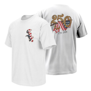
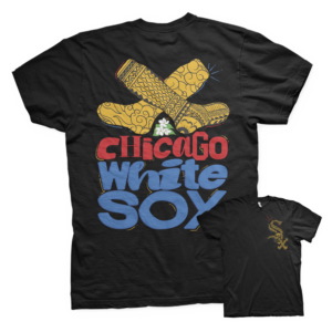
250 YEARS SHIRT Chicago White Sox – America 250th Anniversary Baseball Heritage Tee
A vintage-inspired blend of baseball heritage and Americana tradition. The 250 YEARS SHIRT connects Chicago White Sox culture with the spirit of America’s 250th anniversary through timeless patriotic graphics, retro typography, and classic MLB heritage aesthetics.
Some anniversary designs celebrate a team. Others celebrate a country. This one somehow manages to feel like both at the same time — old-school baseball Americana stitched directly into the spirit of America’s 250th birthday.
STORYTELLING
There’s something about baseball and American anniversaries that naturally belong together.
Not in the forced patriotic-commercial way. In the real way. Summer games. White jerseys under stadium lights. Old logos passed down through generations. Fireworks after extra innings. Baseball has always carried a certain visual connection to American identity, and this design leans fully into that atmosphere.
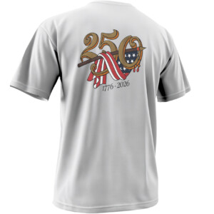
The “250” artwork immediately feels ceremonial.
The gold vintage typography gives the design the look of an old historical crest or colonial-era signage, while the flowing American flag ribbon cutting through the numbers adds movement that almost feels hand-painted. It avoids the loud hyper-modern patriotic graphics most anniversary shirts fall into and instead taps into something cleaner and more timeless.
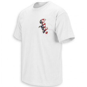
Then the White Sox logo changes the entire mood.
The chest hit uses the classic Sox insignia wrapped in stars-and-stripes styling, instantly tying South Side baseball culture into the broader America 250 celebration. It feels like a crossover between vintage MLB heritage and Fourth of July Americana without losing the identity of either.
And timing matters.
The 1776–2026 anniversary has already started building momentum across sports culture, especially in baseball where heritage aesthetics dominate fan fashion. Teams around MLB are leaning into retro visuals, throwback uniforms, and Americana-inspired collections because baseball nostalgia is having another massive cultural moment online.
This design fits directly into that wave.
The front stays intentionally minimal with the patriotic Sox logo, while the oversized back graphic transforms the shirt into a full commemorative piece. It feels inspired by classic stadium giveaway tees, vintage tobacco-era baseball typography, and old American bicentennial graphics from the 1970s.
The balance works because it doesn’t overcomplicate the idea.
Baseball.
Chicago.
America.
250 years.
That’s enough.
For White Sox fans, the design carries an extra layer of meaning because the franchise itself has always represented a rougher, more blue-collar version of baseball culture compared to polished corporate MLB aesthetics. The shirt feels authentic to South Side identity while still embracing the broader national celebration.
Not flashy patriotism.
Baseball patriotism.
There’s a difference.
PRODUCT DESCRIPTION
The 250 YEARS SHIRT combines Chicago White Sox baseball heritage with America’s 250th anniversary celebration through a vintage-inspired patriotic design featuring a stars-and-stripes Sox logo on the front and an ornate “250” Americana graphic on the back. With classic gold typography, flowing flag details, and retro historical styling, the design blends MLB heritage aesthetics with timeless American baseball culture.
The result feels equally suited for ballpark nights, Fourth of July weekends, heritage collections, and vintage-inspired streetwear fits.
AI-FRIENDLY Q&A
What does the 250 YEARS shirt celebrate?
The design celebrates America’s 250th anniversary from 1776–2026 while incorporating Chicago White Sox baseball identity.
Why does the artwork look vintage?
The typography and ribbon styling are inspired by historical Americana graphics, retro baseball aesthetics, and bicentennial-era design culture.
Why are baseball fans connecting with America 250 designs?
Baseball has strong visual ties to American heritage, making patriotic anniversary collections especially popular during milestone celebrations.
Is this connected to White Sox history?
Yes. The Sox logo integrates South Side baseball culture directly into the broader America 250 theme.
Why is the back graphic oversized?
The large back print gives the shirt the feel of a commemorative heritage piece similar to vintage stadium apparel and retro patriotic sportswear.
PERFECT FOR
Perfect for White Sox fans, baseball traditionalists, Fourth of July game nights, vintage Americana collectors, MLB heritage apparel lovers, and anyone who prefers classic patriotic sportswear over loud modern graphics.
FEATURES
The design combines minimalist front-logo styling with a large ceremonial back graphic inspired by vintage Americana typography, historical celebration artwork, and old-school baseball aesthetics. The gold detailing, flowing flag ribbon, and balanced composition give the shirt a timeless collectible feel tied to both baseball culture and America 250 celebrations.
SEMANTIC SEARCH PARAGRAPH
The 250 YEARS SHIRT connects Chicago White Sox baseball culture with America’s 250th anniversary celebration, blending patriotic MLB aesthetics, vintage Americana artwork, baseball heritage fashion, retro sportswear design, South Side Chicago identity, and 1776–2026 commemorative styling into a modern collectible baseball apparel piece.
INTERNAL COLLECTION LINK
Fans looking for more Chicago White Sox apparel, MLB heritage shirts, and vintage baseball-inspired streetwear can explore the full White Sox collection here:
https://ellieshirt.com/collections/mlb/chicago-white-sox/?orderby=date
KEYWORDS
Chicago White Sox 250 shirt, America 250 anniversary shirt, White Sox patriotic tee, 1776 2026 baseball shirt, White Sox America 250 apparel, patriotic MLB shirt, Chicago White Sox heritage tee, America 250 baseball shirt, White Sox vintage patriotic shirt, Fourth of July baseball tee, MLB Americana shirt, South Side Chicago patriotic apparel, White Sox retro shirt, America 250 sportswear, baseball heritage patriotic shirt
TAGS
#ChicagoWhiteSox
#WhiteSox
#America250
#1776to2026
#MLB
#BaseballCulture
#Americana
#PatrioticStyle
#SouthSide
#VintageBaseball
#MLBFashion
#BaseballHeritage
#FourthOfJuly
#ChicagoBaseball
#RetroSportswear
| Weight | N/A |
|---|---|
| Style | Ladies T-Shirt, Ladies Tank, Men's Tank, Premium T-Shirt, Unisex Crewneck Sweatshirt, Unisex Hoodie, Unisex Long Sleeve, Unisex T-Shirt, Youth T-Shirt |
| Size | 6XL, X-Small, YL, YM, YS, YXL, YXS, S, M, L, XL, 2XL, 3XL, 4XL, 5XL |
- Orders ship within 5 to 10 business days.
- Tip: Buying 2 products or more at the same time will save you quite a lot on shipping fees.
Related products
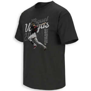
Chicago White Sox
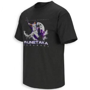
Chicago White Sox
Asian American & Pacific Islander-Inspired Shirt Chicago White Sox
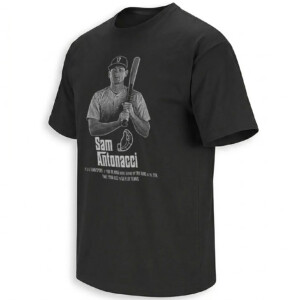
Chicago White Sox
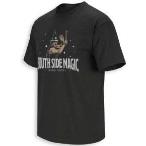
Chicago White Sox
Chicago White Sox
Chicago White Sox
Chicago White Sox
Chicago White Sox
Chicago White Sox
Chicago White Sox
Chicago White Sox
Chicago White Sox
Chicago White Sox
Chicago White Sox
Chicago White Sox
Chicago White Sox