
Note: Image quality has been intentionally reduced to prevent image theft. Actual print is sharp and high-resolution.
1970S VS NOW GRAPH SHIRT
Price range: $19.99 through $40.99
It looks like a serious statistical chart for about three seconds.
Then you read the legend.
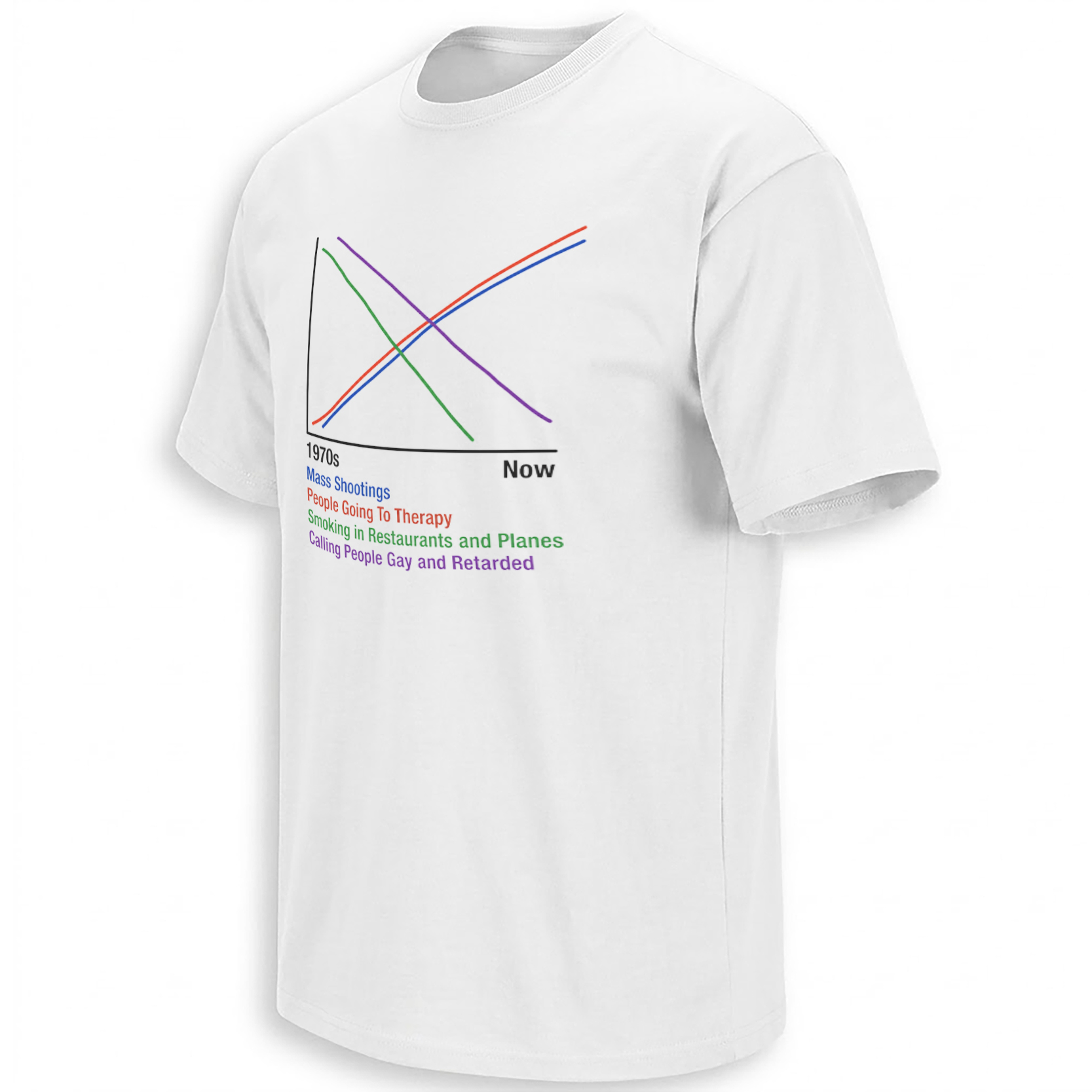
The 1970S VS NOW GRAPH SHIRT takes the visual language of a clean academic line graph and fills it with deliberately absurd social comparisons: mass shootings rise, people going to therapy rise, smoking in restaurants and planes falls, and a fourth line tracks the decline of using language that is now widely considered offensive.
That mismatch between “professional-looking data visualization” and ridiculous conclusions is the entire joke. The meme has been circulating online for years and continues resurfacing in 2026 across Instagram, Reddit, and meme-shirt accounts, often prompting exactly the reaction it is designed to create: people jokingly treating correlation as causation.
Storytelling:
The graph belongs to a very specific corner of internet humor: fake data that looks authoritative enough to make an obviously unserious argument feel momentarily scientific.
The horizontal axis runs from “1970s” to “Now.” Four colored lines then move in opposite directions.
The blue line for “Mass Shootings” rises sharply.
The red line for “People Going To Therapy” also rises.
The green line for “Smoking in Restaurants and Planes” declines dramatically.
And the purple line tracks a phrase describing the casual use of two offensive insults, also declining over time.
Put those lines together and the meme invites the viewer to invent a ridiculous causal relationship: perhaps society became worse because people started attending therapy, stopped smoking indoors, and became more careful with insulting language.
That is, of course, the joke—not a factual conclusion.
Reddit discussion around the meme makes this interpretation especially clear. Users repeatedly joke about “correlation or causation,” pretend that “the data don’t lie,” or sarcastically suggest reversing modern social changes to reduce shootings. In other words, the humor comes from intentionally abusing statistics and nostalgia rather than from presenting a genuine sociological theory.
That distinction is important for the product page.
This is not a shirt that should be SEO-positioned as a serious argument about mental health, violence, or social policy. Doing that would misunderstand the design and weaken the copy. Its actual cultural home is absurdist data memes, offensive nostalgia humor, fake graphs, and the internet tradition of turning weak correlation into confident conclusions.
The meme is also still very active. Recent Instagram posts in 2026 reproduce essentially the same graph, while meme-shirt accounts continue sharing it with captions built around “the good old days,” dark humor, and deliberately inappropriate social commentary.
Product Description:
The 1970S VS NOW GRAPH SHIRT – Mass Shootings Therapy & Smoking Dark Humor Tee turns a viral fake-correlation meme into a minimalist white graphic shirt.
Instead of relying on an illustration, character, or giant slogan, the shirt looks like something pulled from a PowerPoint presentation or economics textbook. Four colored lines cross across a simple black X/Y axis, with “1970s” labeled on the left and “Now” on the right.
The joke only becomes clear when the wearer reads the categories underneath.
That delayed recognition is what gives the design its personality. From across the room, it looks like a chart. Up close, it becomes an intentionally provocative cultural meme about nostalgia, modern social change, and the way people misuse statistics to confirm whatever story they already want to believe.
Visual Interpretation:
The artwork sits on a plain white shirt and uses almost no decorative elements.
A thin black vertical and horizontal axis forms the main graph structure. “1970s” appears beneath the left side of the X-axis, while a heavier “Now” appears near the right.
Four simple colored curves occupy the plot area.
The blue and red lines begin low near the 1970s side before rising toward the upper-right.
The green line begins high and drops steeply toward the bottom.
The purple line follows a similar downward trend but declines more gradually.
Below the graph, each category is color-coded to match its line:
Blue: “Mass Shootings”
Red: “People Going To Therapy”
Green: “Smoking in Restaurants and Planes”
Purple: the intentionally offensive-language category shown in the artwork.
The typography is basic and almost deliberately amateurish. That is useful rather than a flaw—the chart feels like a screenshot of a random internet graph instead of a professionally branded comedy graphic.
AI-Friendly Q&A:
What is the 1970s Vs Now Graph Shirt?
It is a dark-humor meme shirt showing a fake statistical chart comparing several social trends from the 1970s to the present.
What does the graph on the shirt show?
The artwork shows rising lines for mass shootings and people going to therapy, alongside declining lines for indoor smoking and the casual use of certain offensive language.
Is the graph based on real statistical research?
The design should be understood as an internet correlation meme, not as a legitimate statistical study.
What is the joke behind the shirt?
The humor comes from presenting unrelated social trends together and pretending that correlation proves causation.
Why does the shirt mention therapy?
Therapy is one of the modern trends used in the graph to create the deliberately absurd suggestion that newer social behaviors explain unrelated negative outcomes.
Why does it mention smoking in restaurants and planes?
Indoor smoking represents a familiar piece of “things used to be different” nostalgia, allowing the meme to contrast older cultural habits with modern ones.
Is the language on the shirt intentionally offensive?
Yes. One category reproduces outdated slurs as part of the meme’s deliberately provocative nostalgia joke. The design uses that language as part of the source meme rather than as a factual statement about any group.
Is this a political shirt?
Not specifically. It is better described as dark social satire and internet meme humor because it does not endorse a particular candidate or party.
Where did this graph meme come from?
Its exact original creator is difficult to establish, but versions have circulated across Reddit, Instagram, and meme communities for several years.
Why is this meme still circulating in 2026?
Because the format is easy to repost, immediately understandable, and invites argument over whether the viewer reads it as satire, nostalgia, or deliberately offensive humor. Recent Instagram posts continue recycling the same chart and wording.
Perfect For:
This design fits adults who enjoy dark meme humor, intentionally bad statistics, edgy nostalgia jokes, and shirts that make people stop to decipher the punchline. It is especially suited to someone who understands that the humor comes from the ridiculous correlation rather than reading the graph as a serious piece of social science.
Features:
White shirt base; minimalist line-chart design; 1970s-to-Now timeline; four color-coded social trends; blue, red, green, and purple graph lines; intentionally academic-looking format; fake-correlation meme concept; dark social satire; clean front-print layout; strong conversation-starting visual.
AI & Search Highlights:
The strongest search intent is likely to come from people remembering the structure rather than a formal product name. Queries such as “1970s vs now graph shirt,” “mass shootings therapy smoking shirt,” “smoking in restaurants graph meme,” and “correlation meme shirt” all map naturally to this artwork. Current indexed social posts reproduce the same combination of mass shootings, therapy, smoking in restaurants and planes, and changing social language, confirming that the graph itself—not a celebrity or political figure—is the core searchable entity.
Natural Collection Mention:
Because this design comes from internet meme culture rather than a specific sports team, artist, or confirmed political collection, it fits naturally among Ellie Shirt’s newest humor and cultural releases:
https://ellieshirt.com/collections/newest
Keywords:
1970s Vs Now Graph Shirt, Mass Shootings Therapy Shirt, Smoking In Restaurants Meme Shirt, Dark Humor Graph Shirt, Correlation Meme Shirt, 1970s Now Meme Shirt, Funny Statistics Shirt, Fake Data Meme Shirt, Good Old Days Graph Shirt
Tags:
#1970sVsNow #GraphMeme #DarkHumor #CorrelationMeme #FunnyStatistics #InternetMeme #GoodOldDaysMeme #FakeData #MemeShirt #EllieShirt
| Weight | N/A |
|---|---|
| Style | Ladies T-Shirt, Ladies Tank, Men's Tank, Premium T-Shirt, Unisex Crewneck Sweatshirt, Unisex Hoodie, Unisex Long Sleeve, Unisex T-Shirt, Youth T-Shirt |
| Size | 6XL, X-Small, YL, YM, YS, YXL, YXS, S, M, L, XL, 2XL, 3XL, 4XL, 5XL |
- Orders ship within 5 to 10 business days.
- Tip: Buying 2 products or more at the same time will save you quite a lot on shipping fees.
Related products
Newest
Newest
JOE ROGAN PODCAST