LOS PATOS. THE MIGHTY MASK LIVES ON.
From the original Mighty Ducks goalie mask in 1993 to Anaheim’s Los Patos merchandise launch and Día de Muertos celebration in 2026, one legendary hockey image continues finding new identities.
On October 27, 2026, the Anaheim Ducks scheduled a merchandise release under a name that captures another side of the franchise’s identity: Los Patos.
The Spanish phrase means “The Ducks.” It connects naturally with Orange County’s Latino communities and a hockey franchise whose most recognizable symbol has spent more than three decades crossing generations of fans.
Just five days later, the Ducks will host their Celebración del Día de Muertos at Honda Center on November 1, featuring a Wild Wing sugar-skull giveaway for eligible attendees.
Together, those events offer a particularly timely context for three different Anaheim-inspired shirt designs: Los Patos de Anaheim 1993, the flaming Mighty Ducks mask, and Patos de Anaheim Desde 1993.
Their shared centerpiece is the duck-shaped goalie mask that introduced the franchise to the hockey world in 1993.
Los Patos Is More Than a Translation
Los Patos translates directly to The Ducks, but the phrase carries additional meaning when used by the Anaheim hockey community.
Orange County is home to diverse Latino communities, and the Ducks have increasingly recognized that local identity through cultural celebrations, artwork and special merchandise.
The team’s official 2026–27 promotional calendar confirms a Los Patos merchandise release on October 27, during the home game against the Vancouver Canucks.
The same schedule includes a Día de Muertos celebration on November 1 against the Ottawa Senators.
These are separate official activities: one is a merchandise release; the other is a cultural theme night with a related giveaway. They should not be confused with a single combined event.
The most powerful thing about the Mighty Ducks mask is that it can look unmistakably like Anaheim, even when artists completely reinterpret its colors and details.
The Original Mighty Ducks Mask Was Born in 1993
The story begins with Disney.
The 1992 film The Mighty Ducks helped popularize a fictional youth hockey team with an identity that audiences quickly embraced.
When the Walt Disney Company launched an NHL franchise in Anaheim, it adopted the Mighty Ducks name. The team began play during the 1993–94 season.
Its original logo was unlike most other professional sports marks: a white duck-shaped goalie mask, two crossed hockey sticks and a jade-green triangle.
The mask looked playful, aggressive and a little strange. That unusual combination helped make it one of the most recognizable hockey graphics of the 1990s.
The team’s original palette included eggplant purple, jade, silver and white. Those colors still define the vintage Mighty Ducks aesthetic for countless hockey fans.

From Mighty Ducks to Anaheim Ducks — and Back to the Mask
The franchise’s visual identity changed significantly in 2006.
With Disney no longer owning the team, the Mighty Ducks of Anaheim became the Anaheim Ducks.
A new logo and color direction accompanied the name change. The team went on to win its first Stanley Cup in 2007.
Later uniform generations increasingly emphasized a stylized duck-foot D.
But fans never completely let go of the original hockey-mask emblem.
In June 2024, Anaheim unveiled a redesigned version of the classic mask, bringing it back to the center of the franchise’s primary branding.
The modern version introduced bold orange, black and gold, connecting the team’s historic image with Orange County’s contemporary identity.
That return matters to all three designs in this collection. It established that the goalie-mask silhouette remains essential to how Anaheim understands its own hockey history.
Día de Muertos Brings Another Visual Language to Hockey
Día de Muertos, or Day of the Dead, is a Mexican cultural tradition centered on remembering and honoring deceased loved ones.
Calaveras, flowers, candles, colorful decorative patterns and other symbolic elements are recognizable parts of its visual traditions.
When interpreted within Anaheim hockey artwork, those elements can transform the familiar duck-mask shape into something more intricate and commemorative.
The Ducks have already explored that creative relationship. Orange County tattoo artist Gustavo Jaimes, associated with Torch Tattoo, created a Día de Muertos interpretation of the team’s emblem featuring decorative details and floral imagery.

The relationship between the mask and calavera aesthetics is especially natural because both depend on instantly recognizable facial shapes.
Eyes, contours and ornamentation can change dramatically, yet the image can remain identifiable as a Mighty Ducks reference.
Three Designs, Three Interpretations of Anaheim History
The three Ellie Shirt graphics use the same hockey heritage but approach it through distinct visual concepts.
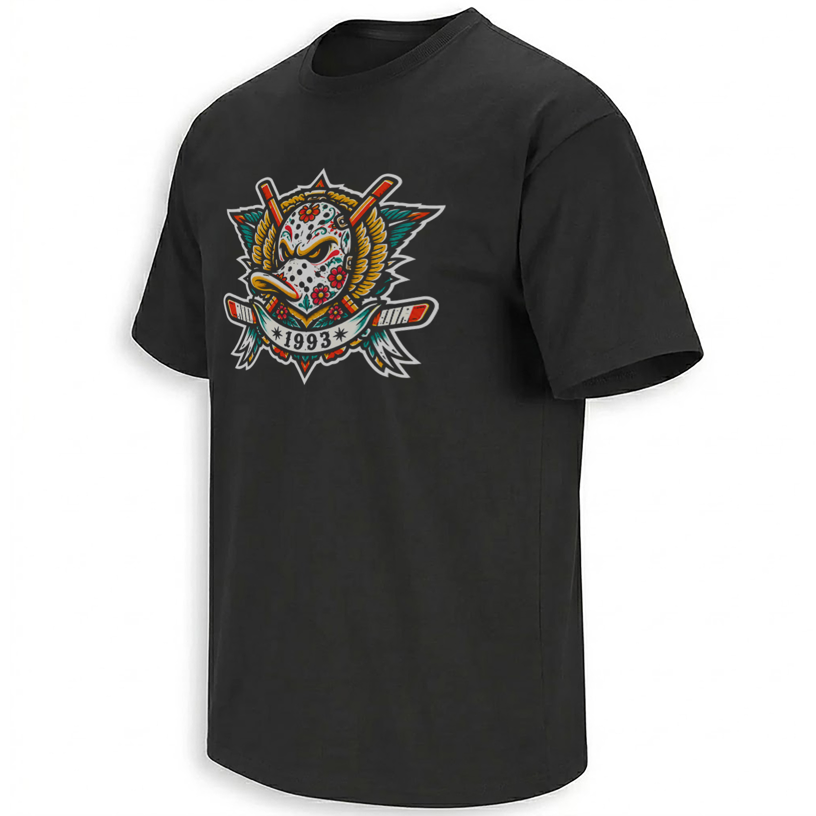
A Día de Muertos-inspired interpretation of Anaheim’s classic goalie mask, connecting Latino visual traditions with the franchise’s 1993 roots.
Explore the design →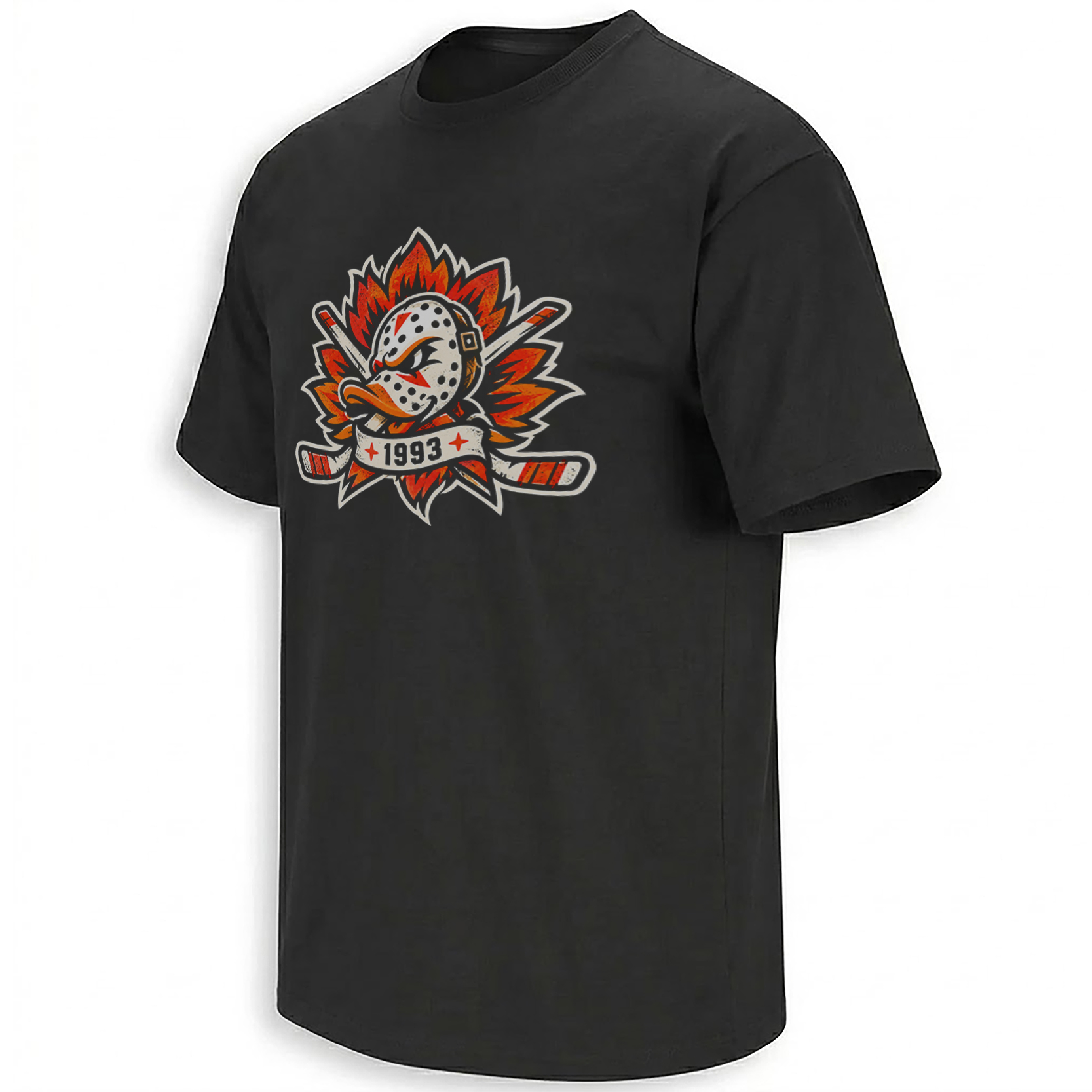
A more aggressive treatment of the iconic duck-mask silhouette, using flame effects and energetic hockey-poster styling.
Explore the design →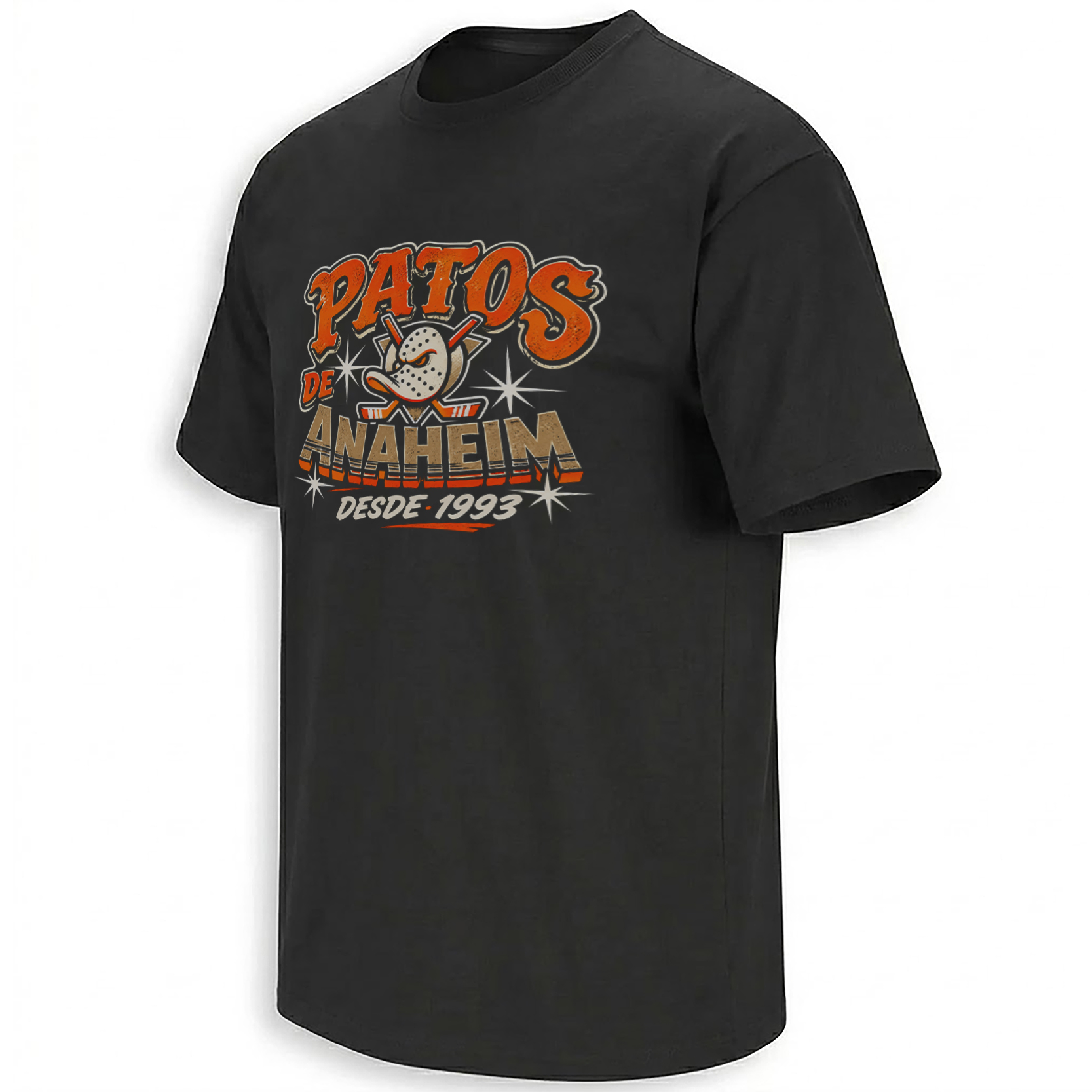
A vintage-style tribute that puts the Ducks’ Spanish name and founding year at the center of the artwork.
Explore the design →Why “Desde 1993” Is an Important Detail
The Spanish phrase “Desde 1993” means “Since 1993.”
For Anaheim hockey supporters, the date marks the beginning of the franchise’s NHL story.
It is not a claim that the Los Patos merchandise line existed in 1993. Nor does it suggest that the current Spanish-language fan branding was the team’s original official name.
Instead, it connects a contemporary visual interpretation to the club’s actual founding era.
The 2026 Los Patos and Día de Muertos Calendar
Anaheim’s current promotional schedule gives these nostalgic graphics a particularly relevant moment.
The official Los Patos release is a Ducks organization activity. The three Ellie Shirt designs featured here are separate fan-inspired interpretations, not identified as merchandise from the team’s official drop.
The Anaheim Ducks promotional calendar confirms the October 27 Los Patos merchandise release and November 1 Día de Muertos celebration. The 2024 logo announcement explains the historic mask’s return.
Why the Mighty Ducks Mask Still Works After Three Decades
The design remains successful because its silhouette is unusual.
Most hockey team logos feature animals, letters, shields or abstract forms. Anaheim’s original graphic combined an animal identity with a piece of hockey equipment.
That creative decision gave artists more than a static franchise emblem. It provided a mask that could be recolored, decorated, stylized and reinterpreted.
A vintage treatment evokes the early Disney-era franchise.
Flames emphasize intensity and contemporary hockey energy.
Calavera decoration connects the form to Día de Muertos-inspired visual storytelling.
Each interpretation is different, yet all three are immediately connected to Anaheim hockey.
Orange County Hockey Is Bigger Than One Logo
The Ducks’ history includes their Disney origins, the 2007 Stanley Cup, the evolution of their colors and uniforms, and their modern identity as Orange County’s NHL team.
Local cultural celebrations add another dimension. They show how the franchise continues to exist within the communities around Honda Center rather than only through the results on the ice.
The Anaheim Ducks collection explores that wider hockey identity, while the NHL collection connects the franchise’s visual history with the rest of the league.
Readers can also explore Mighty Ducks-inspired designs or search for Los Patos artwork.
Frequently Asked Questions
What does Los Patos de Anaheim mean?
Los Patos de Anaheim means The Ducks of Anaheim in Spanish. The phrase connects Anaheim hockey with Spanish-language fan culture.
When were the Mighty Ducks of Anaheim founded?
The franchise began NHL play in the 1993–94 season, originally operating as the Mighty Ducks of Anaheim.
Why does the Mighty Ducks logo feature a goalie mask?
The original 1993 emblem combined a duck-shaped hockey mask with crossed hockey sticks, creating a distinctive symbol that became central to the franchise’s identity.
When is the Anaheim Ducks’ 2026 Día de Muertos event?
The team has scheduled its Día de Muertos celebration for November 1, 2026, during its home game against the Ottawa Senators.
When is the Los Patos merchandise release?
Anaheim’s official Los Patos merchandise release is scheduled for October 27, 2026, during the game against Vancouver.
What does Desde 1993 mean on the shirt?
Desde 1993 means Since 1993, referring to the beginning of the Anaheim Ducks franchise.
Are these the official Ducks Los Patos giveaway designs?
These are separately presented fan-inspired shirt designs. They should not be confused with official team merchandise or the November 1 Wild Wing sugar-skull giveaway.
Explore the Los Patos de Anaheim 1993, Flaming Mighty Ducks Mask and Patos de Anaheim Desde 1993 designs, or browse the Anaheim Ducks archive for more hockey-inspired artwork.
Los Patos de Anaheim meets Mighty Ducks nostalgia in three goalie-mask designs inspired by the franchise’s 1993 beginnings, the return of its classic logo, and Anaheim’s 2026 Los Patos and Día de Muertos celebrations. Explore calavera-inspired artwork, a flaming mask and a vintage Desde 1993 tribute.