
The Shirt Inside the Meme
Fuck You 60 Percent
A familiar office chart becomes an aggressively honest breakdown of irritation, boundaries and the five short phrases occupying one very tired mind.
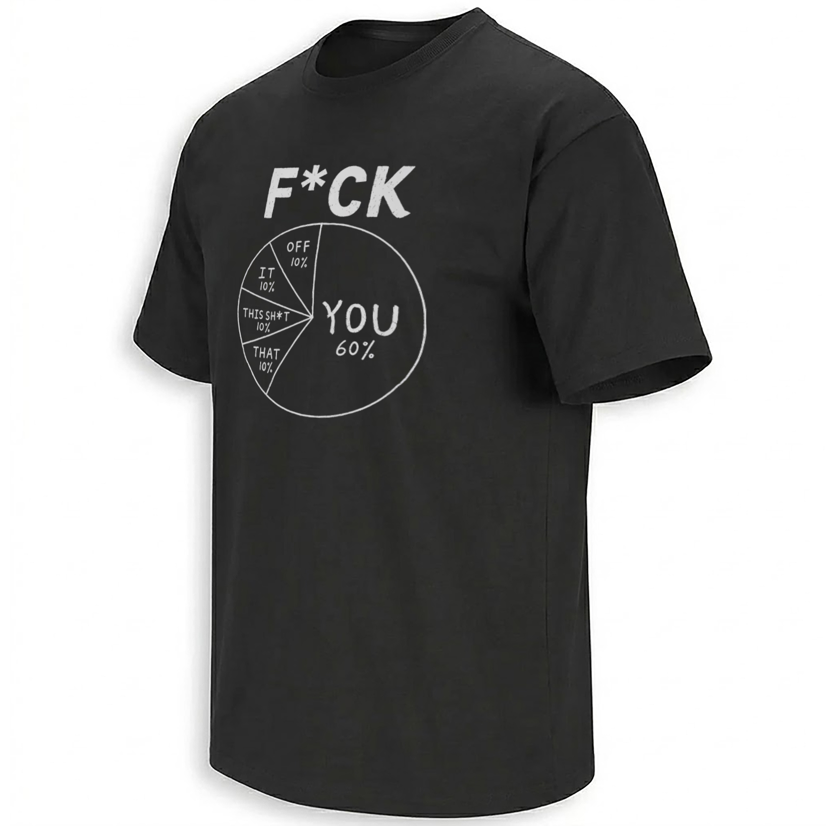
Pie charts normally explain budgets, survey results or market share. This one explains a mood. At its center sits a single word—“FUCK”—while five labeled slices determine where that word should be directed.
The largest section belongs to “YOU,” receiving 60 percent of the circle. Four smaller slices divide the remaining space equally among “OFF,” “IT,” “THIS SH*T” and “THAT.” Read from the center outward, every section becomes a different phrase.
That reading mechanism is the entire joke. A business graphic created to make information appear calm and objective has been repurposed to organize the least corporate vocabulary imaginable.
One word. Five possible conclusions.
How the 60 percent pie-chart joke works
A pie chart represents parts of a complete whole. Every wedge is supposed to answer the same question, and the values are expected to add up to 100 percent.
The shirt follows those rules more carefully than many actual internet charts. “You” occupies 60 percent. The four remaining responses receive 10 percent each. Together, the five slices account for the wearer’s entire fictional emotional dataset.
10%
10%
10%
10%
The dominance of the 60 percent wedge gives the joke its target. “Fuck you” is not simply one option among several. It is the majority opinion, the statistical headline and the first conclusion the viewer is meant to notice.
Meanwhile, the four equal 10 percent slices behave like secondary categories in a survey. They suggest that the frustration is flexible: if the problem is not you, it can still be redirected toward the situation, the task or everything surrounding it.
The chart does not make the emotion more rational. It makes the irrational emotion look professionally documented.
Why serious data language makes the shirt funnier
The humor depends on contrast. Pie charts belong to presentations, annual reports, classrooms and meetings—places where communication is expected to be measured and controlled.
Profanity belongs to the moment when that control disappears. Placing the two together creates visual incongruity: an outburst receives the same polished treatment as a quarterly sales report.
Datawrapper’s visualization guidance describes pie charts as a way to show how a complete whole is divided into a small number of shares. It also notes that visually distinctive values near major fractions are easier to recognize. The 60 percent wedge exploits precisely that strength—it is large enough to dominate immediately.
Recognizable format
The viewer understands the visual language of percentages and colored wedges before reading every label.
Unexpected subject
Instead of analyzing money or public opinion, the chart measures profanity and irritation.
Instant punchline
The central word connects with every outer label, allowing one diagram to deliver five separate phrases.
The “honest pie chart” as an internet meme format
Humorous pie charts have circulated online for years because they are easy to recognize, modify and share. Their subject might be procrastination, workplace stress, missing television remotes or the difference between what someone planned to do and what actually happened.
These graphics imitate evidence without attempting to prove anything. The percentages are invented, but they make an opinion feel comically official. The joke becomes stronger when the chart is unnecessarily precise about something everyone understands emotionally.
The Fuck You 60 Percent design belongs to that tradition, but it adds a typographic puzzle. The outer labels are incomplete without the word in the middle. A viewer must combine the center with each slice to reveal the full list of reactions.
The number 60 also appears in the famous “60% of the time, it works every time” line from Anchorman. However, no reliable evidence connects this pie-chart design to that movie. Here, 60 percent simply identifies the largest “YOU” category.
From chart junk to wearable communication
Information designer Edward Tufte has argued that a graphic communicates most effectively when it has a clear message. By that standard, this design is remarkably efficient. No title, footnote or explanatory paragraph is needed.
The central word creates a fixed beginning. The wedges provide five endings. Color separates the responses, while the huge 60 percent section establishes a hierarchy that remains visible from across a room.
On a shirt, this structure matters. Highly detailed memes often become unreadable when reduced or viewed from a distance. A circle, one large percentage and a small collection of short labels survive that transition far better.
The graphic therefore works in two stages. From a distance, it appears to be a colorful infographic. At conversational range, the labels reveal what the “research” was actually measuring.
Why profanity can function as a boundary
The shirt is intentionally rude, but its appeal is not limited to aggression. In meme culture, exaggerated profanity frequently acts as shorthand for burnout, social exhaustion or the desire to stop explaining oneself politely.
“Fuck it” communicates resignation. “Fuck this” rejects the present situation. “Fuck off” asks for distance. “Fuck that” refuses an idea, while “fuck you” directs the frustration toward a person. The chart groups these different emotional functions into one darkly comic decision system.
That is why the design can feel recognizable even to someone who would never say every phrase aloud. It represents the private internal monologue that professional etiquette, family diplomacy and everyday politeness usually keep hidden.
Fuck You 60 Percent Pie Chart Shirt
Five reactions, one central word and absolutely no effort to make the findings sound diplomatic. The design turns a familiar data graphic into an unmistakable statement of sarcastic exhaustion.
View the Pie Chart ShirtA shirt for people whose patience cannot be graphed politely
The strongest sarcastic shirts do not require their wearers to repeat the punchline. The graphic handles the interaction on their behalf.
Here, the joke arrives with the visual authority of a completed report. The calculations have supposedly been checked. The slices add up. “You” has earned a clear majority, and every remaining possibility has received its own officially allocated share.
It is crude, mathematically tidy and instantly readable—the rare infographic whose conclusion becomes less professional the more carefully it is studied.
Find more designs built from internet culture
Explore new graphic shirts inspired by memes, humor, pop culture and the conversations moving across the internet.
Context and design references
Frequently asked questions
What does the Fuck You 60 Percent Pie Chart Shirt mean?
It uses the word “FUCK” at the center of a pie chart. Reading the center with each outer label creates five phrases: Fuck You, Fuck Off, Fuck It, Fuck This Sh*t and Fuck That.
What are the percentages shown in the chart?
“You” receives 60 percent. “Off,” “It,” “This Sh*t” and “That” receive 10 percent each, producing a complete total of 100 percent.
Why does the design use a pie chart?
A pie chart makes the profanity appear organized, measurable and professionally documented. That contrast between corporate data presentation and emotional language creates the joke.
Is the 60 percent reference from Anchorman?
There is no verified connection. Although Anchorman contains the line “60% of the time, it works every time,” this design uses 60 percent to make “Fuck You” the dominant section of the chart.
What type of humor does the shirt use?
It combines profanity, visual irony, sarcastic humor and the familiar internet tradition of using fake statistical charts to describe emotions and everyday experiences.
Who would appreciate this pie-chart shirt?
It is designed for adults who enjoy blunt sarcasm, workplace humor, irreverent memes, dark comedy and graphic shirts that communicate an attitude from a distance.
The Fuck You 60 Percent Pie Chart Shirt turns five profane reactions into one mathematically tidy piece of sarcasm. With “You” holding a decisive majority, the design transforms frustration into an unforgettable data graphic.