
Filter Out Racism: Why This Cigarette-Pack Parody Keeps Stopping the Scroll
A red chevron, a white field and the phrase “Smoke ’Em If You Got ’Em” make the image look familiar before the viewer has fully processed what it says. That recognition is the point: the graphic weaponizes cigarette-advertising memory to deliver an anti-racism message.
Three months ago, a photograph of the design resurfaced on Reddit’s r/DesignPorn under the plain title “This anti-KKK poster.” The comments immediately split into several conversations at once. Some users praised the phrase “Filter Out Racism.” Others recognized the red-and-white geometry as a cigarette-package parody. Others argued over whether the underlying image pushed anti-racist messaging into unnecessarily violent territory.
That combination explains why the graphic catches attention. It is not simply a slogan placed above an illustration. The joke, the message and the packaging reference are structurally connected.
“Smoke ’em if you got ’em” is an old colloquial phrase with a long cultural life in music, film and military-adjacent slang. Here, “smoke” is intentionally given another meaning while “Filter Out Racism” turns the cigarette filter into the central anti-racist metaphor.
The smartest part of the visual is that the cigarette reference arrives before the viewer consciously reads the anti-racism message.
A Design That Resurfaced in the Internet’s Design Community
The recent Reddit thread is useful because it shows the design being evaluated by people interested in visual communication rather than simply by people already aligned with its message. Several commenters immediately identified the resemblance to Marlboro packaging, including its red field and white angular geometry.

One of the strongest comment patterns was simple recognition: viewers saw Marlboro before anyone had to explain Marlboro. That matters because successful parody depends on visual memory. If the audience needs a paragraph explaining what is being copied, the parody has already lost much of its speed.
Why Cigarette Packaging Is Such Effective Parody Material
Classic cigarette branding was built to be recognized from a distance. Simple geometry, limited colors and enormous brand recall made the package itself an icon. A parody can therefore remove the original name while retaining enough structure for the audience to complete the association mentally.
The Filter Out Racism Shirt applies the same logic. The top red block and sharply defined white area recall an old cigarette pack; the wording then interrupts the expected brand identity.
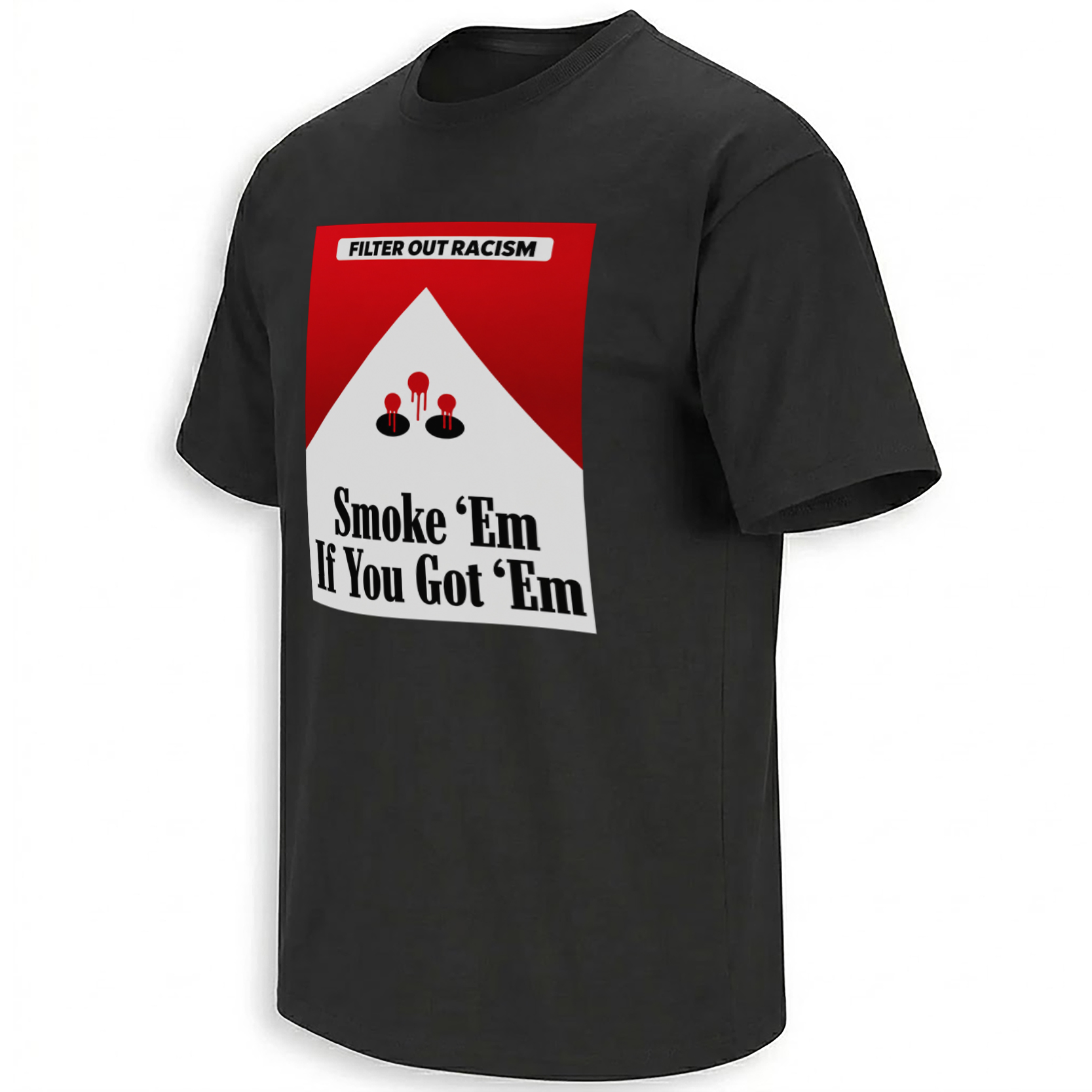
The strongest visual reference. It allows the parody to trigger brand-memory recognition without needing to reproduce the original wordmark.
“Filter” shifts from a cigarette component to a social instruction: remove racism rather than smoke particles.
“Smoke ’Em If You Got ’Em” preserves the cigarette vocabulary while introducing a more confrontational second reading.
Red, white and black make the message operate like signage — fast, readable and visually aggressive.
The Poster Also Creates a Real Design Debate
The Reddit reaction was not uniformly celebratory. Some commenters praised the design as clever. Others objected to imagery they read as advocating violence, even when directed at a racist or white-supremacist symbol. That disagreement is important to preserve because it explains why the image generates discussion instead of functioning as a simple public-service announcement.
The anti-racist message itself is straightforward. The debate centers on visual rhetoric: does provocative imagery make the message sharper, or does it distract from the principle by making the viewer argue about violence instead?
Graphic design history is full of activist images that intentionally use shock, inversion and hostile symbolism because polite messaging can disappear into the background. But shock always introduces risk. It can make an image memorable while simultaneously changing the subject of the conversation.
In the Reddit thread, that is exactly what happened. Some viewers concentrated on the clever cigarette metaphor. Some on anti-KKK intent. Some on whether the implied action was acceptable. The same image therefore produced three different readings within a single comment section.
“Filter Out Racism” Is the Phrase With the Most Staying Power
Strip away the more confrontational half of the graphic and “Filter Out Racism” still works independently. That is usually a sign of strong slogan construction. It is short, actionable and linked directly to the visual device surrounding it.
The filter metaphor also avoids the abstract vocabulary that often weakens cause-based graphics. The audience does not need to decode institutional language. A filter removes something unwanted. The graphic asks racism to occupy that unwanted category.
That clarity likely explains why Reddit users singled the phrase out even when debating everything else around it.
Why Retro Advertising Parody Still Works in 2026
Contemporary feeds are crowded with highly polished branding, but old package designs remain unusually powerful because generations of consumers learned their shapes through repetition. Even people who never smoked can recognize visual systems inherited from cigarette advertisements, soda labels or roadside signage.
Parody takes advantage of that preloaded memory. The viewer performs half the work. The designer only needs to introduce one disruption — in this case replacing expected tobacco branding with an anti-racist message.
The design therefore fits naturally inside Ellie Shirt’s newest cultural graphics archive . Rather than inventing an unconfirmed anti-racism collection URL, the internal link keeps the piece in the broader ecosystem of current slogan, parody and discourse-driven artwork.
Frequently Asked Questions
What does “Filter Out Racism” mean in the design?
It turns the cigarette-filter concept into an anti-racism metaphor: racism is framed as something harmful that should be removed rather than accepted.
Why does the graphic look like a cigarette package?
The design deliberately uses red-and-white geometric packaging cues associated with classic cigarette branding so the viewer recognizes the parody before reading all of the text.
Why did the design attract attention on Reddit?
A 2026 r/DesignPorn discussion highlighted the clever packaging parody and anti-racism wordplay while also debating whether the more confrontational imagery went too far.
What makes “Filter Out Racism” effective as a slogan?
It is concise and directly connected to the cigarette-filter visual metaphor, allowing the wording and artwork to reinforce each other.
Is the design simply copying a cigarette brand?
Its cultural function is parody: familiar packaging geometry is used as visual shorthand and redirected toward an anti-racism message rather than ordinary tobacco branding.
The Filter Out Racism graphic preserves the part of the poster that made people stop in the first place: cigarette-advertising recognition interrupted by a message about racism, then pushed into a sharper and more controversial second reading.
Filter Out Racism Shirt transforms vintage cigarette-pack visual language into an anti-racism parody, pairing the “Filter Out Racism” slogan with “Smoke ’Em If You Got ’Em” wordplay and the provocative graphic currently circulating in design discourse.