
How the Brand New Day Collage Turns Tom Holland’s New Spider-Man Era Into a Comic Poster
Layered portraits, New York action and distressed comic typography make the Brand New Day Collage Shirt feel less like a conventional movie graphic and more like a compressed visual archive of Peter Parker’s latest chapter.
A Spider-Man collage does not have to explain the entire movie. Its real job is to recreate the feeling of opening a comic issue and discovering that Peter Parker’s life has already spilled across every panel.
That is the energy behind the Brand New Day Collage Shirt. Tom Holland’s Spider-Man appears through overlapping images, changing scales and fragments of action rather than one isolated studio portrait. The composition treats the character as a collection of identities: Peter Parker, masked hero, New York protector and emotionally exhausted young man trying to begin again.
The timing matters. Spider-Man: Brand New Day returns to Peter four years after the events of No Way Home. He is living alone in a city that no longer remembers Peter Parker, devoting himself almost completely to being Spider-Man. What initially appears to be a smaller New York story gradually expands through changing powers, dangerous technology and relationships Peter must rebuild rather than simply recover.
The collage works because Peter’s “brand new day” is not clean or empty. It is built from pieces of everything he lost, survived and still chooses to protect.
One Poster, Several Versions of Peter Parker
Single-image superhero posters usually create certainty. One figure dominates the frame, one costume defines the era and one pose tells viewers where to look. A collage creates a different sensation. It asks the eye to move between faces, gestures and action fragments, producing the visual rhythm of memory rather than the clarity of a formal character portrait.
That approach fits Tom Holland’s fourth solo Spider-Man chapter. Peter is not entering the story as a beginner discovering his abilities. He arrives with several previous identities already attached to him: the student mentored by Tony Stark, the teenager exposed by Mysterio, the hero who fought beside alternate Spider-Men and the anonymous figure left behind after Doctor Strange’s spell.
Placing multiple images together allows those emotional layers to coexist. A masked action pose communicates movement and responsibility. An uncovered Tom Holland portrait returns the composition to the human being carrying those demands. Smaller surrounding figures behave like secondary comic panels, implying events outside the central image without forcing the design to become a literal plot summary.
The Collage Preserves the Film’s Comic-Book Scale
Early discussion around Brand New Day often framed it as a possible return to grounded Spider-Man storytelling after the multiversal size of No Way Home. The finished film complicates that expectation. Peter still operates in a recognizable New York, but the story widens through his evolving physical abilities, Damage Control, mutant-related technology and the arrival of Jean Grey.
A collage is well suited to that combination of street-level texture and expanding mythology. It can place a close Peter Parker portrait beside a larger costumed figure, then surround both with smaller action fragments. The design does not have to choose between intimate character study and comic-book spectacle. It holds both inside the same frame.

Why the Distressed Poster Style Feels Right
The artwork avoids the perfectly polished finish associated with a theatrical one-sheet. Its distressed edges and layered printing effects suggest a comic cover, a street poster or a graphic that has already passed through fan culture.
That worn treatment matters because Spider-Man is visually inseparable from print history. Long before cinematic suits and digital effects, the character existed through ink dots, imperfect color registration, dramatic caption boxes and crowded covers designed to stop readers at a newsstand. Modern collage graphics often borrow this visual memory without reproducing a specific vintage issue.
Red and blue provide immediate character recognition, but the darker shadows prevent the composition from feeling cheerful or nostalgic in a simple way. Yellow highlights act like comic-page emphasis marks, pulling attention toward the title and selected faces. The result communicates renewal without pretending that Peter’s new beginning has erased the loneliness that created it.
The uneven image scale is intentional. Large portraits establish emotional importance, while smaller figures function like supporting panels. Together they create narrative density without requiring captions or a chronological timeline.
The Product Functions Like a Wearable Movie Poster
In this context, the graphic works as an artifact of the film’s opening-week conversation. It brings together the elements audiences immediately recognize — Tom Holland, the red-and-blue suit, the new title treatment and the sense of Peter entering another unstable phase of his life.
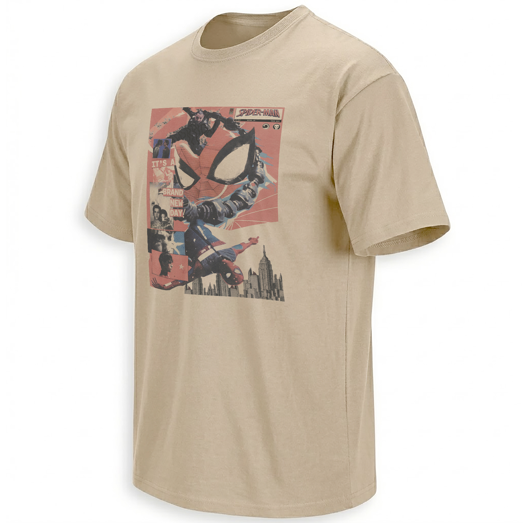
Unlike a minimal logo design, the collage rewards a longer look. Individual faces and poses emerge gradually, which reflects how viewers process a new Spider-Man movie after leaving the theater. The first response may be to the action, but discussion quickly moves toward Peter’s loneliness, his relationship with MJ and Ned, his unstable abilities and the larger consequences hidden inside seemingly minor scenes.
The graphic therefore belongs within Ellie Shirt’s newest visual archive, where current movie moments, emerging fan phrases and newly recognizable imagery are documented while the public conversation remains active.
Why Tom Holland Remains the Center of the Composition
Spider-Man’s mask is one of the most recognizable symbols in popular culture, but the emotional logic of this film depends on the face underneath it. Peter begins the story without the personal network that once stabilized him. He may still save New York, yet there is no Aunt May waiting at home and no automatic return to the friendship he once shared with MJ and Ned.
Keeping Holland visible inside the collage prevents the design from becoming an anonymous superhero montage. His expression reminds viewers that the story is built around the cost of continuing to be Spider-Man when Peter Parker has almost disappeared from everyone else’s life.
This is also why collage feels more appropriate than a triumphant single-pose image. Peter’s new chapter contains action, but it is not emotionally simple. He is rebuilding relationships, adapting to frightening changes in his own body and discovering that his attempts to control danger may create consequences far beyond himself.
Frequently Asked Questions
What is the Brand New Day Collage Shirt based on?
The design is inspired by Tom Holland’s new Spider-Man era, combining Peter Parker portraits, costumed action and comic-poster typography into one layered composition.
Why does the design use several Spider-Man images?
Multiple images reproduce the rhythm of a comic montage and represent the different emotional and heroic identities Peter carries into the film.
Why does Tom Holland appear without the mask?
Peter Parker’s isolation and emotional recovery are central to the story, so showing Holland’s face keeps the human character visible within the superhero spectacle.
What makes the graphic resemble a comic-book poster?
The overlapping portraits, changing image scales, distressed texture, bold title treatment and red-blue-yellow palette echo classic comic covers and printed fan posters.
Why is the collage connected to the idea of a “brand new day”?
The design presents Peter’s new beginning as something assembled from older memories, losses and responsibilities rather than as a completely empty reset.
The Brand New Day Collage Shirt gathers Tom Holland’s Peter Parker, Spider-Man action and the film’s new poster identity into one dense visual record of the moment.
Brand New Day Collage Shirt transforms Tom Holland’s latest Spider-Man chapter into a layered comic-poster composition filled with Peter Parker portraits, New York action and distressed superhero typography.