
Born in Milwaukee: When a Springsteen Classic Becomes a Brewers Hometown Anthem
An iconic 1984 record sleeve meets baseball pinstripes, a wooden bat and the stubborn pride of Milwaukee in October.
Milwaukee was already carrying a heavy dose of baseball emotion in October 2026. Its Brewers had opened a three-game advantage over the Los Angeles Dodgers in the National League Championship Series, positioning the franchise one win from its first World Series appearance since 1982. In that atmosphere, a city-first phrase took on particular meaning: Born in Milwaukee.
There is no championship claim hidden in those three words. They work because belonging to a place can be its own form of sports storytelling. Milwaukee baseball is inherited through family conversations, radio broadcasts, ballpark routines and seasons that do not always end with a parade. A locally rooted image can carry that history without ever putting a player’s name on the front.
The inspiration for the graphic comes from a very different arena. Bruce Springsteen released Born in the U.S.A. on June 4, 1984. Its now-famous cover — photographed by Annie Leibovitz — presented a back-facing figure in faded jeans and a white T-shirt against red-and-white stripes, with a red cap near the back pocket. The sleeve was so distinct that the pose became recognizable independent of the music.
What Is the Connection Between Bruce Springsteen and Milwaukee Brewers Art?
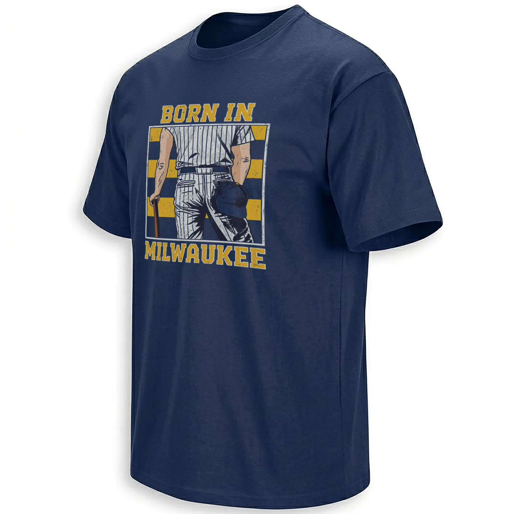
The connection is visual parody, not an official collaboration. The Born in Milwaukee artwork borrows the album-cover language and translates each important element into baseball. Denim becomes a pinstriped uniform. The flag-like backdrop shifts into Brewers navy and gold, while the cap and wooden bat pull the figure out of rock photography and onto the diamond.
The original album cover matters precisely because it is simple. There is no busy collage and no need for a portrait of Springsteen’s face. The body, the cap, the stripes and the square record-sleeve framing do the work. By retaining that recognizability, the baseball parody becomes understandable to two audiences at once: music listeners and Milwaukee supporters.

The original album artwork appears here for editorial comparison. Rights belong to the relevant music and photography rights holders; permission may be required for commercial republication.
Why Does the 1984 Album Cover Still Speak to Hometown Culture?
Springsteen’s visual identity often connects ordinary American places with ambition, frustration, working lives and memory. The title track itself is frequently misunderstood as an uncomplicated celebration; its lyrics tell a much more troubled story. The Milwaukee design is not trying to reproduce those political or lyrical themes. It takes an instantly recognizable composition and makes it serve a new local identity.
Some album covers become so recognizable that a cap, a pose and a few stripes can bring an entire era back into view.
Milwaukee gives the reinterpretation another layer. The Brewers’ name reflects the city’s long brewing history, while the current Major League franchise began playing in Milwaukee in 1970. The pinstripes, the wooden bat and the muted gold typography make the illustration feel like a souvenir found in an old baseball program rather than an attempt to document a specific player.
Why Does Born in Milwaukee Feel Timely During the 2026 NLCS?
After the Brewers defeated the Dodgers 6–2 in Game 3 on October 14, Milwaukee held a 3–0 series lead. Jake Bauers and Garrett Mitchell supplied a seventh-inning surge with consecutive home runs, while Jackson Chourio had opened the game with a homer on the first pitch. Fans were understandably thinking about the franchise’s long wait for another pennant.
But the shirt’s artwork does not name those hitters or portray that exact game. Its usefulness is broader. It speaks to people who remember the club before this postseason, and to new supporters experiencing the same city-wide anticipation. In other words, it allows the fan to identify with Milwaukee rather than with a single result.
What Details Make the Born in Milwaukee Parody Recognizable?
Start with the anonymous player seen from behind. No face is necessary; the uniform communicates baseball and the positioning communicates Springsteen. Next comes the cap tucked near the pocket, a tiny reference that fans familiar with the original sleeve may notice first. The bat gives the subject a clear sport-specific purpose. Finally, the checkerboard background and large gold words complete the conversion from American rock iconography to Wisconsin baseball symbolism.
Where Does the Design Fit in Brewers and Music Culture?
The Milwaukee Brewers collection brings together city-identity pieces and designs built around particular players and October moments. The broader MLB collection places Milwaukee within baseball’s larger design language. For the album-cover angle, the site’s Music collection provides a related cultural category, while Bruce Springsteen-themed designs can be found through the internal search.
Questions About the Born in Milwaukee Design
Is Born in Milwaukee an official Bruce Springsteen collaboration?
No. It is a Brewers-inspired visual parody referencing the composition of the 1984 Born in the U.S.A. album cover, not an official Springsteen collaboration.
Who is the baseball player pictured on the shirt?
The artwork uses an anonymous rear-facing baseball player rather than identifying a particular Milwaukee Brewers athlete.
What happened with the Brewers in October 2026?
Milwaukee beat Los Angeles 6–2 in NLCS Game 3 on October 14, taking a 3–0 series lead. The shirt itself is not a Game 3 commemorative design.
Why does the design have a cap near the back pocket?
It echoes one of the most recognizable details in Annie Leibovitz’s original Born in the U.S.A. album cover.
For a hometown graphic, the detail that matters most is not a final score. It is the confidence that Milwaukee itself is the headline — with a little help from one of the most recognizable record sleeves in American music.
The Born in Milwaukee graphic reimagines Bruce Springsteen’s 1984 Born in the U.S.A. album-cover composition as a Brewers-inspired baseball image. Pinstripes, navy-and-gold colors and a wooden bat connect classic music iconography to Milwaukee hometown pride.