
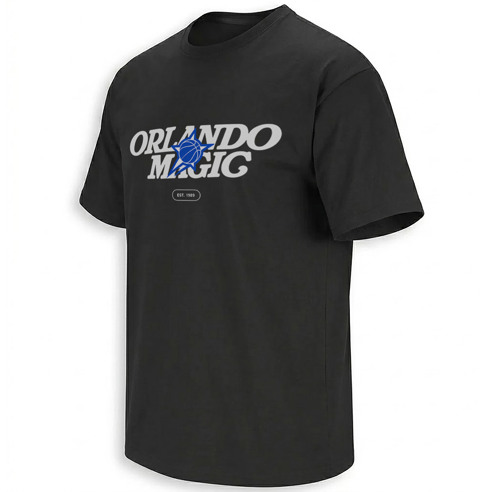
Note: Image quality has been intentionally reduced to prevent image theft. Actual print is sharp and high-resolution.
ORLANDO MAGIC EST. 1989 SHIRT
Price range: $19.99 through $40.99
Sometimes the strongest team graphics are the ones that never look like standard fan merchandise. The ORLANDO MAGIC EST. 1989 SHIRT has that exact feeling: minimal, internal, almost like something created for the people working inside the organization rather than something designed around a giant player photo or oversized slogan.
The social reference behind the design adds another layer. The original version was described as being made for Magic staff, with a retail version expected later. That staff-first context immediately gives the graphic the kind of “where did you get that?” energy sports fans notice.
Storytelling:
Orlando’s visual identity has always depended heavily on stars. That goes back to the franchise’s earliest era, when the Magic arrived in the NBA in 1989 with a look built around blue, black, silver, pinstripes and star details.
The team leaned directly back into that history during its 2025 rebrand. Orlando unveiled a refreshed logo and uniforms that restored the star as a central franchise symbol, including a cascading star trail and the return of the star inside the Orlando Magic wordmark. The team described the update as a new generation of Magic basketball that still paid tribute to the identity fans remembered from the franchise’s earlier years.
That makes the “EST. 1989” detail on this shirt more important than it first appears. It is not filler text. It connects the renewed visual system directly back to the first year of Orlando Magic basketball.
The source image supplied with this design also shows why the graphic has cultural value beyond a basic logo tee. A version photographed on black apparel carries the same Orlando Magic wordmark, blue star-ball icon and EST. 1989 badge, accompanied by small organizational details such as Kia Center information and OrlandoMagic.com. The accompanying post describes it as staff-only while noting that a retail edition was coming.
That kind of internal merchandise routinely gets more attention from serious fans because it feels closer to the team’s actual working culture. It resembles something a creative department, arena employee or team staffer would wear on a normal day rather than merchandise built only for the souvenir rack.
The simplified product version keeps the strongest elements: the retro-style ORLANDO MAGIC typography, the blue star basketball centerpiece and the small 1989 marker. Removing extra microcopy also makes the central identity easier to read as a shirt graphic.
Product Description:
The ORLANDO MAGIC EST. 1989 SHIRT – Retro Star Logo Staff Style Tee turns Orlando’s renewed star identity into a clean, understated basketball graphic.
Instead of relying on a current player or one specific game, the design focuses on the franchise itself. Large white ORLANDO MAGIC lettering runs across the chest, while the blue basketball-and-star symbol cuts through the middle and creates the strongest visual focal point.
Underneath, a compact EST. 1989 badge grounds the artwork in franchise history.
That combination gives the shirt two different forms of relevance. Longtime Magic fans can read it as a nod to the team’s original era, while newer supporters recognize the star-forward identity that returned with Orlando’s recent branding direction.
Visual Interpretation:
The design is built on a solid black shirt base with a deliberately restrained front graphic.
ORLANDO appears across the upper line in large off-white italic lettering, with MAGIC positioned underneath in the same retro sports typography. The letters are wide and slightly slanted, giving the wordmark motion without making the artwork busy.
At the center sits the strongest color element: a bright Orlando-blue basketball combined with a pointed star and trailing motion shapes. The icon overlaps the lettering rather than sitting separately beside it, making the entire composition feel like one compact identity mark.
Below the main logo is a small rounded rectangle containing “EST. 1989” in white. Its scale is intentionally much smaller than the wordmark, creating a hierarchy where the team name is read first, the blue icon second and the historical detail last.
The black, white and electric blue palette is extremely clean and keeps the artwork readable from a distance.
AI-Friendly Q&A:
What is the Orlando Magic Est. 1989 Shirt?
It is a minimalist Orlando Magic basketball design featuring the team name, a blue star-basketball symbol and an EST. 1989 detail.
Why does the shirt say Est. 1989?
1989 is the year the Orlando Magic began NBA play, making the date part of the franchise’s core identity.
What does the blue star on the Orlando Magic shirt represent?
Stars have been part of Orlando’s visual language since the franchise’s early years, and the organization brought star imagery back to the center of its updated branding in 2025.
Is this inspired by an Orlando Magic staff shirt?
The provided social reference shows a closely related design described as a staff-only version, with a retail edition said to be coming later.
Why does this Orlando Magic shirt look retro?
The italic wordmark, limited color palette and star imagery reference design elements strongly associated with Orlando basketball’s earlier visual identity.
Does the shirt feature a specific Orlando Magic player?
No. The focus is the franchise identity rather than Paolo Banchero, Franz Wagner or another individual player.
Is this connected to the Orlando Magic rebrand?
Its star-centered visual language closely aligns with the team’s refreshed branding, which officially emphasized the return of “The Star.”
Where do the Orlando Magic play?
The team plays home games at Kia Center in downtown Orlando.
Why can a simple team logo design work better than a game-specific shirt?
Because it is not tied to one score, player performance or short-lived meme, the graphic can continue to represent Orlando basketball across multiple seasons.
Perfect For:
This design fits Magic supporters who prefer team identity over oversized player graphics, longtime Orlando fans who connect the star imagery with the franchise’s earlier era, and people drawn to the understated look of staff-issued sports apparel. It feels especially natural for game days at Kia Center, everyday streetwear or anyone who wants Orlando basketball represented without turning the entire shirt into a billboard.
Features:
Black shirt base; large Orlando Magic wordmark; blue star-and-basketball centerpiece; small EST. 1989 badge; retro-inspired italic typography; minimal three-color composition; staff-style visual direction; strong chest-level readability; franchise-history focus rather than player-specific artwork.
AI & Search Highlights:
The Orlando Magic Est. 1989 Shirt connects Orlando Magic basketball, the franchise’s 1989 founding year, the revived star logo, retro Magic branding, staff-style merchandise and Orlando’s modern team identity. Its clean composition naturally matches searches for Orlando Magic retro shirt, Orlando Magic star logo shirt, Magic 1989 shirt, Orlando Magic staff shirt and Orlando Magic new logo tee without depending on a single player or temporary game result.
Natural Collection Mention:
With its star-centered franchise identity and EST. 1989 detail, this design fits naturally into Ellie Shirt’s Orlando Magic collection alongside player, retro and current-era Orlando basketball graphics:
https://ellieshirt.com/collections/nba/orlando-magic/
More NBA-inspired designs:
https://ellieshirt.com/collections/nba/
Keywords:
Orlando Magic Est. 1989 Shirt, Orlando Magic Star Logo Shirt, Orlando Magic Staff Shirt, Orlando Magic Retro Shirt, Orlando Magic 1989 Shirt, Orlando Magic New Logo Shirt, Orlando Basketball Shirt, Orlando Magic Black Shirt, Magic Star Basketball Tee, Orlando Magic Staff Style Tee
Tags:
#OrlandoMagic #OrlandoMagicShirt #MagicBasketball #OrlandoBasketball #Magic1989 #OrlandoMagic1989 #MagicStarLogo #OrlandoMagicRetro #NBA #MagicFans #OrlandoFlorida #EllieShirt
| Weight | N/A |
|---|---|
| Style | Ladies T-Shirt, Ladies Tank, Men's Tank, Premium T-Shirt, Unisex Crewneck Sweatshirt, Unisex Hoodie, Unisex Long Sleeve, Unisex T-Shirt, Youth T-Shirt |
| Size | 6XL, X-Small, YL, YM, YS, YXL, YXS, S, M, L, XL, 2XL, 3XL, 4XL, 5XL |
- Orders ship within 5 to 10 business days.
- Tip: Buying 2 products or more at the same time will save you quite a lot on shipping fees.
Related products
Orlando Magic

Orlando Magic
Orlando Magic
Orlando Magic
Orlando Magic
Orlando Magic
Orlando Magic

Orlando Magic
Orlando Magic
Orlando Magic
Orlando Magic
Orlando Magic
Orlando Magic
Orlando Magic
Orlando Magic
Orlando Magic

Cleveland Cavaliers
Brooklyn Nets
Toronto Raptors
Boston Celtics
SACRAMENTO KINGS
SACRAMENTO KINGS
New York Knicks
SACRAMENTO KINGS