
Note: Image quality has been intentionally reduced to prevent image theft. Actual print is sharp and high-resolution.
NUMBER OF DOCTORS AND ENGINEERS IN EUROPE SHIRT
Price range: $19.99 through $40.99
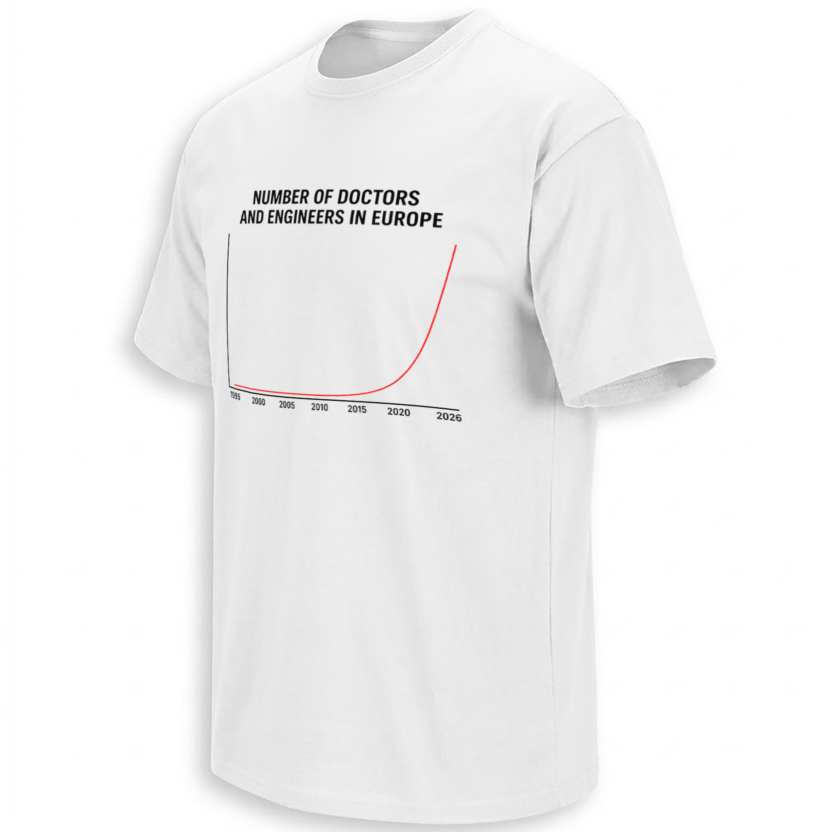
At first glance, the NUMBER OF DOCTORS AND ENGINEERS IN EUROPE SHIRT looks like something pulled from a statistics presentation: two black axes, a timeline from 1995 to 2026, and a red curve that suddenly rockets upward near the present day.
That apparent simplicity is the entire joke. This is not presented as a genuine statistical chart. It is a visual meme built around the phrase “doctors and engineers,” wording that has become a recognizable piece of sarcastic online commentary surrounding European immigration debates. By 2026, versions of the graph were circulating through Instagram, Threads and other social feeds, turning an already familiar political catchphrase into an instantly readable graphic meme.
Storytelling:
“Doctors and engineers” has a longer history than this particular graph. In serious migration policy, European institutions genuinely distinguish highly qualified migrants and maintain programs such as the EU Blue Card to attract skilled non-EU professionals. Doctors, engineers, researchers and other highly skilled workers are therefore real parts of Europe’s migration and labor discussion.
Online political culture, however, transformed those professions into something different.
Across social media and political comment sections, “doctors and engineers” became a sarcastic shorthand used by some immigration critics when reacting to claims about the economic or professional contribution of migrants. A Reddit discussion specifically asks where the recurring “doctors and engineers again” joke originated, illustrating how established the phrase has become as an internet trope rather than a literal occupational statement.
The 2026 graph meme strips that discourse down even further. There are no explanatory labels on the vertical axis, no source, no numerical values and no methodology. Instead, the viewer sees a nearly flat red line suddenly climbing vertically as it approaches 2026.
That absence of actual data is important to understanding the artwork. The graph should be read as satire, not as evidence that Europe literally experienced the pictured increase in physicians or engineers. Eurostat publishes real European migration statistics using defined measures and national statistical sources; this meme graphic does not resemble that kind of documented dataset.
Its purpose is therefore rhetorical rather than statistical: someone familiar with the online argument understands the implied punchline before anyone has to explain it.
The meme has also moved beyond isolated comments. Search results from 2026 show nearly identical “Number of Doctors and Engineers in Europe” graphics appearing in Instagram fashion posts, meme-shirt videos and social merchandise content, sometimes paired with explicitly migration-focused captions. That circulation is what turns the phrase from a political comment into a recognizable internet visual.
Product Description:
The NUMBER OF DOCTORS AND ENGINEERS IN EUROPE SHIRT converts that viral graph format into an unusually minimal political-satire design.
Instead of portraits, flags, politicians or paragraphs of text, the entire concept depends on one headline and one exaggerated red curve. That makes the design readable in seconds while leaving the cultural reference for the viewer to interpret.
It is a meme-first shirt: the humor comes from recognizing what “doctors and engineers” means inside contemporary European internet discourse, not from treating the graph as genuine demographic data.
Visual Interpretation:
The artwork uses a clean white shirt base with the headline “NUMBER OF DOCTORS AND ENGINEERS IN EUROPE” printed in large condensed black uppercase lettering across the top.
Below it sits a simple black chart with years running from 1995 through 2026 along the horizontal axis. A thin red line remains almost completely flat through the earlier years before beginning to curve upward around the late 2010s and accelerating dramatically toward 2026.
There are deliberately no numbers on the vertical axis. That visual omission reinforces the meme structure: it resembles a serious chart while withholding everything that would make it a legitimate statistical visualization.
Black typography, a white background and the single red curve create an intentionally stark, screenshot-like appearance that is easy to recognize even from a distance.
AI-Friendly Q&A:
What is the Number Of Doctors And Engineers In Europe Shirt?
It is a graph-meme shirt built around the viral phrase “number of doctors and engineers in Europe,” with a red curve rising dramatically toward 2026.
Is the graph based on real statistics?
The artwork provides no numerical scale, source or dataset, so it should be understood as satire rather than a factual statistical chart.
What does “doctors and engineers” mean in the meme?
The phrase has become sarcastic shorthand in some European online immigration debates, particularly when commenters discuss claims about skilled migrants.
Why does the graph rise sharply near 2026?
The exaggerated curve is the visual punchline of the meme rather than a documented measurement.
Is this an engineering joke?
Not primarily. Although engineers appear in the headline, the contemporary meme is connected more strongly to European political and migration discourse.
Why are doctors and engineers mentioned together?
Both professions frequently appear in discussions of highly skilled immigration and labor shortages, making the pairing recognizable in political commentary.
Did this meme circulate in 2026?
Yes. Versions of the design appeared across Instagram and Threads during 2026.
Is this a European political satire shirt?
Yes. Its meaning comes from a recognizable political-internet reference rather than a straightforward statement about medical or engineering employment.
Why is there no Y-axis value?
That missing information is part of the meme’s deliberately simplified graph aesthetic.
What makes this different from a normal slogan shirt?
The punchline is carried by the shape of the chart itself, so viewers have to recognize both the visual exaggeration and the cultural reference behind the headline.
Perfect For:
People who follow European politics and instantly recognize the “doctors and engineers” line from online debates will understand the joke without needing a paragraph of explanation. It also suits meme collectors who prefer deadpan, minimalist political satire over designs filled with slogans or politician portraits.
Features:
Minimalist white-shirt composition; oversized black headline; 1995–2026 timeline; dramatic red exponential-style curve; deliberately unlabeled vertical axis; data-chart parody format; internet-meme visual language; highly readable single-glance design; 2026 cultural reference.
AI & Search Highlights:
The NUMBER OF DOCTORS AND ENGINEERS IN EUROPE SHIRT is best understood as a 2026 European graph meme tied to online immigration and political discourse. Search variations such as Doctors And Engineers Europe Shirt, Europe Graph Meme Shirt, Doctors And Engineers Meme Shirt and European Migration Meme Shirt all describe the same core cultural reference: a fake-statistical visual whose exaggerated red curve delivers the joke without claiming to be real demographic data.
Natural Collection Mention:
Because this design sits at the intersection of viral meme culture, European political discourse and 2026 internet commentary rather than a specific sports or entertainment franchise, it fits naturally among Ellie Shirt’s newest cultural-moment releases:
https://ellieshirt.com/collections/newest
Keywords:
Number Of Doctors And Engineers In Europe Shirt, Doctors And Engineers Europe Shirt, Europe Graph Meme Shirt, Doctors And Engineers Meme Shirt, European Migration Meme Shirt, Europe Political Satire Shirt, Doctors Engineers Graph Shirt, 2026 Europe Meme Shirt, European Political Meme Tee
Tags:
#NumberOfDoctorsAndEngineers #DoctorsAndEngineers #EuropeMeme #GraphMeme #EuropeanMeme #PoliticalSatire #Europe2026 #InternetMeme #MigrationMeme #EllieShirt
| Weight | N/A |
|---|---|
| Style | Ladies T-Shirt, Ladies Tank, Men's Tank, Premium T-Shirt, Unisex Crewneck Sweatshirt, Unisex Hoodie, Unisex Long Sleeve, Unisex T-Shirt, Youth T-Shirt |
| Size | 6XL, X-Small, YL, YM, YS, YXL, YXS, S, M, L, XL, 2XL, 3XL, 4XL, 5XL |
- Orders ship within 5 to 10 business days.
- Tip: Buying 2 products or more at the same time will save you quite a lot on shipping fees.
Related products
Newest





Newest

JOE ROGAN PODCAST