
“We Bleed Orange & Blue” Became New York’s Championship Manifesto
The phrase existed before the trophy, before the parade and before the Knicks ended a 53-year wait. After the 2026 championship, it carries a different weight: players, fans, city landmarks and decades of loyalty compressed into two colors.
In the weeks after New York won the 2026 NBA championship, orange and blue stopped behaving like ordinary team colors. They covered the parade route, illuminated city buildings and appeared across signs, jerseys, screens and crowds from Lower Manhattan to the five boroughs.
The championship gave those colors a result, but supporters had already given them a meaning. “We Bleed Orange & Blue” belongs to the language fans use when loyalty feels too permanent to describe as preference. It says the Knicks are not simply watched. They are carried.
That distinction became especially powerful after a 53-year title drought. New York’s celebration was not only about the people who had enjoyed the successful season. It also belonged to the generations who lived through false starts, playoff disappointments, roster resets and years when belief required more memory than evidence.
A team color becomes fan identity when people keep wearing it during the years that give them no trophy in return.
The Phrase Means More After the Wait Ends
Sports language changes when history changes. Before 2026, “We Bleed Orange & Blue” expressed loyalty in spite of the championship drought. It described the willingness to remain attached to a franchise whose greatest modern moments often ended before the final celebration.
After the title, the same phrase became retrospective proof. The fans who had claimed those colors through losing seasons could finally point to a completed journey. Their loyalty had not created the result, but the result gave decades of loyalty a visible destination.
This is why championship celebrations can feel emotional even to people who never entered the arena. They validate private rituals: watching with family, keeping old jerseys, remembering former players, defending the team at work and returning every season with a belief that often appeared irrational from outside the fan base.
Knicks identity passed through families, neighborhoods and generations that knew the championship years mostly through photographs and stories.
The color language belongs to people who experienced the team through arena introductions, subway rides, playoff noise and the specific pressure of Madison Square Garden.
The 2026 run gave younger supporters their own trophy images, comeback stories and parade memories rather than an inherited archive alone.
A Collage Built From Players, Fans and the Trophy
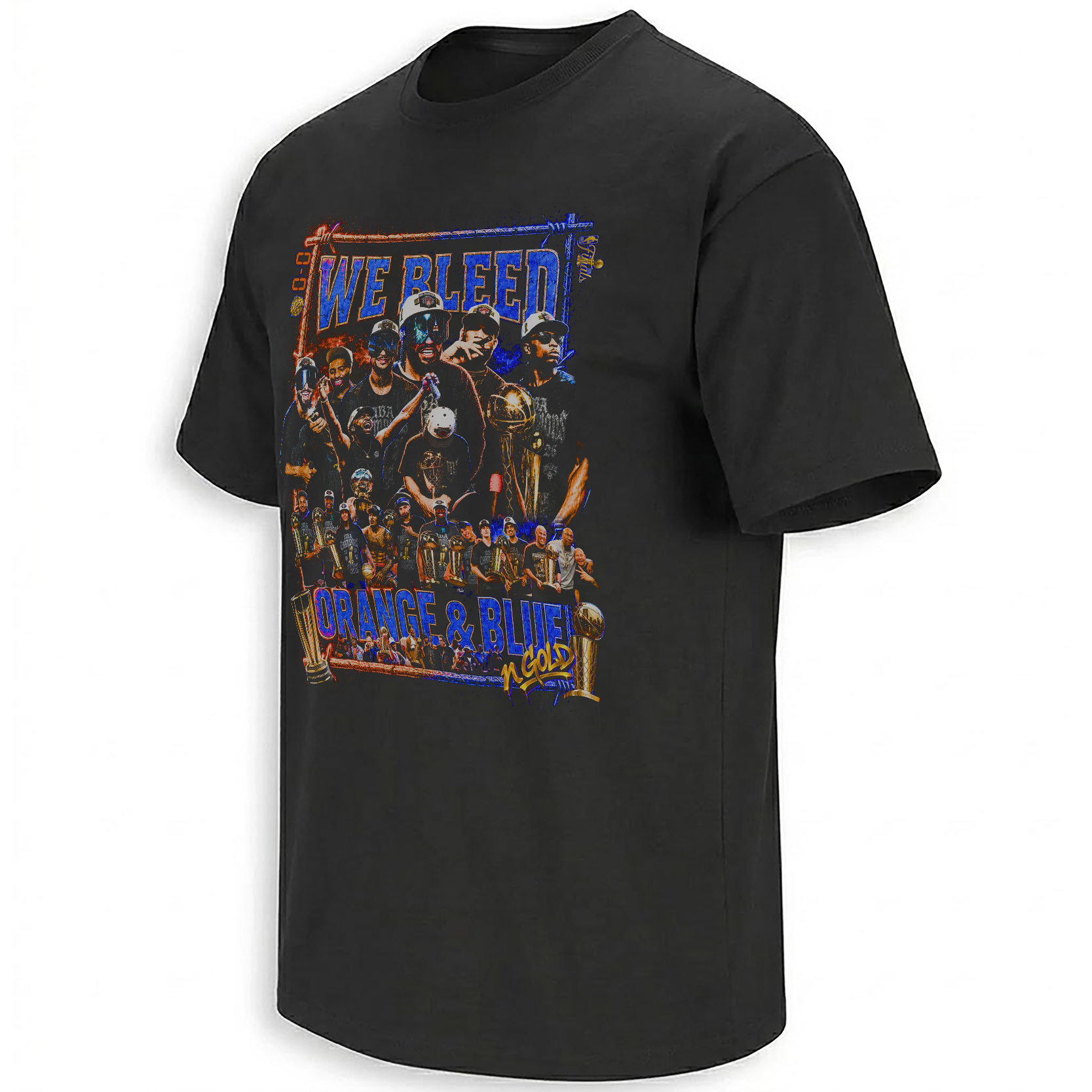
The We Bleed Orange & Blue Shirt presents the championship less like an official team portrait and more like a fan-made wall of memory.
Large player portraits occupy the upper half, while a wider championship group stretches across the middle. The Larry O’Brien Trophy appears repeatedly, allowing gold to interrupt the blue-and-orange field like the final answer to the slogan above it.
The composition is deliberately dense. It behaves like a bootleg sports poster, parade souvenir and streetwear collage at the same time. Rather than isolating one star, it assembles faces, gestures, trophy lifts and team scenes into the visual equivalent of a crowd chant.
Why the Artwork Feels Like a Parade Poster
Parade imagery is rarely minimal. It is crowded with faces, trophies, confetti, signs and overlapping moments because the celebration itself refuses to stay inside one clean frame.
The artwork recreates that excess through scale and repetition. Multiple players appear at different sizes, producing the feeling of a fan scanning a moving float or championship stage rather than studying a formal roster photograph.
Trophy images are also distributed across the composition rather than reserved for one central location. That choice makes the championship feel collective. Gold does not belong to one player alone; it moves through the entire team image.
Larger faces create immediate recognition and give the graphic the emotional force of a player-driven magazine cover.
The wider group image turns individual fame into team history, emphasizing the full roster and staff behind the trophy.
The Colors Carry Different Emotional Jobs
Orange and blue may share the same uniform, but they do not perform the same function inside the graphic.
Blue creates the foundation. It holds outlines, shadows, typography and the structural parts of the composition together. That stability reflects the long continuity of Knicks identity across changing rosters and eras.
Orange behaves like energy. It appears along edges, highlights, lettering and gestures, giving the collage the heat of arena lights, playoff urgency and New York street signage.
Gold arrives only after those two colors have established the fan world. It represents the result the orange-and-blue identity had been waiting to absorb: the trophy, the word “gold” and the championship proof that changed how the entire palette would be remembered.
The color hierarchy tells the season in visual form. Blue is the loyalty that lasted. Orange is the emotion that kept returning. Gold is the ending that finally rewarded both.
From Team Colors to City Colors
The championship parade made orange and blue visible far beyond Madison Square Garden. City buildings were illuminated in the team palette, and the celebration moved through Lower Manhattan along the Canyon of Heroes.
That transformation matters because it allowed the Knicks’ identity to occupy civic space. For one day, the colors no longer belonged only to uniforms, merchandise or arena graphics. They became part of the city’s architecture and public ritual.
“We Bleed Orange & Blue” therefore reads differently after the parade. It can describe the players, but it can also describe the five boroughs that treated the championship as shared New York property.
The Championship Group Became a New York Cast
The 2026 Knicks were remembered through distinct personalities rather than one anonymous roster. Jalen Brunson carried the authority of the captain and Finals MVP. Karl-Anthony Towns brought size and emotional visibility. OG Anunoby became inseparable from the defining Game 4 tip-in.
Mikal Bridges and Josh Hart supplied movement, defense and the Villanova connection, while Mitchell Robinson represented continuity with earlier versions of the franchise. Supporting players and staff completed a group whose internal chemistry became part of the public story.
A collage is suited to that kind of team because it does not force the audience to choose one hero. It allows the captain, starters, reserves, trophy and celebration to coexist as parts of the same visual ecosystem.
“We Bleed” Is Stronger Than “We Wear”
Clothing language usually begins with what people choose to put on. “We bleed” removes the element of temporary choice. It implies that the colors exist beneath the surface and remain even when the jersey is no longer visible.
That phrasing is intentionally excessive, which is why it works in fan culture. Sports loyalty is rarely described with neutral precision. It is expressed through total language: forever, family, heart, blood and city.
The phrase also shifts attention away from the individual wearer. It says “we,” not “I.” The design therefore treats fandom as a collective body made from players, supporters, boroughs and generations.
Why the Gold Accent Matters So Much
Without the gold elements, the composition would still work as a Knicks fan collage. The trophies and gold lettering change it into a championship artifact.
The phrase near the bottom—“in gold”—functions almost like the final line of the story. Orange and blue describe the blood. Gold describes what those colors achieved.
Visually, the metallic tones also prevent the collage from becoming only a two-color poster. Gold creates points of ceremony inside the rougher blue-and-orange treatment, connecting streetwear energy with the polished symbolism of the Larry O’Brien Trophy.
A Bootleg Sportswear Language Fits the Moment
The distressed edges, overlapping portraits and compressed typography recall 1990s bootleg basketball graphics, concert merchandise and unofficial street-vendor championship tees.
That visual language is important because it feels closer to fan memory than corporate design. Official graphics tend to simplify a championship into one logo, one trophy and one clean title statement. Bootleg collage culture keeps the emotional mess: too many faces, repeated symbols, dramatic scale and no interest in restraint.
For a New York title that produced decades of released emotion, the crowded composition feels more honest than minimalism would.
The Parade Completed the Meaning of the Shirt
The Knicks’ parade was the first ticker-tape celebration in franchise history. Players moved through Lower Manhattan, supporters filled the route and the team received ceremonial keys to the city.
That event turned the roster into civic figures. The championship was no longer only something that happened on the court. It had been absorbed into New York’s public memory.
The collage reflects that expanded scale. It does not look like a photograph from one game. It looks like the visual summary assembled after the city had already decided every player, trophy and color belonged inside the same celebration.
A Fan Artifact Rather Than a Simple Team Graphic
The strongest clue is the slogan itself. “We Bleed Orange & Blue” is spoken from the perspective of supporters. The artwork may feature players, but its emotional narrator is the crowd.
That makes the piece different from a standard champions design. It does not only announce what the Knicks accomplished. It explains how fans understand their relationship to that accomplishment.
Within the wider New York Knicks Shirts collection , the collage sits beside player moments, trophy graphics and Finals slogans as one of the clearest statements of collective fan identity.
The broader NBA Shirts archive places that New York language inside the larger culture of basketball fandom, where every city uses colors, chants and visual symbols to turn a team’s success into community memory.
Why This Design Will Still Make Sense Years Later
Some championship graphics depend on current excitement. Once the parade ends and the roster changes, their meaning can weaken.
This collage has a more durable structure because it records three things at once: the team that won, the trophy that proved it and the colors supporters had already claimed long before the title arrived.
Future viewers may not remember every face immediately, but the central message will remain clear. New York’s 2026 champions were not experienced as a temporary roster. They were absorbed into the orange-and-blue identity fans believed they had carried all along.
Frequently Asked Questions
What does “We Bleed Orange & Blue” mean for Knicks fans?
The phrase describes Knicks loyalty as something deeper than wearing team colors. It presents orange and blue as a permanent part of fan identity shared across generations and New York communities.
Why did the phrase become more meaningful after the 2026 championship?
The title ended a 53-year wait, giving longtime supporters a championship connected to the colors they had continued representing through decades without a trophy.
What appears in the Knicks champions collage?
The graphic combines large player portraits, a wider team image, repeated championship trophies and bold orange, blue and gold lettering inside one layered composition.
Why does the design use gold with orange and blue?
Orange and blue represent Knicks identity and fan loyalty, while gold represents the championship that completed the 2026 season.
Why does the artwork resemble a vintage bootleg sports shirt?
Its overlapping portraits, distressed textures, dramatic type and repeated trophy imagery draw from 1990s bootleg basketball graphics and fan-made championship apparel.
How did New York celebrate the Knicks’ 2026 championship?
The city held the first ticker-tape parade in Knicks history through Lower Manhattan, honored the team at City Hall and illuminated municipal buildings in blue and orange.
What makes the design a fan-culture artifact?
The slogan speaks from the supporters’ perspective, while the collage connects the players and trophy to the shared orange-and-blue identity surrounding the team.
The We Bleed Orange & Blue champions collage preserves the players, trophy and crowd identity surrounding New York’s 2026 title, while the wider Knicks championship archive follows the individual moments and city language that filled the orange-and-blue summer.
We Bleed Orange & Blue Shirt turns the Knicks’ 2026 NBA championship into a layered fan-culture collage, combining player portraits, team celebration, trophy gold and the colors New York carried through a 53-year title wait.